-
Notifications
You must be signed in to change notification settings - Fork 204
Improve appearance and readability #648
New issue
Have a question about this project? Sign up for a free GitHub account to open an issue and contact its maintainers and the community.
By clicking “Sign up for GitHub”, you agree to our terms of service and privacy statement. We’ll occasionally send you account related emails.
Already on GitHub? Sign in to your account
Conversation
These changes include:

    - use latest Haskell's logo colors
    - decrease #content width to improve readability
    - use nicer font
    - improve sizes and distances
|
nice! |
Right now, hackage is not responsive, which makes UX terrible.
For example, when viewing the page from a small device, the header
links overlap and the user no longer sees them all. Also, it is
annoying that the #content takes the same space in a small screen
as in a big one, as it results in very small sentences.
|
Thank you, @gbaz. I've now made it responsive. Can you have another look at the preview screenshots above? |
|
I'm a bit confused tbh :-) Why is it considered a good thing that the new stylesheet seems to waste space left/right on a mobile device? Wouldn't you rather want to exploit the little screen estate you have on a mobile device as much as possible? Similarly, on desktops; I have a rather crowded tiled WM, and I make my browser windows rather small; so I'd expect it to use the little window space as efficiently as possible to display the content. |
|
Hi @hvr,
"Waste" is subjective, but you have a fair point here. Design and typography wise, the empty space (aka "negative space") is beneficial. Furthermore, I have already reduced the "wasted" space on mobile devices. Maybe you mean that you still find it too much? I am fine with reducing it.
It's not so much about if it's on mobile or desktop, but about how much space is available. This is solved by the previous point. I also use a WM (i3wm), and I'd rather not have content taking the 100% of the available space as that is a disaster in terms of content proximity, and it's hard to read let alone. |
|
@NunoAlexandre Fwiw, I've given it a quick test-drive; it's not as bad as I thought when I make my windows smaller; there's a size at which the negative space suddenly snaps to a smaller amount, so i guess that's good enough :-) However, I have a high DPI display (somewhere around 120 DPI), and while I can read e.g. GitHub's fonts in its UI just fine (without needing to zoom in), I'm feeling eyestrain with the font style and lower contrast of your stylesheet. Is there something that can be done to improve readability? Btw, just in case you haven't seen this yet, there's also coloured blocks like e.g. at http://hackage.haskell.org/package/bad-package-example-0/candidate ... which design-wise may pose a challenge :-) |
Thanks for giving it a spin and for the feedback 👍
This is good information. Mine is a 227 ppi display and I didn't notice the things you mentioned. Could you perhaps attach a screenshot? We could, for example, darken the colour of the text a little and/or reconsider the font. I like this one quite a lot because it's both very elegant and discrete. I.e, it's not just Helvetica again, which would bring a special feeling to hackage, without being an intrusive font that drags the reader away from the content. But we could try Current (Merriweather Sans)Open SansSource Sans Pro |
I'm not sure what you meant by "challenge" in this case. It looks alright to me: What I don't like is to have the title in the header. It's a bad idea, imo, as its size is always different, which makes the header size unpredictable and ugly often enough. I'd rather move the title to the #content, and let it always be What do you think? |
|
Can we have a screenshot of https://hackage.haskell.org/package/lens-4.16/docs/Control-Lens-Operators.html with new stylesheet. It feels that there is more vertical whitespace around/in code blocks, but I'm not sure how bad it is on pages having a lot of doctests and other code blocks? |
|
Looks great. I think the extra whitespace is great—having shorter lines of text is much easier to read. In the screenshots the purple text looks a bit low-contrast, but that might be because of how the images are resized. The full-size images look better. Might still be worth making the text a bit darker. |
There is an open PR on the haddock repository with the same changes proposed here. The page of your link will be affected by that PR, not this one. I will add the screenshot you ask for over there. |
Agreed. @hvr raised the same issue. I was using Merriweather Sans, which is a low-contrast font. I switched now to Open Sans, which improves that. I will post some more screenshots tomorrow. |
- Make the body text darker and bigger
- Make links shades of purple instead of orange
- Adjust size of header links on smaller screens
|
We need to handle preferred/non-preferred/deprecated in whatever scheme is done, and update the documentation accordingly. cf #373 and for the docs:
Other than that, this is looking pretty good! |
Let’s take this opportunity to switch to a color scheme that is intuitively understandable. Green should not signify “errors”. |
|
The current stylesheet is more readable on mobile devices. I'm actually with @hvr here:
I'd rather just apply the colors of the proposed stylesheet to the old one; and I'll leave the rest as-is. |
|
The mobile margins are tighter than the desktop margins, and seem sort of in-line with how other mobile-optimized sites tend to do it. I like high information-density but I'm sympathetic towards moving more towards how "everyone else" does it with regards to mobile these days, which is emphasizing readability over density to a certain degree. As a whole this is definitely an improvement, and I'd like to see the preferred/etc colors sorted out so we can move forward with a merge while we have good momentum here :-) |
|
You might not have seen this part:
In any case, that space can obviously be tweaked. |
datafiles/static/hackage.css
Outdated
| @media only screen and (min-width: 950px) { | ||
| #page-header { | ||
| text-align: left; | ||
| text-align: left; |
There was a problem hiding this comment.
Choose a reason for hiding this comment
The reason will be displayed to describe this comment to others. Learn more.
double?
datafiles/static/hackage.css
Outdated
| } | ||
|
|
||
| #content { | ||
| width: 55vw; |
There was a problem hiding this comment.
Choose a reason for hiding this comment
The reason will be displayed to describe this comment to others. Learn more.
as this is narrow page, should that be closer to 100vw?
There was a problem hiding this comment.
Choose a reason for hiding this comment
The reason will be displayed to describe this comment to others. Learn more.
Yes, close to, to keep a minimally acceptable margin.
datafiles/static/hackage.css
Outdated
| } | ||
|
|
||
| #content { | ||
| width: 75vw; |
There was a problem hiding this comment.
Choose a reason for hiding this comment
The reason will be displayed to describe this comment to others. Learn more.
should we however have also max-width: 1200px or something like that? Some (accidentally) full screen pages on ridiculously large displays :)
There was a problem hiding this comment.
Choose a reason for hiding this comment
The reason will be displayed to describe this comment to others. Learn more.
Also, imho we should have min-width which is at wide as narrow viewport close to the breakpoint. EDIT that will remove "snap" when resizing.
FWIW, Iphone7+ is 1920-by-1080-pixel resolution at 401 ppi, i.e. 960px virtual pixels in landscape, which is wide viewport (as the breakpoint is at 950px).
There was a problem hiding this comment.
Choose a reason for hiding this comment
The reason will be displayed to describe this comment to others. Learn more.
I have added the max-width you suggested. Thanks!
I am not sure about the min-width though. Having a page that floats around as one scroll is annoying, and it doesn't really help reading it. Do you guys have analytics data about how many people use hackage using a small device?
Personally, I don't like new colors. I think the current Hackage color scheme is perfect. It's high contrast and has ideal warm-cool color balance, unlike dull grey monochrome Stackage-like scheme you moving towards. Compare https://hackage.haskell.org/package/lens-4.16/docs/Control-Lens-Operators.html https://www.stackage.org/haddock/lts-10.4/lens-4.15.4/Control-Lens-Operators.html IMO, the Hackage version is a lot more readable and pleasant to work with. |
- Have special sizes for small, medium and large screens.
- Now the space is further exploited in small screens.
- Set a max-width
The current color scheme is untuitive. Also, add the class "versions" to
the element holding the list of versions of a given package, and add
the class "normal" to normal versions. This helps making the style more
specific and explicit, while being able to drop the "!important" flags.
|
@NunoAlexandre I appreciate the work you've set out to do here. Knowing the risks of "design feedback via committee", here are some of my observations:
|
UpdateAdjust responsive behaviour Screenshots- Iphone7s 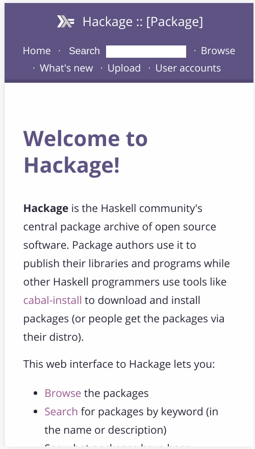Make package version color scheme intuitive (see #648 (comment)) |
|
This is really coming along! It seems the remaining issues around readability mainly involve haddocks rather than the core hackage pages. Perhaps it could be useful to pursue discussions regarding them on that PR? (haskell/haddock#721). I think just bumping contrast a bit on the purple headers could help a ton. (btw do you have screenshots of the table-based results that come from the /browse page etc? It would be nice to see.) |
|
Hi @elben, thank you for your words and for your constructive feedback.
I personally cannot recall a case where density was more important than readability, for I would not prefer to see more content at once and have a much harder time reading any of it. I might be wrong here, I am not dismissing your observation.
Do you have an example of a material which is better read with a dense design than with a good negative space that you can show? I am not with you on this one. I have minor studies in typography and (negative) space is fundamental, and a lot of the things you are not into or don't understand have been thoroughly studied and tested. You are obviously free to have your preference, but I am afraid your are not on the winning side of the discussion. If your point is that I am using too much negative space now, I am open to improve it. But I'd rather have a first version deployed and see what the masses have to say and tweak accordingly, as now the majority seems to like it as I am proposing (which obviously doesn't mean it's right), and democracy rules.
You can't really compare screens with books.
If what you want is to look at raw code, why not look at the source? It gives your all you need and extras. However, we can indeed think of some code-reading mode, but let's not go off-scope here.
I agree, thanks! |
|
Hi @gbaz,
Correct. I have delayed working on haddock for 1) lack of time to work on both and 2) to avoid having to make the same changes in both places. Once we are done here I will move to there.
Are you referring to the top header (menu) or to the headings (titles)?
|
Preview latest suggestionsInstead of posting screenshots, I have hosted the pages you guys have shown interest in seeing the latest suggestions here proposed. You can find a list of links to them following the link below: This allows anyone to preview and try it out! I will keep on updating it as we ago so it will always be updated. |
|
You can fix the header spacing like this:
This will put the same amount of space above and below the items in the header and align all the text to the same horizontal line. |
|
Great work! The only thing that I think could be better is to use dropdown menu for small screens but I guess you are just changing the css, not adding any extra html elements. |
The page-header .caption and the menu links were not alignment.
This was caused by changing the font-weight and size of the caption.
There was too much space between code blocks as pointed out by
reviewers.
Thank you very much. That is a good suggestion, but I am trying to reduce html changes as much as possible in this PR. Maybe you can create an issue here about it? The scope for now is to have the menu looking acceptable and working in small devices, which is the case now. |
|
Just wanted to chime in on the contrast. The purple text against grey or white background was quite hard for me to read, so I tested it for WCAG compliance and found it falls short of AAA readability by a couple of points: https://webaim.org/resources/contrastchecker/?fcolor=9C5791&bcolor=F6F6F6 https://webaim.org/resources/contrastchecker/?fcolor=9C5791&bcolor=FEFEFE Darkening a few shades to achieve WCAG AAA readability might be worthwhile; it would certainly stop me from immediately installing custom CSS. |
will do |
|
I like the direction this style is going. One minor point: there's too much initial vertical space when expanding individual instances. |
- Fix issue with font size on landscape mode
- Make table of contents stick to the left
on wide screens
- Change color of table of contents
- Reduce font size
- Improve space between and within code blocks
- Improve alignments
- Improve spacing within sub-blocks
UpdateI have addressed the many comments about information density by reducing the font-size a little and improving some spacing between elements. |
I don't empathize with this but if you suggest alternative colors I am open to adjusting. I am not of the opinion that every single element or piece of information needs to have the highest level of contrast possible. Sometimes you just need them to be easily spotted, for example. I ran a few tests using color and contrast schemes used in some docs by Google and the whole thing fails altogether, while those are one of the most readable docs around. |
Moving those sliders until the contrast ratio hits 7 (AAA readability) produces #6F3E69 and #794470, both of which no longer hurt my eyes to read.
Your opinion here shouldn't matter. Accessibility should not be optional for a widely used technical reference. Other sites may not comply, but we could do so at no cost. |
This is a brusque way of putting it, but the core idea is sound. WCAG gives us a set of simple, objective rules for making our system useful and comfortable for as many people as possible. With contrast in particular, the standards exist to keep text readable even for people who do not distinguish colors well. Since we aren't experts in accessibility, the guidelines help us do a good job without needing to second-guess other organizations or to generalize from our own limited experiences.
To be clear, the contrast guidelines do not expect everything to have the same level of contrast. There are different levels for different text sizes, and even the AAA standards for text below 18 pt allows a wide range of contrasts. It just provides a minimum contrast level chosen to work for people with 20/80 visual acuity:
(From WCAG.) This still gives you enough flexibility as a designer to use contrast as part of the design—for bringing attention to specific elements, for example—while maintaining a minimum level that works well for a wide range of people. |
|
I have increased the contrast of the links. IMO, now it all looks almost black. I.e, the contrast between different things is low., while it was clear before How do you go about that, @thumphries and @TikhonJelvis? I do not want to put aesthetics before accessibility, but this seems a mix of both. |
|
I agree that the contrast between the text and the background should be large enough to make the text legible - but the same should go for the contrast between normal text and link text. Links are virtually indistinguishable at the moment. Perhaps saturating the color and increasing the brightness could satisfy both requirements. |
|
I've got a branch here: https://github.com/haskell/hackage-server/tree/gb/stylesheet-mar18 It has a few more small changes on top, to resolve the remaining issues. It tightens some spacing around headers a bit more (and distributes it around paragraphs again, instead of putting it all at the top). Additionally, it fixes the header styles for the old (non-template) pages. It makes the links more contrasty again, and makes unvisited brighter and more saturated than visited, as is general practice. It lets the width of the browse tables grow as the page is increased. And finally, it fixes a bug where long package-descriptions could force the menu offscreen. I feel this is mergable. The drawback is that, if we merge now, then the haddocks will still take some time to catch-up, and in the meantime the styles will be nonuniform between haddocks and main hackage. On the other hand, this has been underway for a few months, and it would be good to merge before momentum is lost. We can always continue to tweak styles later, so I see little downside. Thoughts? |
|
Merging this now is definitely a good idea, even if it leads to some temporary inconsistency in style. I don't see anything fundamentally blocking this change and changes end up dying after sitting too long as PRs all too often... |
|
Ok, good to see the sentiment. Closing this in favor of #693, which has all this plus further changes, as described above. |
This was suggested in
#648 (comment) :

Paraphrasing from the comment: Having the title in the header is a bad
idea as its size is always different, which makes the header size
unpredictable and ugly often enough. Thus we move the title to the
content area (which also makes the title feel more associated with the
content), and let the navigation header always show the
`Hackage :: [Package]` caption across all of Hackage.
|
idk if I missed something in this discussion, but why were the changes to the navigation header discarded? The style implemented by @NunoAlexandre seemed much more clean and legible. I don't understand why there's an extra blue bar at the top and stuff. |
|
oh sorry I'm stupid, I was in the haddock-part 😅 |
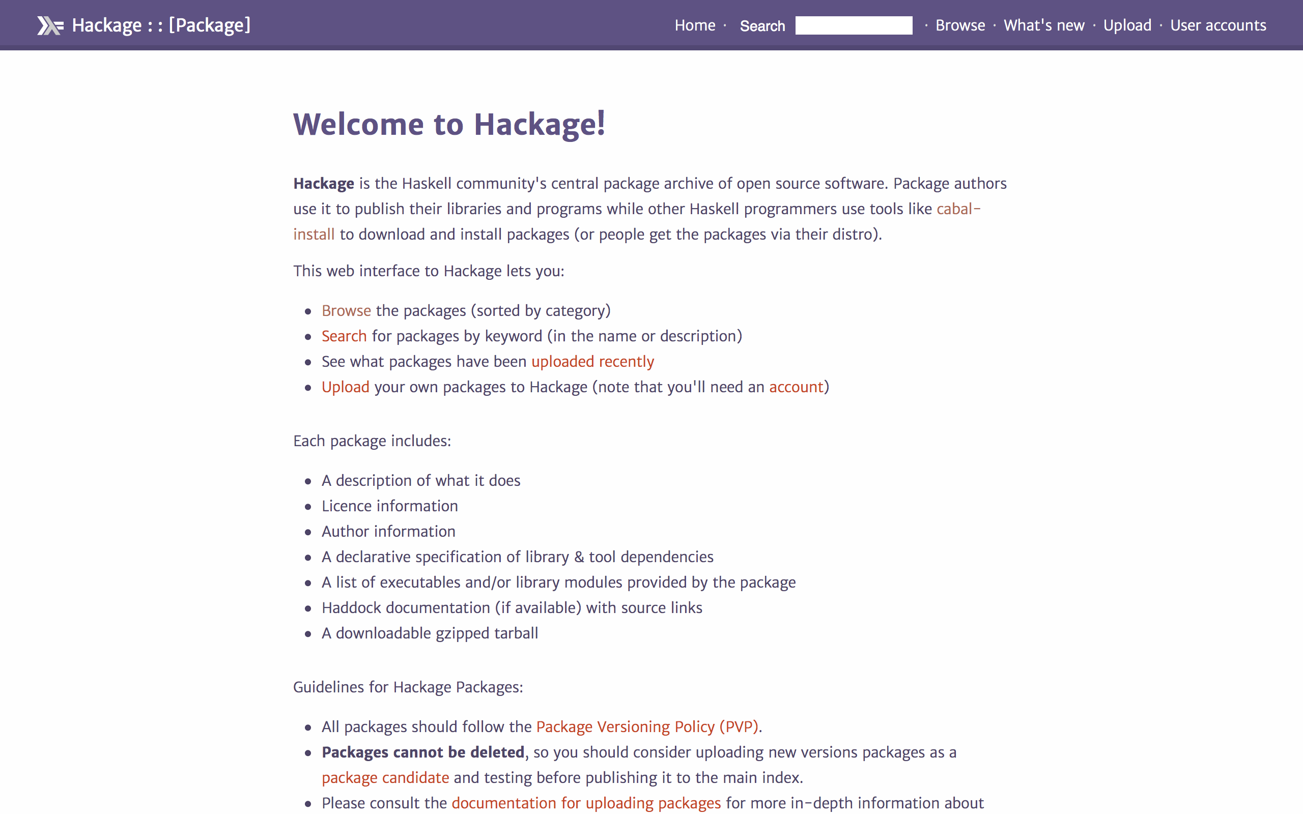

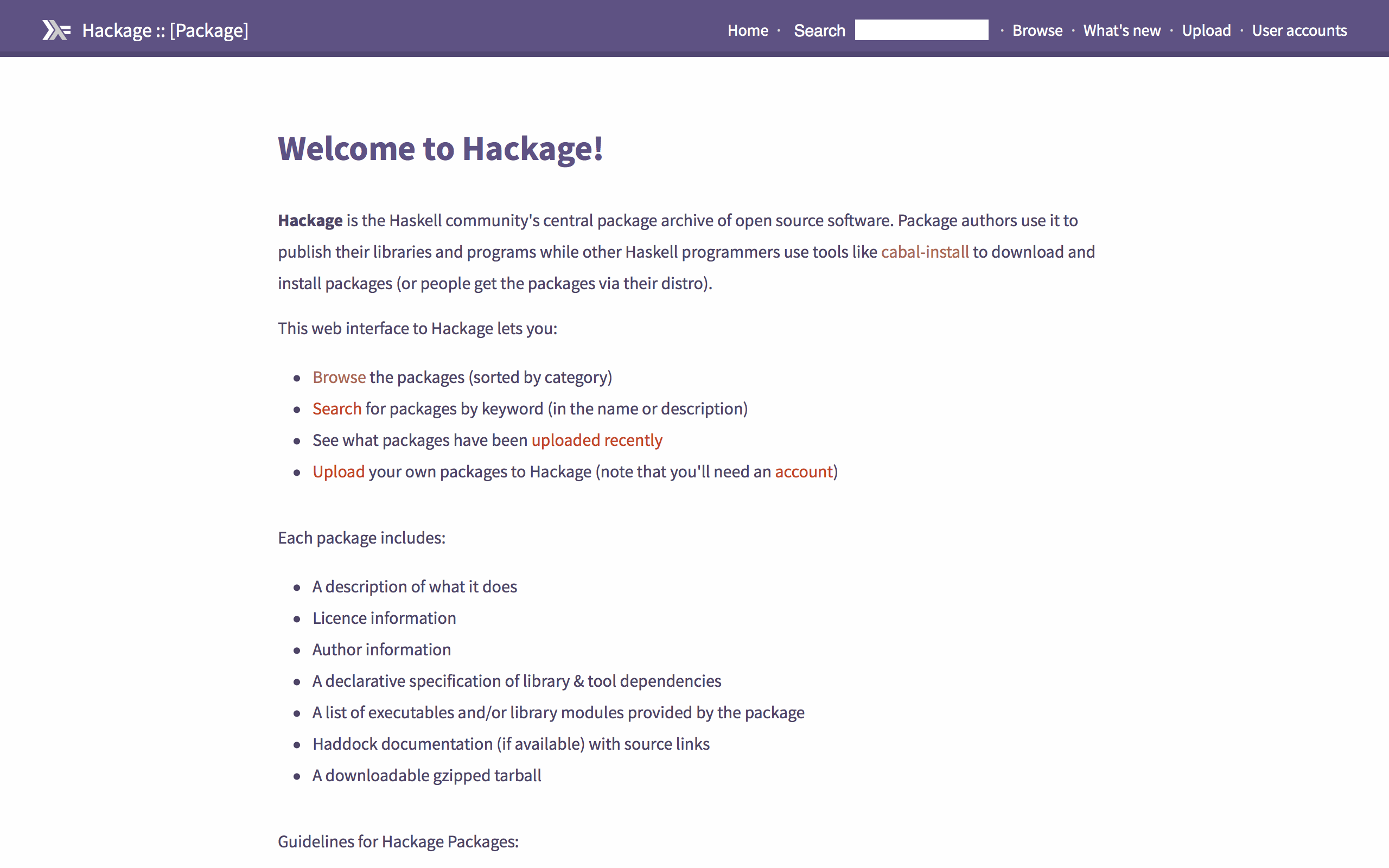
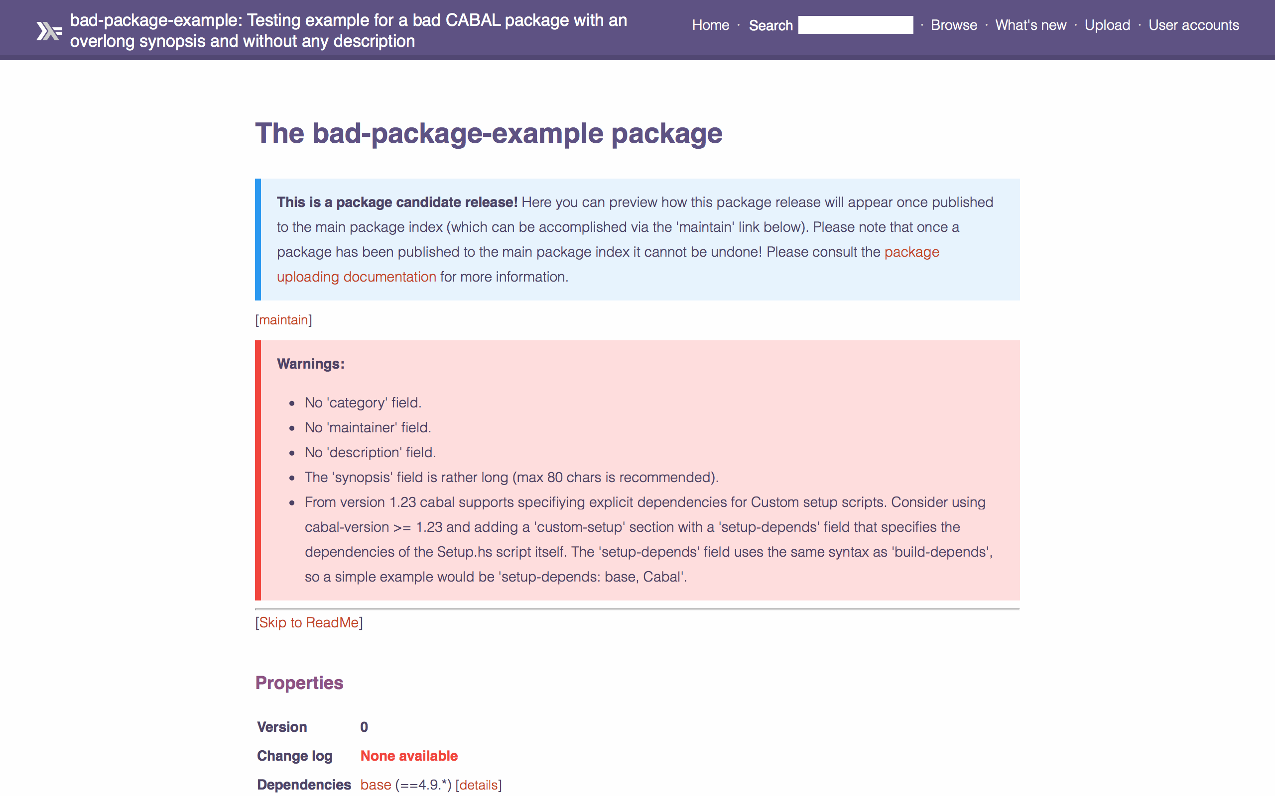
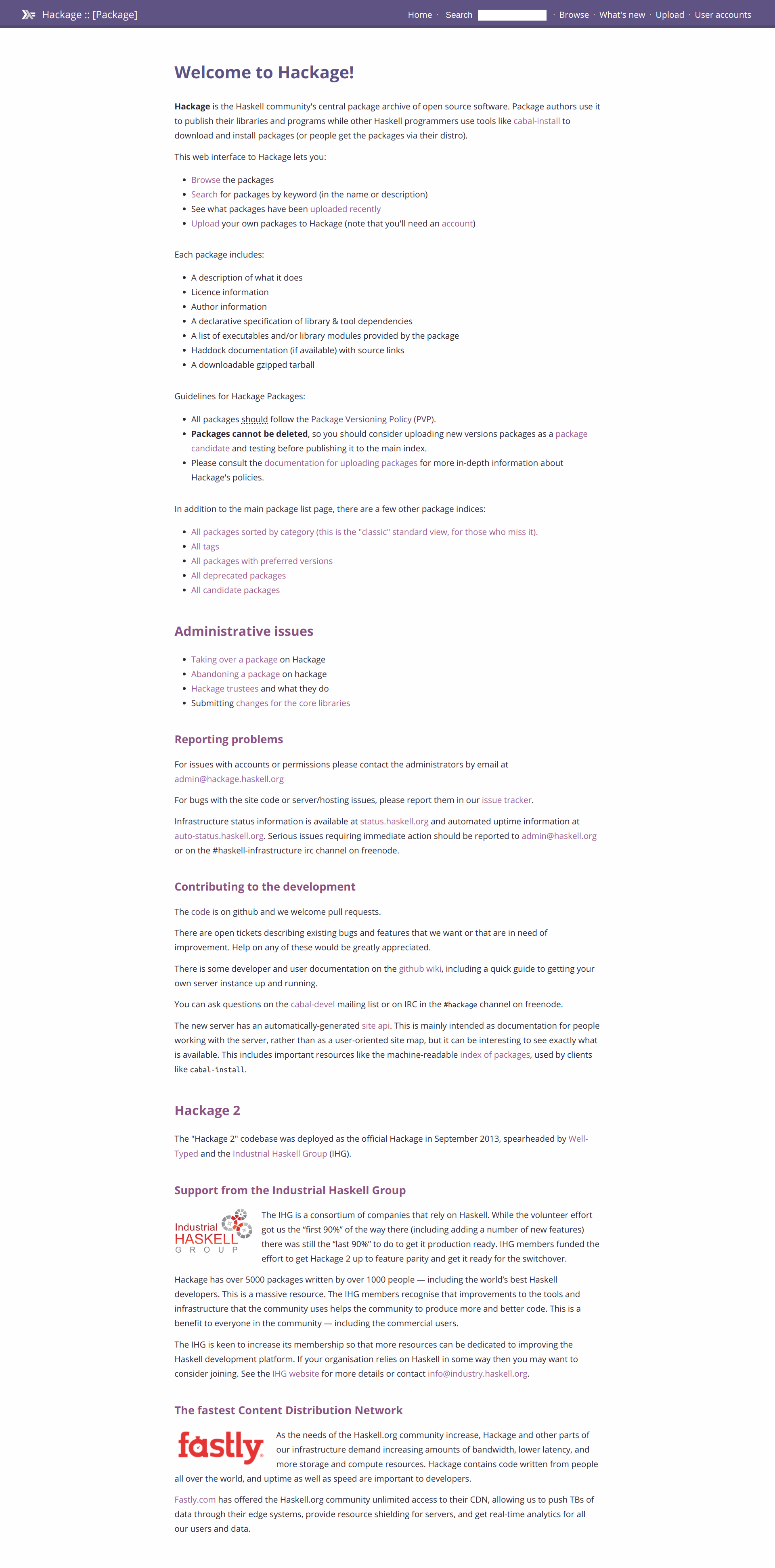
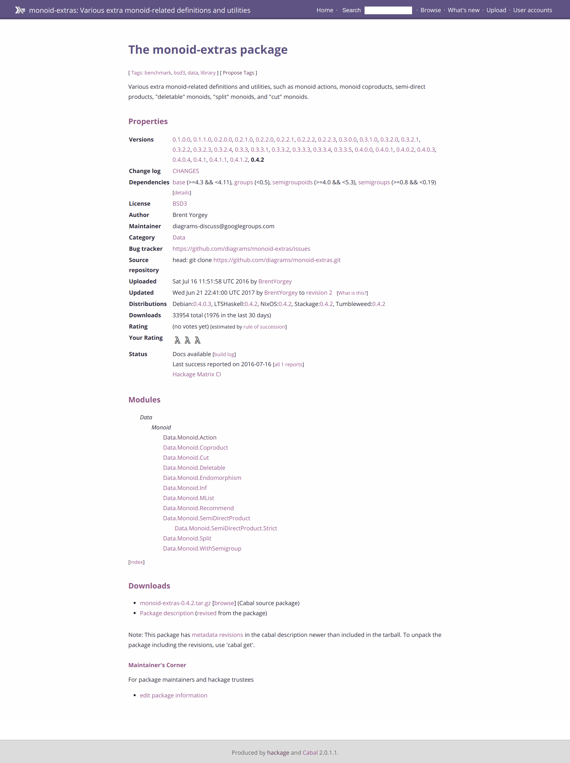
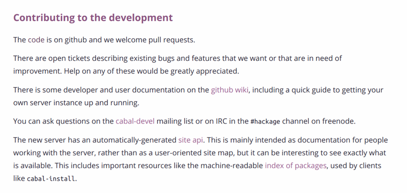

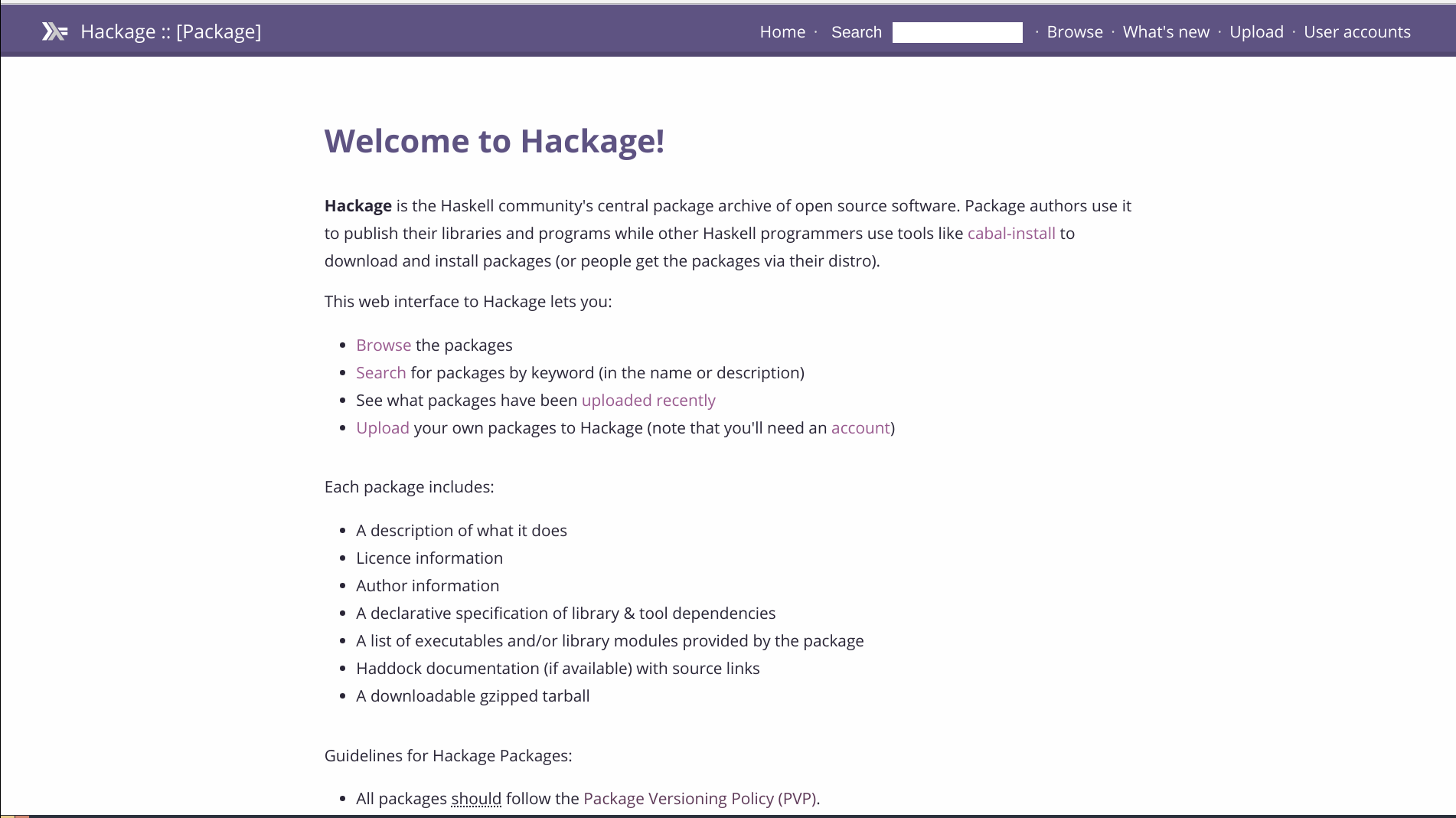


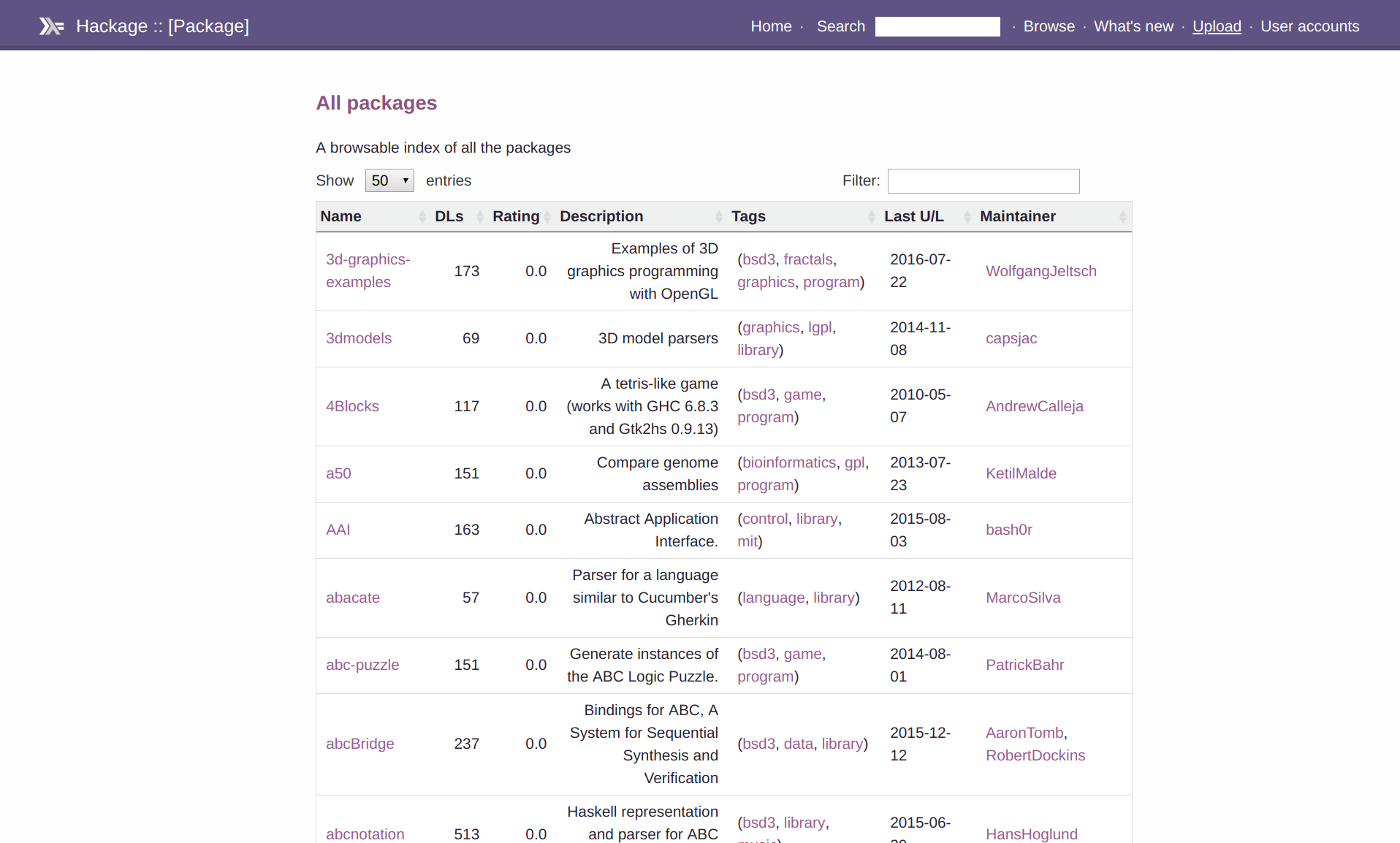
Motive
I work with haddock and hackage almost daily, both at work and at home, and the current theme is unfriendly. I find it very hard to read content with such a wide
#contentand spacing is not great either.Furthermore, I'd say many Haskell developers would appreciate the presense of the latest Haskell's logo (purple) colors in these docs.
(Together with haskell/haddock#721)
Changes
Preview
EDIT 04-02-2018: See #648 (comment)
Before:
After:
Smartphone
Before - iPhone 7
After - iPhone 7
Tablet
Before - iPad horizontal
After - iPad horizontal
Before - iPad vertical
After - iPad vertical
Edit: Responsiveness
I have made it responsive so that it looks nice and reads well on both small and large screens. See commit summary for more information.