
Hyper Effects is a Flutter package inspired from SwiftUI's syntax to create beautiful effects in Flutter. With just a few lines of code after your widget, you can add any number of effects and transitions with ease.
Demo: hyper-effects-demo.web.app
- 📏 Compact Syntax: Write a single line of code for a whole suite of complex effects.
- 🔁 Animate Everything: No animation controllers or tweening needed. Animate any widget with a line of code.
- 🔁 Scroll Transitions: Control how your widgets look based on their position in a scroll view.
- 🔁 Pointer transitions: No gesture detectors or state management required. Control how your widgets look based on pointer events.
- 🚀 Easy Integration: Missing an effect? The API is designed to be simple and easy to extend.
Scroll Transition |
Scroll Wheel |
Scroll Blur |
Shake |
Windows Hover Effect |

Scroll Color Filter |
Spring Animation |
Animation Chain |
Rolling Text 2 |
Rolling Text 3 |
Rolling Text 4 |
Add this package to your dependencies in your pubspec.yaml file:
dependencies:
  hyper_effects: <latest_version>
or run following command in your project directory:
flutter pub add hyper_effects
For any widget you have, you can append any number of effects and transitions to it using the extensions like so:
@override
Widget build(BuildContext context) {
  return Container(
    color: Colors.blue,
  ).opacity(myCondition ? 0 : 1);
}
However, this will not animate the effect. This will only wrap the widget with the specific effect and use the value provided.
| Effect Name | Description |
|---|---|
| Opacity | Changes the opacity of a widget. |
| Blur | Applies a blur effect to a widget. |
| Scale | Scales a widget. |
| TranslateX | Translates a widget along the X-axis. |
| TranslateY | Translates a widget along the Y-axis. |
| TranslateXY | Translates a widget along both the X and Y axes. |
| Rotate | Rotates a widget. |
| RotateX | Rotates a widget around the X-axis. |
| RotateY | Rotates a widget around the Y-axis. |
| RotateZ | Rotates a widget around the Z-axis. |
| SkewX | Skews a widget along the X-axis. |
| SkewY | Skews a widget along the Y-axis. |
| SkewXY | Skews a widget along both the X and Y axes. |
| ColorFilter | Applies a color filter to a widget. |
| Transform | Applies a transformation before painting the widget. |
| ClipRect | Clips its child using a rectangle. |
| ClipRRect | Clips its child using a rounded rectangle. |
| RollingText | Creates a rolling animation from one text to another. |
| Shake | Applies a shake effect to a widget. |
| Align | Changes the alignment of a widget. |
| Roll | Rolls a widget from one state to another. |
| Padding | Adds padding to a widget. |
For details about each effect, please visit the source code of the effect. Link: hyper_effects/lib/src/effects
Hyper Effects is not an animation tweening library. It's a library that provides a convenient way to interpolate between a large set of values for a widget. It's inspired by SwiftUI's syntax and aims to provide a similar experience in Flutter. With that knowledge in mind, you can get very far with Hyper Effects when it comes to animation orchestration, but it's not a replacement for a full-fledged animation library like Rive, Flare, or even a good ol' TweenSequence from Flutter's animation framework.
It's important to understand that the way Hyper Effects works is by lerping two values at any given point in time, therefore, a complex sequenced animation may not have enough context to orchestrate proper state management when chaining multiple animations.
To understand exactly how it works and where to draw the line, read the docs and see the examples.
Points to keep in mind:
- Treat our extensions as widget "shortcuts" more than anything else. They simply wrap your widget with a specific
effect and use the value you provide. IE: Instead of wrapping a widget with an
Opacitywidget, you can use theopacityextension. You can effectively use the extensions as shortcuts without ever animating anything. - By doing this, the framework now has a special Opacity-looking widget that has the ability to consume a time value to interpolate to different values you give that opacity extension.
- To actually get yourself a time value, you need to use the
animatemethod on the widget. This method will take a trigger value that will trigger the animation when it changes. Alternatively, a transition can be used to provide a continuous value to the widget.
These are the core concepts of how the library works. It's important to understand these concepts to get the most out of Hyper Effects.
To animate any effect, you need to use the animate method on the widget like so:
@override
Widget build(BuildContext context) {
  return Container(
    color: Colors.blue,
  )
      .opacity(myCondition ? 0 : 1)
      .animate(trigger: myCondition);
}
trigger is a parameter of type Object. It's inspired from SwiftUI's value parameter on its animation modifier.
Whenever the value of trigger changes, the effect will animate to the new value using an internal AnimatedEffect
widget with its own AnimationController.
In this case, myCondition is the trigger value. You can use any object as a trigger value, but you will likely want
to use the same object that you use to control the condition of the effect as it is the point in which the effect
should animate.
In simpler words, trigger takes any object. When the value of the object changes to anything else, the effect will
animate to the new value. The animation will never play if the value of the trigger is the same as the previous value.
The internal AnimationController is driven based on changes to the trigger object.
Note: If you want the animation to trigger immediately when the widget is built and then allow it to be triggered again later, you can change the
startStateparameter in theanimatemethod to AnimationStartState.playImmediately. This will start the animation immediately without waiting for an initial change in thetriggerobject. Subsequent changes in thetriggerobject will still trigger the animation as normal.
Hyper Effects takes heavy inspiration from SwiftUI in that it attempts to provide Apple-like default values for everything, that means that by default, animations are of 350ms duration and use Apple's custom easeInOut curve. The result is a very smooth and natural feeling animation that is very reminiscent of Apple's style.
Despite having really nice default values, the API of course allows you to customize the animation to your liking. You can do so by your own duration and curve.
@override
Widget build(BuildContext context) {
  return Container(
    color: Colors.blue,
  )
      .opacity(myCondition ? 0 : 1)
      .animate(
    trigger: myCondition,
    duration: const Duration(milliseconds: 200),
    curve: Curves.easeOutQuart,
    startImmediately: true,
  );
}
You can combine and chain any number of effects like so:
@override
Widget build(BuildContext context) {
  return Container(
    color: Colors.blue,
  )
      .opacity(myCondition ? 0 : 1)
      .blur(myCondition ? 10 : 0)
      .scale(myCondition ? 0.5 : 1)
      .translateX(myCondition ? 100 : 0)
      .animate(trigger: myCondition);
}
Since these are convenient extensions, you can use the effects as Widgets directly using the apply method like so:
@override
Widget build(BuildContext context) {
  return OpacityEffect(
    opacity: myCondition ? 0 : 1,
  ).apply(
    context,
    BlurEffect(
      blur: myCondition ? 10 : 0,
    ).apply(
      context,
      ScaleEffect(
        scale: myCondition ? 0.5 : 1,
      ).apply(
        context,
        TranslateEffect(
          offset: Offset(myCondition ? 100 : 0, 0),
        ).apply(
          context,
          Container(
            color: Colors.blue,
          ),
        ),
      ),
    ),
  );
}
This is what the Widget tree looks like internally when you use this library.
- trigger: The value used to trigger the animation. As long as the value of trigger is the same, the animation will not be triggered again.
- duration: The duration of the animation.
- curve: The curve of the animation.
- onEnd: A callback that is called when the animation ends.
- repeat: Determines how many times the animation should be repeated.
- reverse: A boolean property that determines whether the animation should be reversed after each repetition.
- delay: A delay before the animation starts.
- playIf: A callback that returns whether the animation should be played or skipped. If the callback returns false, the animation will be skipped, even when it is explicitly triggered.
- resetValues: Normally, an effect represents the current state of the widget and this animate effect is only in charge of lerping between states of those effect values. If this is set to true, instead of treating effects as current states to animate between, it will always animate from an initial default state towards the current state.
- interruptable: Whether the animation should be reset on subsequent triggers. If this animation is re-triggered, it will reset the current active animation and re-drive from the beginning. Setting this to true will force the animation to wait for the last animation in the chain to finish before starting.
- startState: Determines the behavior of the animation as soon as it is added to the widget tree.
- skipIf: A callback that determines whether the animation should be skipped. If the callback returns true, the animation will be skipped entirely.
If you want to trigger an animation immediately, you can use the oneShot function which triggers a chain of effects
immediately without a trigger parameter.
This function is useful when you want to start an animation as soon as the widget is built, without waiting for a
specific trigger to change. The animation will never play again after it ends.
Here's an example of how to use the oneShot function:
@override
Widget build(BuildContext context) {
  return Container(
    color: Colors.blue,
  ).slideInFromBottom()
      .oneShot(
    // All the normal parameters inside of .animate() but without the trigger and startState parameters.
  );
}The animateAfter function triggers the animation after the last animation in the chain ends.
It's useful when you want to create a simple sequence of animations where one animation starts after the previous one
ends.
Here's an example of how to use the animateAfter function:
@override
Widget build(BuildContext context) {
return Center(
child: GestureDetector(
onTap: () {
setState(() {
trigger = !trigger;
});
},
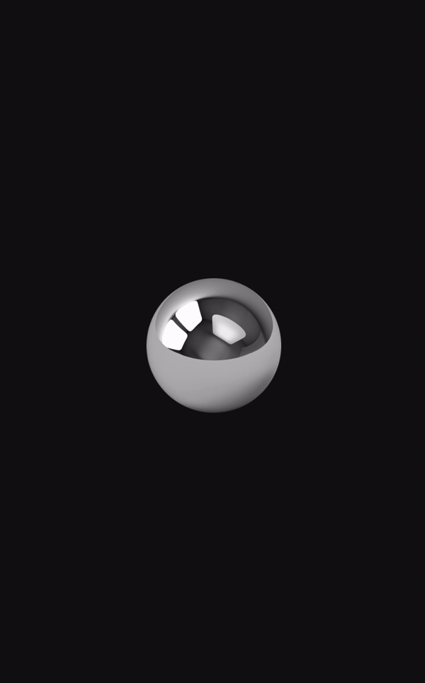
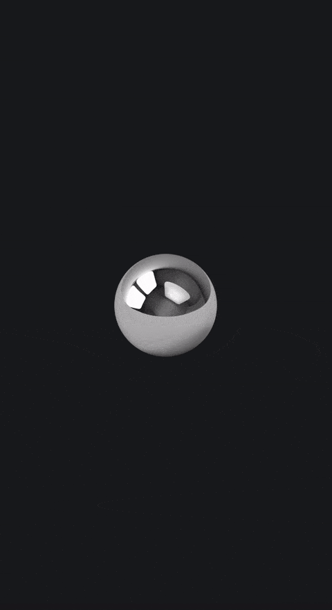
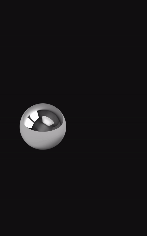
child: Image.asset('assets/pin_ball_256x.png', width: 150, height: 150)
.shake()
.oneShot(
delay: const Duration(seconds: 1),
repeat: -1,
playIf: () => !trigger,
)
.translateY(300, from: 0)
.animate(
trigger: trigger,
curve: Curves.easeOutQuart,
duration: const Duration(milliseconds: 2000),
playIf: () => trigger,
)
.slideOut(const Offset(0, -300))
.animateAfter(
curve: Curves.elasticOut,
duration: const Duration(milliseconds: 450),
onEnd: () => setState(() => trigger = false),
)
.resetAll(),
),
);
}See this example in action in the demo app: hyper-effects-demo.web.app
Using resetAll at the end of the chain of animations will reset all the effects in the chain to their original values.
When the animation is triggered again, all the effects will animate from their original values to the new values. In other words, each individual Hyper Effects AnimationController in the descendent widget tree will be reset to its initial state.
The delay parameter is used in the animate, animateAfter and oneShot methods. This parameter allows you to
specify a delay
before the animation starts.
The delay is specified as a Duration. Here's an example of how to use the delay parameter:
@override
Widget build(BuildContext context) {
  return Container(
    color: Colors.blue,
  )
      .opacity(myCondition ? 0 : 1)
      .animate(
    trigger: myCondition,
    delay: const Duration(seconds: 1), // 1 second delay before the animation starts after the trigger changes.
  );
}
In this example, the opacity animation will start 1 second after the myCondition trigger changes.
The repeat parameter is used in the animate, animateAfter, and oneShot functions.
This parameter allows you to specify how many times the animation will be repeated.
The repeat parameter is an integer, where 0 (default) means the animation will only play once and not repeat.
Any positive integer specifies the number of times the animation will repeat.
If the repeat parameter is set to -1, the animation will repeat indefinitely.
Here's an example of how to use the repeat parameter:
@override
Widget build(BuildContext context) {
  return Container(
    color: Colors.blue,
  )
      .opacity(myCondition ? 0 : 1)
      .animate(
    trigger: myCondition,
    repeat: 3, // The animation will repeat 3 times
  );
}
Note that if the reverse parameter is set to true, the repetition counter will count for each animation direction.
For example, if the repeat parameter is set to 3 and the reverse parameter is set to true, the animation will
play only 3 times, one of which is the reverse animation.
forwards -> backwards -> forwards -> done.
The Rolling Text feature in Hyper Effects allows you to create a rolling animation from one text to another. Each character rolls individually to form the new text. This feature provides a visually appealing way to transition between different text states in your application.
This effect reconstructs each individual symbol in the Text widget into vertical tapes of symbols that are painted using a custom painter. This means that the Rolling Text feature is not suitable for large text bodies. It is recommended to use this feature for short text strings. Each individual strip of characters is animated independently and can be customized to create a unique rolling effect.
This .roll() effect, when applied to non-Text widgets, will work as expected as it does not need to reconstruct anything.
To use the Rolling Text feature, you can use the roll extension on any Text widget. Here's an example:
@override
Widget build(BuildContext context) {
  return Text('Hello').roll('World');
}
In this example, the text will roll from 'Hello' to 'World'. Each character in 'Hello' will roll until it changes to the corresponding character in 'World'.
For non-text widgets, you can use the roll effect similarly:
@override
Widget build(BuildContext context) {
  return Container(
    width: 100,
    height: 100,
    color: Colors.blue,
  ).roll(
    from: const Offset(0, 0),
    to: const Offset(0, 100),
    axis: Axis.vertical,
  );
}The Rolling Text feature provides several options for customization:
- padding: Allows you to set the internal padding between the row of symbol tapes and the clipping mask.
- tapeStrategy: Determines the string of characters to create and roll through for each character index between the old and new text.
- tapeCurve: Determines the curve each roll of symbol tape uses to slide up and down through its characters.
- tapeSlideDirection: Determines the direction each roll of symbol tape slides through its characters.
- staggerTapes: Determines whether the tapes should be staggered or not.
- staggerSoftness: Determines how harsh the stagger effect is.
- reverseStaggerDirection: Determines whether the stagger effect should be reversed or not.
- symbolDistanceMultiplier: Determines the height of each symbol in each tape relative to the font size. If the font size is 32, the final height of the entire widget is fontSize * lineHeightMultiplier. The default multiplier is 1.
- fixedTapeWidth: Can be optionally used to set a fixed width for each tape. If null, the width of each tape will be the width of the active character in the tape. If not null, the width of each tape will be the fixed width provided. Note that this will allow the text's characters to potentially overlap each other.
- widthDuration: Determines the duration of the width animation. If null, the same duration is used as the one
provided to the
animatefunction. - widthCurve: Determines the curve of the width animation of each tape. If null, the same curve is used as the one
provided to the
animatefunction. - characterTapeBuilders: Custom builders for individual character tapes, allowing for fine-grained control over how each character is displayed and animated.
For the general roll effect, additional options include:
- axis: The axis along which the rolling animation occurs (horizontal or vertical).
- from: The starting offset or state.
- to: The ending offset or state.
- transformHits: Whether hit testing should be transformed with the roll animation.
Here's an example of how to use these options:
@override
Widget build(BuildContext context) {
  return Text('Hello').roll(
    'World',
    padding: const EdgeInsets.symmetric(horizontal: 8, vertical: 4),
    tapeStrategy: TapeStrategy.random,
    tapeCurve: Curves.easeInOutQuart,
    tapeSlideDirection: TapeSlideDirection.down,
    staggerTapes: true,
    staggerSoftness: 0.5,
    reverseStaggerDirection: true,
  );
}
To trigger the rolling text effect, you need to call the animate or oneShot functions as normal:
@override
Widget build(BuildContext context) {
  return Text('Hello').roll('World').animate(trigger: myTrigger);
}
When myTrigger changes, the text will roll from 'Hello' to 'World' or vice versa. The animate method also accepts duration and curve parameters that allow you to customize the animation's duration and easing curve.
Please note that if you specify a curve that goes outside the bounds of 0 and 1 like Curves.elasticIn/Out or Curves.easeIn/OutBack, the UI will crash with a warning that the width cannot be negative. To resolve this, simply specify a custom curve for the width. You can do so like this:
@override
Widget build(BuildContext context) {
  return Text('Hello').roll('World').animate(
    trigger: myTrigger,
    curve: Curves.easeInOutQuart,
    duration: const Duration(milliseconds: 500),
    widthCurve: Curves.easeInOutQuart,
  );
}
Transitions are a special type of effect that allows you to control how your widgets look based on some continuous value. For example, you can control the opacity of a widget based on its position in a scroll view or based on the pointer position.
Transitions use a builder pattern to provide you with an event property that gives you active information about the
state of a transition for your widget. You can use this information to control how your widget looks, and it will
animate automatically based on the effects you use inside.
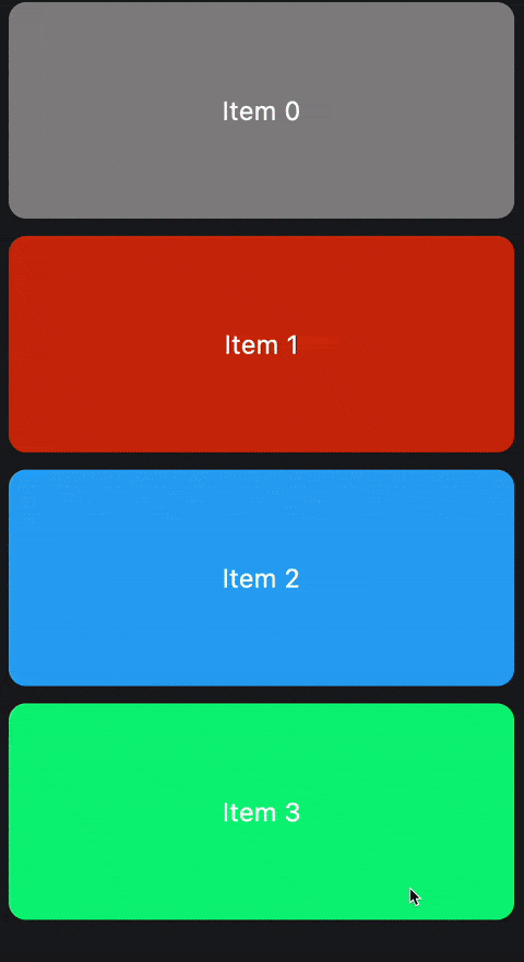
Scroll transitions are transitions that are based on the position of a widget in a scroll view. You can use the
scrollTransition extension on any widget to add a scroll transition to it.
  @override
Widget build(BuildContext context) {
  return ListView.builder(
    itemBuilder: (context, index) {
      return Container(
        width: 350,
        height: 100,
        margin: const EdgeInsets.symmetric(horizontal: 16, vertical: 8),
        alignment: Alignment.center,
        decoration: BoxDecoration(
          color: randomColor(index),
          borderRadius: BorderRadius.circular(16),
        ),
        child: Text(
          'Item $index',
          style: const TextStyle(
            fontSize: 24,
            color: Colors.white,
          ),
        ),
      ).scrollTransition(
            (context, widget, event) =>
            widget
                .blur(
              switch (event.phase) {
                ScrollPhase.identity => 0,
                ScrollPhase.topLeading => 10,
                ScrollPhase.bottomTrailing => 10,
              },
            )
                .scale(
              switch (event.phase) {
                ScrollPhase.identity => 1,
                ScrollPhase.topLeading => 0.9,
                ScrollPhase.bottomTrailing => 0.9,
              },
            ),
      );
    },
  );
}
In a scroll transition, the phase is a ScrollPhase enum that determines the view-state of a widget in a scroll view.
ScrollPhase.identityis when the widget is fully viewable in the scroll view.ScrollPhase.topLeadingis when the widget is partially viewable from the top/left, IE: It's leaving the top or left of the scroll view.ScrollPhase.bottomTrailingis when the widget is partially viewable from the bottom/right, IE: It's leaving the bottom or right of the scroll view.
Other properties of the scroll transition:
- phaseOffsetFraction: The current progress an element's phase is going through. If
phaseis identity this value is 1. Ifphaseis topLeading, it goes from 0 towards 1 as it leaves the screen. Ifphaseis bottomTrailing, it goes from 0 towards 1 as it enters the screen. - phaseOffsetFraction: The current progress an element is going through the scrolling viewport. If the item is near the center of the scroll view, the value tends towards 0. As the item moves towards the ceiling of the scroll view, the value tends towards 1. It clamps to 1 when the item is fully out of the scroll view. As the item moves towards the floor of the scroll view, the value tends towards -1. It clamps to -1 when the item is fully out of the scroll view. final double screenOffsetFraction;
- scrollPixels: The number of pixels scrolled inside of the parent scroll view.
- viewportSize: The height or width of the parent scroll view.
- scrollDelta: The change in scroll position since the last update.
- scrollDirection: The direction the scroll view is being scrolled to.
- pointerPosition: The position of the pointer device in the global coordinate space.
- distanceFromPointer: The distance from the pointer device to the center of this widget.
- visualIndex: The visual index is the index in which the item is displayed in the scroll view. For example, instead of the regular index of a list, if you scroll down, the first item that is visible inside the scroll view will have some arbitrary index, but the visual index would be 0 as it is the index that is perceived by the user.
- reverseVisualIndex: The
visualIndexcalculated in the opposite direction.
Be careful when using screenOffsetFraction as it can be a bit tricky to use. The way transitions work
internally is that they lerp to and from a specific internal value. That value for scroll transitions is the
ScrollPhase.
With that in mind, despite the fact that you can use phase to animte your widgets easily with the extensions, for
other properties likescreenOffsetFraction, you will need to use the manual Effects API to animate them.
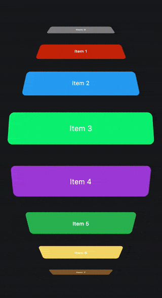
  @override
Widget build(BuildContext context) {
  return ListView.builder(
    itemBuilder: (context, index) {
      return Container(
        width: 350,
        height: 100,
        margin: const EdgeInsets.symmetric(horizontal: 16, vertical: 8),
        alignment: Alignment.center,
        decoration: BoxDecoration(
          color: randomColor(index),
          borderRadius: BorderRadius.circular(16),
        ),
        child: Text(
          'Item $index',
          style: const TextStyle(
            fontSize: 24,
            color: Colors.white,
          ),
        ),
      ).scrollTransition((context, widget, event) =>
          TransformEffect(
            rotateX: -90 * event.screenOffsetFraction * pi / 180,
            translateY: (event.screenOffsetFraction * -1) * 200,
            translateZ: event.screenOffsetFraction.abs() * 100,
            scaleX: 1 - (event.screenOffsetFraction.abs() / 2),
            depth: 0.002,
          ).apply(context, widget));
    },
  );
}
When using the manual Effects API directly, you can use any parameter and manipulate their values as much as you like in
the above example, whereas with the convenient extensions API, you may be limited to using the internally
animated value. In scroll transitions, the internally animated value is the phase property.
Pointer transitions are transitions that provide events based on the pointer's position either locally or globally depending on configuration. This transition has many configurable parameters that allow you to control how the transition should output its values in its builder.
@override
Widget build(BuildContext context) {
  return Container(
    decoration: const BoxDecoration(
      color: Colors.blue,
    ),
  ).pointerTransition(
        (context, child, event) =>
        child.translateXY(
          event.valueOffset.dx / 2,
          event.valueOffset.dy / 2,
          fractional: true,
        ),
  );
}
In the above example, the container will move half the distance of the pointer's movement in the x and y axis. The
fractional parameter is set to true, which means that the widget will move by multiplying its size by the value
provided. If fractional is set to false, the widget will move by the value provided directly in pixels.
value is a double parameter that represents the distance of the pointer device from the origin.
A value of zero is when the pointer device is at the origin.
A value of 1 or -1 is when the pointer device is at the farthest point from the origin.
This value is the average of the valueOffset's x and y values.
valueOffset is an Offset parameter very similar to value but provides more information about the individual x and
y axes. It's The distance of the pointer device from the origin as an offset.
A value offset of (0, 0) is when the pointer device is at the origin.
A value offset of (1, 1) is when the pointer device is at the farthest point from the origin.
isInsideBounds is a boolean parameter that decides whether the pointer is inside the bounds of the widget or not.
position is the raw position of the pointer. It's the position of the pointer device from the top left corner of the
target. The target depends on the configurations below.
When using the pointer transition, you can provide multiple parameters to control its behavior, which is reflected back
in the event provided to the builder.
Widget pointerTransition(PointerTransitionBuilder builder, {
  Alignment origin = Alignment.center,
  bool useGlobalPointer = false,
  bool usePointerRouter = true,
  bool transitionBetweenBounds = true,
  bool resetOnExitBounds = true,
  Curve curve = appleEaseInOut,
  Duration duration = const Duration(milliseconds: 125),
  Key? key,
}) {
  return PointerTransition(
    key: key,
    builder: builder,
    origin: origin,
    useGlobalPointer: useGlobalPointer,
    usePointerRouter: usePointerRouter,
    transitionBetweenBounds: transitionBetweenBounds,
    resetOnExitBounds: resetOnExitBounds,
    curve: curve,
    duration: duration,
    child: this,
  );
}
origin is an Alignment parameter that determines the origin to transform the pointer position around.
- If the origin is set to
Alignment.center, as the pointer moves away from the center of the screen, thevaluewill increase. - If the origin is set to
Alignment.topLeft, as the pointer moves away from the top left corner of the screen, thevaluewill increase.
useGlobalPointer is a boolean parameter that determines whether the pointer position should be calculated globally
or locally. If set to true, the pointer position will be calculated from the top left corner of the screen. If set to
false, the pointer position will be calculated from the top left corner of the widget.
transitionBetweenBounds is a boolean parameter that determines whether the transition should animate between the
bounds of the widget or not. If set to true, the transition will trigger the internal animation to reset when the
pointer moves in and out of the bounds of the widget. If set to false, the transition will snap instantly to
the new values when the pointer moves in and out of the bounds of the widget.
resetOnExitBounds is a boolean parameter that determines whether this transition should reset the position of the
child back to a value of zero when the pointer device is outside the bounds of the widget. transitionBetweenBounds
decides whether the transition should animate or not.
curve is a Curve parameter that determines the curve of the internal when transitioning between bounds animation.
duration is a Duration parameter that determines the duration of the internal when transitioning between bounds.
Like the scroll transition, be careful when using value and valueOffset as it can be a bit tricky to use. The
pointer transition internally uses the value property to internally lerp between values. This means that if you use
other properties and expect them to transition perfectly, you may get unexpected results sometimes.
You are welcome to contribute on this package. See CONTRIBUTING.md for details.
 Birju Vachhani |
 Saad Ardati |
Feel free to join our Discord server for any inquiries or support: https://discord.gg/yrahEhCqTJ
BSD 3-Clause License

Copyright (c) 2023, Hyperdesigned

Redistribution and use in source and binary forms, with or without
modification, are permitted provided that the following conditions are met:

1. Redistributions of source code must retain the above copyright notice, this
   list of conditions and the following disclaimer.

2. Redistributions in binary form must reproduce the above copyright notice,
   this list of conditions and the following disclaimer in the documentation
   and/or other materials provided with the distribution.

3. Neither the name of the copyright holder nor the names of its
   contributors may be used to endorse or promote products derived from
   this software without specific prior written permission.

THIS SOFTWARE IS PROVIDED BY THE COPYRIGHT HOLDERS AND CONTRIBUTORS "AS IS"
AND ANY EXPRESS OR IMPLIED WARRANTIES, INCLUDING, BUT NOT LIMITED TO, THE
IMPLIED WARRANTIES OF MERCHANTABILITY AND FITNESS FOR A PARTICULAR PURPOSE ARE
DISCLAIMED. IN NO EVENT SHALL THE COPYRIGHT HOLDER OR CONTRIBUTORS BE LIABLE
FOR ANY DIRECT, INDIRECT, INCIDENTAL, SPECIAL, EXEMPLARY, OR CONSEQUENTIAL
DAMAGES (INCLUDING, BUT NOT LIMITED TO, PROCUREMENT OF SUBSTITUTE GOODS OR
SERVICES; LOSS OF USE, DATA, OR PROFITS; OR BUSINESS INTERRUPTION) HOWEVER
CAUSED AND ON ANY THEORY OF LIABILITY, WHETHER IN CONTRACT, STRICT LIABILITY,
OR TORT (INCLUDING NEGLIGENCE OR OTHERWISE) ARISING IN ANY WAY OUT OF THE USE
OF THIS SOFTWARE, EVEN IF ADVISED OF THE POSSIBILITY OF SUCH DAMAGE.