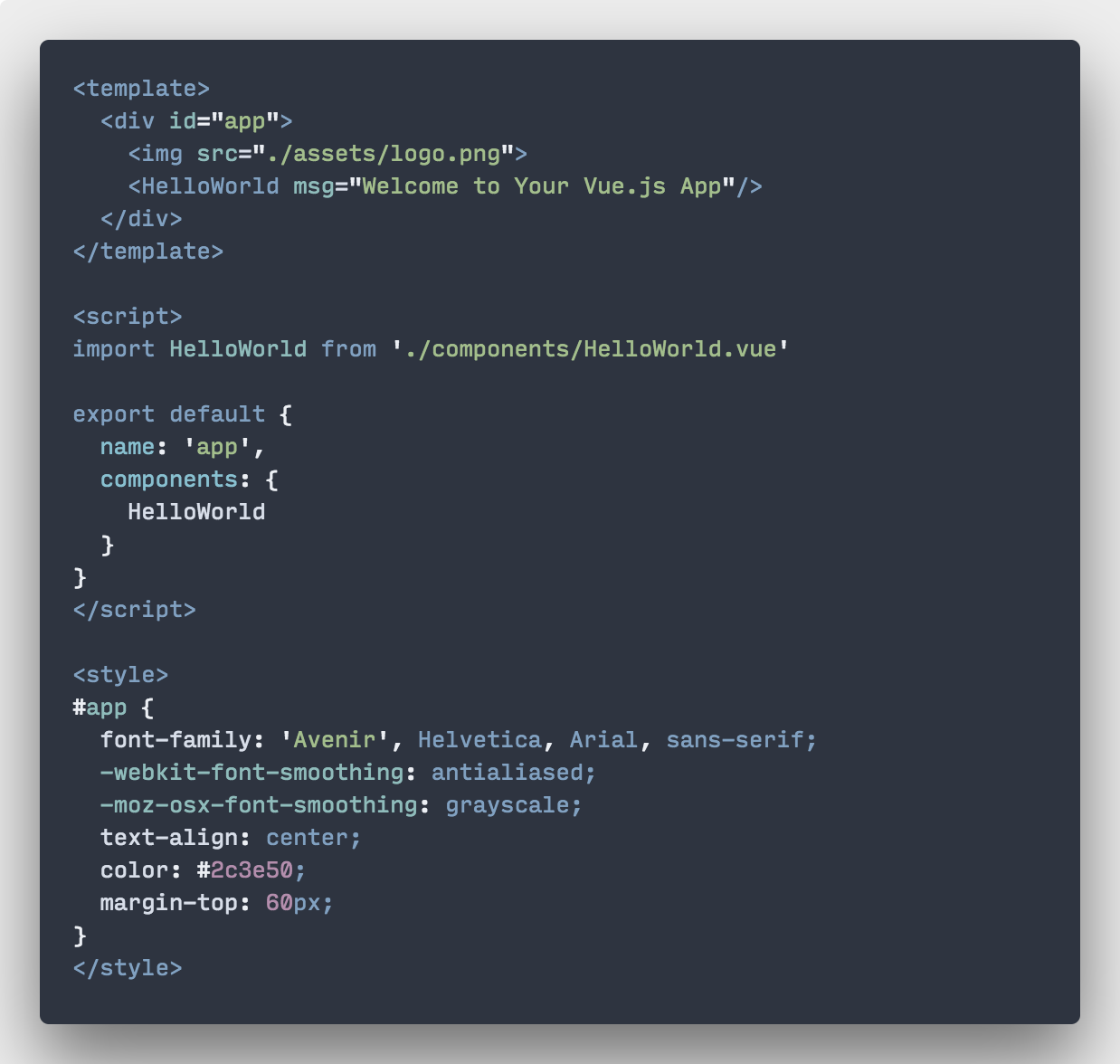
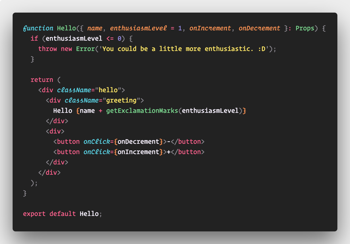
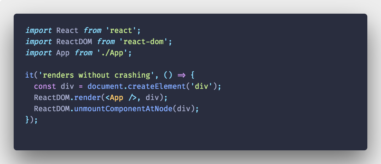
Note: The original project by Pine & Peng was abandoned, so I picked up it when it broke back in 2019.
Modifications include:
- Fixed when VS Code switched away from syntax-highlight-copy by default
- Improved performace from inlining multiple files
- Anton Palgunov added buttons for toggling transparency and shadow
- PR's are welcome!
Polaroid for your code 📸.
By Pine & Peng from VS Code team. Happy Coding!
You have spent countless hours finding the perfect JavaScript grammar, matching it with a sleek-looking VS Code theme, trying out all the best programming fonts.
You take three days porting over your theme before starting to use VS Code. You shell out $200 for italic cursive html attributes.
The code has to look right.
- I like and care about the shadow, padding & rounded corner of macOS's screenshot. I want an easy way to have those nice visuals for any selection of my snippet.
- I want to hide errors, warnings, color decorators, folding markers, line numbers, scrollbar and minimap.
- It generates something decent on Windows & Linux.
Material Theme Palenight + Fira Code
- When running out of horizontal space, try the command
View: Toggle Editor Group Vertical/Horizontal Layout.
Thanks to @tsayen for making dom-to-image, which Polacode is using for generating the images.
Thanks to Dawn Labs for making Carbon that inspired Polacode.
Many color are taken from the elegant Nord theme by @arcticicestudio.
Download button animation is made with Vivus.
Contribution is extremely unwelcome. Please open an issue first so I can stop you from complicating the UX.
MIT


