This package is a Svelte port of Luis Guerrero's React Auth Code Input (https://github.com/drac94/react-auth-code-input).
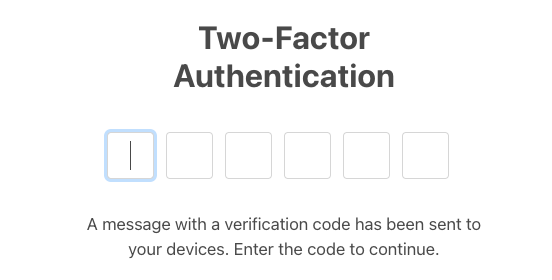
One-time password (OTP) Svelte component, zero dependencies, fully tested.


npm install --save svelte-auth-code-inputor
pnpm add svelte-auth-code-inputor
yarn add svelte-auth-code-input<script lang="ts">
import AuthCodeInput from 'svelte-auth-code-input';
let result = $state<string>('');
const handleOnChange = (res: string) => {
result = res;
};
</script>
<AuthCodeInput
onchange={handleOnChange}
/>
<script lang="ts">
    import AuthCodeInput from 'svelte-auth-code-input';

    let result = $state<string>('');
</script>

<AuthCodeInput
  bind:value={result}
/>
By default, you can type numbers and letters in the inputs as the allowedCharacters prop is defaulted to alphanumeric but you can also choose between allowing only letters or only numbers by setting the prop to alpha or numeric respectively.
<script lang="ts">
    import AuthCodeInput from 'svelte-auth-code-input';

    let result = $state<string>('');
    const handleOnChange = (res: string) => {
        result = res;
    };
</script>

<AuthCodeInput allowedCharacters='numeric'
onchange={handleOnChange}
/>
By default the first input is focused when the component is mounted, you can opt out of this by setting the autoFocus prop to false, and then you can handle the focus manually by passing a reference.
<script lang="ts">
    import AuthCodeInput from 'svelte-auth-code-input';

    let AuthInputRef = $state<AuthCodeInput>();
    let result = $state<string>('');
    const handleOnChange = (res: string) => {
        result = res;
    };
</script>

<AuthCodeInput
autoFocus={false}
onchange={handleOnChange}
bind:this={AuthInputRef}
/>
<button onClick={() => AuthInputRef?.focus()}>Focus</button>
You can clear all the inputs by passing a reference and then calling the clear method.
<script lang="ts">
    import AuthCodeInput from 'svelte-auth-code-input';

    let AuthInputRef = $state<AuthCodeInput>();
    let result = $state<string>('');
    const handleOnChange = (res: string) => {
        result = res;
    };
</script>

<AuthCodeInput
autoFocus={false}
onchange={handleOnChange}
bind:this={AuthInputRef}
/>
<button onClick={() => AuthInputRef?.clear()}>Clear</button>
This component supports autofill from SMS' received, tested on Safari and Chrome in iOS.
| Prop | Type | Description | Default Value | Observations |
|---|---|---|---|---|
allowedCharacters |
String | Type of allowed characters for your code. | alphanumeric |
Valid values: alpha, alphanumeric, numeric |
ariaLabel |
String | Accessibility. | ||
autoFocus |
Boolean | Whether the first input is focused on mount or not.. | true | |
length |
Number | The number of inputs to display. | 6 | |
containerClass |
String | The styles to be applied to the container. | ||
inputClass |
String | The styles to be applied to each input. | ||
onchange |
Function(value: String) | Callback function called every time an input value changes. | Required | |
isPassword |
Boolean | Whether to display the inputs as passwords or not. | false | |
disabled |
Boolean | Makes all the inputs disabled if true. | false | |
placeholder |
String | Displays a placeholder in all the inputs. | ||
value |
String | Bindable value (one way; component -> parent) | ||
name |
String | Copies the result to a hidden input with this name for use in forms. |
Added this README
Licensed under the MIT License, Copyright © 2024-present Jin Chan jinbe.
See LICENSE for more information.