Module 1: Introduction
- What is Data Visualisation?
- Why Data Visualisation?
- Real-life examples
- Data Visualisation in Python
Data Visualization is the representation of data or information in a graph, chart, or other visual format.
It communicates relationships of the data with images.

A visual summary of information makes it easier to identify patterns, trends and outliers than looking through thousands of rows on a spreadsheet.
It’s the way the human brain works.
Since the purpose of data analysis is to gain insights, data is much more valuable when it is visualized.
Our eyes are drawn to colors and patterns. We can quickly identify red from blue, square from circle. Our culture is visual, including everything from art and advertisements to TV and movies
Data visualization is another form of visual art that grabs our interest and keeps our eyes on the message.
You’ve been surrounded by Data Visualisations all this while!
The live traffic status in Google map is another simple example of what is possible through data visualization to make humans life simple and easy. You can see the red colour indicating slow traffic area in the city on the map and blue colour indicating fast etc.

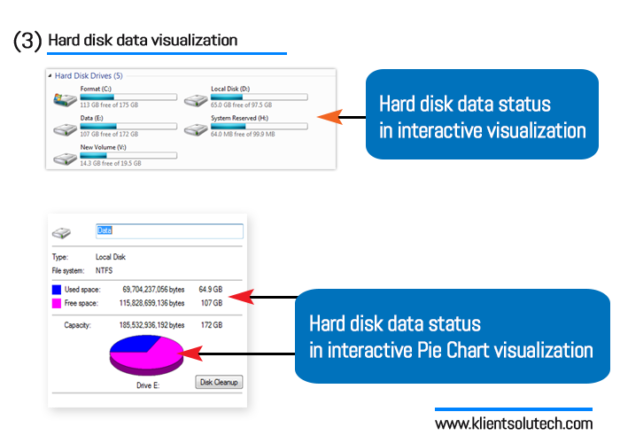
The blue line and empty space in horizontal bar and an pie chart is an example to inform about the consumed and free space in hard disk.
Hard drives data status in interactive visualization is effective to understand even for a normal user.
And that’s always the target of data visualization to make it so much easy and relevant for people to understand and take quick decision.
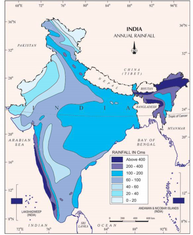
Geospatial visualizations are one of the earliest forms of information visualizations.
Amongst the various types of geospatial visualisations, Heat maps are useful when you have to represent large sets of continuous data on a map using a color spectrum.
This map of India shows the average annual rainfall using different shades of blue. The darker the shade of blue, the higher the rainfall.
Can you think of more such examples?
Python offers multiple great graphing libraries that come packed with lots of different functionalities. No matter if you want to create interactive, live or highly customized plots, python has an excellent library for you.
To get a little overview, here are a few popular plotting libraries:
- Matplotlib
- Pandas Visualization
- Seaborn
- ggplot
- Plotly
- Bokeh
- Altair