Abstract. Humans can more easily perceive differences in line lengths, shapes, and colors (hues) than process sequences of text or numbers. This ability makes data visualization a powerful tool for exploring, understanding, and communicating data. Creating effective data visualizations is a crucial research skill. Visualizations support research at various stages, from early prototypes over systematic experiments to final publications in papers/theses, presentations, or applications/demonstrations. This process often involves presenting the same data at different levels of detail or adapting styles for different audiences. Fortunately, many free tools are available for different types of visualizations, allowing us to choose what best fits our needs. This tutorial provides an overview of common visualization types and tools. We will discuss strategies for managing data visualizations in research, including automation, customization, and best practices. Through hands-on examples, we will explore the plotting library Matplotlib for static graphs and Chart.js for interactive web-based visualizations. Participants will be encouraged to share their experiences and insights throughout the session.
The tutorial starts with a motivation and introduction of types and tools for data visualizations using the following slides:
The following hands-on examples showcase exemplary data visualizations alongside the tools used to create them. For each tool, we provide a brief description, present a sample output, and outline the steps to reproduce the visualizations.
Matplotlib is widely regarded as the standard tool for creating static graphs in scientific publications, because it enables creating publication-ready output, has extensive customization options, and has wide adoption and support in the community. Matplotlib has different interfaces. Our examples cover the implicit, stateful "pyplot" interface. Matplotlib might not be the ideal choice for interactive applications, complex 3D visualizations, or users without a programming background. Its steep learning curve and the need for fine-grained control can be challenging for beginners.
Exemplary Visualization


Setup
-
Download the provided Jupyter notebook tutorial.ipynb
-
Open https://jupyter.org/try-jupyter/lab/ in your browser
-
Upload and open the downloaded Jupyter notebook (see Step 1)
Chart.js is one of many (D3 or Highcharts are exemplary alternatives) free JavaScript libraries for creating interactive charts.
Exemplary Visualization

Setup
- Download the provided HTML page dynamic_bar_chart.html
- Open the downloaded HTML page in your browser (see Step 1)
- Open the downloaded HTML page in a text editor
- Inspect the code
- Optionally, adapt and reload the HTML page
More Advanced Chart.js Project Examples
-
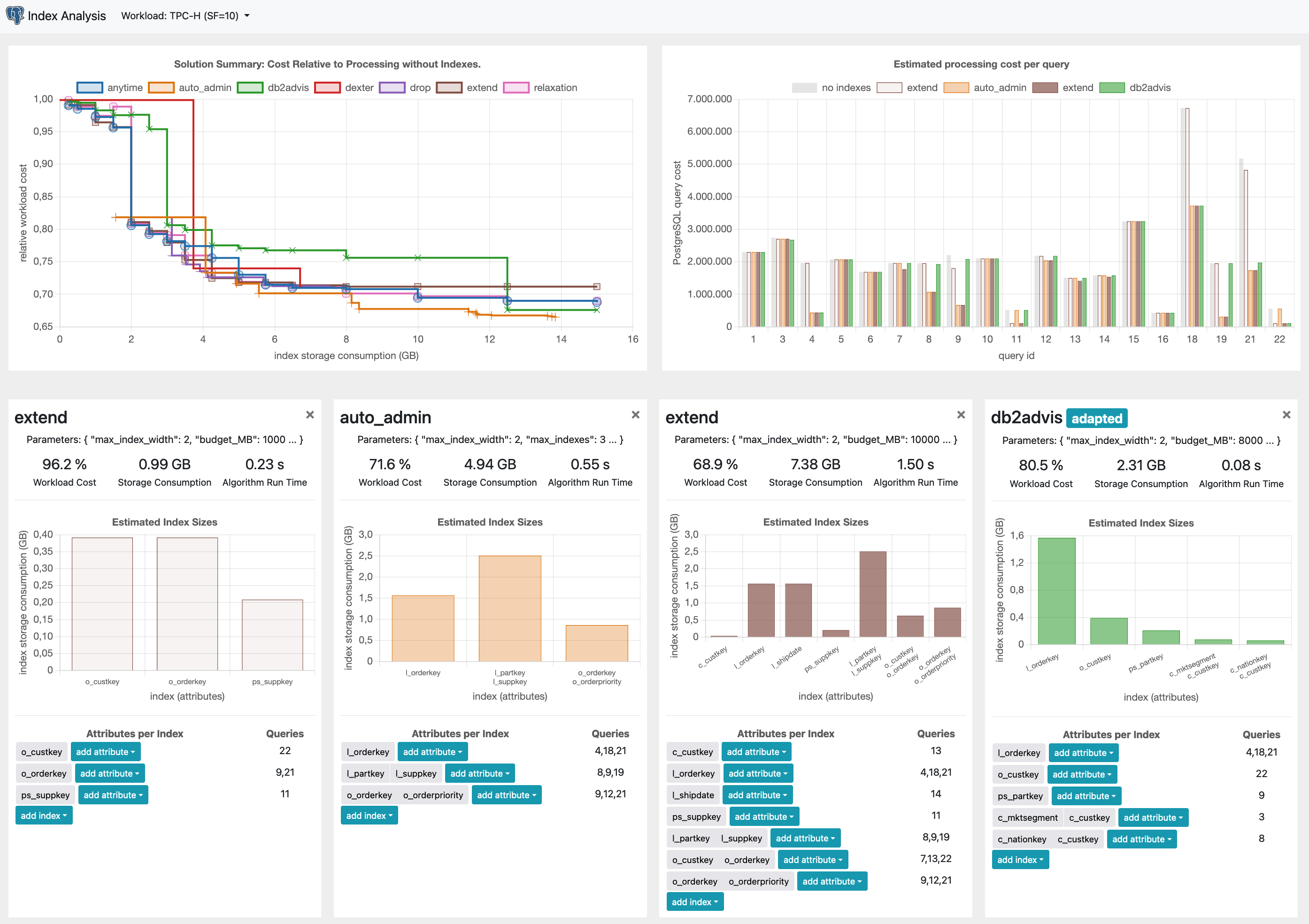
A web application for analyzing database index selection approaches: https://github.com/klauck/index_analysis
Using curses, you can create terminal applications, such as visualizations or games.
Exemplary Visualization

Setup
- Download the provided Python script dynamic_barplot.py
- Open a terminal, go to the download location, and run
python dynamic_barplot.py - Optionally, adapt the code and rerun the application
More Advanced Curses Project Examples
-
A visualization of the load-balancing in database clusters. https://github.com/hyrise/replication

-
A simple Tetris game implemented using Python's curses library: https://github.com/klauck/tetris


Data Visualization - Tutorial by Stefan Halfpap is licensed under CC BY 4.0