Update Google Fonts #3942
Update Google Fonts #3942
Conversation
|
Linked w/ BASE#672 to update our MuPDF patch to the new filename of NotoSansCJK-SC. |
|
Pinging... @frankyifei I believe. There's something about the CJK fonts but I forget what exactly. |
|
Oh, I was probably confused with #3564. |
|
|
|
Mhhh, may be using |
|
@poire-z : just to be clear, that's a local patch you apply on your own copy, not something I missed somewhere? |
|
@NiLuJe : yes, I messed up applying your PR patch (fetched with wget by appending |
|
Oh, right, 3942 is this PR's number. Duh! :). |
|
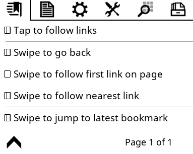
That menu is a little confusing, shouldn't the "Swipe" options be radio buttons? Why the separation line before the last one? What dose the "open book" box signify? |
|
@KenMaltby : that was not a change proposal :) |
|
@poire-z Well, there is this 🕮 UTF-8 character… :-P |
There was a problem hiding this comment.
Probably best to wait for @frankyifei to respond with regard to CJK but naturally fine in principle.
|
I will update the font file and upload here. It seems 🕮 is not supported on my Android phone. |
|
it's not CJK but Emoji, I added noto emojis in the font file. I did not test it but it should work. |
|
@frankyifei: Aren't the various NotoSansCJK variants already hitting the 65535 glyph limit? |
|
More to the point, did we ever modify NotoSansCJK, and if yes, why? I can't find any of the NotoEmoji glyphs in the previous version we shipped, for instance. And the one you linked is unhinted, which is arguably not great, especially for CJK? |
|
I deleted some of the not commonly used chinese characters. So there are less than 50,000 in this file. |
|
It is modified several times to add support for other languages. Some one is asking for emoji so I just added emoji. |
|
Besides the hinting issues:
There's also a scale issue when merging NotoEmoji:
TL;DR: I'm at a loss at why we'd even want to modify NotoSansCJK SC in the first place? |


|
I'm a big fan of hinting, even on high-dpi screens ;). Now, if the issue is actually missing script/language support, then that potentially qualifies as a valid reason to do weird stuff ;). (Because shipping the full set of CJK variants would take ~100MB). So, to recap: do we need to tweak the latest CJK SC version, and if so, why? |
|
At the begging someone is asking for support of Arabic or Hindu support and they want the fallback font contains these characters. Because we dont have font config support so the fallback font has to be one file that contains as many languages as possible |
|
Ok, that's clearer, thanks ;). Wouldn't shipping Is the case where text is mainly in Latin script, with small portions/quotations in Hindi/Arabic without a specific font requested/embedded that common? |
|
I definitely get the 'most language possible in the fallback' argument, but in that case, we have a problem: the CJK font is the one supporting the least amount of languages ;). |
|
And going back to DroidSansFallback doesn't really help, it's mostly CJK there, too. The font with the most coverage we ship right now is Noto Sans. That still doesn't include Arabic or Hindi, though. |
|
And, understandably, as both those scripts are barely usable without a layout engine anyway, both |
Big sense of déjà vu incoming. I said something extremely similar last year or so. ;-) |
|
The thing about this 🕮 UTF-8 character was a joke by Frenzie, not really a request to have it in our fonts. Lines 75 to 79 in a9905c5 But if emojis were beginning to appear in EPUBs :(, we may need them to be available in some font. But it feels a bit strange to have that work done manually by @frankyifei (how would we update if you were to disappear :| :|). Can't that be automated or documented? Or isn't there a smaller suit-all-languages font even if of less quality than Noto, that people could use as a fallback if they really needed that much coverage? |
|
IIRC, FontForge can be scripted, but I'm not familiar with how that actually works in practice... (Hell, even with the GUI, I'm mostly clicking on shiny-looking stuff more or less at random :D). |
|
Looks (as obviously, I can't read any) perfect, with China EN, where there is some chinese, persian, sanskrit. |
|
@frankyifei : anything you think we'd miss from the glyphs you added manually to the vanilla NotoSans CJK, if we keep the vanilla NotoSans CJK ? |
|
I added some emoji yesterday. Arabic can be handled in other fonts. I dont think there is something we need to worry about vanilla noto CJK. |
|
Shall we bump base for koreader/koreader-base#672 and merge this (haven't tested the mupdf patch, but this frontend change is fine with me). |
|
The actual changes are great, but I'm not a big fan of adding the 14+ MB binary files to the main repo like I said. :-/ I like having the whole repo available rather than being forced to shallow clones by too many binary files in there, you see. :-) |
|
@Frenzie : I genuinely don't understand the issue, but if you want to restructure the layout of the repo, go ahead and I'll rebase once that's done. |
|
@NiLuJe Try doing a full clone of this repo ;-) https://github.com/blchinezu/pocketbook-coolreader The structure as such wouldn't change. It'd just be the fonts dir as a submodule (like base, test, and android). |
|
We and the CI would still need to pull the submodule at one point, so I really, really don't see the difference :? |
|
I'd understand the interest if git submodules were shallow by default, but that's not the case. And even then, it's a bit late, and switching now would probably do more harm than good, because we'd still carry the history in the main repo, but have no delta to rebuild the same data in the submodule. Unless I'm missing something, which is more than probable, because git. :D. |
The GH online search interface is terrible. There's great value to me in quickly being able to pull in a relatively small repo completely (as opposed to only, say, 50-100 commits). You don't have to init submodules or anything to do that.
We can make it so for binary submodules like fonts and test. In fact that's exactly what I was thinking. :-)
What delta? Do these binary files have an actual diff overlap? ;-) The patch file is 35 MB.
The harm is adding another couple dozen MB to the repo on every font update. It would already make the repo more annoying to work with because it'd be larger, but past a certain point Git will start to slow down and take longer to do all of its lovely Git stuff if you bloat it too much. Luckily, for us that'd take a great many years but I still think it's something to beware of. Just because the repo I linked to may or may not be big enough to slow Git down yet doesn't mean it isn't incredibly annoying to work with. |
|
@Frenzie : Guess I was hoping the deltas were slightly less dramatic than they actually are (f.g., the small changes in Droid Sans Mono are dealt with in a fairly okay'ish manner ;)). Feel free to split things off as you see fit, and I'll re-implement that in the right place once that's done ;). |
|
Cool! I'll create new repo called koreader-fonts and then I'll init that as a --depth=1 submodule in place of the current fonts/ folder. But I'll do that tomorrow; I don't have too much time atm (and none tonight). :-) |
As per the discussion in koreader/koreader#3942 (comment)
We don't ship Droid Sans Fallback anymore
To pickup related changes
|
(Hijacking a random font topic.) The ttf files are quite a lot bigger (5MB each, so 20MB for the 4 reg/bold/italic/bolditalic - instead of 4x350 KB :), but they do display (without any fallback font enabled) quite a few scripts - but not the CJK ones. And their JA/SC/TC/KO versions don't seem to have the feature of our NotoSansCJK that allows to pick JA/SC/KO glyphs from a single font thanks to providing a lang tag to Harfbuzz (not tested, but not mentionned in their doc, which is otherwise quite complete and interesting to read https://www.kurinto.com/pdf/Kurinto_UserGuide.pdf). The Kurinto Sans looks really really similar to our Noto Sans, so it might replace a few of our Noto Sans Arabic/Devanagi... UI ones. But may be not: we have tuned a few UI tricks with symbols, and a few of them get messed up (like checkboxes in the menu a bit off). Btw, there were another commercial font mentionned and praised in this mobileread topic - not available for download anywhere, except in one obscure place - so, if you wanna try it before you buy. It works well in crengine, looks really nice, has good Opentype features, and I haven't found any bug, bad hyphens, or unpleasant kerning. |
|
Where would you buy Capita? |
|
Uh? In any place Google tells me I can :) |
Bump to latest releases