Repository navigation
Kit
Package kit is the layer an
app is written with: 37 styled components in the look of
shadcn/ui (style "new-york-v4", at one pinned registry
commit), built on the behavior hooks of aria and the classes of
h. A button, a card, a select, a dialog, a calendar, a
table: each is one struct, with the keyboard, focus and accessibility the aria
hooks give it, and a look that follows the theme tokens, the color
scheme and your own recipes.
import "github.com/kuronosu/tela/kit"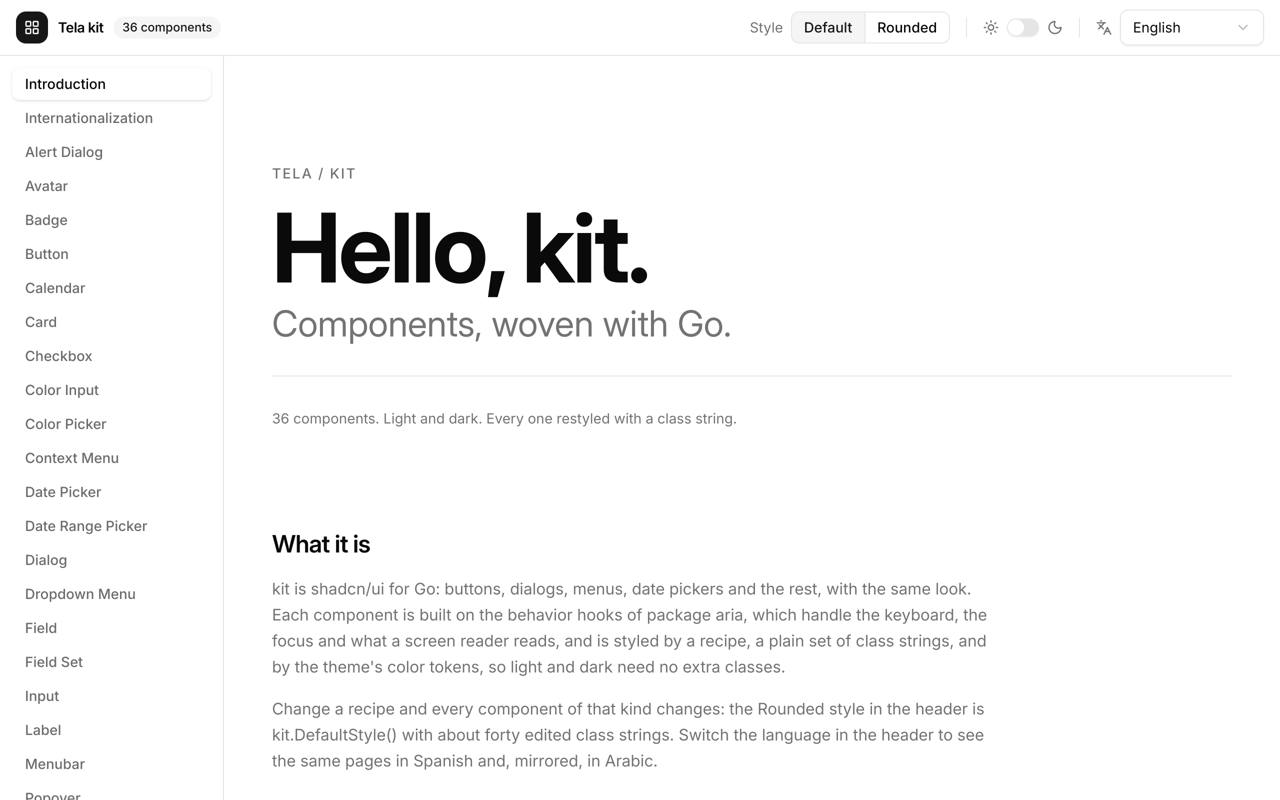
The whole kit is on show in
examples/kit, a
gallery that opens on an Introduction and has a page per component, light and dark, in
the default style and in a second one made of a few edits (see
Customization), and in English, Spanish and
Arabic (the header's Language menu; Arabic lays the whole window out right to left).
Run it with go run ./examples/kit, or render one page with
tela snapshot --preview Calendar ./examples/kit.
import (
	"github.com/kuronosu/tela"
	. "github.com/kuronosu/tela/h"
	"github.com/kuronosu/tela/kit"
)

var theme = kit.Theme() // shadcn's neutral colors and its 10 px radius

func Login() tela.Node {
	email, setEmail := tela.UseState("")
	return Div(Class("flex min-h-screen items-center justify-center"),
		kit.Card{
			Class:       "w-full max-w-sm",
			TitleLevel:  2,
			Title:       Text("Login to your account"),
			Description: Text("Enter your email below to login."),
			Children: kit.Field{Label: "Email",
				Children: kit.Input{Type: "email", Value: &email, OnValueChange: setEmail.Set}},
			Footer: kit.Button{Class: "w-full", Children: Text("Login")},
		})
}

func main() {
	tela.Main(tela.App{Title: "Login", Theme: &theme, RootClass: "bg-background text-foreground",
		Root: tela.C(Login)})
}
Theme: &theme and RootClass: "bg-background text-foreground" are what make
the components look right: every class of the kit is a token (bg-primary,
text-muted-foreground, border-input), so the page follows light and dark with
no dark: classes of yours.
Every component is a struct component: its props are the fields of the
struct and Build returns its element. The same few fields mean the same on
every component:
| Field | Meaning |
|---|---|
Class |
Classes added to the root element after the component's own. Tela applies classes last-wins, so Class: "w-full" or Class: "rounded-full" overrides the look with no tailwind-merge. The Class of a part is named after it: HeaderClass, FooterClass, ContentClass. |
Props |
A tela.Child with more props for the root element: h.Key, h.TestID, h.AriaLabel, h.OnMouseEnter(...). It takes one value: for several, merge them with tela.MergeProps(h.TestID("save"), h.OnMouseEnter(warm)). |
Children |
The content, a tela.Component. |
| Slots | A component with several parts has a tela.Component field for each (kit.Card has Title, Description, Action, Children and Footer); nil leaves it out. A slot that is only text for assistive technologies (a Field's Label, Description and Error) is a string. |
| Items | Components that choose take their options as a slice of structs, generic over the key: kit.Tabs[K]{Tabs: []kit.Tab[K]{...}}, kit.Select[K]{Items: []kit.SelectItem[K]{...}}, kit.RadioGroup[K], kit.ToggleGroup[K], and the menus' []kit.MenuItem[K]. |
| Behavior fields | Named after the HTML or React prop: Disabled, OnClick, Type, Placeholder, Name, ID, ReadOnly, AutoFocus, MaxLength, Invalid, AriaLabel. |
Variant, Size
|
Choose among the looks of the recipe: kit.Outline, kit.Ghost, kit.Destructive; kit.Sm, kit.Lg, kit.Icon. |
| Icons | Every icon a component draws is a tela.Icon field (Button.Icon and IconEnd, Badge.Icon, Select.Icon), so you use the set you like, such as icons/lucide. Where shadcn draws an icon itself, the field has Lucide's as its default. |
A struct component compares its fields to skip a build, so one given a func
(OnClick) or a slice builds on every parent build. That is cheap, and
tela.UseCallback makes it skippable when it matters.
A kit component is a tela.Node, like any struct component: a function or a
Build returns it as it is, return kit.Button{...}, and Fragment is only for
several siblings.
A component with a value follows one rule, whatever the value is. Give a pointer to your state to control it, a default to leave it to the component, and a callback to be told of changes:
name, setName := tela.UseState("")
kit.Input{Value: &name, OnValueChange: setName.Set} // controlled
kit.Input{DefaultValue: "Ana"} // uncontrolled| For | Fields |
|---|---|
| A string |
Value *string, DefaultValue, OnValueChange func(string)
|
| On or off |
Checked *bool, DefaultChecked, OnCheckedChange func(bool); Pressed for a Toggle
|
| Open or closed |
Open *bool, DefaultOpen, OnOpenChange func(bool)
|
| A choice among keys |
Value *K, DefaultValue *K, OnValueChange func(K) (new("pro"); nil is no default, so the zero key can be a real one) |
| Several choices |
aria.Selection[K]: Selected, DefaultSelected, OnSelectionChange
|
| A number, a date, a color |
Value *float64, *aria.Date, *aria.DateRange, *tela.Color, the same three names. DefaultValue is a pointer where the zero value is a valid one (Slider: new(0.0); ColorPicker, ColorInput: new(tela.Hex("#6366f1")), nil is opaque black) and a plain value where the zero means none (aria.Date, aria.DateRange) |
A Dialog, AlertDialog, Popover and Tooltip, and the menus, selects and
pickers that open something, have a Trigger slot: the element that opens them.
One rule makes every trigger slot work, Radix's asChild: the overlay needs to
put props on the element that opens it (the press, aria-expanded, the ref it is
placed against, a tooltip's hover), and it does not wrap the trigger in an element
of its own. A Trigger is a component with one method,
WithTriggerProps(tela.Prop) tela.Component, that merges the props into its root
element.
-
kit.Buttonis aTrigger, as is every kit component that says so. - A component of yours becomes one by adding the method.
- Any other element is made one with
kit.TriggerFunc, which hands you the props:
kit.Popover{
	Trigger: kit.TriggerFunc(func(p tela.Prop) tela.Node {
		return Button(p, Class("rounded-full"), AriaLabel("Account"), kit.Avatar{Fallback: "MT"})
	}),
	Children: Profile{},
}
The button you wrote is the one a screen reader finds, with its name and its tab
stop. Set Disabled on the overlay, not on the trigger: the trigger props set
disabled after the trigger's own.
1. Theme tokens. kit.Theme() is shadcn's neutral theme with a 10 px radius.
Change its colors and every component follows:
theme := kit.Theme()
theme.Colors["primary"] = tela.SchemeColor{Light: tela.Hex("#4f46e5"), Dark: tela.Hex("#818cf8")}
tela.Main(tela.App{Title: "Notes", Root: Notes{}, Theme: &theme, RootClass: "bg-background text-foreground"})
2. Recipes. The whole look of a component is data. kit.Style has one struct
of class strings per component (ButtonStyle, CardStyle...), with a Root for
the root element and a field for each other part, variant and size.
kit.DefaultStyle() returns a copy of the defaults to edit, and
kit.StyleProvider applies the edited one to a subtree, as h.Scheme does for the
color scheme. A worked example, the "Rounded" style of the gallery in short:
// Build the style once, never edit it after giving it to a provider.
var rounded = func() *kit.Style {
	s := kit.DefaultStyle()

	// Edit a string: pill buttons.
	s.Button.Root = strings.ReplaceAll(s.Button.Root, "rounded-md", "rounded-full")
	for size, classes := range s.Button.Sizes {
		s.Button.Sizes[size] = strings.ReplaceAll(classes, "rounded-md", "rounded-full")
	}

	// Change a variant, and add a new one: a variant is valid when the
	// active recipe defines it, so "glass" is a variant of every Button below.
	s.Button.Variants[kit.Default] = "bg-violet-600 text-white hover:bg-violet-600/90 dark:bg-violet-500"
	s.Button.Variants["glass"] = "bg-white/10 text-white backdrop-blur hover:bg-white/20"

	// Parts: a bigger corner and a colored indicator.
	s.Card.Root = strings.ReplaceAll(s.Card.Root, "rounded-xl", "rounded-3xl")
	s.Progress.Indicator = "h-full w-full flex-1 bg-linear-to-r from-violet-500 to-fuchsia-500 transition-all"
	return &s
}()

func App() tela.Node {
	return kit.StyleProvider{Style: rounded, Children: Dashboard{}}
}kit.Button{Variant: "glass", Children: Text("Share")} // defined by the recipe above
kit.Button{Variant: "glas"} // dev mode panics: did you mean "glass"?A Variant or Size the active recipe does not define panics in dev mode,
naming the ones it does and the closest, and uses the default look otherwise.
Components of your own read the active style with kit.UseStyle(). Part names
are public API; the class strings are defaults and may change with the look. See
examples/kit/styles.go
for 40 edits that restyle every component.
3. Per instance. Class, the Class of a part, Props and the icon slots
change one component:
kit.Card{Class: "w-full max-w-sm", HeaderClass: "pb-6 border-b", TitleLevel: 2, Title: Text("Billing")}Plain classes apply last-wins and a class with a variant (hover:, dark:,
aria-invalid:) comes after every plain one, as in Tailwind's stylesheet, so
an instance Class: "bg-red-600" does not remove a recipe's hover: class
(the same as tailwind-merge does in shadcn's cn).
A kit.Field ties a label, a control, help text and an error together: the label
names the control and focuses it when clicked, and the control is described by
the error or the help text, and is marked invalid while an error shows.
kit.Field{Label: "Email", Description: "We never share it.", Error: errs.Email,
Children: kit.Input{Type: "email", Value: &email, OnValueChange: setEmail.Set}}Input, Textarea, Select, DatePicker, DateRangePicker, ColorInput,
Checkbox and Switch take the field's id (a ColorPicker gives it to its hex
field and is named by the label); a RadioGroup takes its description and invalid
state (name it with AriaLabel, or with a FieldSet legend, below).
Orientation: kit.Horizontal puts a checkbox or switch beside its label, the
control first; ControlAfter: true puts it after the label and the description,
as in shadcn's switch rows (a Vertical field ignores it).
kit.Field{Orientation: kit.Horizontal, ControlAfter: true, Class: "items-center gap-6",
	Label: "Marketing emails", Description: "News about new features.",
	Children: kit.Switch{Checked: &on, OnCheckedChange: setOn.Set}}
A Field's label points at one control. To caption a group, such as a
RadioGroup or a ToggleGroup, use kit.FieldSet (shadcn's FieldSet,
FieldLegend and FieldDescription). It is a group named by its legend and
described by its description; a RadioGroup or ToggleGroup inside takes its
name from the legend, so it needs no AriaLabel.
kit.FieldSet{Legend: "Theme", LegendVariant: kit.LegendVariantLabel,
	Description: "Pick how the app looks.", // optional
	Children: kit.RadioGroup[string]{Items: themes, Value: &theme, OnValueChange: setTheme.Set}}
Give several children as h.Fragment(...): they are a column with a 24 px gap
(12 px for a RadioGroup given directly). LegendVariantLegend, the default,
is a title; LegendVariantLabel has the size of a field's label. shadcn's
FieldGroup has no component: a FieldSet is already a column of fields, and
elsewhere h.Div(h.Class("flex w-full flex-col gap-7"), ...) is the same.
There is no component to place: a kit.Toaster goes once around the app, and
any component below it gets a handle with kit.UseToast(). The handle is
comparable and every method is safe from any goroutine; there is no global.
tela.Main(tela.App{Title: "Notes", Root: kit.Toaster{Children: Notes{}}, Theme: &theme})

toast := kit.UseToast()
id := toast.Loading("Uploading...")
go func() { upload(); toast.Success("Uploaded", kit.ToastReplace(id)) }()Avatar a round picture with a fallback; Badge a small label; Card a surface
with slots; Label; Separator; Skeleton a pulsing placeholder.
kit.Avatar{Fallback: "MT", Size: kit.Lg}
kit.Badge{Variant: kit.Secondary, Icon: lucide.Check, Children: Text("Verified")}
kit.Card{TitleLevel: 2, Title: Text("Notifications"), Description: Text("3 unread."), Children: list, Footer: markRead}
kit.Separator{Orientation: kit.Vertical}
kit.Skeleton{Class: "h-4 w-[250px]"}
A Card's Title is a div, as in shadcn; TitleLevel from 1 to 6 makes it an
h1 to h6 with the same classes.
Button (six variants, eight sizes, Icon and IconEnd), Toggle a button that
stays pressed, ToggleGroup the segmented control and the toolbar, Checkbox,
Switch, RadioGroup (with Render to draw the options yourself), Slider
(one knob or several, vertical too) and Progress.
kit.Button{Variant: kit.Outline, Size: kit.Sm, Icon: lucide.Plus, OnClick: add, Children: Text("Add")}
kit.Toggle{Variant: kit.Outline, Icon: lucide.Bold, AriaLabel: "Bold", Pressed: &bold, OnPressedChange: setBold.Set}
kit.ToggleGroup[string]{AriaLabel: "View", DisallowEmptySelection: true, Value: &view, OnValueChange: setView.Set,
	Items: []kit.ToggleGroupItem[string]{{Value: "list", Label: "List"}, {Value: "grid", Label: "Grid"}}}
kit.Checkbox{Checked: &agree, OnCheckedChange: setAgree.Set, AriaLabel: "Accept the terms"}
kit.Switch{Checked: &wifi, OnCheckedChange: setWifi.Set, AriaLabel: "Wi-Fi"}
kit.RadioGroup[string]{AriaLabel: "Plan", Value: &plan, OnValueChange: setPlan.Set,
	Items: []kit.RadioItem[string]{{Value: "free", Label: "Free"}, {Value: "pro", Label: "Pro", Description: "For teams."}}}
kit.Slider{Value: &volume, OnValueChange: setVolume.Set, Max: 100, Step: 5, AriaLabel: "Volume"}
kit.Progress{Value: 62, AriaLabel: "Storage used"}Input, Textarea, Field, Select.
kit.Input{Placeholder: "Search...", AriaLabel: "Search", Value: &q, OnValueChange: setQ.Set}
kit.Textarea{Rows: 3, MaxLength: 140, Value: &msg, OnValueChange: setMsg.Set, AriaLabel: "Message"}
kit.Select[string]{Placeholder: "Select a fruit", Items: []kit.SelectItem[string]{
{Value: "apple", Label: "Apple"}, {Value: "banana", Label: "Banana"}}}Dialog, AlertDialog, Popover, Tooltip, DropdownMenu, Menubar,
ContextMenu. A dialog is modal (the page is inert, Tab stays inside, Escape and
a press on the scrim close it, the focus returns to the trigger); an alert dialog
is not closed by a press outside; a popover is not modal; a tooltip opens on
hover or keyboard focus and describes its trigger. A dialog draws its close button
(an X in the corner) unless HideClose is set.
kit.Dialog{Trigger: kit.Button{Children: Text("Edit profile")}, Title: Text("Edit profile"),
	Description: Text("Make changes here."), Children: form, Footer: save}
kit.AlertDialog{Trigger: kit.Button{Variant: kit.Outline, Children: Text("Delete")}, Title: Text("Are you sure?"),
	Description: Text("This cannot be undone."), Action: Text("Delete"), Destructive: true, OnAction: remove}
kit.Popover{Trigger: kit.Button{Children: Text("Dimensions")}, Align: "start", Children: dimensions}
kit.Tooltip{Trigger: kit.Button{Size: kit.Icon, Icon: lucide.Plus, AriaLabel: "Add"}, Content: Text("Add to library")}
The three menus take the same []kit.MenuItem[K]: plain items (a label, an icon,
a shortcut that is only shown, a destructive variant), checkbox items, radio
groups, labels, separators and groups.
kit.DropdownMenu[string]{Trigger: kit.Button{Variant: kit.Outline, Children: Text("Account")}, Align: "start",
	Items: []kit.MenuItem[string]{
		{Kind: kit.MenuLabel, Label: "My account"},
		{Key: "profile", Label: "Profile", Shortcut: "Shift+Cmd+P"},
		{Kind: kit.MenuCheckbox, Key: "bars", Label: "Status bar", DefaultChecked: true},
		{Kind: kit.MenuSeparator},
		{Key: "logout", Label: "Log out", Variant: kit.Destructive},
	},
	OnSelect: func(key string) { run(key) }}
kit.Menubar[string]{AriaLabel: "Application", Menus: []kit.MenubarMenu[string]{{Key: "file", Label: "File", Items: fileItems}}}
kit.ContextMenu[string]{AriaLabel: "Page", Class: "h-40 w-72", Children: Text("Right click here"), Items: items}
ContextMenu and Menubar are drawn in the kit's look by default. Native: kit.NativeOn asks for the OS's own menu where the platform has one (Windows; a menu
bar only on windows with a title bar of the OS) and keeps the drawn menu everywhere
else; tela.App{NativeMenus: true} does it for every menu, and a menu's own Native
(kit.NativeOn, kit.NativeOff) wins. A native menu cannot show icons, the
destructive color or KeepOpen. See
Desktop Integration.
TitleBar and WindowControls are for a window that draws its own title bar: a
Frameless window (tela.App or tela.Window), or one on a Wayland desktop
whose compositor draws none (tela.UseWindow().State().ClientSideDecorations).
The bar is a drag area (h.WindowDrag): the OS moves the window when it is
dragged, maximizes it on a double click and opens the window menu on a right
click, so the bar does nothing for those, and the buttons and fields you put in
its Leading, Children and Trailing slots stay clickable. The window
controls (minimize, maximize or restore, close) are real buttons with
h.WindowControl, so they act on click with no handler, named "Minimize",
"Maximize" (or "Restore" while the window is maximized) and "Close"; set the
...Label fields to translate them.
func Notes() tela.Node {
	return Div(Class("flex h-screen flex-col"),
		kit.TitleBar{
			Title:    Text("Notes"),
			Leading:  kit.Button{Variant: kit.Ghost, Size: kit.IconSm, Icon: lucide.Menu, AriaLabel: "Menu"},
			Trailing: kit.Button{Variant: kit.Ghost, Size: kit.IconSm, Icon: lucide.Settings, AriaLabel: "Settings"},
		},
		Div(Class("min-h-0 grow"), content),
	)
}

// main: a frameless window.
tela.Main(tela.App{Title: "Notes", Frameless: true, Root: tela.C(Notes)})
The look is the platform's (kit.Windows: 32 px, the title at the start, flat
46 px buttons and a close button that turns red; kit.GNOME: a 47 px header bar
with the title centered and round buttons; kit.MacOS: the three dots at the
start), chosen by runtime.GOOS; Variant picks another, and the looks are
recipes (Style.TitleBar, Style.WindowControls) you can edit or add to. The bar
dims while the window is not focused and drops its outline while it is maximized
or fullscreen; under h.Dir("rtl") it mirrors. Variant: kit.Plain
is for an app with a design of its own: the platform's arrangement (Look picks
another) with no background, border or outline, so the surface under the bar
shows (give it one with Class: "bg-sidebar"), and ghost window controls that
follow the theme tokens (muted glyphs, an accent hover, a destructive hover on
close; small neutral dots on macOS). It does not hide itself: to show
it only where the OS draws no title bar, wrap it in
If(tela.UseWindow().State().ClientSideDecorations, ...). State overrides the
window's state, for previews and tests (tela snapshot has no window: the bar is
focused and not maximized). The windows, the h.WindowDrag and h.WindowControl
props these components are made of, and what each platform does are in
Windows and Desktop.
Tabs, Table. A Table[T] shows rows of any type through columns, sorts by a
header (aria-sort, Enter and Space) and keeps its header and leading columns in
place when it scrolls.
kit.Tabs[string]{DefaultValue: new("account"), Tabs: []kit.Tab[string]{
	{Value: "account", Label: "Account", Content: AccountForm{}},
	{Value: "password", Label: "Password", Content: PasswordForm{}}}}
kit.Table[Invoice]{Rows: invoices, RowKey: func(i Invoice) any { return i.ID }, Columns: []kit.Column[Invoice]{
	{Header: "Invoice", Sticky: true, Width: "120px", Cell: func(i Invoice) tela.Node { return Text(i.ID) },
		Sort: func(a, b Invoice) int { return strings.Compare(a.ID, b.ID) }},
	{Header: "Amount", Align: kit.AlignRight, Cell: showAmount, Sort: byAmount}}}
Column.CellProps puts props on a cell and RowProps on a whole row (a name, a
handler: events from the row's cells reach it).
Calendar (one date) and RangeCalendar (a span) over aria.Date and
aria.DateRange, comparable days with no time or zone (the zero value is none),
with limits (Min, Max, IsDateUnavailable), several months and the names,
digits, first weekday and direction of the locale; DatePicker and
DateRangePicker, an outline button that opens a popover with the calendar.
ColorPicker chooses a tela.Color with an area for saturation and brightness, a
hue slider, an optional alpha slider, a hex field and swatches; ColorInput is
the same behind a button. (shadcn/ui has no color picker: its look is the kit's own.)
day, setDay := tela.UseState(aria.Date{})
kit.Calendar{Value: &day, OnValueChange: setDay.Set, Min: aria.Today()}
kit.RangeCalendar{VisibleMonths: 2, OnValueChange: func(r aria.DateRange) { stay = r }}
kit.DatePicker{Value: &day, OnValueChange: setDay.Set, Placeholder: "Pick a date"}
kit.DateRangePicker{OnValueChange: func(r aria.DateRange) { stay = r }}
kit.ColorPicker{Value: &c, OnValueChange: setC.Set, Alpha: true, Swatches: []tela.Color{tela.Hex("#ef4444")}}
kit.ColorInput{DefaultValue: new(tela.Hex("#6366f1")), OnValueCommit: save}The recipes use logical classes (ps-*, start-*, rounded-s-*,
text-start) and rtl:, so an h.Dir("rtl") around the page mirrors every
component. The components whose arrow keys or drag follow the direction
(Slider, Tabs, ToggleGroup, RadioGroup, Menubar, ColorPicker,
ColorInput and the calendars) read it at their position with
tela.UseDirection:
under rtl, ArrowLeft goes to the next item and a slider's minimum is at the
right. Their Direction field ("ltr" or "rtl") overrides the direction
around them and sets it on their root.
f := i18n.UseFormatter()
return Div(Dir(f.Dir().String()),
	kit.Tabs[string]{Tabs: tabs, AriaLabel: "Settings"}, // follows the locale
	kit.Slider{AriaLabel: "Volume", Direction: "ltr"},   // always left to right
)
What kit defaults to English (the date pickers' placeholder and month buttons, a
dialog's close button, the alert dialog's Cancel and Continue) is a field of the
component (Placeholder, PreviousLabel, NextLabel, CloseLabel, Cancel,
Action): fill it from your catalog. The Toaster's viewport and close button
names ("Notifications", "Close toast") are English with no field yet. The gallery's Internationalization page
shows catalogs, plurals and formats next to the date picker with its labels from the
catalog (tela dev --preview Internationalization ./examples/kit), and the Language
menu in its header turns every other page into Spanish or right-to-left Arabic; see
Internationalization.
Components keep the roles and names a screen reader reads, so tests find them the same way (Testing):
a := telatest.Mount(t, tela.C(Login), telatest.FromApp(App))
a.Fill(telatest.ByRole("textbox", "Email"), "mei@example.com")
a.Click(telatest.ByRole("button", "Login"))
a.Expect(telatest.ByRole("switch", "Dark mode"), telatest.Checked(true))
The gallery's own tests drive the sidebar with the keyboard alone and assert its aria snapshot.
The class strings are shadcn/ui's own, from the pinned commit
(kit.ShadcnCommit), with the translations Tela needs (data-[state=checked]:
is checked: or an aria-*: variant, [&_svg]: classes sit on the icon slot, a
border with no color is border-border). Every component has a golden image in
light and dark at scales 1 and 2, and a page written with shadcn's markup,
rendered by Chromium with Tailwind 4.3.3, that the tests compare with Tela's
rendering: boxes to a few hundredths of a pixel and the pixels to the
anti-aliasing of text.
-
Menus have no submenus (
DropdownMenu,Menubar,ContextMenu): a menu is one level. -
Checkboxhas no indeterminate state yet. -
Selectalways opens below (or above) its trigger, as shadcn'sposition="popper"; no scroll buttons. -
Toasterhas no swipe to dismiss, no promise helper (show aLoadingtoast and replace it), no rich colors. -
Dates: no time of day and no typed date segments;
Calendarhas no year and month dropdowns, week numbers or multiple-date mode. -
Table: no column resizing, row selection or editing. It is virtual only whenRowHeightis set (fixed row height, noStickycolumns). -
tela add <component>, which copies a component's source into your project (shadcn's model), is not there yet; customization is by recipes.