You signed in with another tab or window. Reload to refresh your session.You signed out in another tab or window. Reload to refresh your session.You switched accounts on another tab or window. Reload to refresh your session.Dismiss alert
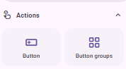
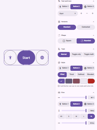
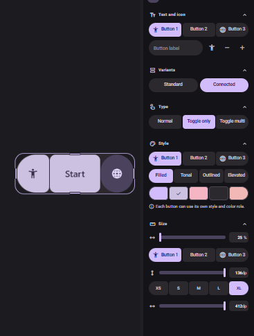
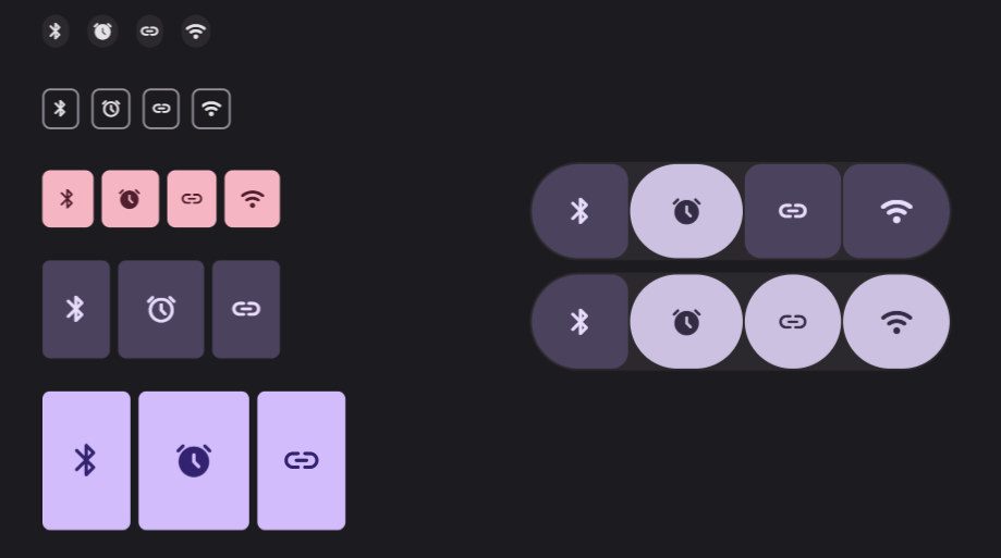
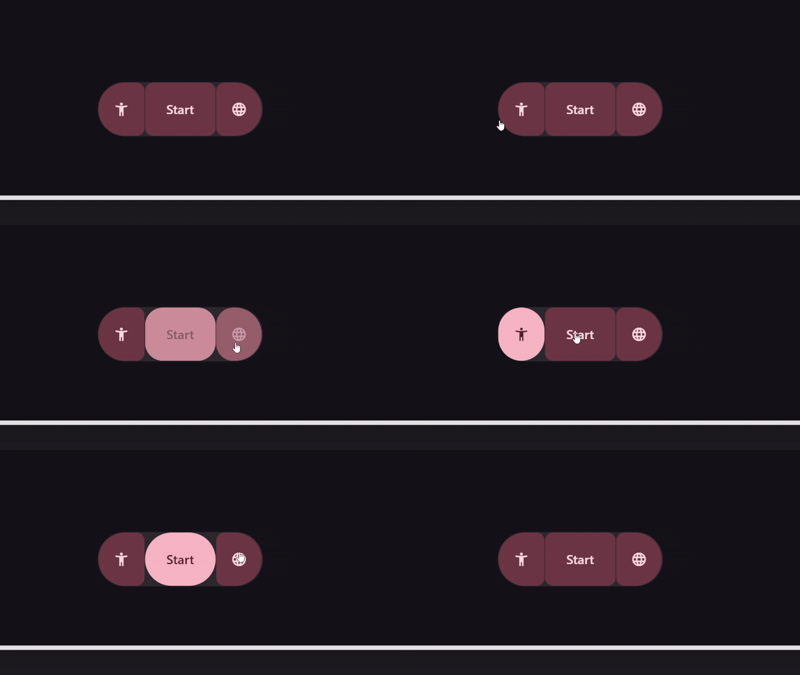
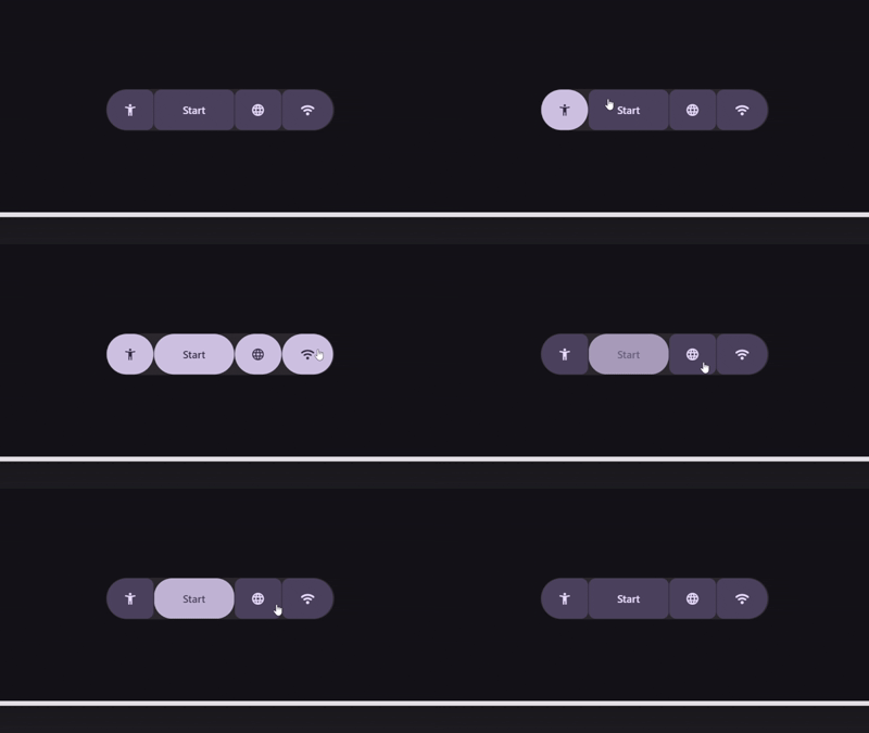
This component is essential for toggles and similar functions, offering both standard and connected versions in a variety of sizes and colors. The check icon is employable when the connected option is activated. (OPTIONAL CHECK)
=== IDEA 2: MORE COLORS ===
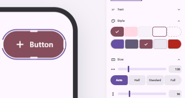
The current color palette is limited. Future enhancements will include options such as Filled, Tonal, Elevated, Outlined, and Text in Primary, Secondary, Tertiary, Surface, and Error categories. These changes will impact buttons, button groups, icon buttons, FABs, and more.
=== IDEA 3: FAB MENU ===
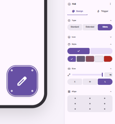
The FAB menu is crucial for easy access and customization of options. It offers flexibility in adapting its features to user needs.
=== IDEA 4: SEGMENTED BUTTONS ===
Though not crucial, segmented buttons could offer interesting applications within the M3E Canvas framework.
=== IDEA 5: SLIDER UPDATE ===
Current sliders offer limited configurability. Expanding their options to include variable directions and types will enhance functionality.
=== IDEA 6: FREE WIDTH OF THE SPLIT BUTTONS ===
Split buttons should have adjustable width or be responsive to different design contexts.
=== IDEA 7: PILL BUTTONS ===
Creating pill-shaped buttons is advisable when they feature an icon rather than text for a streamlined design.
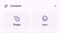
=== IDEA 8: SHAPES ===
Adding the ability to feature diverse shapes in different colors will enhance expressiveness in design.
=== IDEA 9: ICON ===
An additional icon option is provided for versatility.
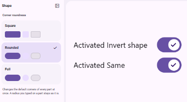
=== IDEA 10: CHANGE SHAPE WITH TOGGLE ===
Toggle functionality allows for shape modification or retention as needed. This feature applies to toggle buttons, button groups, and icon buttons; under Trigger > Tap action > Toggle. Or with the standard group buttons with Toggle Only or Toggle multi.
reacted with thumbs up emoji reacted with thumbs down emoji reacted with laugh emoji reacted with hooray emoji reacted with confused emoji reacted with heart emoji reacted with rocket emoji reacted with eyes emoji


Uh oh!
There was an error while loading. Please reload this page.
=== IDEA 1: BUTTON GROUPS ===
This component is essential for toggles and similar functions, offering both standard and connected versions in a variety of sizes and colors. The check icon is employable when the connected option is activated. (OPTIONAL CHECK)
=== IDEA 2: MORE COLORS ===
The current color palette is limited. Future enhancements will include options such as Filled, Tonal, Elevated, Outlined, and Text in Primary, Secondary, Tertiary, Surface, and Error categories. These changes will impact buttons, button groups, icon buttons, FABs, and more.
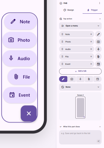
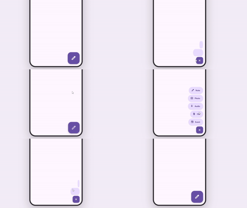
=== IDEA 3: FAB MENU ===
The FAB menu is crucial for easy access and customization of options. It offers flexibility in adapting its features to user needs.
=== IDEA 4: SEGMENTED BUTTONS ===
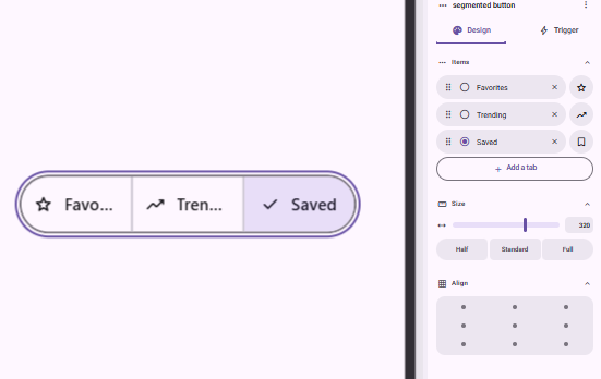
Though not crucial, segmented buttons could offer interesting applications within the M3E Canvas framework.
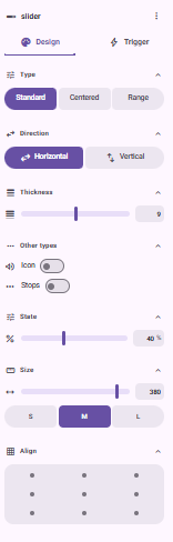
=== IDEA 5: SLIDER UPDATE ===
Current sliders offer limited configurability. Expanding their options to include variable directions and types will enhance functionality.
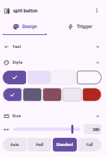
=== IDEA 6: FREE WIDTH OF THE SPLIT BUTTONS ===
Split buttons should have adjustable width or be responsive to different design contexts.
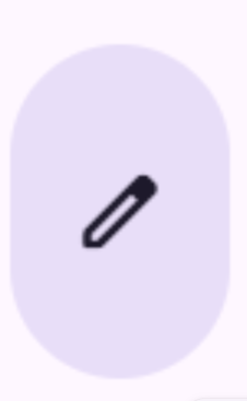
=== IDEA 7: PILL BUTTONS ===
Creating pill-shaped buttons is advisable when they feature an icon rather than text for a streamlined design.
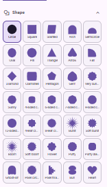
=== IDEA 8: SHAPES ===
Adding the ability to feature diverse shapes in different colors will enhance expressiveness in design.

=== IDEA 9: ICON ===
An additional icon option is provided for versatility.
=== IDEA 10: CHANGE SHAPE WITH TOGGLE ===
Toggle functionality allows for shape modification or retention as needed. This feature applies to toggle buttons, button groups, and icon buttons; under Trigger > Tap action > Toggle. Or with the standard group buttons with Toggle Only or Toggle multi.
All reactions