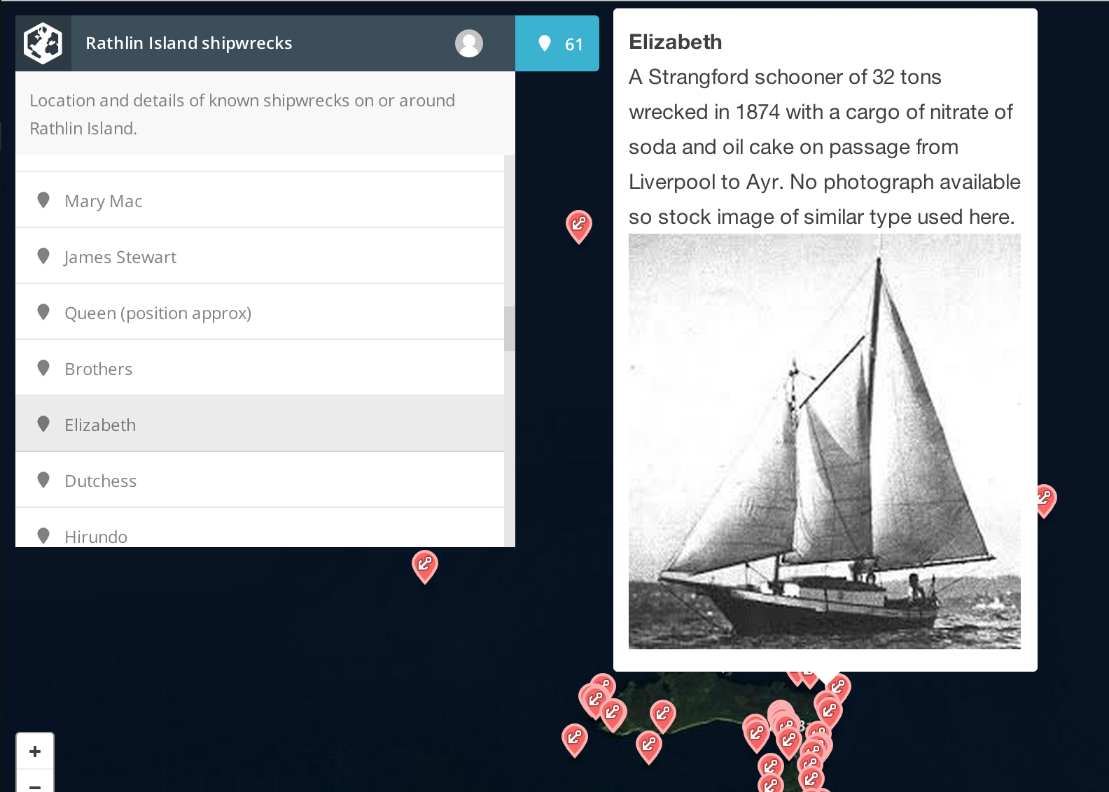
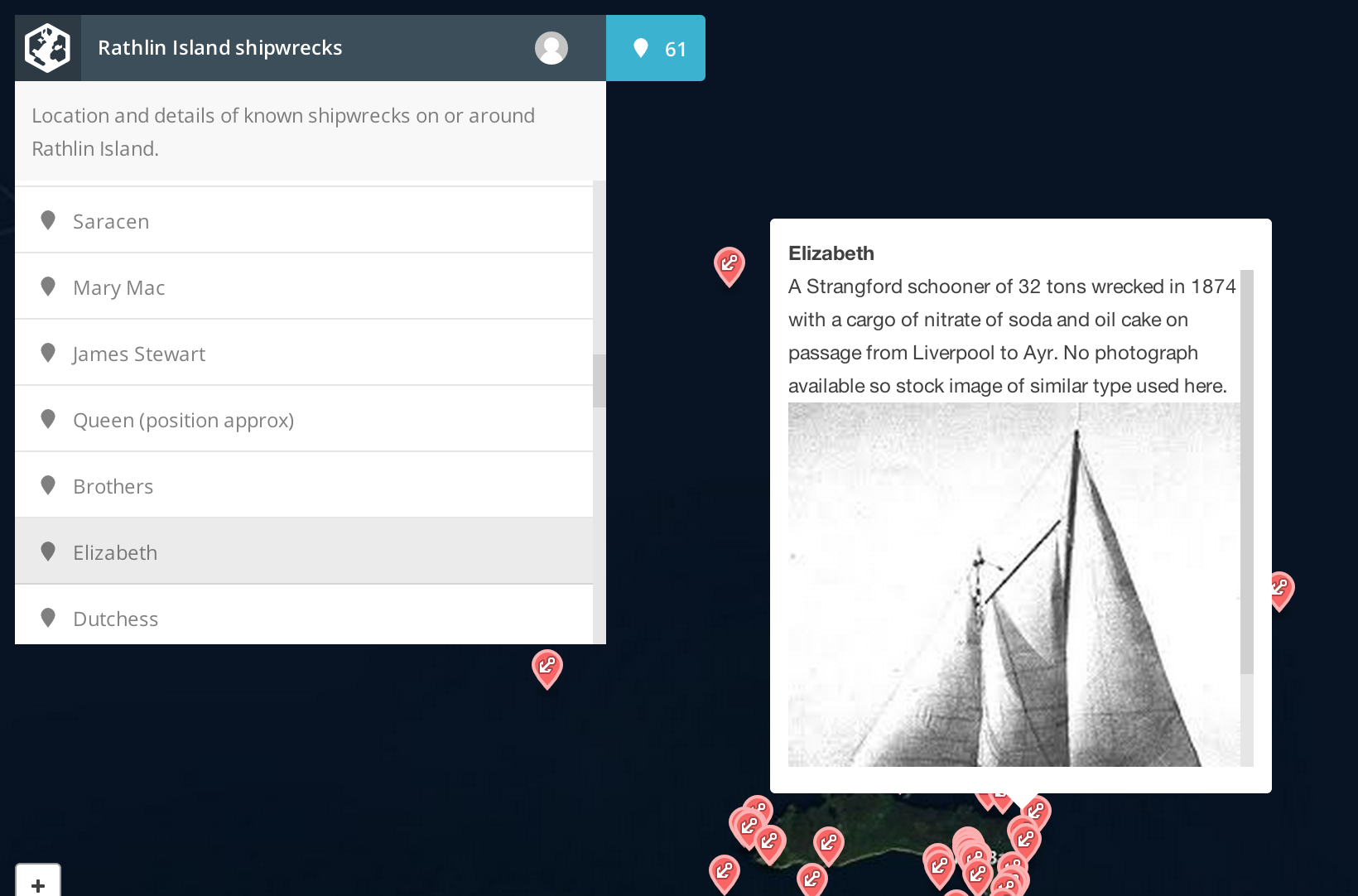
-
Notifications
You must be signed in to change notification settings - Fork 385
Conversation
|
Hm, looks good but enforcing a max-height in CSS may be problematic: Leaflet writes its styles from JS-land and users with custom maxHeight values will see changed behavior. /cc @mourner |
|
I fixed this on mapbox.com side as a short term solution: https://github.com/mapbox/mapbox.github.com/commit/0444bf3076031a3d7633c628d61094719c0169ca |
|
@samanpwbb why not just use |
|
I'd like this sort of thing to be handled by CSS. I'm guessing Leaflet's |
| @@ -746,9 +757,9 @@ | |||
| /* Browser Fixes | |||
| ------------------------------------------------------- */ | |||
| /* Map is broken in FF if you have max-width: 100% on tiles */ | |||
| .leaflet-container img { max-width:none!important; } | |||
| .leaflet-container img.leaflet-tile { max-width:none; } | |||
There was a problem hiding this comment.
Choose a reason for hiding this comment
The reason will be displayed to describe this comment to others. Learn more.
The reason why I had to put important here is that some stupid CSS frameworks like Bootstrap use !important too, which will break Leaflet maps unless overriden with !important from Leaflet side. E.g. https://github.com/twbs/bootstrap/blob/master/dist/css/bootstrap.css#L222
So I'd suggest not touching these.
There was a problem hiding this comment.
Choose a reason for hiding this comment
The reason will be displayed to describe this comment to others. Learn more.
That is the silliest rule I've ever seen. As much as I'd like to step out of this CSS specificity arms race, I don't see how your override could hurt as long as it applies only to tiles.
There was a problem hiding this comment.
Choose a reason for hiding this comment
The reason will be displayed to describe this comment to others. Learn more.
Right. I should be more specific in Leaflet as well.
|
One reason it was not entirely handled in CSS is that I wanted to add a special class when popup reaches max height so that I could style the scrolled container, e.g. add borders like Leaflet does now. |
|
Okay, reverted to importants. Now that the rule applies to |
|
Removed the max height rule with bc3b5fe so this should now be good to go. Sounds like it's best to leave max height management to the front end. |
|
|
||
| .leaflet-container img { | ||
| margin-bottom: 10px; | ||
| } |
There was a problem hiding this comment.
Choose a reason for hiding this comment
The reason will be displayed to describe this comment to others. Learn more.
shouldn't this be more specific?
|
Otherwise looks good. |
|
Y, we should not style all |
|
Cool, I made the style more specific. I am ok totally cutting it as well if you guys still feel weird about it. I think it's ok to be a little opinionated with styles within the |
|
Yeah, looks good now. |
From:

To:
