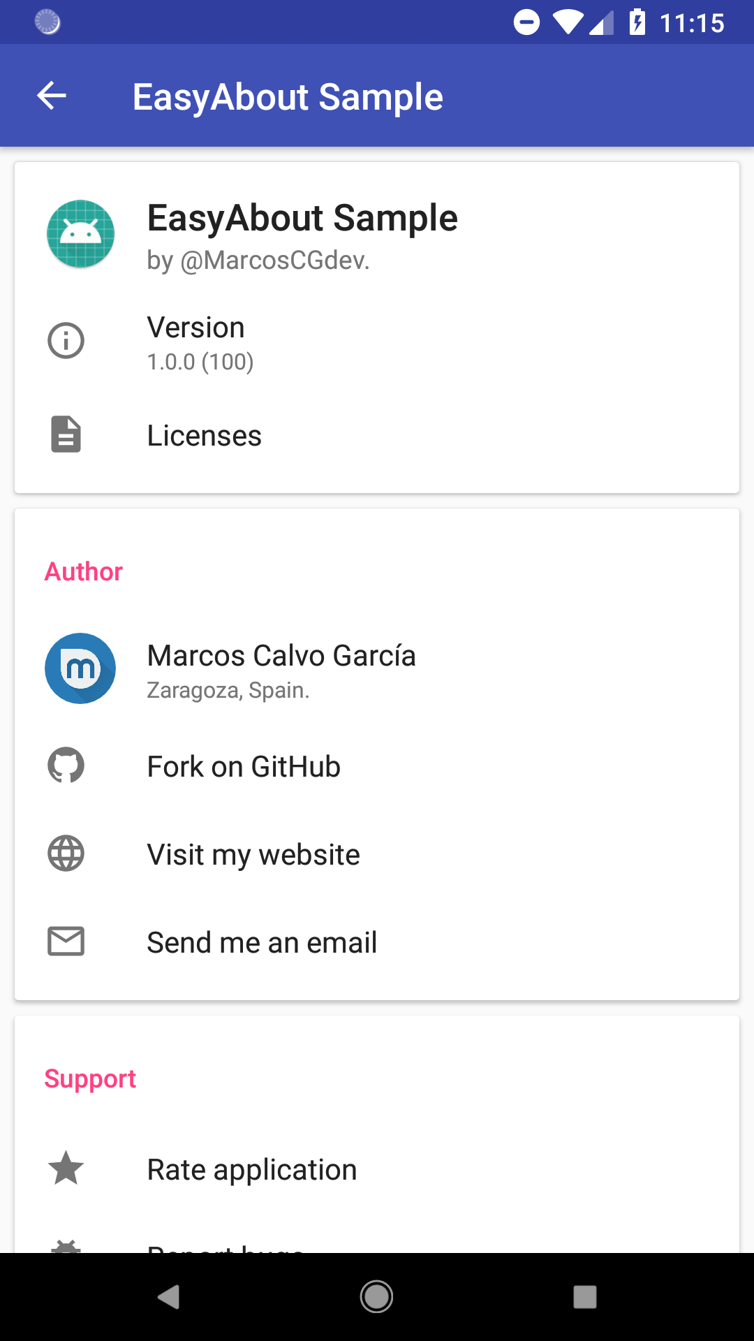
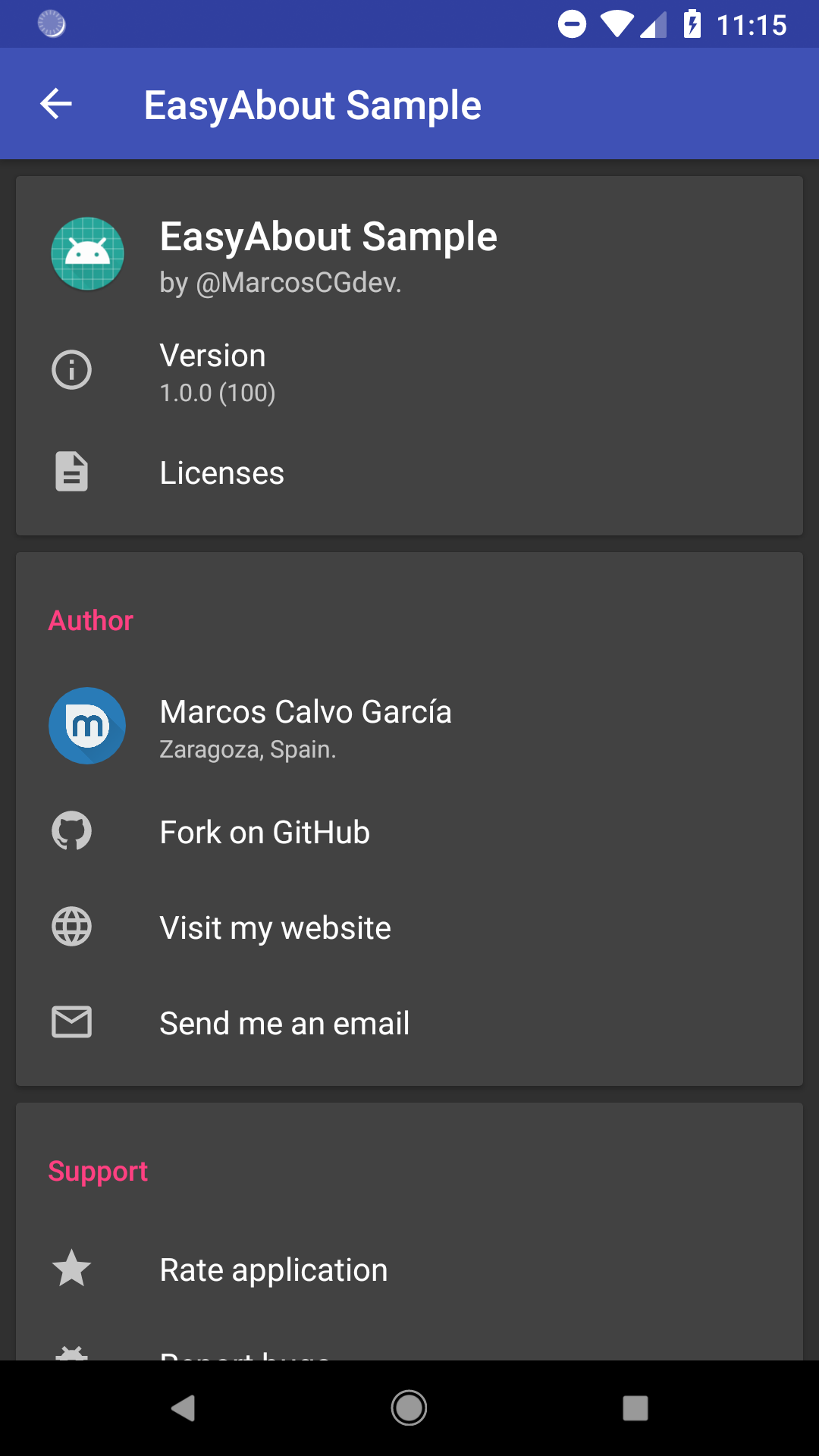
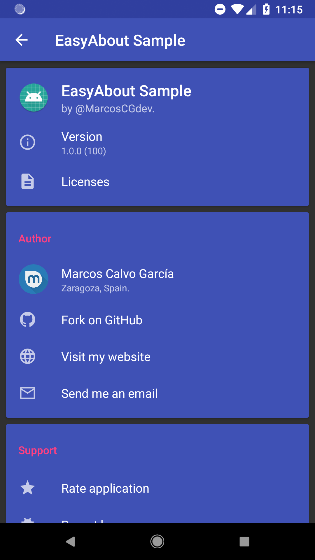
A fully material-designed about fragment for your application.
You can see all the library releases here.
You can download the sample apk here.
| Default | Default Dark | Colored |
|---|---|---|
 |
 |
 |
Add this to your root build.gradle file:
allprojects {
    repositories {
        ...
        maven { url 'https://jitpack.io' }
    }
}
Now add the dependency to your app build.gradle file:
implementation 'com.github.marcoscgdev:EasyAbout:1.0.6'
Your about fragment must extend from EasyAboutFragment
public class AboutFragment extends EasyAboutFragment {

    @Override
    protected void configureFragment(Context context, View rootView, Bundle savedInstanceState) {
        // add cards here
    }
}Note: all parameters are optional
AboutCard aboutCard = new AboutCard.Builder(context)
        .setTitle("Card title") // It can also be passed as a string resource
        .setTitleColorRes(R.color.colorAccent) // You can also use setTitleColor(int color);
        .addItem(personAboutItem)
        .addItem(normalAboutItem)
.build();Note: all parameters are optional and common for all item types
HeaderAboutItem headerAboutItem = new HeaderAboutItem.Builder(context)
        .setTitle(R.string.app_name) // It can also be passed as a string value
        .setSubtitle(BuildConfig.VERSION_NAME) // It can also be passed as a string resource
        .setIcon(R.mipmap.ic_launcher) // It can also be passed as a drawable
.build();NormalAboutItem normalAboutItem = new NormalAboutItem.Builder(context)
.setTitle("Item title") // It can also be passed as a string resource
.setSubtitle("Item subtitle") // It can also be passed as a string resource
.setIcon(R.drawable.ic_info_outline_black_24dp) // It can also be passed as a drawable
.setOnClickListener(new View.OnClickListener() {
@Override
public void onClick(View view) {
// Your click action here
}
})
.setOnLongClickListener(new View.OnLongClickListener() {
@Override
public boolean onLongClick(View view) {
// Your long click action here
return false;
}
})
.build();PersonAboutItem personAboutItem = new PersonAboutItem.Builder(context)
.setTitle("Your name here") // It can also be passed as a string resource
.setSubtitle("Your info here") // It can also be passed as a string resource
.setIcon(R.drawable.user) // It can also be passed as a drawable
.build();You can add cards with the addCard(AboutCard aboutCard); method (inside the configureFragment function of the fragment)
AboutCard aboutCard = new AboutCard.Builder(context)
        .setTitle("Card title") // It can also be passed as a string resource
        .setTitleColorRes(R.color.colorAccent) // You can also use setTitleColor(int color);
        .addItem(personAboutItem)
        .addItem(normalAboutItem)
        .build();

addCard(aboutCard);
addCard(anotherCard);
addCard(contactCard);public class AboutFragment extends EasyAboutFragment {
@Override
protected void configureFragment(final Context context, View rootView, Bundle savedInstanceState) {
addCard(new AboutCard.Builder(context)
.addItem(AboutItemBuilder.generateAppTitleItem(context)
.setSubtitle("by @MarcosCGdev."))
.addItem(AboutItemBuilder.generateAppVersionItem(context, true)
.setIcon(R.drawable.ic_info_outline_black_24dp))
.addItem(new NormalAboutItem.Builder(context)
.setTitle("Licenses")
.setIcon(R.drawable.ic_description_black_24dp)
.setOnClickListener(new View.OnClickListener() {
@Override
public void onClick(View view) {
DemoUtils.showLicensesDialog(context);
}
})
.build())
.build());
addCard(new AboutCard.Builder(context)
.setTitle("Support")
.addItem(AboutItemBuilder.generatePlayStoreItem(context)
.setTitle("Rate application")
.setIcon(R.drawable.ic_star_black_24dp))
.addItem(AboutItemBuilder.generateLinkItem(context, "https://github.com/marcoscgdev/EasyAbout/issues/new")
.setTitle("Report bugs")
.setIcon(R.drawable.ic_bug_report_black_24dp))
.addItem(new NormalAboutItem.Builder(context)
.setTitle("Clickable item")
.setSubtitle("This item has onClick and onLongClick listener.")
.setOnClickListener(new View.OnClickListener() {
@Override
public void onClick(View view) {
Toast.makeText(context, "onClick", Toast.LENGTH_SHORT).show();
}
})
.setOnLongClickListener(new View.OnLongClickListener() {
@Override
public boolean onLongClick(View view) {
Toast.makeText(context, "onLongClick", Toast.LENGTH_SHORT).show();
return false;
}
})
.setIcon(R.drawable.ic_mouse_black_24dp)
.build())
.build());
}
}Simply add this to your app theme. Replace @color/colorPrimary with your desired color.
<item name="aboutCardBackground">@color/colorPrimary</item>See the sample project to clarify any queries you may have.
MIT License

Copyright (c) 2018 Marcos Calvo García

Permission is hereby granted, free of charge, to any person obtaining a copy
of this software and associated documentation files (the "Software"), to deal
in the Software without restriction, including without limitation the rights
to use, copy, modify, merge, publish, distribute, sublicense, and/or sell
copies of the Software, and to permit persons to whom the Software is
furnished to do so, subject to the following conditions:

The above copyright notice and this permission notice shall be included in all
copies or substantial portions of the Software.

THE SOFTWARE IS PROVIDED "AS IS", WITHOUT WARRANTY OF ANY KIND, EXPRESS OR
IMPLIED, INCLUDING BUT NOT LIMITED TO THE WARRANTIES OF MERCHANTABILITY,
FITNESS FOR A PARTICULAR PURPOSE AND NONINFRINGEMENT. IN NO EVENT SHALL THE
AUTHORS OR COPYRIGHT HOLDERS BE LIABLE FOR ANY CLAIM, DAMAGES OR OTHER
LIABILITY, WHETHER IN AN ACTION OF CONTRACT, TORT OR OTHERWISE, ARISING FROM,
OUT OF OR IN CONNECTION WITH THE SOFTWARE OR THE USE OR OTHER DEALINGS IN THE
SOFTWARE.


