HowTo : CheckBox widget
 About FAQ User Guide Reference documentation
This wxRuby guide demonstrates how to use the Wx::CheckBox widget with it’s various styles, features and functions. A complete list of options will be included here together with code examples for your convenience.
The syntax for creating a CheckBox widget in wxRuby is as follows:
cb = Wx::CheckBox.new(parent, id, label, pos, size, style, validator, name)Parameter descriptions:
-
parent : Wx::Window
the parent window (widget) such as a Wx::Panel. -
id : Integer
Button ID.Wx::ID_ANYindicates a default value. -
label : String
Optional text which appears on the widget. Empty by default. -
pos : Array(Integer,Integer) or Wx::Point
Optional coordinates for the position of the topleft corner of the widget. Default isWx::DEFAULT_POSITION. -
size : Array(Integer,Integer) or Wx::Size
Optional dimensions of the widget. Default isWx::DEFAULT_SIZE. -
style : Integer
Optional styling mask for the button (such as alignment). Default is 0. -
validator : Wx::Validator
Optional Window validator. Default is nil. -
name : String
Optional window name. Default is Wx::CHECK_BOX_NAME_STR.
Note: As with all windows, keyword constructor alternatives for all arguments but the 'parent' argument are available. See here for more information.
Available styles for the CheckBox widget:
| Button Style | Description |
|---|---|
| Wx::CHK_2STATE | Creates a 2-State Checkbox (Default) |
| Wx::CHK_3STATE | Creates a 3-State Checkbox |
| Wx::CHK_ALLOW_3RD_STATE_FOR_USER | Allows the User to activate the 3rd State by clicking (By default, the 3rd State can only be triggered through code). |
| Wx::Alignment::ALIGN_RIGHT | Makes the text appear on the left of the checkbox |
A list of useful methods which can be used on the RadioBox widget.
| Method | Description |
|---|---|
| get_value | Returns the State of the CheckBox (True/False) |
| get3state_value | Returns an Enum (CheckBoxState) with the State of the CheckBox |
| is3state | Used to check whether the CheckBox is a 3-State CheckBox. |
| is3rd_state_allowed_for_user | Checks to see if the 3rd State is Allowed for User. Return type (True/False) |
| is_checked | Returns the State of the CheckBox (True/False) |
| set3state_value(state) | Sets the CheckBox to the given state. |
| set_value(bool) | Sets the value for a 2-State Checkbox (either True or False) |
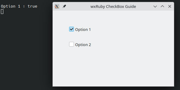
In this example we create two CheckBox widgets in a wxRuby Window.
Both CheckBox Widgets have been created with some simple labels and positioned near the center of the Panel. The Panel
itself is connected to the Wx::EVT_CHECKBOX and the check_box_event method. Whenever a CheckBox within this Panel is
clicked, the check_box_event method will be called.
The check_box_event method simply prints out the Label of the CheckBox that was clicked.
require 'wx'

class MyWindow < Wx::Frame
  def initialize(title)
    super(nil, title: title)
    @panel = Wx::Panel.new(self)

    @cb1 = Wx::CheckBox.new(@panel, label: 'Option 1', pos: [50, 50])
    @cb2 = Wx::CheckBox.new(@panel, label: 'Option 2', pos: [50, 100])

    @panel.evt_checkbox(Wx::ID_ANY) { |e| check_box_event(e) }

    centre
  end

  def check_box_event(e)
    cb = e.get_event_object
    puts "#{cb.get_label} : #{cb.get_value}"
  end
end

Wx::App.run do
  window = MyWindow.new("wxRuby CheckBox Guide")
  window.show
end
The output of the above code, when the first CheckBox is clicked:
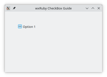
In this example we will make a 3-State CheckBox.
A 3-State CheckBox has 3 possible states, On, Off and an Intermediate state (picture of this state is included at the end). Since Bool values cannot be used to represent 3 states, an enum called Wx::CheckBoxState is used with these values:
-
Wx::CheckBoxState::CHK_UNCHECKEDrepresenting the Off state -
Wx::CheckBoxState::CHK_CHECKEDrepresenting the On state -
Wx::CheckBoxState::CHK_UNDETERMINEDrepresenting the Intermediate state
In the below example, we initialize the CheckBox to the intermediate state by using the
set3state_value(state) method, and
in the check_box_event method, print out the enumerator value corresponding to the current state.
require 'wx'

class MyWindow < Wx::Frame
  def initialize(title)
    super(nil, title: title)
    @panel = Wx::Panel.new(self)

    @cb1 = Wx::CheckBox.new(@panel, label: 'Option 1', pos: [50, 50],
                       style: Wx::CHK_3STATE | Wx::CHK_ALLOW_3RD_STATE_FOR_USER)
    @cb1.set3state_value(Wx::CheckBoxState::CHK_UNDETERMINED)

    @panel.evt_checkbox(Wx::ID_ANY) { |e| check_box_event(e) }

    centre
  end

  def check_box_event(e)
    cb = e.get_event_object
    puts "#{cb.get_label} : #{cb.get3state_value}"
  end
end

Wx::App.run do
  window = MyWindow.new("wxRuby CheckBox Guide")
  window.show
end
Below is an image of the intermediate state selected.