HowTo : Button widget
 About FAQ User Guide Reference documentation
This wxRuby guide demonstrates how to use the Wx::Button widget with it’s various styles, features and functions. A complete list of options will be included here together with code examples for your convenience.
The syntax for creating a Button widget in wxRuby is as follows:
myButton = Wx::Button.new(parent, id, label, pos, size, style, validator, name)Parameter descriptions:
-
parent : Wx::Window
the parent window (widget) such as a Wx::Panel. -
id : Integer
Button ID.Wx::ID_ANYindicates a default value. -
label : String
Optional text which appears on the button. Empty by default. -
pos : Array(Integer,Integer) or Wx::Point
Optional coordinates for the position of the topleft corner of the button. Default isWx::DEFAULT_POSITION. -
size : Array(Integer,Integer) or Wx::Size
Optional dimensions of the button. Default isWx::DEFAULT_SIZE. -
style : Integer
Optional styling mask for the button (such as alignment). Default is 0. -
validator : Wx::Validator
Optional Window validator. Default is nil. -
name : String
Optional window name. Default is Wx::BUTTON_NAME_STR.
Note: As with all windows, keyword constructor alternatives for all arguments but the 'parent' argument are available. See here for more information.
Available styles for the Button widget:
| Button Style | Description |
|---|---|
| Wx::BU_LEFT | Aligns the Label to the left. WXMSW and WxGTK only. |
| Wx::BU_TOP | Aligns the Label to the top. WXMSW and WxGTK only. |
| Wx::BU_RIGHT | Aligns the Label to the right. WXMSW and WxGTK only. |
| Wx::BU_BOTTOM | Aligns the Label to the bottom. WXMSW and WxGTK only. |
| Wx::BU_EXACTFIT | Overrides the Default settings, and ensures button is just big enough to fit the contents. |
| Wx::BU_NOTEXT | Disables the display of the text label in the button even if it has one. |
| Wx::BORDER_NONE | Creates a button without border. |
Note: Some of these Styles are not available on certain platforms.
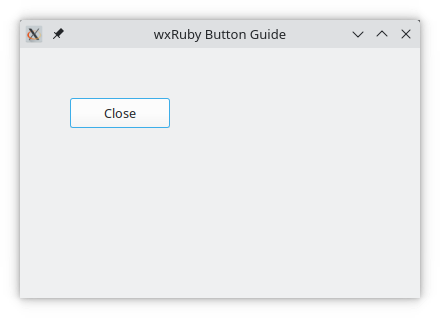
In the example below, we have created a simple Button Widget in our wxRuby Window.
require 'wx'

class MyFrame < Wx::Frame
  def initialize(title)
    super(nil, title: title)
    panel = Wx::Panel.new(self)

    close_btn = Wx::Button.new(panel, label: 'Close', pos: [50,50], size: [100,30])
    evt_button close_btn, :close_window

    centre
  end

  def close_window(_evt)
    close
  end
end

Wx::App.run { MyFrame.new('wxRuby Button Guide').show }
A few interesting things to note:
- the keyword constructor alternative is used
- the
idargument is not specified (this will cause it to use it’s default value) - the
sizeargument specifies to create a button 100 pixels wide, and 30 pixels tall. - the
posargument specifies to place the button at coordinates [x=50, y=50] of the window. This coordinate will be the topleft corner of the button. - the named event connector for buttons, Wx::EvtHandler#evt_button, is used to connect the
close_windowmethod we defined. (This makes sure that whenever theWx::EVT_BUTTONevent is detected to call the specified handler method).
Output of the above code:
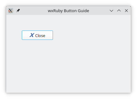
The Button widget comes with a built in feature that allows you to set a Wx::Bitmap image for the button, effectively making it an image Button.
First we need to create a Bitmap object using the filepath to a valid image.
close_icon = Wx::Bitmap.new("delete.xpm")Next we just need to use the Wx::Button#set_bitmap method, which takes the Wx::Bitmap that we created earlier as an argument.
close_btn = Wx::Button.new(panel, pos: [50,50], label: 'Close')
evt_button close_btn, :close_window
close_btn.set_bitmap(close_icon)
The Complete Example Code:
require 'wx'

class MyFrame < Wx::Frame
  def initialize(title)
    super(nil, title: title)
    panel = Wx::Panel.new(self)

    close_icon = Wx::Bitmap.new("delete.xpm")

    close_btn = Wx::Button.new(panel, label: 'Close', pos: [50,50], size: [100,30])
    evt_button close_btn, :close_window
    close_btn.set_bitmap(close_icon)

    centre
  end

  def close_window(_evt)
    close
  end
end

Wx::App.run { MyFrame.new('wxRuby Button Guide').show }Note: To run this example you will need the icon file too. Download that here.
Output:
This marks the end of the wxRuby Button widget guide.