fix(compass-components): improve dark theme toggle appearance COMPASS-5470 #2751
Conversation
|
Hmm seeing two different build ci e2e tests failing for timeout after merging main. Could be a rendering slowdown from these changes or unrelated. Looking into |
| import { Theme, useTheme } from '../hooks/use-theme'; | ||
|
|
||
| function Toggle( | ||
| props: React.ComponentProps<typeof LeafyGreenToggle> |
There was a problem hiding this comment.
Do we want to to be overridable like that? What should take precedence?
| props: React.ComponentProps<typeof LeafyGreenToggle> | |
| props: Omit<React.ComponentProps<typeof LeafyGreenToggle>, 'darkMode'> |
There was a problem hiding this comment.
Good question. I think we probably want it to be overrideable, yes, but I'm alright with either approach. If it's a component which always is displayed in a darkMode or always needs to be light mode I think we'll want to customize it and override the provider. I think we could also add more providers in that situation, but if it's just one component I think it's simpler to just override this. I'm cool with either here - is there one you prefer?
There was a problem hiding this comment.
Yeah, this makes sense! Let's keep it like that for now 👍
| function Toggle( | ||
| props: React.ComponentProps<typeof LeafyGreenToggle> | ||
| ): ReturnType<typeof LeafyGreenToggle> { | ||
| const theme = useTheme(); | ||
|
|
||
| return <LeafyGreenToggle darkMode={theme?.theme === Theme.Dark} {...props} />; | ||
| } |
There was a problem hiding this comment.
Raised this with leafygreen, if that's the only way to set the darkMode for their components, we are at the risk of wrapping every single leafygreen component that we export here which sounds like a giant maintenance headache
There was a problem hiding this comment.
yes it would be better if they'd have a provider we can use, I'd expect LG to also provide themes and guidelines for the palette, which is something we'd have to do on our side otherwise:
const darkTheme = {
    theme: Theme.Dark
    colors: {
        accent: palette.green.light1,
        // .. etc
    }
}
There was a problem hiding this comment.
We could do something like this before re-exporting the components on our side:
const LGComponentWithTheme<T>(Wrappee: T): T {
   const theme = useTheme()
   return (props) => Wrappee(...props, {...darkmode: theme?.theme})
}
const Toggle = LGComponentWithTheme(Toggle)
export Toggle;
There was a problem hiding this comment.
I mean, yeah, we totally can do something like that, HOC is indeed a good pattern to use here. It's just weird that we have to even though we all agree that we want to do as little changes to leafygreen as possible
There was a problem hiding this comment.
lg team said this will be addressed when they are eventually working on a dark mode support
There was a problem hiding this comment.
What should we do for now? I think we probably won't need to do many fixes like this until dark theme/the new provider is released in leafygreen so having one component listening to the theme is probably alright?
There was a problem hiding this comment.
I would merge this as it is
3 participants
COMPASS-5470
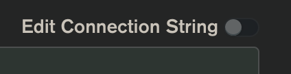
This PR adds a theme context to the react tree that the connections page is in. This theme context is used in the toggle to render the leafygreen dark theme when dark theme is turned on.
This does not yet fix the toggles in the aggregations view as those are currently in a different react tree and do not have access to the theme context. Work to make them use one react root will happen in COMPASS-5481 . Once that is done, these changes will fix those toggles as well.
I think we could initialize the theme preference, listen to updates in the theme from the main compass process, and propagate that state to the react renderer in a more concise, generalized way which would hopefully free up adding more settings to Compass. I'll leave a comment where this is in the code with this text also. Since the theme is the only state of Compass which is currently managed between multiple windows, I think it's alright to have the solution in this pr for now to unblock the connect form and give the theme to the react context. We can improve and generalize the initialization and synchronization of the shared state in future work when there's more to sync. What do y'all think? Should we do more now?
Before:
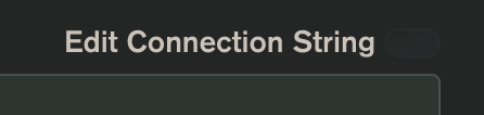
After: