- Create Data Visualization with Python
- Use various Python libraries for visualization
The aim of these labs is to introduce you to data visualization with Python as concrete and as consistent as possible. Speaking of consistency, because there is no best data visualization library available for Python - up to creating these labs - we have to introduce different libraries and show their benefits when we are discussing new visualization concepts. Doing so, we hope to make students well-rounded with visualization libraries and concepts so that they are able to judge and decide on the best visualization technique and tool for a given problem and audience.
Please make sure that you have completed the prerequisites for this course, namely Python Basics for Data Science and Analyzing Data with Python.
Note: The majority of the plots and visualizations will be generated using data stored in pandas dataframes. Therefore, in this lab, we provide a brief crash course on pandas. However, if you are interested in learning more about the pandas library, detailed description and explanation of how to use it and how to clean, munge, and process data stored in a pandas dataframe are provided in our course Analyzing Data with Python.
1.1 The Dataset: Immigration to Canada from 1980 to 2013
1.2 pandas Basics
1.3 pandas Intermediate: Indexing and Selection
2. Visualizing Data using Matplotlib
2.1 Matplotlib: Standard Python Visualization Library
3. Line Plots
pandas is an essential data analysis toolkit for Python. From their website:
pandas is a Python package providing fast, flexible, and expressive data structures designed to make working with “relational” or “labeled” data both easy and intuitive. It aims to be the fundamental high-level building block for doing practical, real world data analysis in Python.
The course heavily relies on pandas for data wrangling, analysis, and visualization. We encourage you to spend some time and familiarize yourself with the pandas API Reference: http://pandas.pydata.org/pandas-docs/stable/api.html.
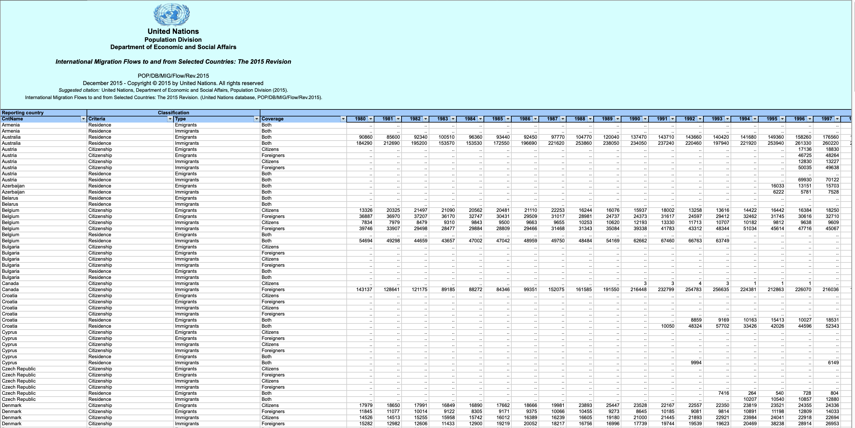
Dataset Source: International migration flows to and from selected countries - The 2015 revision.
The dataset contains annual data on the flows of international immigrants as recorded by the countries of destination. The data presents both inflows and outflows according to the place of birth, citizenship or place of previous / next residence both for foreigners and nationals. The current version presents data pertaining to 45 countries.
In this lab, we will focus on the Canadian immigration data.
.png)
.png)
.png)
.png)
.png)
.png)
.png)
.png)
The Canada Immigration dataset can be fetched from here.
- Explore Matplotlib library further
- Create pie charts, box plots, scatter plots and bubble charts
- Create Word cloud and Waffle charts
- Create regression plots with Seaborn library
- Visualize geospatial data with Folium
In this lab, we will learn how to create maps for different objectives. To do that, we will part ways with Matplotlib and work with another Python visualization library, namely Folium. What is nice about Folium is that it was developed for the sole purpose of visualizing geospatial data. While other libraries are available to visualize geospatial data, such as plotly, they might have a cap on how many API calls you can make within a defined time frame. Folium, on the other hand, is completely free.
As a data analyst, the given a task to monitor and report US domestic airline flights performance. Goal is to analyze the performance of the reporting airline to improve flight reliability thereby improving customer reliability.
Below are the key report items,
- Yearly airline performance report
- Yearly average flight delay statistics NOTE: Year range is between 2005 and 2020.
- Yearly airline performance report For the chosen year provide,
- Number of flights under different cancellation categories using bar chart.
- Average flight time by reporting airline using line chart.
- Percentage of diverted airport landings per reporting airline using pie chart.
- Number of flights flying from each state using choropleth map.
- Number of flights flying to each state from each reporting airline using treemap chart.
- Yearly average flight delay statistics For the chosen year provide,
- Monthly average carrier delay by reporting airline for the given year.
- Monthly average weather delay by reporting airline for the given year.
- Monthly average national air system delay by reporting airline for the given year.
- Monthly average security delay by reporting airline for the given year.
- Monthly average late aircraft delay by reporting airline for the given year.
- Two dropdown menus: For choosing report type and year
- Each dropdown will be designed as follows:
- An outer division with two inner divisions (as shown in the expected layout)
- One of the inner divisions will have information about the dropdown and the other one is dropdown.
- Layout for adding graphs.
- Callback function to compute data, create graph and return to the layout.