This report provides a simple way to analyse the predictability and variation in flow metrics for a team, inspired by Dan Vacanti's book, Actionable Agile Metrics Volume II - Advanced Topics in Predictability.
For the flow metrics of Throughput, Cycle Time, Work In Progress (WIP) and Work Item Age, a Process Behaviour Chart (PBC) is visualized.
The PBC shows what type of variation is present in a teams flow. Any time you see a data point outside of the Upper Natural Process Limit (UNPL) or Lower Natural Process Limit (LNPL), these points (shown as a red dot) highlight a signal that represents exceptional variation. The report contains two pages, page one contains the simplified 'X Chart' and page two contains the 'XmR Chart'. There are two date slicers, one for choosing the baseline range (for calculating UNPL/LNPL/URL), the second for what data you what to compare these values against.
Separate that which is ‘signal’ from that which is ‘noise' in your data. Variability in terms of Throughput, Cycle Time, Work In Progress (WIP) and/or Work Item Age is inevitable. Understanding when you have too much variability and when an intervention is needed is what is important. Use these charts to find out where you may need to focus. Please note, for flow metrics where the LNPL is not visible, this is because the value is less than 0 which will not be possible for certain metrics (e.g. it is impossible to have a negative Throughput or negative Cycle Time).
Use this at potentially every other retrospective to understand where there has been variation in your process/ways of working and potentially do some root-cause analysis as to why that may be.
- Make sure you have the latest version of Power BI Desktop
- Download the appropriate template file:
- Create/save an access token
- Then you're good to get started!
- Open the .pbit file in Power BI Desktop
- Select http/https (only choose http if your Azure DevOps Server is HTTP)
- Add the Analytics / Azure DevOps Server URL - for Azure DevOps services enter 'analytics.dev.azure.com' / for Azure DevOps Server enter your server details
- Add your organization, project name and team name
Don't confuse the team name with the project name, a common mistake. If the URL you use is "http://dev.azure.com/Microsoft-UK/AzureDevOpsTeam/Database", then Microsoft-UK is the Organization Name, AzureDevOpsTeam is the Project name, Database is the team name.
- It should then look something like this:
Azure DevOps Services:
Azure DevOps Server:
-
Hit 'Load'
-
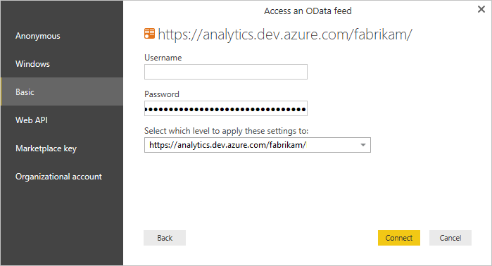
If you are prompted for a login, you can choose:
- 'Organizational' and enter your Organization email/password (if required) and sign in
- 'Basic' and use a Personal Access Token (PAT) to login, entering it in the password field (user can be left as blank - make sure it has 'Read' access to Analytics)
-
Once signed in hit 'Load' and wait for your charts to populate!
- Open the .pbit file in Power BI Desktop
- Add your Jira URL
- Add your Jira Project Key
Don't confuse the project name with the project key, a common mistake! Your project key will be in the URL when viewing an item.
- It should then look something like this:
- Hit 'Load'
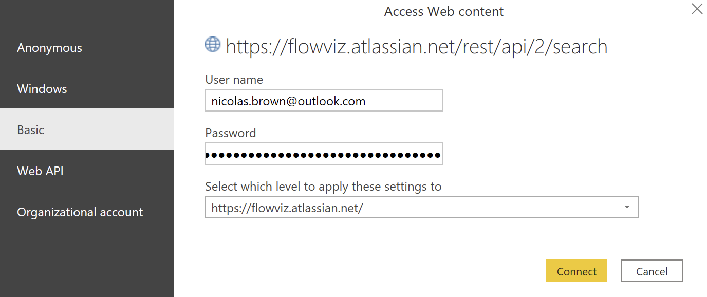
- You will be prompted for a login, choose Basic and enter:
- Your email associated with your Jira account for your username
- Your API token you created in the Prerequisities
There are some key things to look for when visually analysing the charts, things to look for are:
-
NOTE: Any items with a cycle time of 0 are automatically excluded
-
Large Changes (any points outside the Upper Natural Process Limit (UNPL) | Lower Natural Process Limit (LNPL)) - Any data point outside of the natural process limits (UNPL/LNPL). Unless it is something seasonal this is the key point to focus on (it’s a ‘signal’). These will be highlighted as a red dot.
-
Moderate changes - Any data point with a run of 3 items with 2 out of any 3 consecutive points within the process limits are above the 2-sigma line. These will be highlighted as an orange dot.
-
Moderate shifts - Any data point with a run of 5 items where 4 out of any 5 consecutive points within the process limits are above the 1-sigma line. These will be highlighted as a light orange dot.
-
Small shifts - Any data point with a run of at least 8 successive values within the process limits on the same side (above or below) the average
-
Similarly, in the XmR chart page you can apply the same filters however there will also be a red dot any time the mR chart value exceeds the Upper Range Limit (URL)
-
For the queries in use for the tables, they will bring back the following:
- Throughput - everything that isn't a Task, Test Case, Test Plan, Shared Parameter, Shared Steps, Test Suite, Epic, Feature or Impediment
- WIP - any work item at Requirement (User Story/PBI) backlog level
- Cycle Time - everything that isn't a Task, Test Case, Test Plan, Shared Parameter, Shared Steps, Test Suite, Epic, Feature or Impediment
- WIAge - any work item at Requirement (User Story/PBI) backlog level


