The development of this  package is still in progress. More widgets are to come.
However because the widgets are purely Flutter widgets, you can use it with no fear :)
Flutter UI Toolkit is a pre-built collection of the most used widgets to create apps, the basic ones like: Buttons, Inputs, Headings, Dialogs, Action Sheets, etc..
The idea is that you can use these widgets the way you use classes in HTML and CSS and be a simple helper.
The widgets can receive an argument called as that will carry the widget's styles.
The advantage of this approach is that we don't need to repeat styling every time we create a new widget.
In addition to custom styles, this package also provides native look and feel to the widgets.
This is useful when you want to have one widget that displays the right look and feel based on the Platform.
| Widget | Status |
| Modals | in progress |
| iOS | Android | |
 |
 |
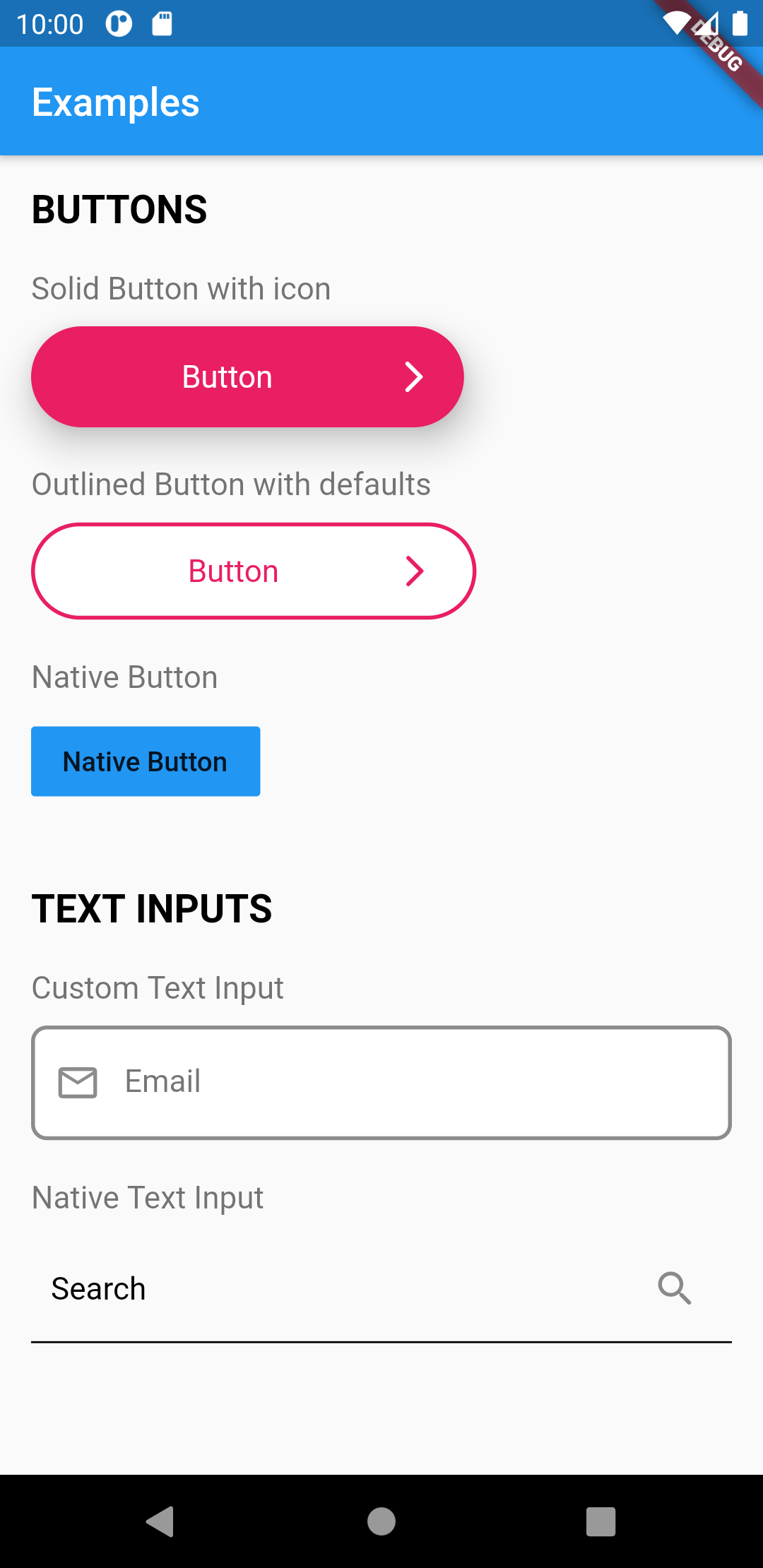
This widget provides a full customizable button.
There are three kind of buttons you can choose from:
UIButton.solid(),
UIButton.outlined(),
UIButton.native(),
To create default styles for the button you need to create a class of type UIButtonDefaults.
You can have a separated directory where you add all your default styles.
// styles/buttons.dart

final primaryButton = UIButtonDefaults(
  elevation: 10.0,
  borderRadius: 50.0,
  borderColor: Colors.purple,
  borderWidth: 2.0,
  labelColor: Colors.purple,
  bgColor: Colors.white,
  widthFactor: 0.5, // sets the button width
);
Then use the button anywhere in your application.
import 'styles/buttons.dart';

// Outlined Button
UIButton.outlined(
    as: primaryButton,
    label: "Outlined Button",
    onPressed: () => print('Call API'),
),

// Solid Button
UIButton.solid(
    as: primaryButton,
    label: "Solid Button",
    onPressed: () => print('Call API'),
),


// Native Button
UIButton.native(
    label: "Button",
    onPressed: () => print('Call API'),
),
This widget can be used to create custom headings or text content.
To create default styles for the heading you need to create a class of type UIHeadingDefaults.
You can have a separated directory where you add all your default styles.
// styles/headings.dart

final articleTitle = UIHeadingDefaults(
    heading: 2,
    color: Colors.pink,
    fontWeight: FontWeight.bold,
);
We can also add custom styles to UIHeading as well
/// Use Google Fonts to set font family and extend stylyes

final articleTitleLato = UIHeadingDefaults(
    color: Colors.pink,
    style: GoogleFonts.lato(
      fontSize: 40.0,
    ),
);
Then use the headings anywhere in your application.
import 'styles/headings.dart'

// Use articleTitle
UIHeading(
    as: articleTitle,
    text: 'Article Title',
),


// Use articleTitleLato
UIHeading(
    as: articleTitleLato,
    text: 'Big title using font Lato',
),
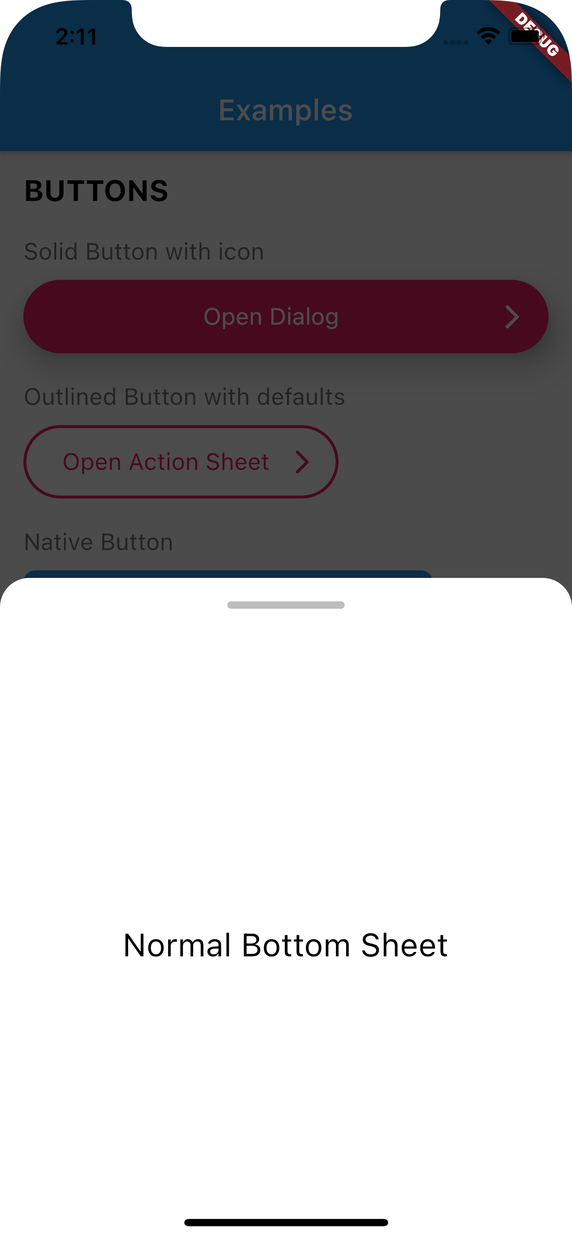
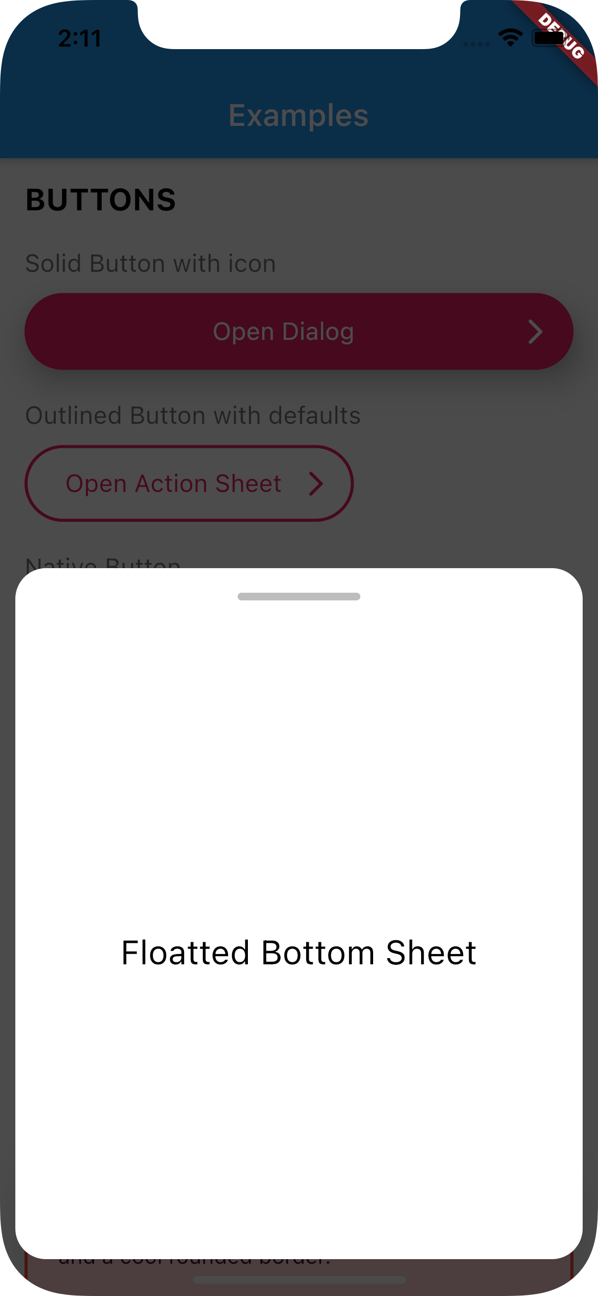
Use UIBottomSheet when you want to display a bottomsheet.
Set floatted: true if you want the bottom sheet to be floatted (have margin all around it, like some iOS bottom sheets)
You can also have a trailing Widget that can be useful for a close button when you have enableDrag set to false.
| Full Width | Floatted | |
 |
 |
Create a function that calls UIBottomSheet.show().
Call the function when you need it (eg.: on tap on a button)
// Set up the bottom sheet

Future<void> _openBottomSheet(BuildContext context) async {
  await UIBottomSheet.show(
    context: context,
    floatted: true,
    hideHead: false,
    content: Container(
      alignment: Alignment.center,
      height: 400,
      child: UIHeading(
        heading: 3,
        text: 'Some cool content',
      ),
    ),
  );
}

// Open the bottom sheet

UIButton.native(
  label: 'Open Bottom Sheet',
  onPressed: () async {

    // OPEN BOTTOM SHEET
    // and wait until it's closed
    await _openBottomSheet(context);

    // proceed
    print('Bottom sheet closed');
  },
),
This widget renders a input text field.
There are two kind of text fields you can choose from:
UITextField(),
UITextField.native(),
To create default styles for the text field you need to create a class of type UITextFieldDefaults.
You can have a separated directory where you add all your default styles.
// styles/inputs.dart


final primaryInput = UITextFieldDefaults(
  borderColor: Colors.black45,
  borderRadius: 8,
  borderType: UIBorderType.outlineBorder,
  borderWidth: 2.0,
  hintColor: Colors.black54,
  bgColor: Colors.white,
);
Then use the inputs anywhere in your application.
import 'styles/inputs.dart'

UITextField(
    as: primaryInput,
    hint: 'Email',
),

// Native Text Field
UITextField.native(
    hint: 'Email',
),
This widget renders a customizable Container.
To create default styles for the container you need to create a class of type UIContainerDefaults.
You can set the size of the contianer by using the widthFactor argument.
You can have a separated directory where you add all your default styles.
// styles/containers.dart

final errorContainer = UIContainerDefaults(
  padding: EdgeInsets.all(20),
  borderRadius: 10,
  widthFactor: 1.0, // make full width
  borderColor: Colors.red,
  borderWidth: 2.0,
  color: Colors.red.shade100,
);
Then use the button anywhere in your application.
import 'styles/containers.dart';

// Show container with error styling
UIContainer(
  as: errorContainer,
  child: Text('This is a box with a nice shadow\nand a cool rounded border.'),
),
This widget creates a Native Action Sheet.
Compared with the other classes in this package,UIActionSheet is a bit more verbose.
However you write once for all platforms.
Create a function that calls UIActionSheet.show().
The actions need to be of type UIAction.
Call the function when you need it (eg.: on tap on a button)
See example below:
// Creates a Native Action Sheet Factory

void _openActionSheet(BuildContext context) {
  UIActionSheet.show(
    context,

    /// TITLE
    title: UIHeading(
      text: 'Select you favorite color',
      color: Colors.blue,
      textAlign: TextAlign.center,
      heading: 5,
    ),

    /// CONTENT
    content: Text('We will use the color on your profile.'),

    /// ACTIONS
    actions: [
      UIAction(
        child: Text('Red'),
        onPressed: () => Navigator.of(context).pop(),
      ),
      UIAction(
        child: Text('Green'),
        onPressed: () => Navigator.of(context).pop(),
      ),
      UIAction(
        child: Text('Bue'),
        onPressed: () => Navigator.of(context).pop(),
      ),
      UIAction(
        child: Text('Pink'),
        onPressed: () => Navigator.of(context).pop(),
      ),
    ],

    /// CANCEL BUTTON
    cancel: UIAction(
      child: UIHeading(
        text: 'Cancel',
        color: Colors.red,
        heading: 4,
      ),
      onPressed: () => print('Cancel'),
    ),
  );
}

// Will open  action sheet based on the current OS

UIButton.solid(
    as: solidButtonStyles,
    label: "Open Action SHeet",
    onPressed: () => _openActionSheet(context),
),
This widget creates a Native Dialog.
Compared with the other classes in this package, UIDialog is a bit more verbose.
However you write once for all platforms.
Create a function that calls UIDialog.show().
The actions need to be of type UIAction.
Call the function when you need it (eg.: on tap on a button)
See example below:
// Creates a Native Dialog Factory

void _openDialog(BuildContext context) {
  UIDialog.show(
    context,

    /// TITLE
    title: Text('Are you sure?'),

    /// CONTENT
    content: Text('You cannot reverse this action.'),

    /// ACTIONS
    actions: [
      UIAction(
        child: Text('YES'),
        onPressed: () => print('YES'),
      ),
      UIAction(
        child: Text('NO'),
        onPressed: () => Navigator.of(context).pop(),
      ),
    ],
  );
}

// Will open a dialog based on the current OS

UIButton.solid(
    as: solidButtonStyles,
    label: "Open Dialog",
    onPressed: () => _openDialog(context),
),
If you find any bug or want to request a feature, feel free to open an issue on Github.
https://github.com/nobrefelipe/flutter_ui_toolkit/issues
I will be improving this package bit by bit and will always try to keep it simple and objective.
If you want to connect with me, send a request on Linkedin: