The Leaflet DVF is an extension to CloudMade's Leaflet JavaScript mapping library. The primary goal of the framework is to simplify data visualization and thematic mapping.


It includes:
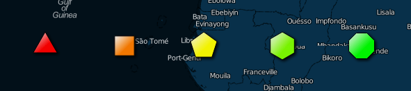
New marker types (see the markers example below):
- MapMarker - create an SVG-based map marker similar to Leaflet's image-based marker, but fully customizable via L.Path style properties
- RegularPolygonMarker - create N-sided shapes like triangles, squares, hexagons, etc.
- StarMarker - create stars with N points
- ChartMarkers - useful for displaying multiple data properties at each location:
- BarChartMarker
- PieChartMarker
- RadialBarChartMarker
- CoxcombChartMarker
- RadialMeterMarker
- StackedRegularPolygonMarker - a variation on the bar chart
- SparklineMarker - graph-based markers for illustrating time series and other x, y data in a geospatial context (Coming soon)
Functions for easily mapping data properties to Leaflet style values:
- LinearFunction
- Color functions:
- HSLHueFunction - vary the output hue based on a data property
- HSLSaturationFunction - vary the output saturation based on a data property
- HSLLuminosityFunction - vary the output lightness/luminosity based on a data property
- Various RGB functions
- Built-in support for Colorbrewer color scales
- PiecewiseFunction - use multiple LinearFunction classes in sequence (e.g. vary a color from white to yellow, yellow to red)
- CustomColorFunction - specify the specific color scale to use. Use L.ColorBrewer to specify Colorbrewer scales.
New layer types that simplify reading and visualizing any JSON-based data structure:
- DataLayer
- ChartDataLayer and corresponding DataLayer instances for various chart types
- ChoroplethDataLayer
- Others
GeoJSON polygons for countries and US states to support Choropleth mapping. Countries are generated from: https://github.com/johan/world.geo.json. Just include these JavaScript files if you plan to build a country or US state choropleth. Polygons are indexed via a state or country code and lookups are created to map various state/country code formats to the default index format.
Automatic legend generation and a simple legend control. To generate a legend, just call getLegend on any DataLayer, or use the provided legend control and the legend will be displayed automatically.
Support for gradient fills and drop shadows, text on Path-based items (e.g. markers, polylines, polygons, etc.), and more.
Callouts for annotating map data. Use the L.Callout class to add individual callouts to your map. See the Markers example for an illustration of callouts.
NOTE: The dist folder includes a minified version of the full framework as well as a minified version of the code required to use the new markers Use leaflet-dvf.markers.min.js if you want to use the new markers without the rest of the framework
Required:
Optional - required for particular classes to work:
- Underscore JS
- Moment JS
- geohash.js
- JavaScript Topology Suite (JSTS)
- Core Framework SVG Utilities Required for full functionality in archaic browsers (see note below)
- TopoJSON Recommended/required for US county lookups
Using the framework in IE8 and below:
Special thanks to Keith Chew of e3solutions for testing and getting things working in IE8 and below. This is still an on-going effort, so additional bug fixes may be forthcoming. The examples provided here may need some tweaking to work in IE8 and below
As you may or may not be aware, IE8 and below do not support SVG. Leaflet and most SVG frameworks mitigate this problem by using Vector Markup Language (VML) instead of SVG when rendering custom shapes and paths. With the latest version of the framework, most of the components will work without requiring any extra dependencies. However, L.RadialBarChartMarker and L.PieChartMarker will require including the Core Framework SVG Utilities. These utilities can convert more complex SVG shapes into corresponding VML shapes.
Concatenate the source files in the following order:
Full:
- src/copyright.js
- src/leaflet.dvf.linearfunctions.js
- src/leaflet.dvf.utils.js
- src/leaflet.dvf.palettes.js
- src/leaflet.dvf.regularpolygon.js
- src/leaflet.dvf.markers.js
- src/leaflet.dvf.chartmarkers.js
- src/leaflet.dvf.datalayer.js
- src/leaflet.dvf.lines.js
- src/leaflet.dvf.controls.js
Markers only:
- src/copyright.js
- src/leaflet.dvf.linearfunctions.js
- src/leaflet.dvf.utils.js
- src/leaflet.dvf.palettes.js
- src/leaflet.dvf.markers.js
- src/leaflet.dvf.chartmarkers.js
NOTE: Most of these examples have multiple layers; use the layers control to see all of the layers
New Marker Types:
Proportional Symbol:
- USGS Earthquakes
- Meetup Finder Zoom to an area of interest, put in a Meetup topic, and click the search button
- Weather
Choropleth Mapping:
Mix:
- WorldBank and UN Data
- Election 2012 Polling Illustrates sizing pie charts by a data value
- 2008 vs 2012 Election Results
- 2008 Election Results
- Netherlands Population by ZIP 2 Thanks to Steven De Schrijver of Conundra for providing the example use case
Images:
- Panoramio Browser NOTE: This is a work in progress but is mostly complete
Lines:
- Napoleon's March Yet another variation of Charle's Minard's famous visualization that illustrates the use of the FlowLine class
- US Airports and Flight Data Illustrates using the L.Graph class for visualizing flights between airports
In Progress:
- Sparklines NOTE: This is a work in progress. The code is incomplete and can be found in src/leaflet.dvf.experimental.js
- Run Map NOTE: This is a work in progress. Illustrates using a WeightedPolyline to show variations in GPS data
- US County Statistics
Tutorials coming soon to HumanGeo's blog
A work in progress ...
Two new optional properties have been added to the basic L.Path properties to enable for a gradient fill and drop shadow. For now, these properties are boolean values, but in the future, support might be added for fine-grained control over the appearance of gradients/drop shadows.
var layer = new <Leaflet Path-based Layer (e.g. L.Polygon)>(<Constructor inputs>, {
	// L.Path style options
	...
	gradient: true,
	dropShadow: true
});

var layer = new <Leaflet Path-based Layer (e.g. L.Polygon)>(<Constructor inputs>, {
	gradient: {
		vector: [['0%', '50%'], ['100%', '50%']],
		stops: [{
			offset: '0%',
			style: {
				color: '#ffffff',
				opacity: 1
			}
		}, {
			offset: '50%',
			style: {
				color: '#ff0000',
				opacity: 1
			}
		}]
	}
});| Option | Type | Default | Description |
|---|---|---|---|
| gradient | Boolean OR Object | differs depending on the layer class (most new marker types use a gradient by default) | Specifying a value of true will fill the path with a gradient from white to the specified fillColor (top left - bottom right) |
| dropShadow | Boolean | false | Specifying a value of true will add a dropShadow to the path |
| Option | Type | Default | Description |
|---|---|---|---|
| vector | Array | [['0%', '0%'], ['100%', '100%']] | an array consisting of a start and end point that defines the direction of the gradient. Each start and end point is an array of x and y values. Where x and y values can be percentage strings (e.g. '100%') or numbers defining an absolute position |
| stops | Array | an array of stop objects defining the colors to be used in the gradient. Each stop object has offset and style properties. See below. |
| Option | Type | Default | Description |
|---|---|---|---|
| offset | String OR Number | The position along the gradient at which to apply the given color/opacity | |
| style | Object | { opacity: 1, color: } | an object with color and opacity properties defining the color and opacity to be used in the given stop. If you omit the color, the Path's fillColor or color will be used automatically. |
You can also add text to any Path based item by passing in the a text option as part of the normal style options
var layer = new <Leaflet Path-based Layer (e.g. L.Polygon)>(<Constructor inputs>, {
	// L.Path style options
	...
	text: {
		text: <Text to display>,
		attr: {<Object of key/value pairs defining SVG element attributes to apply to the text element>},
		style: {<Object of key/value pairs defining style properties to apply to the text element},
		path: {
			startOffset: <percentage or absolute position along the path where text should start>,
			attr: {},
			style: {}
		}
	}
});| Option | Type | Default | Description |
|---|---|---|---|
| text | String | null | The text to display |
| attr | Object | null | A set of key/value pairs that will be added as attributes to the created SVG text element (see the SVG spec for specifics) |
| style | Object | null | A set of key/value pairs that will be added to the style attribute for the created SVG text element (see the SVG spec for specific styles) |
| path | Object | null | This will cause the specified text to be displayed along the path (see options below) |
| Option | Type | Default | Description |
|---|---|---|---|
| startOffset | String | null | Percentage or absolute position along the path where text should start |
| attr | Object | null | A set of key/value pairs that will be added as attributes to the created SVG textPath element (see the SVG spec for specifics) |
| style | Object | null | A set of key/value pairs that will be added to the style attribute for the created SVG textPath element (see the SVG spec for specific styles) |
The framework adds several new marker types geared towards dynamic data visualization. See the Markers example for an illustration of each of these markers.
Creates an SVG-based map marker, similar to the default Leaflet image-based marker but fully customizable using the basic L.Path properties

L.MapMarker(<LatLng> LatLng, <Marker options> options?);
var marker = new L.MapMarker(new L.LatLng(0, 0), {
	radius: 10,
	// L.Path style options
	...
});

map.addLayer(marker);| Option | Type | Default | Description |
|---|---|---|---|
| numberOfSides | Number | 3 | If an inner radius is specified, then the marker will have a hole in center. This property determines the shape of the hole. |
| rotation | Number | 0 | If an inner radius is specified, this controls the rotation of the hole in the center. |
| radius OR radiusX, radiusY | Number | 10 | The radius of the circular part of the marker, also adjusts the height of the marker |
| innerRadius OR innerRadiusX, innerRadiusY | Number | null | The inner radius of the marker hole in pixels. |
| imageCircleUrl | String | null | The URL of an image to display on the marker. This will be displayed in the main circular area of the marker. |
Creates an N-sided marker
L.RegularPolygonMarker(<LatLng> LatLng, <Marker options> options?);
var marker = new L.RegularPolygonMarker(new L.LatLng(0, 0), {
	numberOfSides: 3,
	rotation: 60.0,
	radius: 10,
	// L.Path style options
	...
});

map.addLayer(marker);| Option | Type | Default | Description |
|---|---|---|---|
| numberOfSides | Number | 3 | The number of sides the marker should have |
| rotation | Number | 0.0 | The angle in degrees that the marker should be rotated |
| radius OR radiusX, radiusY | Number | 10 | The radius of the marker in pixels |
| innerRadius OR innerRadiusX, innerRadiusY | Number | null | The inner radius of the marker in pixels. Specifying an innerRadius will produce a regular polygon with a hole in the middle. |
| imageCircleUrl | String | null | The URL of an image to display on the marker. This will be displayed in the main circular area of the marker. |

Creates a star-shaped marker with N-points
L.StarMarker(<LatLng> LatLng, <StarMarker options> options?);
| Option | Type | Default | Description |
|---|---|---|---|
| numberOfPoints | Number | 5 | The number of points the star should have |


Display dynamic charts (bar chart, radial bar chart, pie chart, coxcomb chart, etc.) as markers
L.BarChartMarker(<LatLng> LatLng, <Chart options> options?);
L.RadialBarChartMarker(<LatLng> LatLng, <Chart options> options?);
L.PieChartMarker(<LatLng> LatLng, <Chart options> options?);
L.CoxcombChartMarker(<LatLng> LatLng, <Chart options> options?);
L.StackedRegularPolygonMarker(<LatLng> LatLng, <Chart options> options?);
L.RadialMeterMarker(<LatLng> LatLng, <Chart options> options?);
var options = {
	data: {
		'dataPoint1': Math.random() * 20,
		'dataPoint2': Math.random() * 20,
		'dataPoint3': Math.random() * 20,
		'dataPoint4': Math.random() * 20
	},
	chartOptions: {
		'dataPoint1': {
			fillColor: '#FEE5D9',
			minValue: 0,
			maxValue: 20,
			maxHeight: 20,
			displayText: function (value) {
				return value.toFixed(2);
			}
		},
		'dataPoint2': {
			fillColor: '#FCAE91',
			minValue: 0,
			maxValue: 20,
			maxHeight: 20,
			displayText: function (value) {
				return value.toFixed(2);
			}
		},
		'dataPoint3': {
			fillColor: '#FB6A4A',
			minValue: 0,
			maxValue: 20,
			maxHeight: 20,
			displayText: function (value) {
				return value.toFixed(2);
			}
		},
		'dataPoint4': {
			fillColor: '#CB181D',
			minValue: 0,
			maxValue: 20,
			maxHeight: 20,
			displayText: function (value) {
				return value.toFixed(2);
			}
		}
	},
	weight: 1,
	color: '#000000',
	... // Other L.Path style options
}

var barChartMarker = new L.BarChartMarker(new L.LatLng(0, 0), options);| Option | Type | Default | Description |
|---|---|---|---|
| data | Object | null | A set of key/value pairs that provides a data value for each property displayed by the marker |
| chartOptions | Object | null | A set of key/value pairs that defines the options associated with each data property displayed by the marker. |
| backgroundStyle (L.RadialMeterMarker) | Object | L.Path object with a semi-transparent gray fill and stroke | An object of L.Path style options that will be used to style the background area of the chart. Set this to null or false to prevent a background from being displayed. |
Used for annotating markers, lines, and polygons. Callouts include a line and associated icon (L.Icon or L.DivIcon).
L.Callout(<LatLng> latlng, <Callout options> options?);
var callout = new L.Callout(new L.LatLng(0.0, 0.0), {
	arrow: true,
	numberOfSides: 3,
	radius: 8,
	icon: new L.DivIcon(...),
	direction: L.CalloutLine.DIRECTION.NE,
	lineStyle: L.CalloutLine.LINESTYLE.ARC,
	size: new L.Point(50, 50),
	weight: 2,
	fillOpacity: 1.0,
	color: '#FFFFFF',
	fillColor: '#FFFFFF'
});

map.addLayer(callout);| Option | Type | Default | Description |
|---|---|---|---|
| arrow | Boolean | true | true/false - whether or not an arrow should be added to the end of the callout line |
| numberOfSides | Number | 3 | The number of sides the arrow at the end of the callout line will have. |
| radius | Number | 6 | The radius of the arrow that will be displayed at the end of the callout line |
| icon | Object | null | An L.Icon or L.DivIcon object that will be displayed at the end of the callout line |
| direction | String | 'ne' | The quadrant in which the callout will be placed: 'ne', 'se', 'sw', 'nw'. Use L.CalloutLine.DIRECTION properties (NE, SE, SW, NW) to specify this |
| lineStyle | String | 'angle' | The style of the associated callout line: 'arc', 'angle', 'straight'. Use L.CalloutLine.LINESTYLE properties (ARC, ANGLE, STRAIGHT) to specify this. 'arc' displays a curved line, 'angle' displays an angled line, and 'straight' displays a straight line from the annotation point to the associated icon. |
| size | Object | L.Point(60, 30) | The bounds of the callout line |
Include L.Path options to style the callout line associated with the callout object (e.g. color, fillColor, weight, etc.)
Draws an arced polyline. Rather than drawing a straight line from latlng1 to latlng2, this class draws an arced line from latlng1 to latlng2. The height of the arc is proportional to the distance between latlng1 and latlng2 and defined by a customizable L.LinearFunction instance. This is useful for illustrating spatial relationships, flight paths, etc.
L.ArcedPolyline(<LatLng[]> latlngs, <ArcedPolyline options> options?);
var arcedPolyline = new L.ArcedPolyline([...], {
	distanceToHeight: new L.LinearFunction([0, 0], [4000, 400]),
	color: '#FF00000',
	weight: 4
});

map.addLayer(arcedPolyline);| Option | Type | Default | Description |
|---|---|---|---|
| distanceToHeight | L.LinearFunction | new L.LinearFunction([0, 5], [1000, 200]) | An L.LinearFunction instance that maps the distance between two points to an arc height in pixels |
Classes for mapping data properties to Leaflet style values
Used to map a data property from one scale to another
L.LinearFunction(<Number[]|Point> minPoint, <Number[]|Point> maxPoint, <LinearFunction options> options?);
// Map a data property that ranges from 0 to 100 to a value between 5 and 20 (e.g. marker radius)
var linearFunction = new L.LinearFunction(new L.Point(0, 5), new L.Point(100, 20));

// OR - In addition to L.Point objects, you can also use arrays
var linearFunction = new L.LinearFunction([0, 5], [100, 20]);

console.log(linearFunction.evaluate(10)); // prints 6.5| Option | Type | Default | Description |
|---|---|---|---|
| preProcess | Function | null | A function for pre-processing an input value |
| postProcess | Function | null | A function for post-processing an output value |
| Method | Usage | Description |
|---|---|---|
| evaluate | linearFunction.evaluate(<value>); |
Interpolates an output value based on the passed in input value |
Used to map a data property to a color. The framework includes tools for mapping color using Hue, Saturation, and Lightness/Luminosity (HSL) or Red, Green, Blue (RGB) color. See the Colors example.
Change the output hue dynamically based on the input data property Useful for producing colors along a rainbow scale (or subset)
L.HSLHueFunction(<Number[]|Point> minPoint, <Number[]|Point> maxPoint, <HSL options> options?);
Change the output saturation dynamically based on the input data property Useful for varying between a color and gray
L.HSLSaturationFunction(<Number[]|Point> minPoint, <Number[]|Point> maxPoint, <HSL options> options?);
Change the output luminosity dynamically based on the input data property Useful for varying between a color and white
L.HSLLuminosityFunction(<Number[]|Point> minPoint, <Number[]|Point> maxPoint, <HSL options> options?);
Change the output red value dynamically based on the input data property
L.RGBRedFunction(<Number[]|Point> minPoint, <Number[]|Point> maxPoint, <RGB options> options?);
Change the output blue value dynamically based on the input data property
L.RGBBlueFunction(<Number[]|Point> minPoint, <Number[]|Point> maxPoint, <RGB options> options?);
Change the output green value dynamically based on the input data property
L.RGBGreenFunction(<Number[]|Point> minPoint, <Number[]|Point> maxPoint, <RGB options> options?);
Vary the output color dynamically between two RGB colors
L.RGBColorBlendFunction(<Number> minX, <Number>> maxX, <RGB array> minColor, <RGB array> maxColor);
// Map a data property that ranges from 0 to 100 to a color between green (hue of 120) and red (hue of 0)
var colorFunction = new L.HSLHueFunction(new L.Point(0, 120), new L.Point(100, 20));

colorFunction.evaluate(10); // prints 'hsl(110.00, 100%, 50%)'| Option | Type | Default | Description |
|---|---|---|---|
| outputHue | Number | 0 | The desired output hue NOTE: use with L.HSLSaturationFunction and L.HSLLuminosityFunction |
| outputSaturation | String | '100%' | The desired output saturation NOTE: use with L.HSLHueFunction and L.HSLLuminosityFunction |
| outputLuminosity | String | '50%' | The desired width of the legend element NOTE: use with L.HSLHueFunction and L.HSLSaturationFunction |
| Option | Type | Default | Description |
|---|---|---|---|
| outputRed | Number (0..255) | null | The desired output red value NOTE: use with L.RGBGreenFunction and L.RGBBlueFunction |
| outputGreen | Number | (0..255) | The desired output green value NOTE: use with L.RGBRedFunction and L.RGBBlueFunction |
| outputBlue | Number | (0..255) | The desired output blue value NOTE: use with L.RGBRedFunction and L.RGBGreenFunction |
Used to combine L.LinearFunction instances for cases where one instance won't suffice
L.PiecewiseFunction(<LinearFunction[]> functions, <LinearFunction options> options?);
// Map a data property that ranges from 0 to 100 to a color that ranges from white to yellow, yellow to red
// To vary a color between white and that color, use an HSLLuminosityFunction.  In this case we'll vary
// the color from white to yellow until the value reaches 50
var whiteToYellow = new L.HSLLuminosityFunction(new L.Point(0, 1), new L.Point(50, 0.5), {
	outputHue: 60
});

// We'll then vary the color from yellow to red from 50 to 100
var yellowToRed = new L.HSLHueFunction(new L.Point(50, 60), new L.Point(100, 0));

// Create a new PiecewiseFunction and use this as you would any other LinearFunction
var colorFunction = new L.PiecewiseFunction([whiteToYellow, yellowToRed]);

...Support loading and displaying data from any JSON-based object/collection
Display data values using L.RegularPolygonMarker instances. To override the default marker behavior, use the getMarker option or inherit from DataLayer and override _getMarker. In thematic mapping, this class displays data using proportional symbols.
NOTE: If the location features are lines/polygons (e.g. GeoJSON), this class will use the centroid of each line/polygon to place each marker. When dealing with line/polygon features, you must include a reference to the JavaScript Topology Suite (JSTS) JS files. These files are used to calculate centroids. If these files are not included, the DataLayer class will fallback to using the center of the bounds of the layer's geometry.
L.DataLayer(<Object> data, <DataLayer options> options?);
| Option | Type | Default | Description |
|---|---|---|---|
| recordsField | String | 'features' | A pointer to the field in the input data that contains the records to be visualized. Use null when the data being passed in is the set of records to be visualized. Use dot notation to specify child properties (e.g. data.election.resultsByState), see note below. |
| locationMode | String | 'latlng' OR L.LocationModes.LATLNG | The mode used to determine a location for each record. Use a string or the L.LocationModes constant values |
| latitudeField | String | 'coordinates.1' | The property of each record that contains the latitude NOTE: Use with 'latlng' locationMode |
| longitudeField | String | 'coordinates.0' | The property of each record that contains the longitude NOTE: Use with 'latlng' locationMode |
| codeField | String | null | The property of each record that contains the code used to lookup a location NOTE: Use with 'state', 'country', or 'lookup' locationMode values |
| geohashField | String | null | The property of each record that contains the geohash used to determine a location NOTE: Use with 'geohash' locationMode values |
| layerOptions | Object | null | Default style - An object containing Leaflet L.Path style properties that will be used as the default style for DataLayer markers/polygons. These properties will be overridden by the displayOptions. |
| displayOptions | Object | null | Dynamic styles - An object containing pointers to one or property values of each record with associated L.Path style properties and LinearFunction objects |
| tooltipOptions | Object | null | Options used to configure the tooltips that are displayed on mouseover (iconSize and iconAnchor) |
| onEachRecord | Function | null | A function that performs additional operations (e.g. binding a popup) on a created layer based on the record associated with that layer (similar to the L.GeoJSON onEachFeature method). Note that the parameter ordering is: layer, record. This is slightly different from the L.GeoJSON onEachFeature method, where the ordering is: featureData, layer. |
| includeLayer OR filter | Function | null | A function for determining whether or not the layer for a given record should be added to the map. |
| getLocation | Function | null | A function for getting a custom location from a record (e.g. looking up an address) NOTE: Use with 'custom' locationMode value |
| locationLookup | Object (GeoJSON FeatureCollection) | null | A GeoJSON FeatureCollection that will be used to lookup the location associated with a given record. This is useful when you have some data that maps to political/statistical boundaries other than US states or countries. NOTE: Use with 'lookup locationMode |
| locationIndexField | String | null | A string identifying the field that will be used to index GeoJSON Feature objects when the locationMode is L.LocationModes.LOOKUP. If you don't specify this field, the DataLayer will use the codeField value as the property to use when indexing GeoJSON Features |
| includeBoundary | Boolean | null | true/false - whether or not the boundary polygon should be displayed when displaying proportional symbols. This is useful for identifying the boundary associated with each symbol. |
| boundaryStyle | Object | null | Path style options used for specifying how the boundary associated with the point will be displayed |
| getMarker | Function | null | A function for overriding the default marker that gets placed at each location. The function takes a latlng and options as parameters. |
Use dot notation to reference items in the passed in data object. This applies to all field options (e.g. recordsField) as well as displayOptions.
Given an object like:
{
	data: {
		values: [
			{
				property1: 1,
				property2: 'akdfljlkfds',
				property3: 234,
				location: [-1.234324, 13.123213],
				additional: {
					property1: 2,
					property2: 56
				}
			},
			...
			{
				property1: 34,
				property2: 'werewrwer',
				property3: 56,
				location: [5.435444, 8.999345],
				additional: {
					property1: 88,
					property2: 3
				}
			}
		]
	}
}
You might specify the following options:
{
	recordsField: 'data.values',
	locationMode: L.LocationModes.LATLNG,
	latitudeField: 'location.1'  // Points to the second item in the location array
	longitudeField: 'location.0' // Points to the first item in the location array,
	displayOptions: {
		'additional.property1': {
			... // See displayOptions below
		}
	}
}The displayOptions option is used to define how data properties are dynamically mapped to display styles. It's a JavaScript object of key/value pairs that follows the pattern:
{
	<reference to data property 1>: {
		displayName: <Human-readable text describing this property>,
		displayText: <Function for converting the value of this property to a human-readable value>,
		// Leaflet L.Path style properties with static values or L.LinearFunction instances
		// or just functions for dynamic mapping
		color:  <Color function or basic function (e.g. L.HSLHueFunction)>,
		fillColor:  <Color function or basic function (e.g. L.HSLHueFunction)>,
		...
	},
	<reference to data property 2>: {
		displayName: ...,
		displayText: ...,
		...
	},
	...
	<reference to data property X>: {
		displayName: ...,
		displayText: ...,
		...
	}
}Display data values using ChartMarker instances (inherits from L.DataLayer)
L.BarChartDataLayer(<Object> data, <ChartDataLayer options> options?);
L.RadialBarChartDataLayer(<Object> data, <ChartDataLayer options> options?);
L.PieChartDataLayer(<Object> data, <ChartDataLayer options> options?);
L.CoxcombChartDataLayer(<Object> data, <ChartDataLayer options> options?);
L.StackedRegularPolygonDataLayer(<Object> data, <ChartDataLayer options> options?);
| Option | Type | Default | Description |
|---|
NOTE: You can use the displayOptions option to size ChartMarker instances dynamically by some property of each record. See the DataLayer options above for more information about displayOptions.
Display data values using dynamically styled points, lines, and polygons (inherits from L.DataLayer)


L.ChoroplethDataLayer(<Object> data, <DataLayer options> options?);
| Option | Type | Default | Description |
|---|
Display data values using markers based on L.Icon or L.DivIcon icons (inherits from L.DataLayer)
L.MarkerDataLayer(<Object> data, <MarkerDataLayer options> options?);
| Option | Type | Default | Description |
|---|
Display Panoramio images on the map. Shows the top 50 most popular images for the current map view. NOTE: Requires Moment.js Check out Panoramio Browser for an example of using this layer.

L.PanoramioLayer(<PanoramioLayer options> options?);
| Option | Type | Default | Description |
|---|---|---|---|
| photoSet | String | public | The Panoramio API photo set to use for retrieving images. Can be one of 'public' - the most popular photos, 'full' - all photos, or a specific author id |
| updateInterval | Number | 300000 | The number of milliseconds to wait before updating the current view |
| size | String | square | The marker image size ("square" or "mini_square") |
| refreshEvents | String | moveend | The Leaflet events that will trigger a refresh of photos (separate with spaces) |
| onEachPhoto | Function | null | A function that will be called for each photo in the collection of retrieved photos. This is similar to the onEachRecord function of a DataLayer. |
Useful for visually informing users about the dynamic styles associated with your L.DataLayer instances
Add this control to your map to automatically display a dynamic legend for any L.DataLayer based instance that you add to your map
var legendControl = new L.Control.Legend();

legendControl.addTo(map);Call getLegend on any L.DataLayer instance to get an HTML element that can be added to your page
layer.getLegend(<Legend options> options?);
var layer = new L.DataLayer(data, {...});

layer.getLegend(); // Returns HTML| Option | Type | Default | Description |
|---|---|---|---|
| className | String | null | A class name that will be added to the legend element, useful for adding custom CSS styles |
| numSegments | Number | 10 | The number of segments/bars to include in the legend element |
| width | Number | 100 | The desired width of the legend element |