subplot: problems with stacked histograms bins and legends when few datapoints #1456
Description
What I want to do
Hello! I'm currently creating a shiny app using plotly to show histograms of my data. My intention is to emulate the ggplot2 function facet_grid with stacked histograms. With enough data, the code seems to work correctly, but when the data is scarce, some strange things start to happen. Specifically, the size of the bins gets distorted and the legend has fewer categories than what it should.
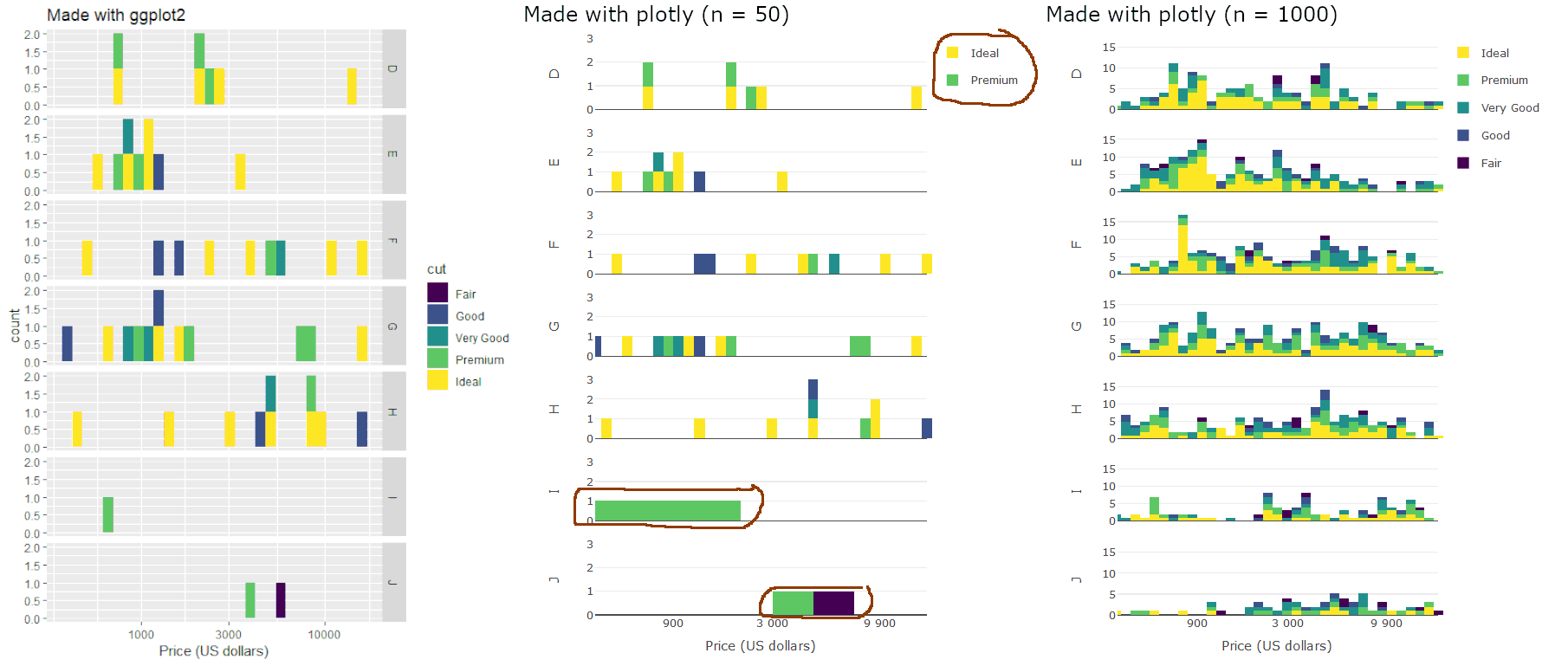
Here's a quick comparison of 3 outputs:
- Left and middle: made with
ggplotandplotlyrespectively, using the same 50 rows of data in both cases. The latter has the aforementioned problems. - Right: made with
plotly(using the same code as the middle figure), using 1000 rows of data. This one seems OK.

Reprex
(not made with reprex package)
The following code sets up the R session and the data, including the amount of datapoints needed to recreate the figures (change to size = 1000 to get the one on the right):
library(ggplot2)
library(dplyr)
library(magrittr)
library(plotly)
library(scales)
library(grDevices)

set.seed(0)
di <- diamonds %>%
  sample_n(size = 50)
My goal is to reproduce plot on the left (created with the code below), w/o using the ggplotly function (mainly because of this).
p <- ggplot(di) +
  aes(price, fill = cut) +
  facet_grid(color ~ .) +
  geom_histogram() +
  scale_x_log10() +
  ggtitle("Made with ggplot2") +
  xlab("Price (US dollars)")
print(p)
Manipulating the data for plot_ly
First I need to manually set the breaks and counts for the histogram bins (the type = "log" option for the xaxis has some problems). To do this I use the hist and cut functions:
# With hist I set the breaks and midpoints of said breaks:
h <- hist(di$price %>% log10, breaks = 30, plot = FALSE)

# Using cut I get a factor with all the bins:
intervals <- cut(log10(di$price), breaks = h$breaks)
midpoints <- intervals
levels(midpoints) <- h$mids

# This are the x values used in the final plots:
midpoints <- midpoints %>%
  as.character %>%
  as.numeric
Finally I calculate de counts for all the bins, using all combinations of the columns cut, color and midpoints (note that I group by intervals too, which coincide with the grouping made with midpoints; the goal is to have the intervals for hovermode info):
plot_data <- di %>%
  mutate(mids = midpoints,
         ints = intervals) %>%
  count(cut, color, mids, ints)
Setting up the plotting parameters
Here I set up the plot_ly parameters. First I set a common range for the y axis (yrange):
maxCount <- plot_data %>%
  group_by(color, mids) %>%
  summarise(N = sum(n, na.rm=TRUE)) %>%
  (function(x) max(x$N))
yrange <- c(0, maxCount) # The range for all the y axis
Then I set up both axis, which are lists. The first part involves calculating the breaks for x axis, using functions from the scales package (log10_trans and number):
plot_breaks <- log10_trans()$breaks(di$price)

xaxis <- list(
  title = "Price (US dollars)",
  tickvals = log10(plot_breaks),
  ticktext = number(plot_breaks, accuracy = min(plot_breaks)),
  range = range(log10(di$price))
  )
yaxis <- list(
  fixedrange = FALSE,
  range = yrange
  )
Creating the plot objects
In this part I split the data by the column color and then I create a list to store the plots. I also made the plotFun as a wrapper for the plotly commands for the sake of cleanlyness.
pdata_split <- split(plot_data, plot_data[["color"]])
plots <- vector("list", length(pdata_split))

plotFun <- function(i, showlegend = TRUE) {
  yaxis$title <- names(pdata_split)[i]
  pdata_split[[i]] %>%
    plot_ly(
      x = ~mids, y = ~n, color = ~cut,
      legendgroup = ~cut,
      showlegend = showlegend,
      text = ~paste0("Rango: ", ints, "\n",
                     "Conteo: ", n),
      hoverinfo = "text+name") %>%
    add_bars() %>%
    layout(
      hovermode = "compare",
      barmode = "stack",
      bargap = 0,
      xaxis = xaxis,
      yaxis = yaxis
    )
}
Finally I excecute the plot_ly commands using a loop, with an iteration for each "color" category in the dataset:
plots[[1]] <- plotFun(1, TRUE)
for (i in 2:length(pdata_split))
  plots[[i]] <- plotFun(i, FALSE)

sp <- subplot(plots, nrows = i, shareX = TRUE,
              shareY = TRUE, titleY = TRUE)
The (sub)plot:
print(sp)
UPDATE
Found a hacky solution to this, check my following comment.