ggplotly rewrites axis tick labels (specified in scale_x_continuous) incorrectly #1721
Description
Hi! Thank you for the great package!
Last time when trying to convert ggplot object into plotly I met the following bug.
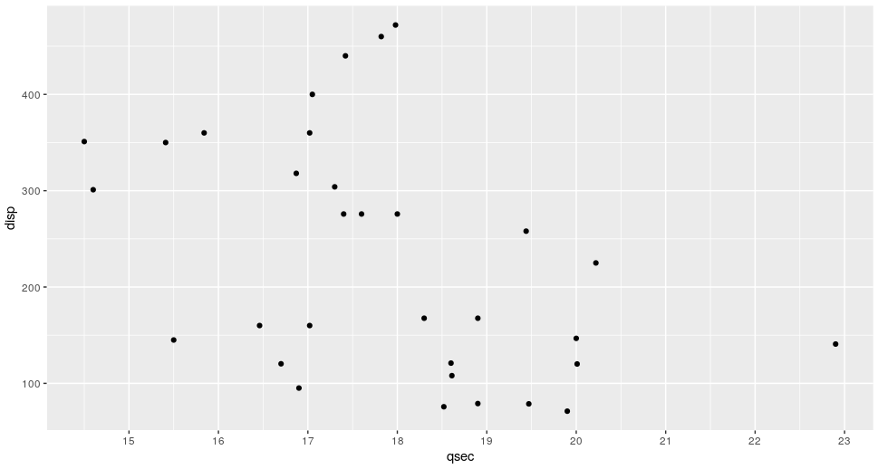
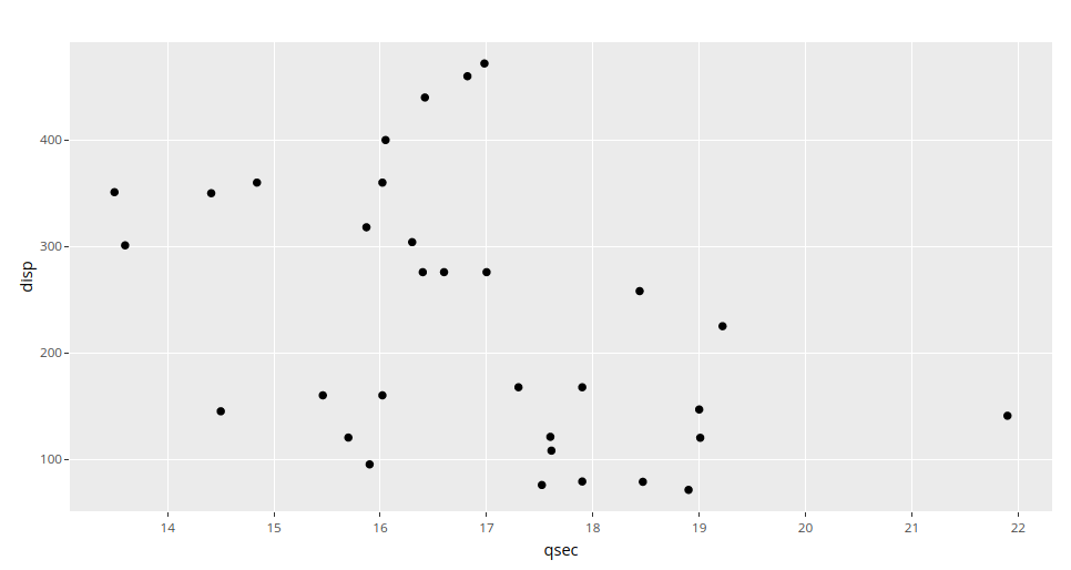
When specifying labels in scale_x_continuous for original ggplot object and then converting it to plotly with ggplotly the tick labels are moved one tick to the right.
Original ggplot:
library(ggplot2)
library(plotly)

p <- ggplot(data = mtcars, aes(x = qsec, y = disp)) +
  geom_point() +
  scale_x_continuous(
    breaks = pretty(range(mtcars$qsec), n = 10),
    labels = pretty(range(mtcars$qsec), n = 10)
  )
p
Plotly version:
ggplotly(p)
SessionInfo:
R version 3.6.1 (2019-07-05)
Platform: x86_64-pc-linux-gnu (64-bit)
Running under: Debian GNU/Linux 9 (stretch)

Matrix products: default
BLAS/LAPACK: /usr/lib/libopenblasp-r0.2.19.so

locale:
 [1] LC_CTYPE=en_US.UTF-8       LC_NUMERIC=C               LC_TIME=en_US.UTF-8        LC_COLLATE=en_US.UTF-8
 [5] LC_MONETARY=en_US.UTF-8    LC_MESSAGES=C              LC_PAPER=en_US.UTF-8       LC_NAME=C
 [9] LC_ADDRESS=C               LC_TELEPHONE=C             LC_MEASUREMENT=en_US.UTF-8 LC_IDENTIFICATION=C

attached base packages:
[1] stats     graphics  grDevices utils     datasets  methods   base

other attached packages:
[1] plotly_4.9.2  ggplot2_3.3.0