Parallel coordinates chart handle normalized data #2468
Description
Hi, I am working with a group of normalized data, each data range is between 0 to 1. I want to use the parallel coordinate chart to do data visualization, however, the chart did not produce the correct tick value for the y-axes.
Below is the code I am testing on the https://codepen.io/plotly/pen/ZepaxM, simply change the first dictionary in the dimension can reproduce the error.
var trace = {
  type: 'parcoords',
  line: {
    color: 'blue'
  },

  dimensions: [{
    range: [0.1, 0.5],
    constraintrange: [0.1, 0.2],
    label: 'A',
    values: [0.1,0.4]
  }, {
    range: [1,5],
    label: 'B',
    values: [3,1.5],
    tickvals: [1.5,3,4.5]
  }, {
    range: [1, 5],
    label: 'C',
    values: [2,4],
    tickvals: [1,2,4,5],
    ticktext: ['text 1','text 2','text 4','text 5']
  }, {
    range: [1, 5],
    label: 'D',
    values: [4,2]
  }]
};

var data = [trace]

Plotly.plot('graphDiv', data);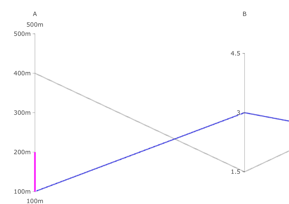
Any suggestions on solving this issue will be appreciated