Plotly Annotations show random behaviour as the number of subplots increase vertically #3043
Description
I am trying to implement a live plotly app that updates every one minute. I face an issue with trying to show the annotations of each subplot, I am using annotations in the first place as I didn't find a method to show the legend of each subplot inside the subplot seperately, so I began using annotations to show the legend for each subplot separately.
my code is as follows which updates every one minute and fetches all the necessary data through the fetch_data() function:
app = dash.Dash(name)
app.layout = html.Div([
    html.Div([
        dcc.Graph(id="fig1", animate=False),
    ]),
    dcc.Interval(
        id='graph-update',
        interval=60*1000, n_intervals=0
    ),
])

@app.callback(
    [Output("fig1", "figure"),], [Input('graph-update' , 'n_intervals')])
def charts(self):
    df = fetch_data()
    fig1 = make_subplots(rows=9, cols=1, shared_xaxes=True, vertical_spacing=0.05,
        specs=[[{"secondary_y": True}], [{ }],[{ }],[{ }],[{ }],[{ }],[{ }],[{ }],[{ }]],)

    fig1.add_trace(go.Scatter(x=df['date'], y=df['sumOpenInterest'], fill='tozeroy', name='Sum of OI'),row=1,col=1,secondary_y=False)
    fig1.add_trace(go.Scatter(x=df['date'], y=df['sumOpenInterestValue'], name='Sum of OI value', line=dict(color='#e377c2')),row=1,col=1,secondary_y=True,)
    fig1.update_yaxes(range=[df['sumOpenInterest'].min(), df['sumOpenInterest'].max()], row=1, col=1, secondary_y=False,)
    fig1.update_yaxes(range=[df['sumOpenInterestValue'].min(), df['sumOpenInterestValue'].max()], row=4, col=1, secondary_y=True,)

    fig1.add_trace(go.Bar(x=df['date'], y=df['topglobalratio'], name='Top/Global Ratio'),row=8,col=1)
    fig1.update_yaxes(tickfont_size=10, tickfont_family='Droid Sans Mono',range=[df['topglobalratio'].min(), df['topglobalratio'].max()*1.2], row=8, col=1)

    fig1.add_trace(go.Scatter(x=df['date'], y=df['fundingRate'], fill='tozeroy', name='Funding Rate'),row=3,col=1)
    fig1.update_yaxes(tickfont_size=10, tickfont_family='Droid Sans Mono',range=[df['fundingRate'].min(), df['fundingRate'].max()*2], row=3, col=1, ticksuffix='%',)

    fig1.update_xaxes(rangeslider_visible=False, showgrid=False)
    fig1.update_yaxes(showgrid=False)

    fig1.update_layout(
        title_x=0.5,
        showlegend = False,
        width=1400, height=800,
        margin=dict( pad=4 ),

        annotations=[
            dict(x=df['date'].iloc[-50], y=df['sumOpenInterest'].max(),
                xref='x1', yref='y1', text='<b>Open Interest</b>',
                showarrow=False, font=dict(family = 'Courier New', size=10,)
            ),
            dict(x=df['date'].iloc[-50], y=df['topglobalratio'].max(),
                xref='x9', yref='y9', text='<b>Top/Global Ratio</b>', xanchor='right', yanchor='bottom',
                showarrow=False, font=dict(family = 'Courier New', size=10, )
            ),
            dict(x=df['date'].iloc[-25], y=df['fundingRate'].max(),
                xref='x4', yref='y4', text='<b>Funding Rate</b>',
                showarrow=False, font=dict(family = 'Courier New', size=5,)
            ),
        ]
    )
    return [fig1]

if __name__ == '__main__':
    app.run_server(debug=True)
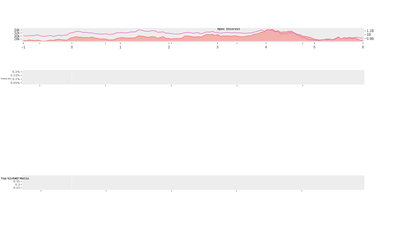
The output looks as follows
I also tried to simply use 3 subplots and check the behaviour using the following code:
@app.callback(
    [Output("fig1", "figure"),], [Input('graph-update' , 'n_intervals')])
def charts(self):
    df = fetch_data()
    fig1 = make_subplots(rows=3, cols=1, shared_xaxes=True, vertical_spacing=0.05,
        specs=[[{"secondary_y": True}], [{ }],[{ }],],)

    fig1.add_trace(go.Scatter(x=df['date'], y=df['sumOpenInterest'], fill='tozeroy', name='Sum of OI'),row=1,col=1,secondary_y=False)
    fig1.add_trace(go.Scatter(x=df['date'], y=df['sumOpenInterestValue'], name='Sum of OI value', line=dict(color='#e377c2')),row=1,col=1,secondary_y=True,)
    fig1.update_yaxes(range=[df['sumOpenInterest'].min(), df['sumOpenInterest'].max()], row=1, col=1, secondary_y=False,)
    fig1.update_yaxes(range=[df['sumOpenInterestValue'].min(), df['sumOpenInterestValue'].max()], row=4, col=1, secondary_y=True,)

    fig1.add_trace(go.Bar(x=df['date'], y=df['topglobalratio'], name='Top/Global Ratio'),row=2,col=1)
    fig1.update_yaxes(tickfont_size=10, tickfont_family='Droid Sans Mono',range=[df['topglobalratio'].min(), df['topglobalratio'].max()*1.2], row=2, col=1)

    fig1.add_trace(go.Scatter(x=df['date'], y=df['fundingRate'], fill='tozeroy', name='Funding Rate'),row=3,col=1)
    fig1.update_yaxes(tickfont_size=10, tickfont_family='Droid Sans Mono',range=[df['fundingRate'].min(), df['fundingRate'].max()*2], row=3, col=1, ticksuffix='%',)

    fig1.update_xaxes(rangeslider_visible=False, showgrid=False)
    fig1.update_yaxes(showgrid=False)

    fig1.update_layout(
        title_x=0.5,
        showlegend = False,
        width=1400, height=800,
        margin=dict( pad=4 ),

        annotations=[
            dict(x=df['date'].iloc[-50], y=df['sumOpenInterest'].max(),
                xref='x1', yref='y1', text='<b>Open Interest</b>',
                showarrow=False, font=dict(family = 'Courier New', size=10,)
            ),
            dict(x=df['date'].iloc[-50], y=df['topglobalratio'].max(),
                xref='x3', yref='y3', text='<b>Top/Global Ratio</b>', xanchor='right', yanchor='bottom',
                showarrow=False, font=dict(family = 'Courier New', size=10, )
            ),
            dict(x=df['date'].iloc[-25], y=df['fundingRate'].max(),
                xref='x4', yref='y4', text='<b>Funding Rate</b>',
                showarrow=False, font=dict(family = 'Courier New', size=5,)
            ),
        ]
    )
    return [fig1]

if __name__ == '__main__':
    app.run_server(debug=True)
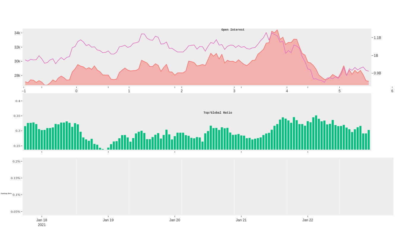
The result seems to be better with the second subplot now actually showing the annotation
and without the annotations part of the code (just commented out the following part of the code) everything seems to work absolutely fine
# dict(x=df['date'].iloc[-50], y=df['topglobalratio'].max(),
#     xref='x3', yref='y3', text='<b>Top/Global Ratio</b>', xanchor='right', yanchor='bottom',
#     showarrow=False, font=dict(family = 'Courier New', size=10, )
# ),
# dict(x=df['date'].iloc[-25], y=df['fundingRate'].max(),
#     xref='x4', yref='y4', text='<b>Funding Rate</b>',
#     showarrow=False, font=dict(family = 'Courier New', size=5,)
# ),

Would highly appreciate if someone could direct me on where things are starting to get messy.