-
-
Notifications
You must be signed in to change notification settings - Fork 2.7k
Description
I've found a bug while customizing colours in a Scatter 3D plot. I'm using the attached file (actually a .json file) which contains, for a 3d point in a 3D space (x, y and z values), some other values (let's call it M, E, F, etc.). I want to plot this 3D points using a scatter plot and change the colour of each point depending on the other values.
Sample of this source file:
{
     "x": 1,
     "y": -31,
     "z": -63,
     "M": -2,
     "E": -2,
     "F": -2,
     "CE": -2,
     "MA": -2,
     "R": -2
}
import plotly.express as px
import numpy as np
import pandas as pd
import json
with open("voxels_with_calculated.json", "r") as in_file:
    json_data = json.load(in_file)
json_df = pd.DataFrame(json_data["values"])

# Colours don't render correctly so every colour has a comment saying how it looks in a colour picker and how it looks in
# the plot
grey_colour = 'rgba(0, 0, 0, 0.5)'
def row_to_color(df_row):
    if df_row["M"] == -2: #invalid value
        return grey_colour
    #elif df_row["F"] > -2: #
    #    return 'rgba(222, 44, 86, 1)' #reddish colour
    elif df_row["R"] > 6:
        return 'rgba(243, 206, 215, 1)' #white with reddish tone colour/ yellowish in plot
    elif df_row["CE"] > 8 and df_row["MA"] < 60:
        return 'rgba(253, 250, 149, 1)' #yellowish colour / turquoise in the plot
    elif df_row["E"] > 9 and df_row["MA"] < 60:
        return 'rgba(255, 173, 105, 1)' #orange colour / pinkish in the plot
    elif df_row["E"] > 5 and df_row["M"] > 6 and df_row["MA"] < 60:
        return 'rgba(185, 116, 247, 1)' #purple colour
    elif df_row["M"] > 9 and df_row["MA"] < 60:
        return 'rgba(138, 235, 205, 1)' #turquoise colour / purple in plot
    elif df_row["M"] > 10 and df_row["MA"] > 50:
        return 'rgba(138, 235, 140, 1)' #green colour / purple in the plot
    elif df_row["MA"] > 60:
        return 'rgba(229, 138, 235, 1)' #turquoise colour
    else:
        return 'rgba(0,0,0, 1)'

custom_color = json_df.apply(row_to_color, axis=1)
fig = px.scatter_3d(json_df, x="x", y="y", z="z", custom_data=["M", "E", "F", "CE", "MA", "R"], color=custom_color)
fig.update_traces(
    hovertemplate="<br>".join([
        "M: %{customdata[0]}",
        "E: %{customdata[1]}",
        "F: %{customdata[2]}",
        "CE: %{customdata[3]}",
        "MA: %{customdata[4]}",
        "R: %{customdata[5]}"
    ])
)
fig.show()
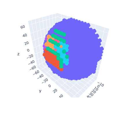
That code produce the next figure:

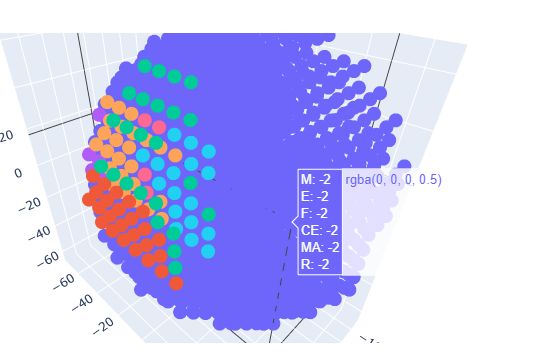
First, the points that should be rgb(0,0,0) have this default purple-ish colour (which, according to the graph, they are).

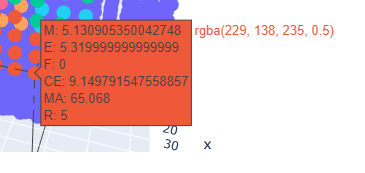
Then all the colors are mismatched. Some examples. According to the plot, that point's color is rgb(229, 138, 235), while it look orangish.

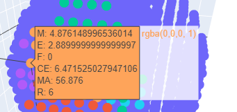
This is the other way around, the color label says it's the default colour but it's not (according to the colour, the second elif was triggered).
