-
-
Notifications
You must be signed in to change notification settings - Fork 2.7k
Closed as not planned
Description
Description
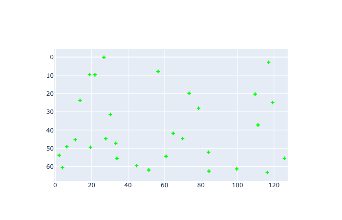
With px.imshow, or using go.Heatmap and some manual axes manipulation, I can plot an image with aspect ratio = 1 and the axes range exactly matching the size of the image. As soon as I try to overlay a scatter plot over the image, the range of one of the axes isn't respected.
Actually, this may be a more general problem with a scatter plot. I've never been able to figure out how to exactly control the axes range.
Example
import plotly.graph_objects as go
import numpy as np

np.random.seed(100)

# create image of given size
imsz = (64, 128)
img = np.random.rand(*imsz)

# -0.5 because (0, 0) is center of top-left pixel
range_x = np.array([0, imsz[1]]) - 0.5
range_y = np.array([0, imsz[0]]) - 0.5

# create data for scatter plot
num_pts = 30
xy = np.random.rand(num_pts, 2) * imsz[::-1] - 0.5

fig = go.Figure()
fig.add_traces([
    go.Heatmap(z=img),
    go.Scatter(x=xy[:, 0], y=xy[:, 1], mode='markers', marker_symbol='cross', marker_color='#00ff00')
])
fig.update_layout(
    xaxis=dict(anchor='y', range=range_x, constrain='domain'),
    yaxis=dict(anchor='x', scaleanchor='x', scaleratio=1, range=range_y, autorange='reversed', constrain='domain'),
    autosize=False
)
Using only heatmap:
Using both heatmap and scatter:
Using scatter only:
Versions
- plotly = 5.13.0
- python = 3.7.15
Metadata
Metadata
Assignees
Labels
No labels


