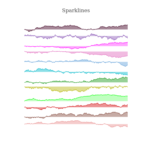
Sparklines Figure Factory #888
Conversation
|
Playing around with the column_width param: https://plot.ly/~AdamKulidjian/5610 Picture: |
|
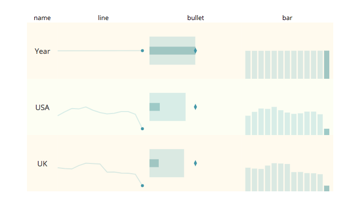
Looks like they're on the right track! You happy with them? Can you do a lines example? For example, can you recreate this? I think there's more vertical and horizontal padding needed between the subplots:
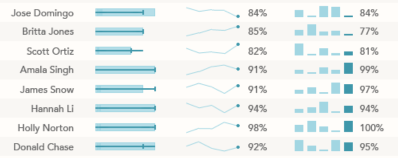
Can you also try adding an option to alternate row color? As a sort of benchmark, see how close you can get to this:
(From Stephen's blog) |

|
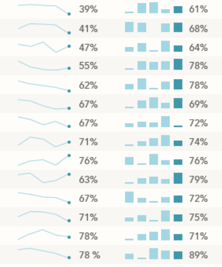
Some of the possibilities: |
|
|
@Kully - do you have a sample notebook or documentation that shows how this works? |
|
A link to a sample notebook on plotly or nbviewer would be really great
…On Mon, Dec 11, 2017 at 12:51 PM, Chris Parmer ***@***.***> wrote:
@Kully <https://github.com/kully> - do you have a sample notebook or
documentation that shows how this works?
—
You are receiving this because you were mentioned.
Reply to this email directly, view it on GitHub
<#888 (comment)>, or mute
the thread
<https://github.com/notifications/unsubscribe-auth/ABx4aoN2n8Hn_HYOFZziYrWoPFhrcTQ6ks5s_WuggaJpZM4QvlNG>
.
|
I'll make one now. Caught another bug in the FF so I'll deal with that first |
|
@jackparmer @chriddyp |
|
This looks really nice. Nice work. A few small suggestions and usage questions that jumped out at me:
|
|
It would nice if
|

|
We could do something simple like alternating through the Plotly colors if the user wants changing trace colors. But we'll run out quickly for large enough figures. How do you feel about I have all this machinery to do this stuff easily 🎰
|
|
You already have What you have now:
Same as what you have now, but alternates primary and secondary trace colors by row:
Traces of every 3rd row are red (other traces are grey):
1D lists longer than 2 elements are the primary trace color for each row, so this could be a colorscale
I think if given an array, we should cycle instead of interpolate. This is what Maybe try this idea out and see if you can replicate something like:
|
I like this whole idea. It covers all the bases, including first 48 rows grey and last one red |
My thoughts on this now are that users will more often than not, not want to specify the second color and will be okay with a light color as half the opacity of the main. Why don't we:
and we
and
|
|
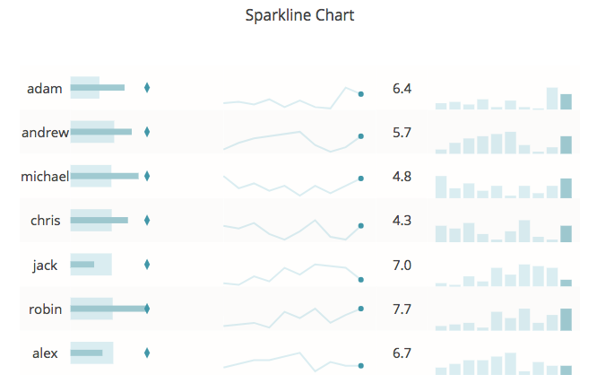
@jackparmer new notebook of charts/features: https://plot.ly/~AdamKulidjian/6215 |
|
@chriddyp ready for a review (when tests pass) |
plotly/figure_factory/_sparkline.py
Outdated
| Applied to all rows | ||
| :param (float) alternate_row_color: set to True to enable the alternate | ||
| row coloring of the chart. Uses the colors from param 'lane_colors' | ||
| :param (list) lane_colors: a list/tuple of two colors that are used to |
There was a problem hiding this comment.
I think it would be helpful to add the default colors here
plotly/figure_factory/_sparkline.py
Outdated
| Applied to all columns | ||
| :param (float) vertical_spacing: Space between subplot rows. | ||
| Applied to all rows | ||
| :param (float) alternate_row_color: set to True to enable the alternate |
There was a problem hiding this comment.
Is this a float or a bool? can the default (True) be included here too?
plotly/figure_factory/_sparkline.py
Outdated
| Applied to all rows | ||
| :param (float) alternate_row_color: set to True to enable the alternate | ||
| row coloring of the chart. Uses the trace_colors from param 'row_colors' | ||
| :param (list) row_colors: a list/tuple of colors that are used to |
There was a problem hiding this comment.
maybe include the default here too
There was a problem hiding this comment.
I'll include more of the defaults
|
@chriddyp so I like most of your suggestions, but I found something that may pose a problem. The entire code in I really want to keep this method for coloring (first column gets first list: |
|
There's also the issue of the other way in which a user can use For these two reasons, I think it would make more sense to keep sparklines as its own FigureFactory, but perhaps to also change the variable names in sparklines to match those in facet_grid. But you do make good points about the familiarity of the already existing FF and building on top of it. Any thoughts? |
Goals:
Documentation:
Issues:
|
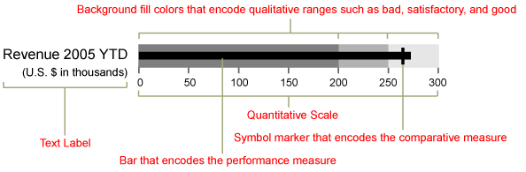
For the Bullet Charts in this FF:I am redefining the various elements in the ones that are displayed in sparklines. Since we are using 1D data, there is only so much we can do. Bullet charts were made for the purpose of comparing a performance (thin dark line) to a target (the vertical bar marker) with gradated qualitative sections representing BAD, OK, GOOD, etc.
I think we could pull off something with 1D data that is interesting. How about the WDYT? |
Hm... toughy. What about leaving it to the user to define what these things mean? They'll have to calculate mean, max, etc on their own, but this would provide the most flexibility and forward compatibility. |
While it's more robust, I don't like what this will mean for users who just want a quick and dirty bullet chart. What would the syntax for that look like? |
|
Yeah, I can see that. Let's go with your proposal - I think it's totally reasonable. 👍 |
|
Hi @Kully , I haven't read through this PR thread yet, but is this something you're planning to keep working on? |
Yes |
|
Do you have a timeline on when this PR will be merged with the master branch? |
Hi @jonmmease |
|
@chriddyp and @jonmmease |
|
I think this kind of thing is easier to make now with |
|
Hi @nicolaskruchten , In finance (currently) at least, you can't build a state of the art dashboard without sparklines see e.g, yahoo. https://finance.yahoo.com/world-indices/ At which point would we be able to build something similar using make_subplots and indicator and px and Dash? Is this currently a wip? |
|
These kinds of tables are quite common, but IMO a data visualization library such as |
|
Thanks, I tried dash, it unfortunately doesn't work, I get about 20% there after 3 days spent. Hopefully at some point a company could sponsor this so that it can be open sourced. @Kully was approaching something interesting, a templatable framework that could be used by ordinary users. |
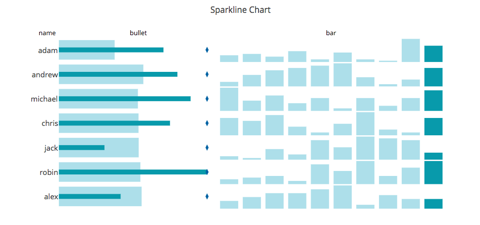
@jackparmer progress so far
you can set column_widths (like in go.Table) with a list [1, 4, 2, ...]
you set the chart types with a list: i.e. the one above is produced with
chart_types=['name', 'bullet', 'line', 'avg', 'bar']any suggestions?