Repository navigation

Replies: 1 comment 2 replies

It even has a bug, so removing them is a good idea (?)
This can be a toggle, but I think when you selected that object, most of the time you want to micro-moving it around the place you already placed.
Inspecting about an object is nice addition, since now you can make some good and bad decision regarding the map. The only thing I'd change here is re-arrange the lines to make it less stupid, do the coordinate in one line and the SV give better instruction on what it's showing. All the data there is nice and I don't think you use the editor enough to appreciate those data gives. |

I don't like the "toggle" approach here, because game has already have many toggles, imo and in addition Mania editor in stable has always had a grid no matter what.
I didn't say that inspector as a concept is useless please remove it. Quoting my last sentence in OP:
As you said, my main point is to make it more structured, since right now I don't understand what should I concentrate on. |
|
However, thank you for sharing your opinion |


Uh oh!
There was an error while loading. Please reload this page.
I don't think my post is either as big or important as pishifat's or DeviousPanda ones, but I still want to list the things I personally find wrong in editing with lazer as someone who does that for quite a long time and pretty often.
Note: I don't want to raise a very deep discussion about hotkeys, since I map with mouse only. If you want my small opinion, there should be a toggle that will also bring back stable's editor hotkeys into lazer editor. That's it. I don't want any further talking about that, sorry.
Spinner makes a sound
I saw no one talking about that, but it sounds quite irritating, for me, who came from stable's editor. I wish it would make no sound at all (please)
Mapper tags field feels wrong
Imo, that field should be times bigger and maybe have a style of youtube's one. I find it quite tedious to scroll through that long line of tags just to remove a 10 character long part and accidentally touch another part of it

there's tooooo much of them
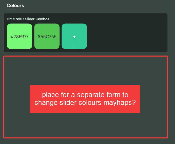
Lack of setting for beatmap-specific slider colors
Not like stable, with it's UI had offered you a way to add them, but lazer could offer one, I think
Sidebars don't feel scrollable on the 1st sight
On the first sight, it does feel like a complete thing, like there's nothing waits you down bellow, when it should give that feeling. I think there should be some hint like "hey, there's more things down below".
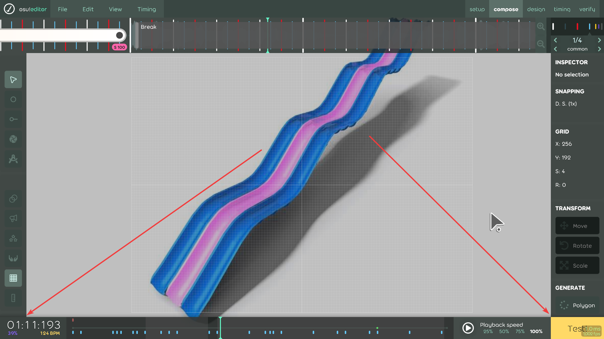
On the 1st sight... I think that's all we have to use for editing, right?
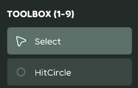
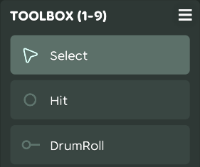
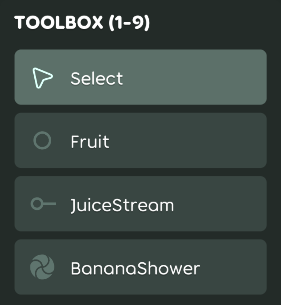
Some toolbox names aren't separated
It's obvious, yet it's a nitpick, but I either like to see "Circle" like it was in stable or "Hit Circle" separately, for example. I know that it's most likely a part of Enum, but I still wish there was a way to show text like this separately.
Inspector says too much and nothing at the same time
I know how that sounds like, but hear me out. It's design is complicated for a thing that just says "yeah this object has this type, placed down there and that Npx far from previous one. I won't try to suggest you how to do that, but I wish it would be more structured
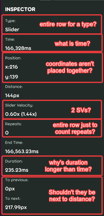
This image shows what do I think about it
Burger icons on sidebars are confusing
Every time my head thinks it's a draggable thing. Like I can change an order for each tool (that would be cool to implement, tho), but instead it's colapse/expand button. I kinda get the picture of that choice, but please... Please, could it be something else, instead?
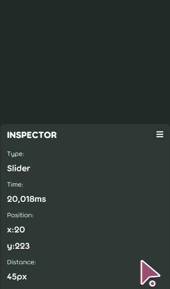
Silly me, trying to drag a thing that wasn't meant for that
Add a grid of buttons to add bookmarks
I'm tired of pressing CTRL+B and CTRL+SHIFT+B. Genuinely miss these buttons from stable

Blueprints are too small
Sub nitpick, slider draggable thingy isn't very obvious for reversing
I think they should be bigger like they were in stable (I know that the half of the reason why that has happened is addition of new things above and bellow blueprint, but they're still too small, imo.
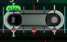
Attempt to compare both nodes together
Permanently show grid in Mania, Catch and Taiko modes
I think it would be miles useful than just hiding it unless you select an object

In the end, feel free to share with me if you think I'm wrong, or if any of those points have been discussed somewhere else, so I can remove them from this list. Thank you
All reactions