- 🧱 How to create the html structure of any design
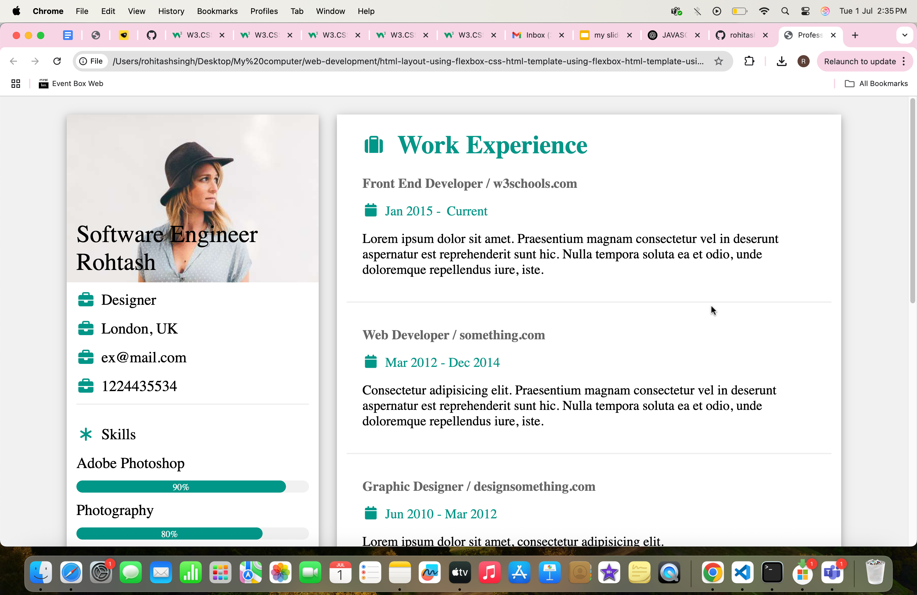
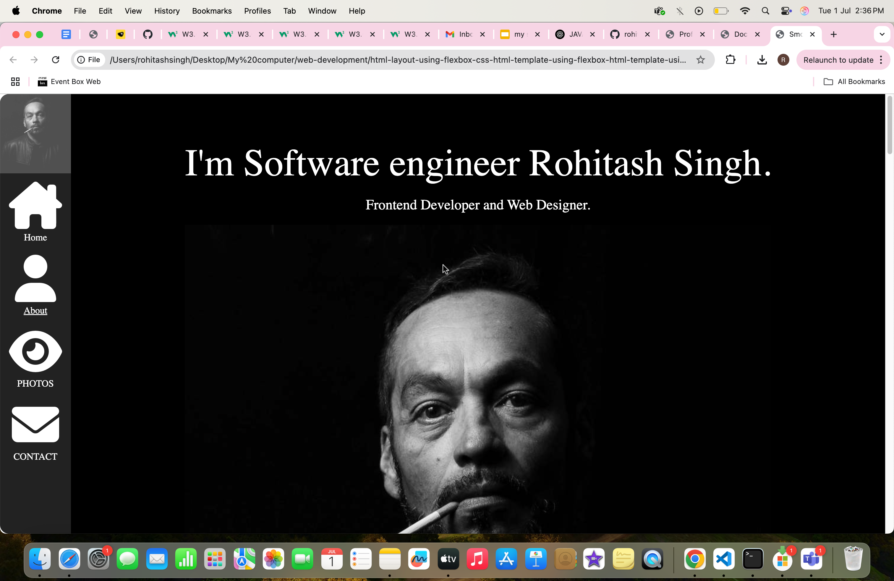
- 🎨 I have created the some examples using Flexbox or flex css, where you can learn different flex box properties and also different different layouts
- First watch or learn normal css with float then start with flex css or Flexbox
- you can clone and check the html structure and css code of the templates
👉 Watch my YouTube tutorial playlist here:
📺 Flexbox or Flex css Layout Tutorials
--- watch video tutorial on youtube (https://www.youtube.com/watch?v=qtg2bUGgH6c&list=PLN1cxIWe98bfEgpC81lDEwuJDoxUoquKe)
👉 Watch my YouTube tutorial playlist here:
📺 HTML + CSS Float Layout Tutorials
This tutorial demonstrates the use of various Flexbox CSS properties to create a responsive, professional layout. Below is a list of all the Flex properties used, with explanations.
| Property | Description | Why We Use It |
|---|---|---|
display: flex |
Converts an element into a flex container. | To enable flexible, responsive layout of child elements. |
flex-direction: row |
Arranges flex items horizontally (default). | Used implicitly for horizontal layouts. |
flex-direction: column |
Stacks flex items vertically. | Useful for vertical sections like .main-continer and .right-section. |
justify-content: center |
Aligns items along the main axis (horizontal or vertical). | Used in .header-box to center content horizontally. |
align-items: center |
Aligns items along the cross axis. | Used in .footer, .heading-wrapper for vertical centering. |
gap |
Adds spacing between flex items. | Used for consistent spacing in .header-box, .exp-wrapper, etc. |
flex: 1 |
Allows a flex item to grow and fill remaining space. | Used in .header-box to fill vertical space with min-height. |
| Property | Description | Why We Use It |
|---|---|---|
flex-basis: 100% |
Sets the initial size of a flex item before growing/shrinking. | Used in .white-div to allow full-width bars. |
width: 33.33% / 66.66% |
Manually sets column widths in flex layout. | Used in .left-bar and .right-section to define layout split. |
flex-direction: column |
Applies column stacking for child items. | Used in multiple wrappers for vertical stacking like .right-section. |
| Media Query Example | Description | Why We Use It |
|---|---|---|
@media screen and (max-width: 480px) |
CSS for small screens (like mobile) | To make .header-box, .left-bar, and .right-section responsive. |
flex-direction: column |
Stacks elements vertically on small screens | Applied inside media query for mobile layout. |
width: 100% |
Makes columns span full width on mobile | Used for .left-bar and .right-section inside media query. |
Rohitash Singh
Frontend Developer | CSS Flexbox Enthusiast
This project is open-source and available under the MIT License.