-
Notifications
You must be signed in to change notification settings - Fork 3.7k
New issue
Have a question about this project? Sign up for a free GitHub account to open an issue and contact its maintainers and the community.
By clicking “Sign up for GitHub”, you agree to our terms of service and privacy statement. We’ll occasionally send you account related emails.
Already on GitHub? Sign in to your account
Odd gap between glyphs and text #29
Comments
|
I've been away but I will look into this. I think one thing that needs to happen is to detect if the powerline characters are present in the font being patched and to not add (override) the already existing powerline glyphs. per: #28 (comment) |
|
I have the same issue using the pre-patched source code pro fonts |
|
@mhartington i think you are using tmux separator as | change it to "" blank |
|
@kiranps I don't think so. I have the same issue without using tmux.. |
|
I have the same problem with "Sauce Code Powerline Plus Nerd File Types Mono Plus Font Awesome Plus Octicons Plus Pomicons.otf". My terminal is urxvt and I am seeing the gap in VIM with lightline. |
|
I can reproduce the gap by increasing the horizontal character spacing in iTerm2, maybe it's a editor/terminal font rendering issue. |
|
@mudox I left the character spacing untouched. And like @sethamclean I have it with "Sauce Code"-Font only. So this is definitely a font issue. |
|
@mudox reducing the font spacing can remove the gap but the arrows are vertically too small as well. This results in a "road cone" like shape. |
|
Yeah, using source code pro or hack, which has powerline support already, there isn't an issue. |
|
I am working on not overwriting powerline glyphs if they are already present in the font to be patched. I thought this actually may have been fixed for recently patched Sauce Code but ryanoasis/vim-devicons#126 seems to suggest otherwise. I have not tested yet. |
|
Looking good! Happy to be closing this. |
|
I have this problem, commented in #26 |
|
@voiprodrigo thanks |
|
2019, the issue is still present |
|
@cata0309 Could you attach a screenshot and give some more details (os, terminal, font and font size)? I know it seems frustrating that this seemingly small issue may not be solved 100% for all scenarios but this is actually difficult to look perfect for all terms and fonts at all sizes. It seemed like this was solved and furthermore it made sense to spend time on the lower hanging fruit. Thanks |
|
@cata0309 I also see this effect in GNOME-Terminal 3.32.2 running on GNOME desktop. Testing different nerd fonts (DejaVu Sans Mono Regular, Fura Code Regular, Meslo LG L Regular, Sauce Code Pro) and font sizes from 9 to 14 doesn't solve the problem. After testing some hinting and anti-aliasing settings in GNOME Tweak Tool I have found that the gaps disappear by changing the anti-aliasing from Subpixel to Grayscale. |
|
Thank you, I will try that out ? What are you using ? Powerline 10k ?
mar., 2 iul. 2019, 22:55 spinnau <notifications@github.com> a scris:
… @cata0309 <https://github.com/cata0309> I also see this effect in
GNOME-Terminal 3.32.2 running on GNOME desktop. Testing different fonts
(DejaVu Sans Mono Regular, Fura Code Regular, Meslo LG L Regular, Sauce
Code Pro) and font sizes from 9 to 14 doesn't solve the problem.
After testing some hinting and anti-aliasing settings in GNOME Tweak Tool
I have found that the gaps disappear by changing the anti-aliasing from
Subpixel to Grayscale.
With Subpixel anti-aliasing:
[image: subpixel_antialiasing]
<https://user-images.githubusercontent.com/2995937/60541930-e6e12e00-9d12-11e9-8597-f891f5bb85e6.png>
With Standard (grayscale) anti-aliasing:
[image: grayscale_antialiasing]
<https://user-images.githubusercontent.com/2995937/60541975-09734700-9d13-11e9-8008-ad82c714bcf8.png>
GNOME Tweak Tool settings:
[image: Gnome_antialiasing_settings]
<https://user-images.githubusercontent.com/2995937/60541999-1a23bd00-9d13-11e9-9e31-d265bf97c5f9.png>
—
You are receiving this because you were mentioned.
Reply to this email directly, view it on GitHub
<#29?email_source=notifications&email_token=AIPZH4JUEYPSWQFE47HLFK3P5OXCJA5CNFSM4BPB6QA2YY3PNVWWK3TUL52HS4DFVREXG43VMVBW63LNMVXHJKTDN5WW2ZLOORPWSZGODZCL5XI#issuecomment-507821789>,
or mute the thread
<https://github.com/notifications/unsubscribe-auth/AIPZH4IUW4JW5XRVEKNDINDP5OXCJANCNFSM4BPB6QAQ>
.
|
|
The theme used in the screenshots is powerlevel9k. I have tried this on another computer, also with GNOME-Terminal 3.32.2 on GNOME desktop. The effect can be reproduced. With subpixel anti-aliasing the small gaps can be seen, but they are gone if the anti-aliasing is switched to grayscale. @ryanoasis so maybe this is just a rendering problem? Both computers are running on arch linux with the same GNOME desktop version but with different graphics hardware and drivers. One computer uses nvidia drivers on X11 and a monitor with 110 ppi. The other computer runs intel graphics with modesetting driver on wayland and a monitor with 92 ppi. |
|
@MIvanchev do you mean the faint line, circled yellow? We would need exact font name (and if you self patched or where you did download it, to examine the exact same file), terminal used, terminal font settings, Edit: Note: Gnome Tweak tool updates the setting only after you close the tool! |
|
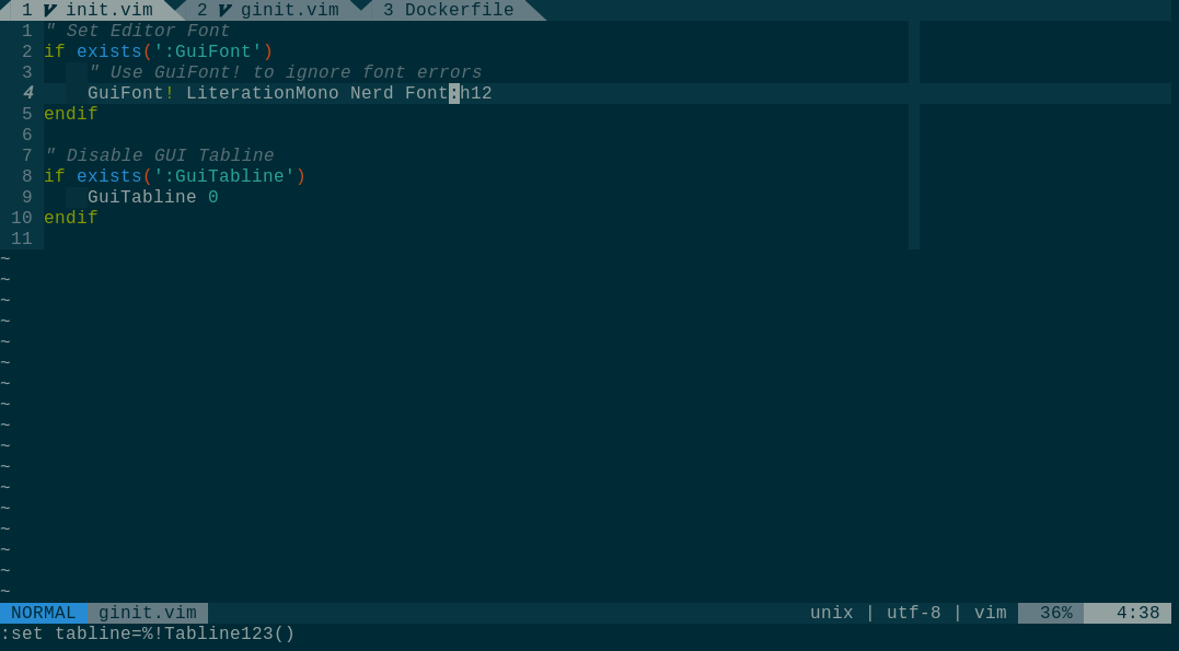
Hey @Finii, this line is exactly what I mean yes. This is Literation Mono size 12 downloaded directly from https://www.nerdfonts.com/. I use neovim-qt, default Gnome settings but changing them has no effect. Grayscale has no effect. The only thing that fixes this is disabling anti-aliasing completely. |
|
I see it in Tilix: But it is gone when
Anyhow, that is just kind of hotfix for you, possibly. Just found out #779 (comment) |
|
@Finii Could you try the triangle characters back to back? Just tried again, grayscale has absolutely no effect. |
|
Can you copy and paste the chars, then I do not need to find out which comes first in your setup? The whole line if possible, as text. |
|
I use ordinary If it does not work for you I bet it is some Qt font rendering blah... 🙄 |
|
You change the font using |
|
I think this error exists on any nerd font, just do |
|
Oh, and I'm on X11 not Wayland, if that is a difference 🤔 |
|
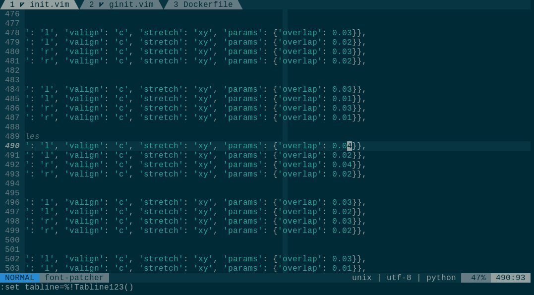
Hmm, our No negative bearing on left, but negative bearing on right. \me starts up editor if overlap != 0:
overlap_width = self.font_dim['width'] * overlap
if sym_attr['align'] == 'l':
x_align_distance -= overlap_width
if sym_attr['align'] == 'r':
x_align_distance += overlap_width
align_matrix = psMat.translate(x_align_distance, y_align_distance)
self.sourceFont[currentSourceFontGlyph].transform(align_matrix)
# Needed for setting 'advance width' on each glyph so they do not overlap,
# also ensures the font is considered monospaced on Windows by setting the
# same width for all character glyphs. This needs to be done for all glyphs,
# even the ones that are empty and didn't go through the scaling operations.
self.set_glyph_width_mono(self.sourceFont[currentSourceFontGlyph])
# Ensure after horizontal adjustments and centering that the glyph
# does not overlap the bearings (edges)
self.remove_glyph_neg_bearings(self.sourceFont[currentSourceFontGlyph])😭 First we methodically |
|
Hey, thanks for the extensive testing. Unfortunately I do still have it with. Even forcing grayscale with in I think I'm going to generate a bitmap grayscale font and work with that. |
|
Some years back we added the 'overlap' to avoid the color lines, the overlap being much smaller than Cascadia Code's. It still might be a problem with Qt's font rendering (I do not trust anything Qt 😬) or how neovim-Qt does it. All the different terminal emulators have all their own opinions how to render fonts, now yet another idea ;) I think |
|
Thanks, I'm really grateful for your insights!!! Btw this is not only in Qt, every tool on the system has it. It's some GNOME / FreeType weirdness. I was quick to blame Qt as well. |
[why]
With the previous commit the gap between powerline glyphs became much
better, but a faint line is still visible for LCD antialiasing (on my
machine).

Having seen how big the overlap is for Cascadia Code the overlap here
can be increase maybe a bit.

[how]
Increase the overlap to 3 % (from mostly 2 %) for the glyphs that have a
'full colored edge' on one side.

Fixes: #29

Signed-off-by: Fini Jastrow <ulf.fini.jastrow@desy.de>
|
I guess this is solved now. Maybe you can check the font on your setup. |
|
I can self-patch, will retest asap. Thank you so much btw! |
|
Homeoffice sei dank ;-) |
|
Allerdings :)) Das ist echt großartig. |
|
This looks like I did not check the overlap for the non- Is it an improvement? I see faint lines. Do they bother? Maybe patch with 4% overlap 🙄 |
|
Wait, what, it says mono in the name, I'm CONFUSED :D |
|
naming is hard... |
[why]
With the previous commit the gap between powerline glyphs became much
better, but a faint line is still visible for LCD antialiasing (on my
machine).

Having seen how big the overlap is for Cascadia Code the overlap here
can be increase maybe a bit.

[how]
Increase the overlap to 3 % (from mostly 2 %) for the glyphs that have a
'full colored edge' on one side.

Fixes: #29

Signed-off-by: Fini Jastrow <ulf.fini.jastrow@desy.de>
[why]
With the previous commit the gap between powerline glyphs became much
better, but a faint line is still visible for LCD antialiasing (on my
machine).

Having seen how big the overlap is for Cascadia Code the overlap here
can be increase maybe a bit.

[how]
Increase the overlap to 3 % (from mostly 2 %) for the glyphs that have a
'full colored edge' on one side.

Fixes: #29

Signed-off-by: Fini Jastrow <ulf.fini.jastrow@desy.de>
[why]
With the previous commit the gap between powerline glyphs became much
better, but a faint line is still visible for LCD antialiasing (on my
machine).

Having seen how big the overlap is for Cascadia Code the overlap here
can be increase maybe a bit.

[how]
Increase the overlap to 3 % (from mostly 2 %) for the glyphs that have a
'full colored edge' on one side.

Fixes: #29

Signed-off-by: Fini Jastrow <ulf.fini.jastrow@desy.de>
|
This issue has been automatically locked since there has not been any recent activity (i.e. last half year) after it was closed. It helps our maintainers focus on the active issues. If you have found a problem that seems similar, please open a new issue, complete the issue template with all the details necessary to reproduce, and mention this issue as reference. |


Not sure what happened, but since updating my fonts to include the new icons, I'm getting some weird spacing between the powerline glyphs and regular text.
Using other fonts that have powerline support do not have this issue.
The text was updated successfully, but these errors were encountered: