Repository navigation
Home
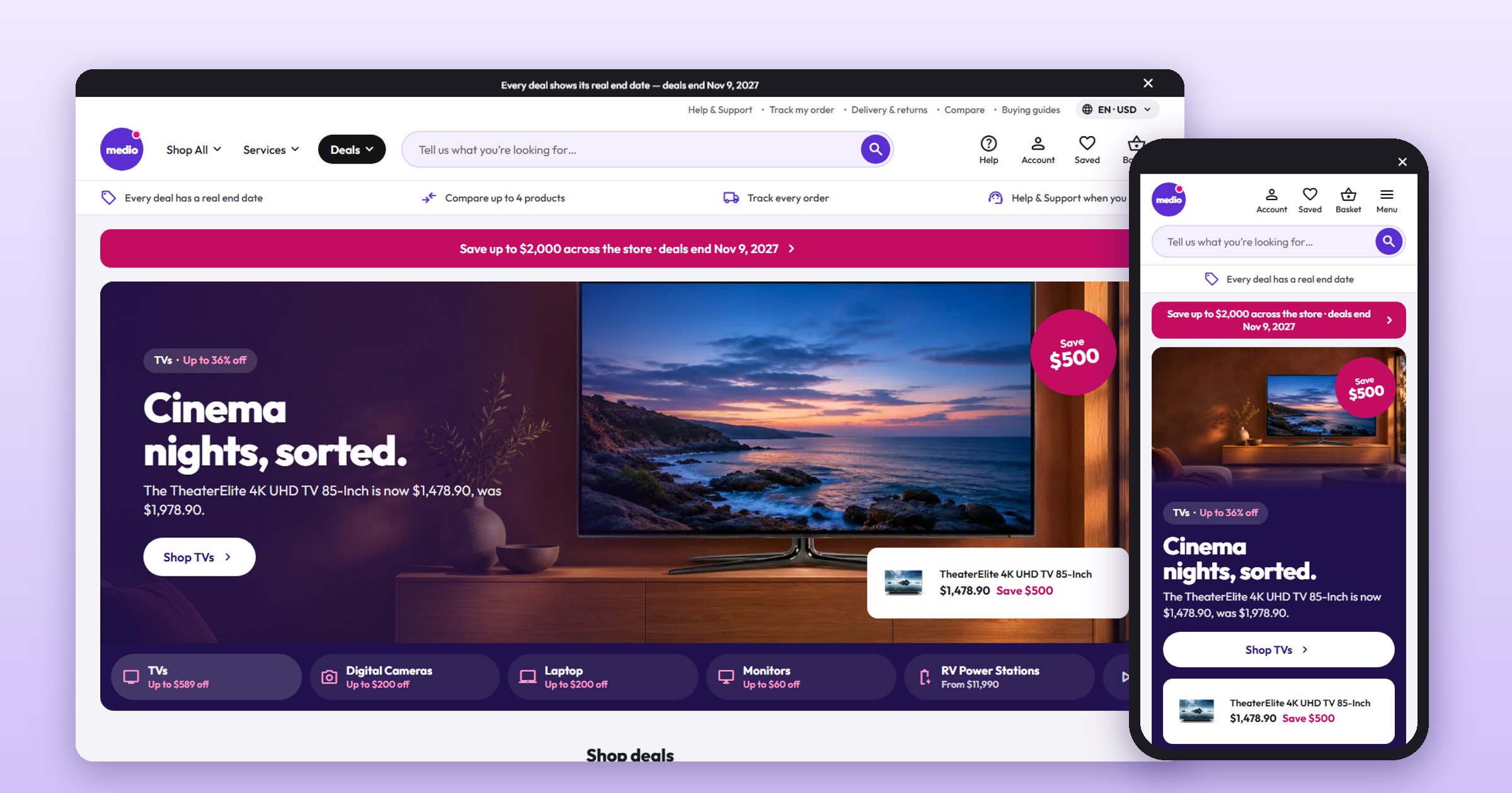
Medio Electronics is a custom storefront Layout for Selldone shops: a single-shop electronics store dressed as a big high-street electronics retailer. One deep violet for every action, magenta savings and white rounded cards on a light grey page; a deals-first home; a category hub over every results page; results with a Filters card and a List / Grid toggle; a product page with a sticky buy card, add-ons and Buy together; a basket drawer, a desk-style account, Help & Support and a designed 404. Every word it writes is in English, Arabic (right to left), Hindi and Danish.
It runs on medio.selldone.shop, one address of the Selldone shop Digini: one shop, one Layout per domain (see Go Live). It is built on the official selldone/storefront, so Selldone's basket, checkout, payments and orders keep working underneath a new design.
| I want to… | Page |
|---|---|
| Have an AI agent set it up on my shop | Install with AI |
| Set it up myself | Manual Setup |
| Know what my shop's data needs | Shop Requirements |
| Build, upload and verify a release | Build and Upload |
| Put it live on my shop and domain | Go Live |
| Change the name, photos, sections, pages, languages | Customize |
| Change the colours, light or dark, the visitor switcher | Theme and colours |
| Fix a problem | Troubleshooting |
- A Layout is a complete storefront app (Vue 3) that runs on Selldone's own servers instead of the default storefront.
- You build it, zip it, and upload it to your Selldone developer account with the official selldone-cli. Each upload is a new version.
- You attach a version to your shop, or to one domain of it.
- Selldone injects your shop into the Layout: its products, categories, prices, tags, languages, currencies and settings. Nothing about Digini is hard-coded: only the brand name (one line) and the photos (category photos matched by slug, and named photo slots).
| Part | Medio |
|---|---|
| Action colour | one deep violet #5a2ed0 (white words 7.67:1): pill buttons, the round search button, links, chosen states |
| Savings | hot magenta #c40c63: "Save $X", the campaign strip |
| Tags | black pills |
| Grounds | a light grey page #f4f3f7, white rounded cards (14px), a dark slate footer, pastel promise tiles |
| Type and icons | Outfit, Material Symbols Rounded |
| Buttons | flat pills; hover changes the colour only; no line under any word or icon; selection rings inside the box |
| Theme | five palettes, a custom colour and Light / Dark; a visitor switcher (a footer row) on Medio's showcase shop only (see Theme and colours) |
| Languages | English, Arabic (right to left), Hindi, Danish; the language and currency pill in the header |
- Header: a dark strip with one honest message at a time and a close ×; a utility row with the language and currency pill; the round logo, Shop All (every category, the chosen one's top deals), Services, a black Deals pill; a big round search with suggestions; Help, Account, Saved and Basket (its total as the label); four promises. On a phone: four icons, the search across and a right-hand menu (All deals, six categories and "Show N more", services, language & currency).
- Home: a campaign strip, a photo slider hero (one slide per category with a wide photo: its line, its pick, a Save circle that always fits, pill tabs that fill as they play), round category tiles, promo tiles with the category photos, the latest from a brand, brand deal cards, dark deal cards with real clocks, Best sellers / Just arrived / Popular picks tabs, offers, Why shop with Medio (six pastel tiles) and the newest buying guides.
- Category hub: a campaign strip, the categories as round tiles, Top categories, Popular links, Buying guides, Top deals, Can't decide? (one choice per tag) and the category's brands.
- Results pages: a Filters card (Hide out of stock, Deals, price, Brand, Colour, capacity, spec filters), Sort by, Show 20 / 40 / 60, the count and List / Grid; the list row has six spec bullets and a price column.
- Cards: white, rounded, small badges, the price with a magenta Save and Was, the deal's clock, swatches or capacity chips, a violet Add to basket that turns into "− n +", Compare and Save.
- Product page: the gallery and a key-spec grid; a sticky buy card (price, deal clock, colour or capacity tiles, Ways to pay, offers, stock, Add to basket, Save, Share, delivery and help); add-ons with tick boxes; a top bar or a phone buy bar; Buy together and save; accordions; We recommend and More like this.
- Compare: the picks pinned on top, the specs side by side with differences marked.
- Basket and checkout: a basket drawer, the numbered basket page, a map-first address sheet, delivery choices and the payment window.
- Orders and account: the receipt, delivery and messages; the account as a desk with a side menu.
- Content pages: Help & Support, guides, article, About, Terms, Privacy, Contact and a designed 404.
- Live shop: https://medio.selldone.shop
- Repository: https://github.com/selldone-custom-layouts/official-medio
- What Medio is, its data rules and releases:
MEDIO.md; shared behaviours:KALIO.md - All official custom Layouts: https://github.com/selldone-custom-layouts
- Selldone: https://selldone.com