This workshop is important because:
Materialize is a front-end framework based on "material design," Google's specifications for building apps. (See this video for a more dynamic idea of what this looks/feels like.) Materialize is a library of CSS classes that helps make any old site look nice with very little effort. It comes with a grid system that makes layout out content on a variety of screen sizes much easier to deal with. Proficiency in at least one CSS framework allows you to make better first impressions when people land on your page.
After this workshop, developers will be able to:
- Implement class-based CSS
- Use a CDN to import Materialize into your project
- Effectively use a grid system to space elements across your page
- Improve the design of your HTML pages with the aid of Materialize & mockups
Before this workshop, developers should already be able to:
- Write custom HTML & CSS
- Include external stylesheets
Create modular classes that encapsulate a certain behavior and name them semantically.
How would you style CSS for these elements?
.shout— make all of the characters uppercase in the element's text.shadow— add a drop-shadow to text inside the element.invert— flip an element upside-down
Example solution
.shout {
	text-transform: uppercase;
}

.shadow {
	text-shadow: 1px 1px 2px black;
}

.invert {
	transform: rotate(180deg);
}"Responsive web design (RWD) is an approach to web design aimed at crafting sites to provide an optimal viewing and interaction experience— easy reading and navigation with a minimum of resizing, panning, and scrolling—across a wide range of devices (from desktop computer monitors to laptops to cellphones).
A site designed with RWD adapts the layout to the viewing environment by using fluid, proportion-based grids, flexible images, etc..."
Source: Wikipedia

Find an example of responsive design on the web!

-
Materialize is a styling library created by a team of four Carnegie Mellon students. It's open source so anybody can help make sure it's properly maintained.
-
The framework consists of one main CSS file and a main JS file.
-
Parts of Materialize require jQuery to work.
-
To apply Materialize styles, you just add classes to your HTML elements. The Materialize CSS files style these classes in complex ways.
-
It has excellent documentation!
Materialize comes with a ton of features, including:
- Responsive Grid System
- CSS library for quick and easy styling
- UI components - HTML + CSS
- Javascript widgets to make your page interactive (e.g. a nav bar)
- Icons
- & more!
- To use Materialize, we need to include its CSS and JavaScript files in our project.
- We also need to include jQuery, as Materialize's JS plug-ins depend on it.
- There are a few different ways to accomplish this, listed below. In this class, we'll keep it simple and stick with the CDN.
A content delivery network (CDN) hosts the library/framework and you access it via a URL. The Materialize getting started page includes the requisite HTML. Where do we include these in our HTML file?
	<!-- Compiled and minified CSS -->
  <link rel="stylesheet" href="https://cdnjs.cloudflare.com/ajax/libs/materialize/0.98.0/css/materialize.min.css">

  <!-- Compiled and minified JavaScript -->
<script src="https://cdnjs.cloudflare.com/ajax/libs/materialize/0.98.0/js/materialize.min.js"></script>Download the actual CSS and JS files and link to them on your local computer - better for offline/local development. Just hit the download button on their site. You'll need to include the JS and CSS files in your project and properly reference them in <link> tags in index.html.
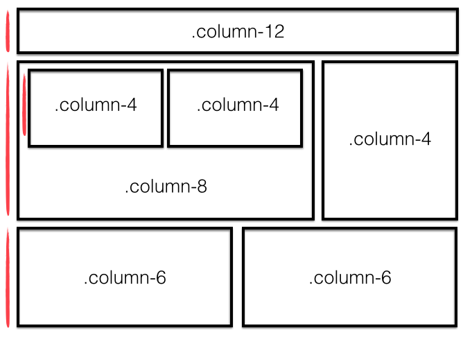
Note: There's an error in the image above. Can you find it? Maybe after you have a bit more background on the 12 column layout system.
The Materialize grid system is based on the idea that a page layout for any given screen size is represented with 12 fluid columns. Columns are always horizontally contained in rows, which in turn are contained inside of a larger container (container > row > column). But why 12?
12 is divisible by 2, 3, 4, and 6 (meaning we can have columns that are: half-width, third-width, quarter-width, and sixth-width aka 50%, ~33.3%, 25%, and ~16.7%):
12/2  = 6
12/3  = 4
12/4  = 3
12/6  = 2
12/12 = 1

            6         +         6               = 12

      4     +         4         +      4        = 12

    3     +     3     +     3     +     3       = 12

  2   +   2   +   2   +   2   +   2   +   2     = 12

1 + 1 + 1 + 1 + 1 + 1 + 1 + 1 + 1 + 1 + 1 + 1   = 12

We can also create the typical two column layout (main content area + sidebar):
              8             +        4          = 12
                9              +       3        = 12
To ensure all your Materialize styles behave properly, always put your content inside an element with a class "container" (usually <div class="container">). This will center your content and leave a small margin on the sides of the page.
To use the grid system we must put a row in our container:
<div class="row"> ... </div>- Columns are written using at least two CSS classes. Use the
colclass to make an element into a column and then use another class to specify the screen size and number of columns you want to take up. For example,col s4, would be an element that takes up 4 columns or 1/3 of the width of its surrounding container.
Then select what screen size we'll want it to display on:
s≤ 600px (e.g. mobile devices and smartphones)m≤ 992px (e.g. tablets)l> 992px (e.g. laptops, desktops)
-
At screen sizes smaller than the specified screen sizes, the columns will default to filling the width of the screen.
-
Pick a portion of the
12columns that will determine how much of the row an element will take up. -
You then use the above choices to determine the exact class you will add to an element in the row (Materialize has them all built in).
For example the class: col l3 will take up 3/12 of the space at >992px. Feel free to add more classes to the same element to change how it will behave at other screen sizes. Let's checkout some more examples...
Here's an example of a two-column layout that spans the width of the page. Notice that the widths of the two columns add up to 12. The column content of any row must always be ≤12.
 <div class="row">
   <div class="col m6">
     <p>I'm a medium-sized column</p>
    </div>
   <div class="col m6">
     <p>Me too! We have SO much in common</p>
   </div>
 </div>
What will this code do?
 <div class="row">
   <div class="col s12 col m6">
     <p>I take up the entire space when the screen is small, but share it when there's more room.</p>
    </div>
   <div class="col s12 col m6">
     <p>Samesies...</p>
   </div>
</div>- How much of the page would elements with these classes take up?
col m2col s1col l8col s12
- Using the Materialize grid, make a grid that is 1 column on a phone (s), 3 columns on a tablet (m), and 4 columns on a desktop (l).
Sample code
<div class="row">
  <h3 class="text-center">1 column on a phone (s), 3 columns on a tablet (m), and 4 columns on a desktop (lg) Mobile</h3>
  <div class="col s12 m4 l3">Yao</div>
  <div class="col s12 m4 l3">Hey</div>
  <div class="col s12 m4 l3">Ola</div>
</div>
For other examples, check out the Materialize docs
You can also offset and nest your columns. When you offset a column, you add a column of whitespace and push the column to the right. Example:
 <div class="row">
   <div class="col m3 offset-m3">
     <p>This column occupies 1/4 of the page width and is moved to the right by 1/4 of the page width</p>
   </div>
 </div>
Here is an example of nesting columns (putting one row inside another)
 <div class="row">
   <div class="col m6">
     Level 1: Column takes 1/2 the width of the page
     <div class="row">
       <div class="col m4">
         Level 2: This column takes 1/3 the width of its parent column
       </div>
       <div class="col m8">
         Level 2: This column takes 2/3 the width of its parent column
       </div>
     </div>
   </div>
</div>For a complete list: Materialize Typography classes
To align text, use these classes.
<div>
  <h5 class="left-align">This should be left aligned</h5>
</div>
<div>
  <h5 class="right-align">This should be right aligned</h5>
</div>
<div>
  <h5 class="center-align">This should be center aligned</h5>
</div>
<!-- Vertical align -->
<div class="valign-wrapper">
  <h5 class="valign">This should be vertically aligned</h5>
</div>
Note: If you want to horizontally center a block of HTML rather than just text, use thecenter-block materialize class.
More useful typography classes...
	<h4 class="truncate">This is an extremely long title that will be truncated</h4>
<p class="flow-text">I am Flow Text that will actively resize as the page changes</p>Materialize comes with a set of icons that can be included in your page. Check out these icons here. To use them, you need to include them in the <head> of your index.html:
<link href="https://fonts.googleapis.com/icon?family=Material+Icons" rel="stylesheet">Then you can use <i> tags with a class of material-icons to wrap the name of the icon. Additional classes can size the icons. For example:
<!-- a plus icon -->
<i class="material-icons">add</i>
<!-- a large volume up icon -->
<i class="large material-icons">volume_up</i>
<!-- a tiny volume up icon -->
<i class="tiny material-icons">volume_up</i>Materialize provides a wide selection of button sizes and colors. Button classes can be applied not just to <button> elements, but also <a> and <input> elements
To style buttons, you will need to provide multiple classes.
 <!-- Standard colored button with effects/animations -->
 <a class="waves-effect waves-light btn">button</a>
 <!-- A large, red, floating button -->
<a class="btn-floating btn-large waves-effect waves-light red"><i class="material-icons">add</i></a>Materialize helps you format images using class="responsive-img" to make it scale well when the screen size changes (this sets its max-width to 100% of its parent element and the height to auto for maintaining aspect). You can also use class="circle responsive-img" to make the responsive image into a circle.
Materialize is also very helpful when you need to style your forms. You must have a .input-field div wrapping your input and label in order for it to be styled.
Materialize allows you to incorporate interactive behavior into your page with JavaScript plug-ins. While you would ultimately have to write some JS in order for these components to provide actual functionality within the application, you don't have to write JS if you're simply mocking up a UI.
Some examples:
Materialize demonstrates good practices in terms of exemplifying class-based CSS and introducing the concept of a grid-system. It is useful for most projects where style is somewhat important but not the central to the product.
Be aware that critical users of the web know what Materialize and other styling frameworks look like; Bootstrap is especially all over the place! If you’re making a serious project or portfolio work, add some of your own styling to stand out!
- Bootstrap - a CSS-library, similar to Materialize
- Foundation - another CSS-library, similar to Materialize
- Skeleton - a lovely, minimal, unopinionated CSS library
- Block Element Modifier methodology
- Hipster Ipsum - Dummy placeholder "hipster" text