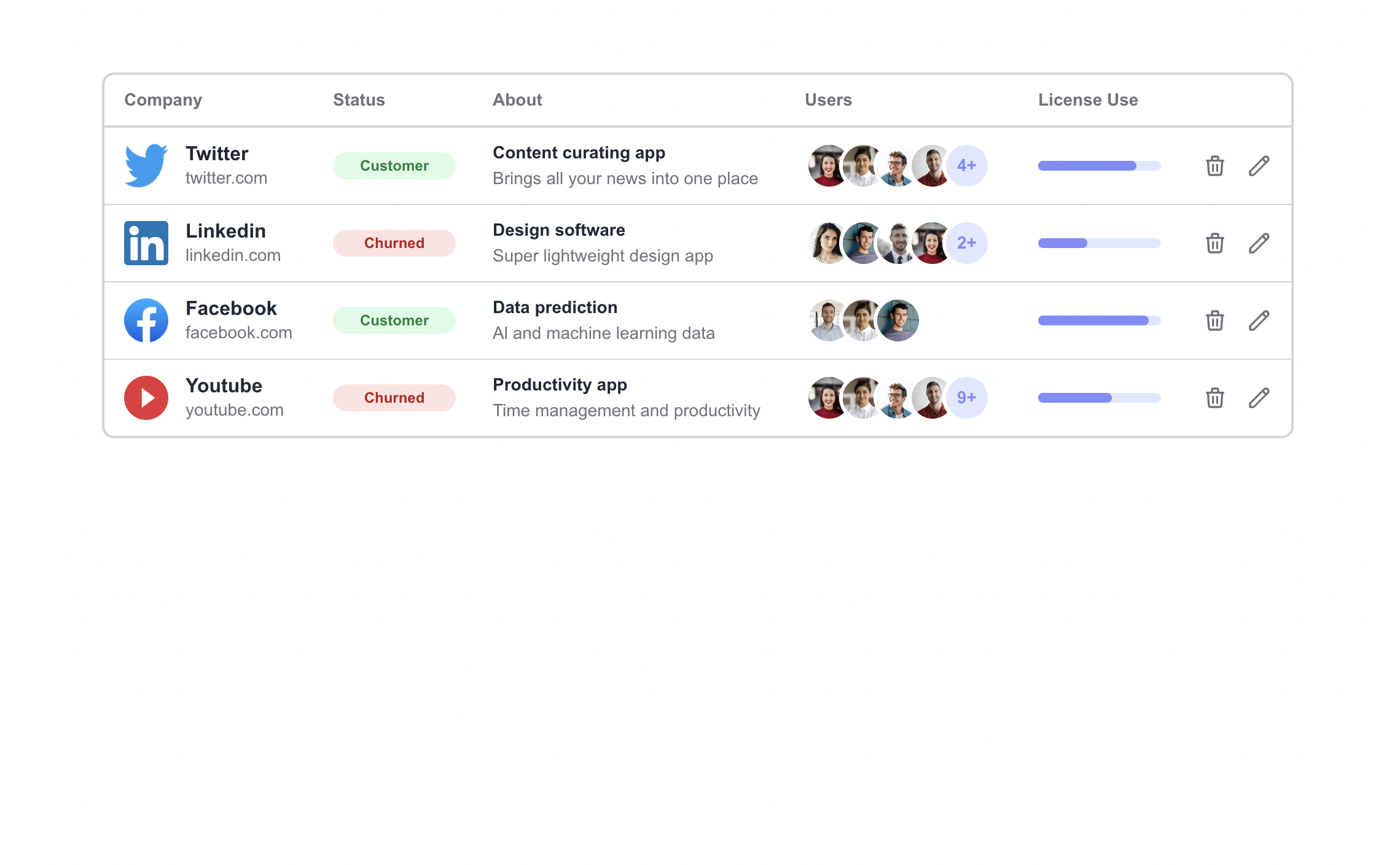
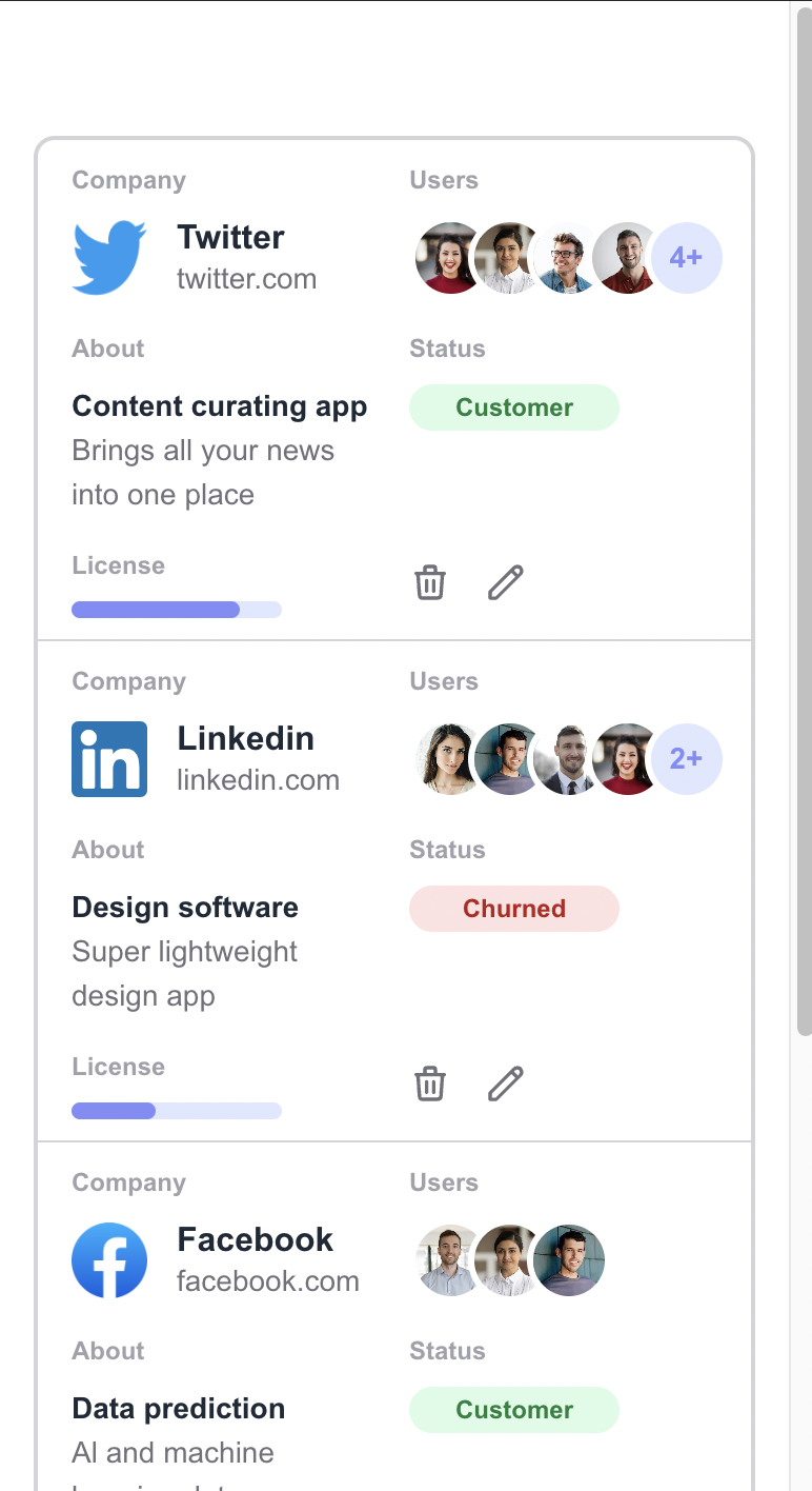
The main unique feature of this data-table is it shifts position of the columns to different location based on the screen sizes. So the user will see three different UI for desktop, tablet, and mobile view instead of either squashed or horizontal scrollbar which are very ugly to look at. See the below screenshots for better understandings.
-
Notifications
You must be signed in to change notification settings - Fork 0
A fully responsive HTML data table made with CSS Flexbox & Grid that shifts the column position based on screen sizes.
shamscorner/responsive-data-table-with-css-grid-flexbox
Folders and files
Name | Name | Last commit message | Last commit date | |
---|---|---|---|---|
Repository files navigation
About
A fully responsive HTML data table made with CSS Flexbox & Grid that shifts the column position based on screen sizes.