


SVAR React DataGrid is a ready-to-use component that helps you integrate powerful, feature-rich and lightning-fast data tables into React apps. It efficiently handles large datasets and supports virtual scrolling, in-cell editing, sorting, filtering, TypeScript, and full customization for complex projects.
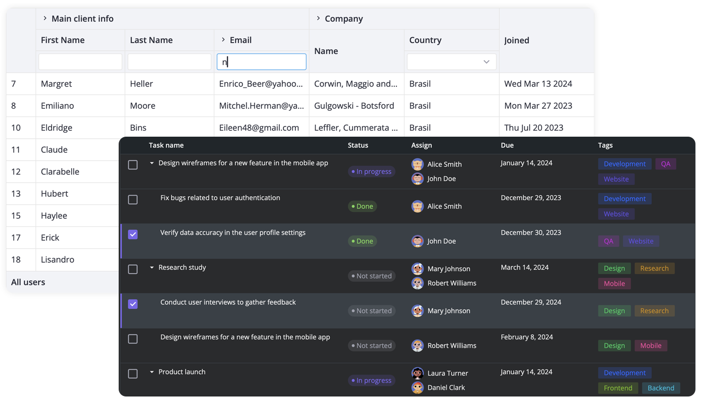
- High performance (virtual scrolling and dynamic loading)
- In-cell editing with different cell editors (datepicker, combo, select, rich select, etc.)
- Custom HTML for cells
- Sorting by multiple columns
- Filtering
- Paging
- Accessibility: compatibility with WAI-ARIA standard
- Frozen columns
- Expandable/collapsible columns
- Row reordering with drag-and-drop
- Customizable tooltips for grid cells
- Context menu
- External editor for grid data
- Tree-like structure
- Print support
- Keyboard navigation
- RestDataProvider for easy backend data binding
- Dark and light skins
- Easy customization with CSS
- TypeScript support
- React 18 and 19 compatible
To start using SVAR React DataGrid component, simply import the package and include the desired component in your React file:
import { Grid } from "@svar-ui/react-grid";
import "@svar-ui/react-grid/all.css";

const columns = [
    { id: 'id', width: 50 },
    {
      id: 'city',
      width: 100,
      header: 'City',
      footer: 'City',
    },
    {
      id: 'firstName',
      header: 'First Name',
      footer: 'First Name',
      width: 150,
    },
];

const data = [
    {
        id: 1,
        city: "London",
        firstName: "Alex"
    }
];

const myComponent => (<Grid columns={column} data={data} />);
See the getting started guide to quickly set up and begin using SVAR React DataGrid component in your React projects.
Post an Issue or use our community forum.