


SVAR React Menu is a flexible menu component for adding navigation and interaction menus to your React applications. The component is easy-to-customize, compatible with React 18 and 19, and complements SVAR React Core library.
SVAR React Menu can be used as:
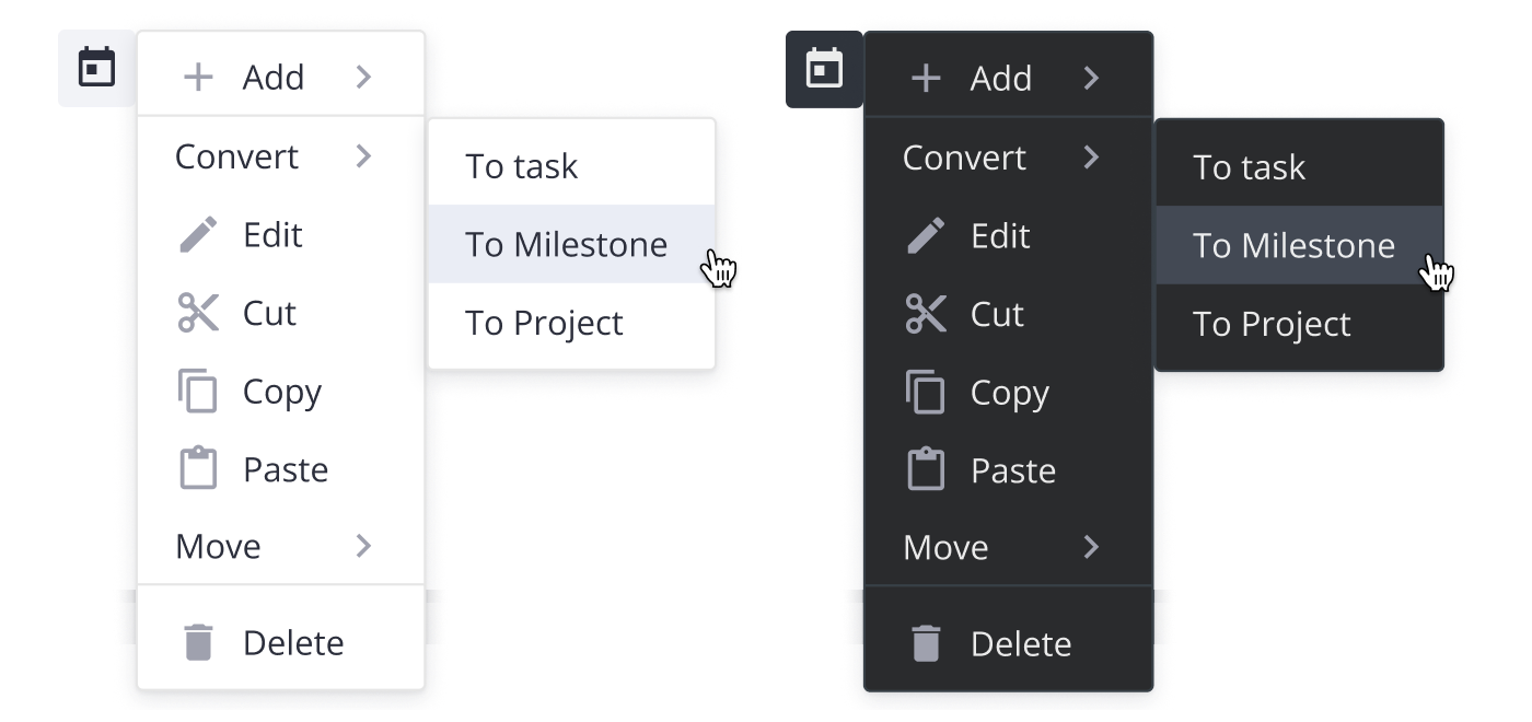
- Action Menu: Provides a compact list of actions (e.g. edit, delete, share.) that appears when a user clicks on a UI element.
- Basic Menu: A simple, hierarchical menu that displays options for navigation or actions.
- Context Menu: A right-click (or long-press) menu offering context-specific options for a selected element.
- DropDown Menu: A dropdown attached to buttons or other clickable elements, expanding on click.
- Menu Bar: A horizontal top-level menu providing access to grouped commands, with support for dropdowns and sub-menus.
To use the widget, simply import the package and include the component in to .jsx file:
	import { Menu } from "@svar-ui/react-menu";
  import "@svar-ui/react-menu/all.css";

    function MyComponent(){
	    const options = [
			{ id: 'add-task', text: 'Add', icon: 'wxi wxi-plus', data: [
        		{ id: 'add-task:child', text: 'Child task' },
        		{ id: 'add-task:above', text: 'Task above' },
        		{ id: 'add-task:below', text: 'Task below' },
      		] },
    		{ type: 'separator' },
		    { id: 'edit-task', text: 'Edit', icon: 'wxi wxi-edit' },
		];

        return (<Menu options={options} />);
    }