Skip to content
New issue

Have a question about this project? Sign up for a free GitHub account to open an issue and contact its maintainers and the community.

By clicking “Sign up for GitHub”, you agree to our terms of service and privacy statement. We’ll occasionally send you account related emails.

Already on GitHub? Sign in to your account

userstory Metadata upload #1

Closed
beritarheimer opened this issue Oct 19, 2015 · 50 comments
Closed

userstory Metadata upload #1

beritarheimer opened this issue Oct 19, 2015 · 50 comments
Assignees
Milestone

Comments

@beritarheimer
Copy link

As a user of the virtual Water-science lab I want to upload metadata with link to research data into the SIP so that I can share data with other scientists.

@p-a-s-c-a-l
Copy link
Contributor

@switchonproject/end-users

Please see switchonproject/sip-html5#44 for a related user-story and the links to the current Google Meta-Data Form.

@esafa
Copy link

esafa commented Oct 20, 2015

A technical note on the spam-issue raised by me during telco 2015-10-19. Google forms is very susceptible for spam as documented in

https://productforums.google.com/forum/#!topic/docs/QxGOG--Vd9Q

However, a HTML5 metadata upload client would be much more resilient against spam.

@lornalittle
Copy link

We want a seperate tool for uploading similar to BYOD but not included in BYOD

@GBoot
Copy link

GBoot commented Oct 21, 2015

If the 'upload' functionality will be developed as a separate tool, it should - also - be initiated/started from BYOD as well (and opens in a new browser window)

@esafa
Copy link

esafa commented Oct 21, 2015

the feature to open in a new browser windows is quite often blocked by
browsers (for instance my browser blocks it, I only get a yellow warningbox
to the far right that the page request to spawn another window).

On Wed, Oct 21, 2015 at 12:59 PM, GBoot notifications@github.com wrote:

If the 'upload' functionality will be developed as a separate tool, it
should - also - be initiated/started from BYOD as well (and opens in a new
browser window)


Reply to this email directly or view it on GitHub
#1 (comment)
.

Esa Falkenroth
mobile: 0702-104028 (intl +46702104028)
work: 011-4958298 (intl +46114958298)
skype: Esa.Falkenroth
email: nospam@falkenroth.se (for business mail)
email: esa@falkenroth.se (for private mail)

@GBoot
Copy link

GBoot commented Oct 21, 2015

How about a new tab...? I am not experiecing the same browser behaviour as you, Esa. My main point is that it should be launched from the BYOD (= what). The actual implementation and the potential issues related to that is for the developer to find out (= how) ;-)

@esafa
Copy link

esafa commented Oct 21, 2015

Apologies for the pedagogical(?) lecture below but a short reminder of
agile work may help us get started.

One of the fundamental principles that make agile work is that the USERS
decide what they need. Userdriven agile development leads to fewer buttons
(= easier GUI) and more useful features.

So...

(1) The feature requests for tools should come from Anna, Serena, Duro,
Alessio, Remko and Lorna. We IT-partners (Esa, Deltares, cismet) can try to
guess what our scientists need but now we have userstory group so it is
better to let them decide and define userstories.

(2) In my opinion, the NEED of faster jumping between tools can be
addressed later (if the userstory group feels it two clicks are too much).
This absolutely first version (the first user-story) should focus on the
most important needs of the user (not IT). Of course IT can (and should)
add userstories that are related to hosting, availability monitoring,
backups, testing, bugreports but this comes later.

(3) Also, the agile work depends on NOT making the user story any bigger
than they have to be. Our wellknown mantra is "MINIMAL and MARKETABLE".
Just make the userstory complete enough so the group can TEST the first
version. After all, we are only talking about the FIRST userstory... not
the finished tool. The finished tool will be the result of many
userstories (depending on how many different things the user story group
needs).

So back to Anna, Serena, Duro, Alessio, Remko and Lorna: Berit said the
scientists need to upload links and metadata. What did she mean with that
in more detail... What data? Links from where? From an app or browser? What
metadata are mandatory in your opinion?

Cheers,
//Esa

On Wed, Oct 21, 2015 at 1:50 PM, GBoot notifications@github.com wrote:

How about a new tab...? I am not experiecing the same browser behaviour as
you, Esa. My main point is that it should be launched from the BYOD (=
what). The actual implementation and the potential issues related to that
is for the developer to find out (= how) ;-)


Reply to this email directly or view it on GitHub
#1 (comment)
.

Esa Falkenroth
mobile: 0702-104028 (intl +46702104028)
work: 011-4958298 (intl +46114958298)
skype: Esa.Falkenroth
email: nospam@falkenroth.se (for business mail)
email: esa@falkenroth.se (for private mail)

@AnnaKue
Copy link

AnnaKue commented Oct 21, 2015

After looking at the google form, I couldn't find any keyword fitting to the data I want to make available (catchment descriptors like climate, soil data, geology, land use etc, and flow signatures like mean flow, quantiles etc). I think the list of keywords should be extended, with maybe a limited possibility to add keywords when necessary.

@AnnaKue
Copy link

AnnaKue commented Oct 21, 2015

Another comment from my test of the google form : maybe something about the scale / type of data should be added : is the data corresponding to specific points ? grid points ? areas (my case : catchments) ? There is the specification of the spatial extent but it doesn't inform on the distribution inside these limits. What do the others users think ?

@duropa
Copy link

duropa commented Oct 21, 2015

just one concrete example for the role of the upload metadata tool (from our flood type experiment):
we are doing an experiment in virtual lab...and one of our inputs is catalogue of weather pattern classification. the use of this catalogue (and tools for extracting data from it) is described in experiment protocol, but the data itself are not available in our portal, so we need to make them available for the partners and external users (e.g. for the reproducibility of the experiment).impl;ications from this are:

  1. in my opinion the upload tool will not be just a general tool for upload of everything but we need to clearly link the tool with the virtual laboratory in general and experiments in particular.
  2. similar tool (probably following user story) will be then to upload the results of experiments in virtual lab (which will include metadata and data itself, i guess) (i understand the wish to keep the user stories simple, but some broader vision might be helpful for designing small individual parts).

so, we have from our experiment a practical example which can be used as an test case...
once we decide to use google form for the upload, i'm ready to comment on the design and implementation...

these are my 5cents to help to start
cheers
d.

@p-a-s-c-a-l
Copy link
Contributor

once we decide to use google form for the upload, i'm ready to comment on the design and implementation.

@duropa The Google Form is the current design template / blueprint for the actual upload tool. Feel free to provide your comments and suggestions.

@p-a-s-c-a-l
Copy link
Contributor

After looking at the google form, I couldn't find any keyword fitting to the data I want to make available (catchment descriptors like climate, soil data, geology, land use etc, and flow signatures like mean flow, quantiles etc). I think the list of keywords should be extended, with maybe a limited possibility to add keywords when necessary.

@AnnaKue
The list of keywords in Google Form is not up-to date. You can find the current list of X-CUAHSI Keywords which is based on the Hydrologic Ontology for Discovery here: X-CUAHSI Meta-DB
The new upload tool will allow you to select keywords from the list mentioned above, but it won't allow you to add new keywords since the extension of the X-CUAHSI keyword list is not an IT task. If you need additional keywords, you can ask the maintainers of the X-CUAHSI Ontology. See also switchonproject/sip-html5#55

@p-a-s-c-a-l
Copy link
Contributor

Another comment from my test of the google form : maybe something about the scale / type of data should be added : is the data corresponding to specific points ? grid points ? areas (my case : catchments) ? There is the specification of the spatial extent but it doesn't inform on the distribution inside these limits. What do the others users think ?

@AnnaKue
I interpret this as the ability to add besides a bounding box also (multiple) polygon and point coordinates. That could be a candidate for a new user story. Please see also switchonproject/sip-html5#46 for a similar discussion and the proposed solutions.

@AnnaKue
Copy link

AnnaKue commented Oct 22, 2015

Actually I was more thinking about a text field where you could specify this information, but your interpretation is much better ! But as I have like 35000 catchments I couldn’t entre the coordinates manually, it could maybe be done by loading a shapefile ?

Från: Pascal Dihé [mailto:notifications@github.com]
Skickat: den 22 oktober 2015 13:45
Till: switchonproject/switchon-tools
Kopia: Kuentz Anna
Ämne: Re: [switchon-tools] userstory Metadata upload (#1)

Another comment from my test of the google form : maybe something about the scale / type of data should be added : is the data corresponding to specific points ? grid points ? areas (my case : catchments) ? There is the specification of the spatial extent but it doesn't inform on the distribution inside these limits. What do the others users think ?

@AnnaKuehttps://github.com/AnnaKue
I interpret this as the ability to add besides a bounding box also (multiple) polygon and point coordinates. That could be a candidate for a new user story. Please see also switchonproject/sip-html5#46switchonproject/sip-html5#46 for a similar discussion and the proposed solutions.


Reply to this email directly or view it on GitHubhttps://github.com//issues/1#issuecomment-150195379.

@p-a-s-c-a-l
Copy link
Contributor

But as I have like 35000 catchments I couldn’t entre the coordinates manually, it could maybe be done by loading a shapefile ?

@AnnaKue
Yes, extracting coordinates from a Shape File is possible. That's definitely a candidate for a separate user story as it requires considerable implementation effort in the SIP Backend (Geoserver integration). The Shapefile could also be shown on the BYOD map like in this example: http://tl-243.xtr.deltares.nl/byod/#/map/object/11882 ("Corine Land Cover - Land principally occupied by agriculture, with significant areas of natural vegetation", > 100.000 polygons)

@duropa
Copy link

duropa commented Oct 22, 2015

here are my first impressions from the google form upload tool. i think it is a very good start, but i have also some comments. these are as follows:

  1. too many clicks to finish (i.e. less pages and more efficient page use would be usefull).
  2. logo on the 1.page is too large and not needed on following pages (or at least not in such large size)
  3. Keywords: would it be possible to present it as a list box with multiple choices?
  4. access conditions and license: this seems to be the most difficult question (metadata) to answer. how we will check if the info provided is correct? for me the abbreviations are not clear at all, and i do not have a feeling to differ between some of the options.
  5. graphic location: here it seems to me, that the page is not used in a very efficient way. i would suggest to provide some typical region setting in a list box - e.g. europe, global, maybe countries, where it would not be necessary to fill the coordinates. the coordinates option should be just an alternative in case that it will not fit to some predefined regions. this part has many options to be more attractive...e.g.. by giving a rectangle by drawing on a map...also some automatic check can be implemented, if the given coordinates really define a rectangle.
  6. resource location: i would suggest to move this request to a page with basic data description and keywords. for a content type, please use a list box, with predefined formats and some user define option for special cases.
  7. the formulation of function request is not very clear. a more detailed - intuitive description would be helpful...not just a link to some wiki page.
  8. resource location: this seems not to work properly. it does not work if you put only www.xxx.xxx (without e.g. http://).why?
  9. Lineage. i'm not sure if a typical hydrologist (or scientist) has the right interpretation of the Lineage. We should be more precise what are we expecting here.
  10. submit. maybe there might be an option to review once again the metadata provided. not compulsory, but just an option (button) which will summarize the metadata given before the final submission.

cheers
d.

@p-a-s-c-a-l
Copy link
Contributor

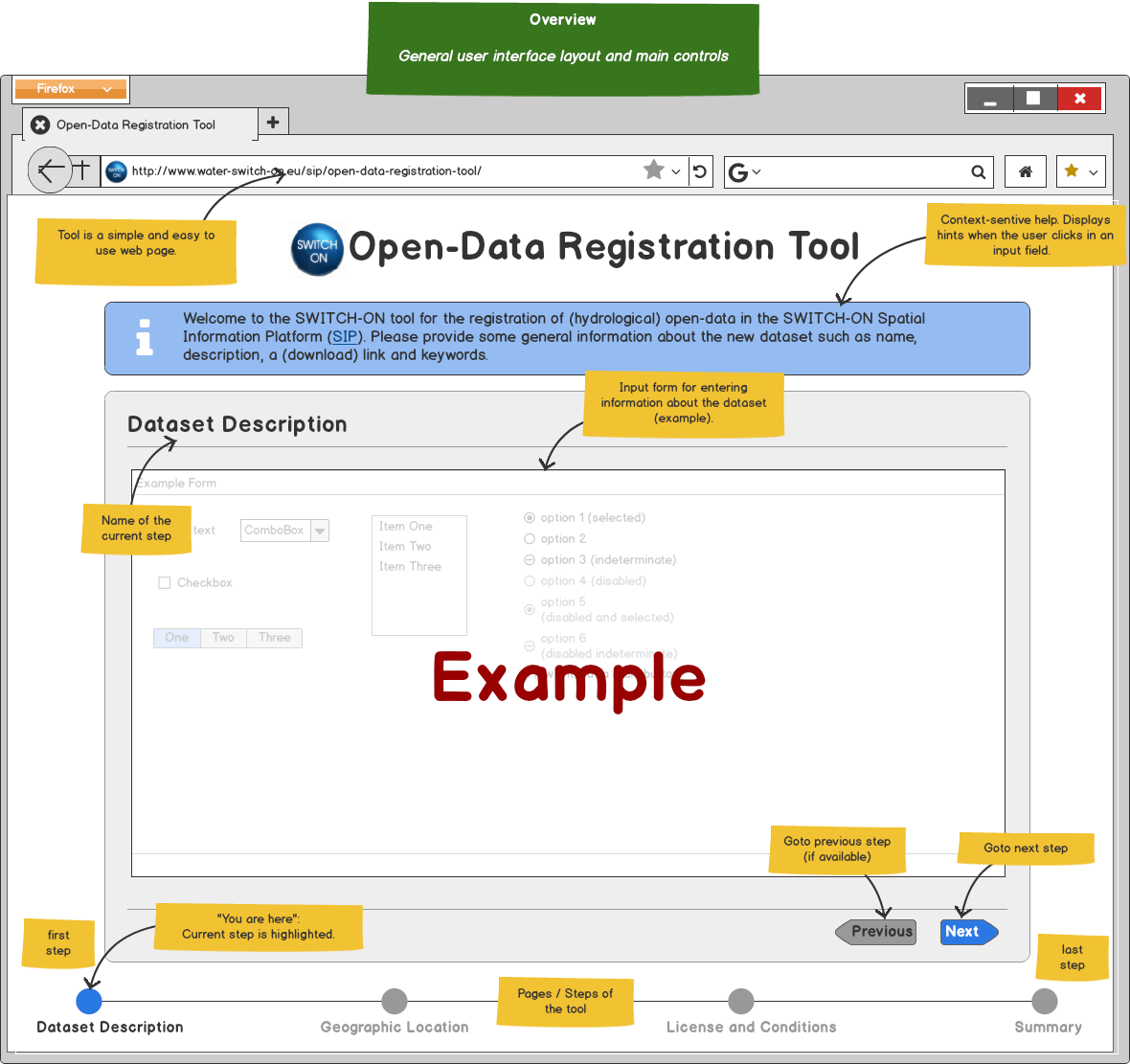
Mockup 000-Overview

General user interface layout of the tool and main controls:

000-overview 1

@p-a-s-c-a-l p-a-s-c-a-l added this to the User Stories milestone Nov 17, 2015
@p-a-s-c-a-l
Copy link
Contributor

Mockup 010-Resource-Description

010-resource-description

@p-a-s-c-a-l
Copy link
Contributor

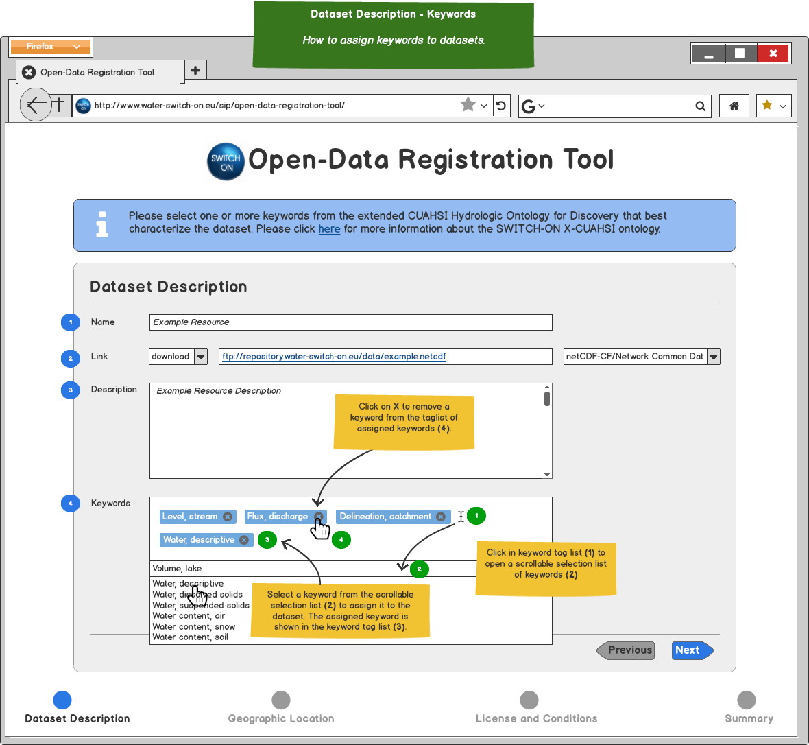
Mockup 011-Resource-Description-Keywords

011-resource-description-keywords

@p-a-s-c-a-l
Copy link
Contributor

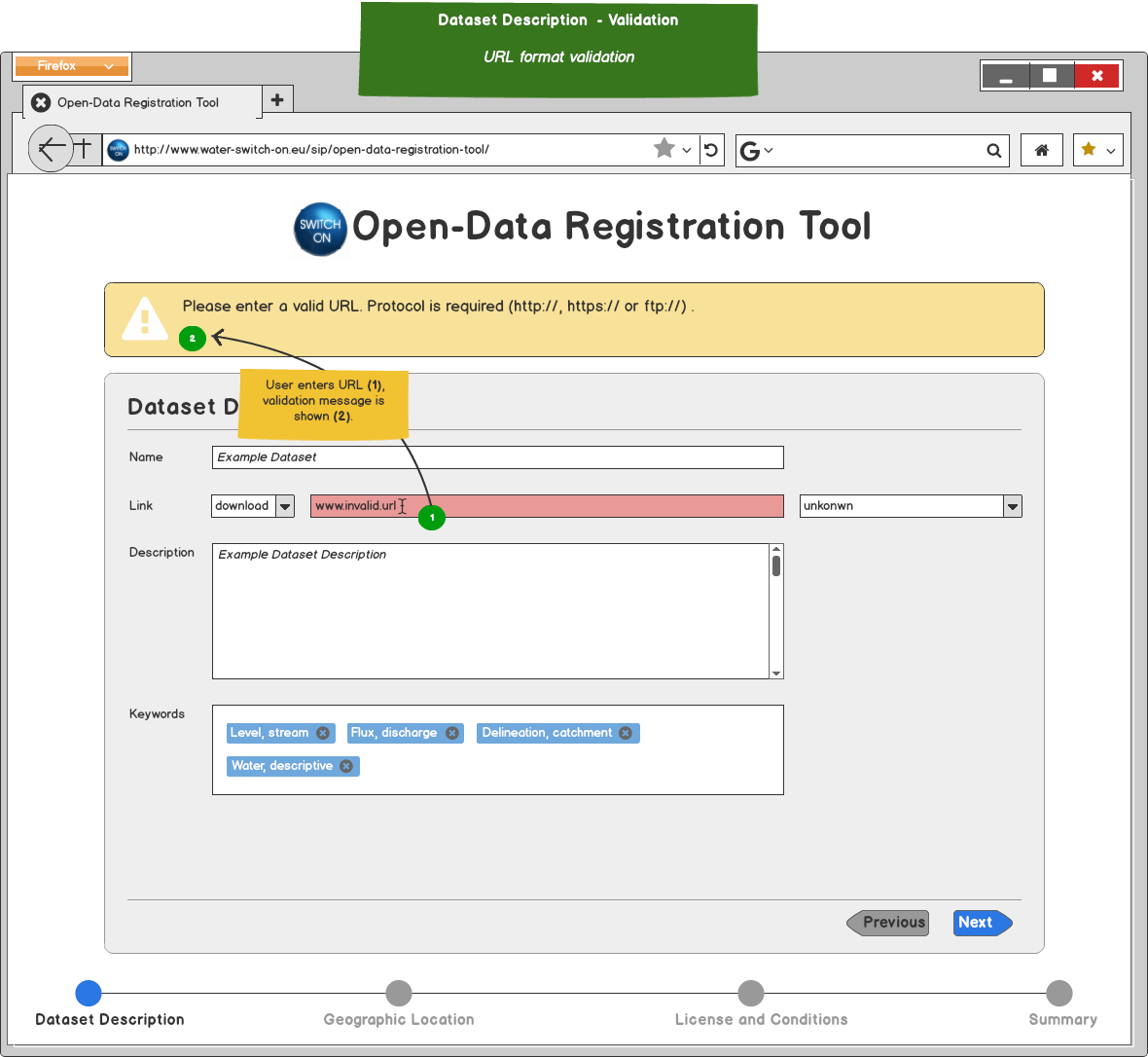
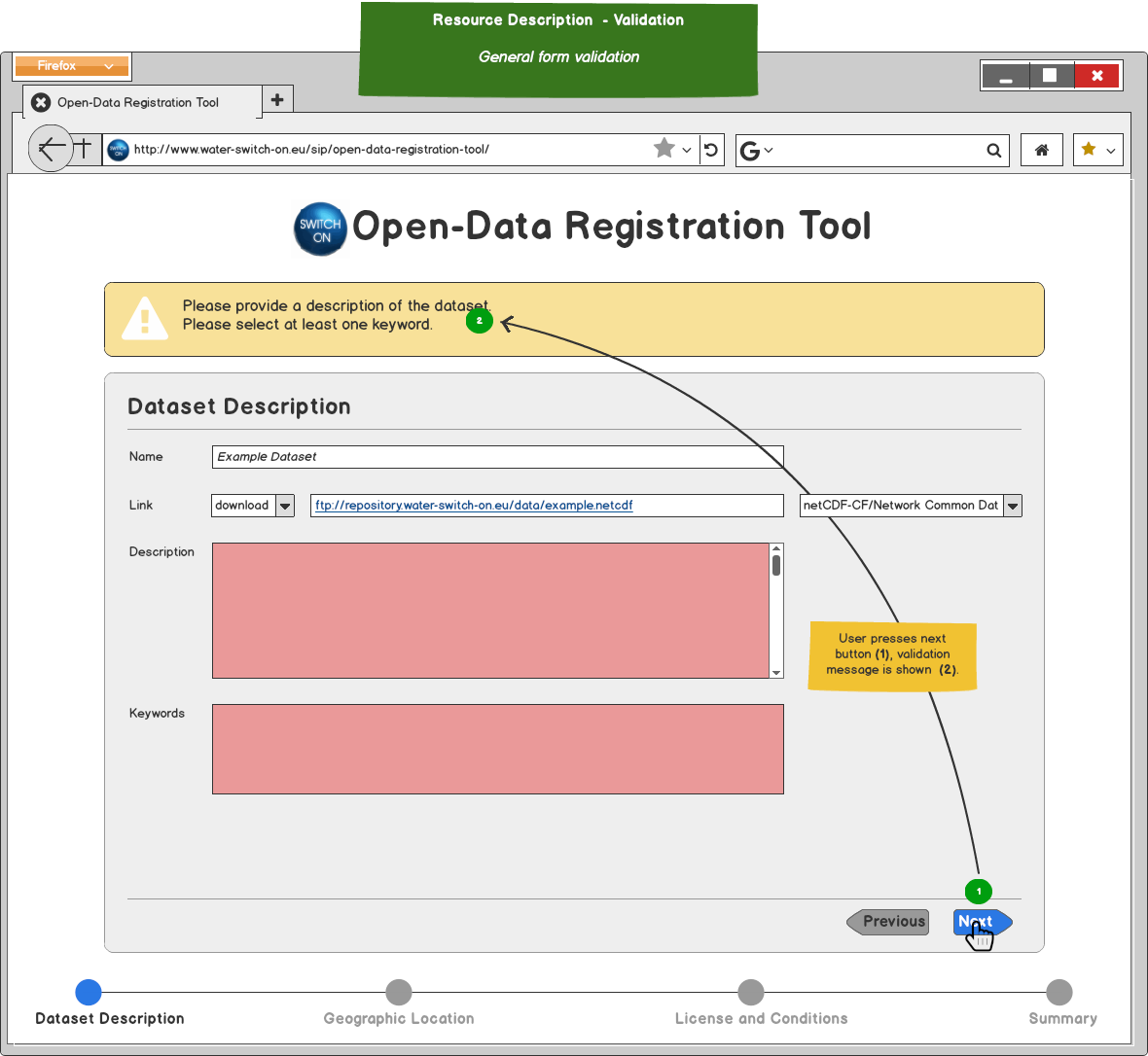
Mockup 012-Resource-Description-Validation-1

URL format validation
012-resource-description-validation-1

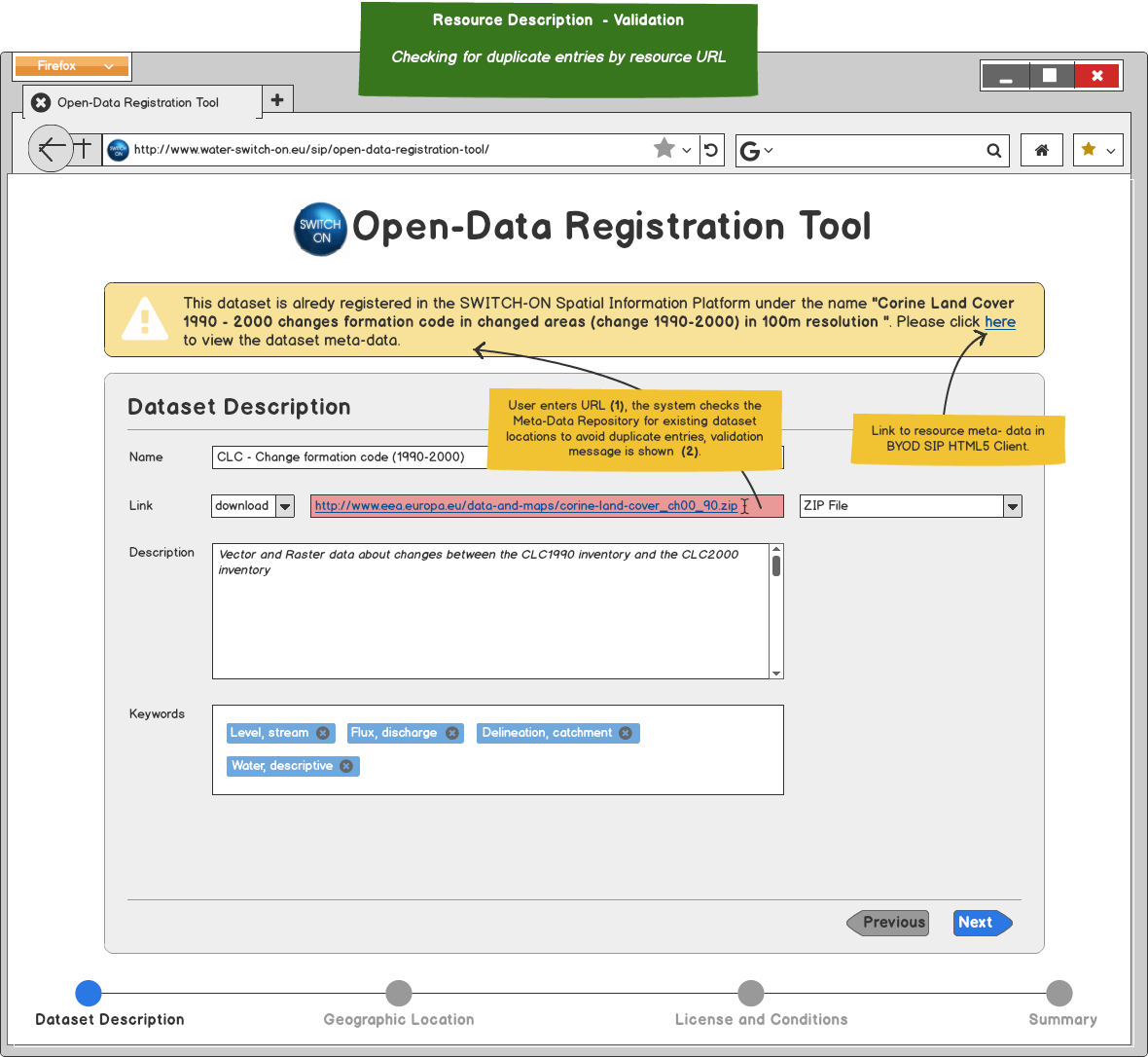
Mockup 013-Resource-Description-Validation-2

Checking for duplicate entries by resource URL
013-resource-description-validation-2

Mockup 014-Resource-Description-Validation-3

General form validation
014-resource-description-validation-3

@p-a-s-c-a-l
Copy link
Contributor

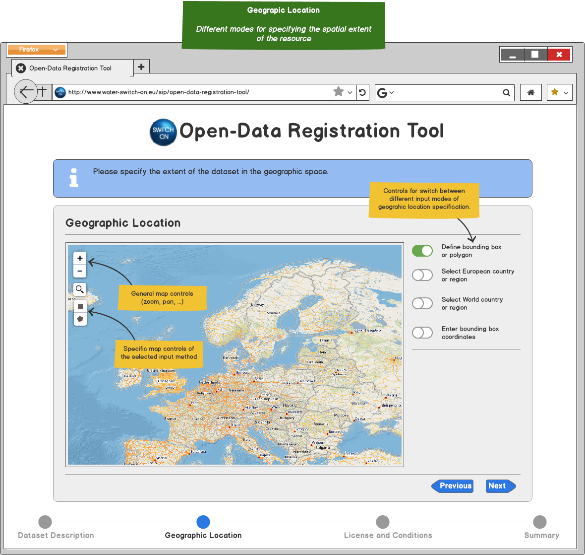
Mockup 020-Geographic-Location

020-geographic-location

Mockup 021-Geographic-Location-Define

Define bounding box or polygon
021-geographic-location-define

Mockup 022-Geographic-Location-Select

Select country or region
022-geographic-location-select

Mockup 023-Geographic-Location-Enter

Enter coordinates
023-geographic-location-enter

Mockup 024-Geographic-Location-Validation

024-geographic-location-validation

@p-a-s-c-a-l
Copy link
Contributor

Mockup 030-License-and-Conditions

Information about conditions for using the resource

030-license-and-conditions

Mockup 031-License-and-Conditions-Selection

031-License-and-Conditions-Select

Mockup 032-License-and-Conditions-Validation

032-License-and-Conditions-Validation

@p-a-s-c-a-l
Copy link
Contributor

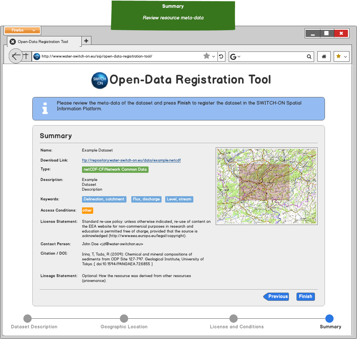
Mockup 040-Summary

Review resource meta-data.

040-Summary

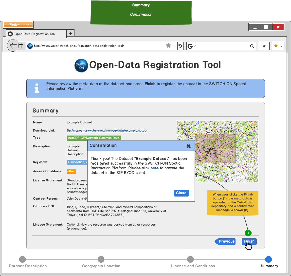
Mockup 041-Summary-Confirmation

041-Summary-Confirmation

@lornalittle
Copy link

Title of the tool should be 'Open-Data Registration Tool'

@lornalittle
Copy link

Instead of using the word 'resource' in the help information, use the word 'data' or 'datasets'

@lornalittle
Copy link

The top of the first page of the mock up - instead of resource description, use 'data description'

@serenaceola
Copy link

I totally agree with Lorna's comments. Then I will add some more:
Mockup 000
Next Pages/steps: maybe grey points? and also grey fonts? to better differentiate between current and next steps

Mockup 022-Geographic-Location-Select
When selecting European country or region, is it possible to select e.g. single Italian regions?
I would need this since I am using 3 of them in the nightlights experiment

Mockup 040-Summary:
I do not know what "lineage" refers to. We should find a synonym "Origin"? but I don't like it too much...

@duropa
Copy link

duropa commented Nov 20, 2015

I like it. Just one question. Is the font (type, size) as it is planned to be? I would suggest to have the same layout and formatting as in BYOD tool...

@p-a-s-c-a-l
Copy link
Contributor

@switchonproject/end-users Thank you for your comments, I'll update the mock-ups accordingly.
@duropa Yes, the new tool will have the same layout, fonts, etc. as the BYOD

@p-a-s-c-a-l
Copy link
Contributor

@switchonproject/end-users The mockups have been updated in place considering the following change requests:

  • Title of the tool should be 'Open-Data Registration Tool'
  • Instead of using the word 'resource' in the help information, use the word 'data' or 'datasets
  • The top of the first page of the mock up - instead of resource description, use 'data description'
  • License information - the first in the list could be the same license as we have in SWITCH ON, followed by Research Only, and then Other. Other leads to compulsory description of which license that is used.
  • Geographic Location: multi polygons, multiple countries, SHP upload -> new user story
  • grey points and also grey fonts in next Pages/steps

@serenaceola I'll add the Italian Regions to the list.

@p-a-s-c-a-l
Copy link
Contributor

I slightly modified the mock-ups for improved keyword selection.

Here is a preview of the keyword selection functionality:

keyword-selection

@p-a-s-c-a-l
Copy link
Contributor

@switchonproject/end-users

I've deployed the first preview version of the the tool at: http://switchon.cismet.de/open-data-registration-snapshot/

@p-a-s-c-a-l
Copy link
Contributor

The check for duplicate links in the Meta-Data Repository has been implemented. You can test it with e.g. the following URL (copy the URL intto "Link" input field): http://www.eea.europa.eu/themes/water/status-and-monitoring/state-of-bathing-water/country-reports-2013-bathing-season/albania-2013-bathing-water-report/at_download/file

url-validation

@lornalittle
Copy link

image

  • Link: should say Link to Data. In the link box, in grey, should say 'type of link'. Order should be 'link to order data'
  • Next drop down box to right should have in grey: choose file type.
  • Third box: In grey should say 'Choose file format'.
    - Remove na from the list.
    - Add ‘unknown’ to the top of the list.
    - Make the list alphabetical.
    - Remove duplicates.
    - Clean up list –use common abbreviations instead of full names.
    - In firefox, the file format box needs a scroll bar.
  • Add a link to CUAHSI webpage to find more info on keywords.
    - Remove ‘X CUASHI’ from grey text information.
    - Should have table of tick boxes for keywords, listed in columns, instead of drop list (to get full overview before choosing).
    - Derived variable – what does that mean?
    - Add simulated and observed to keyword list.
    - The keywords are not right! Should match the CUASHI words.

@lornalittle
Copy link

image

  • Remove 2nd ‘use’ from green info box. Replace 'geographic space' with 'map'.
  • Map did not work in Internet explorer – map didn’t adjust to screen size.
  • Should be a heading over all options saying ‘Select One’
  • Buttons on right hand side need white background – cannot see the green.
    • The buttons should just be a dot to click in with a colour to show when it is selected.
    • The box underneath the buttons is missing a heading – should have country or region to match when bounding box coordinates is selected.
      • Selecting Europe takes most of the world! Can we please have just one Australia/North America.
  • Need a note that your bounding box shape has been successful – pop up or that the next button goes green when bounding box is ready.

@lornalittle
Copy link

image

  • CC should be written out fully with abbreviation in brackets: Creative Commons License (CC-NY-SC-SA).
    • Add the other versions of Creative commons to the list.
    • Have a link to the right side of access conditions: Read more about Creative Commons Licenses (www.creativecommons.org).
    • Default option for access conditions should be the most open CC license.
    • If you choose CC license, you shouldn’t be able to add any other information.
  • Add second row to contact where user can specify 'Institute'
  • Data lineage: grey text should say – 'Provide information on the sources used to create datasets. Links and citations can be included'.

@lornalittle
Copy link

image

  • Order-link - should be two headings: 'Type of Link', 'Link to data'.
  • Content type should be 'Format'.
  • Conditions should be 'License'
  • Contact person should be Contact Person and Institute (two rows).

@lornalittle
Copy link

When considering the upload data tool connected to the metadata tool:

  • Linked from upload: Should not be able to change the name of dataset if you came from the upload tool.
  • Name and link and file box should be greyed out/deactiviated if you come from the upload tool.
  • File type came up incorrectly from previous tool. Default should be ‘please choose’.
  • Link from Deltares tool was not valid.
  • Should be a link back to upload tool from metadata tool

@lornalittle
Copy link

Overall impressions: impressed, many nice things in this tool

@duropa
Copy link

duropa commented Feb 5, 2016

to add to lorna:
I think it is generally very nice...i'm attaching some minor comments which might be considered:

  1. I found the size of the application window too large for my 13' laptop. the upper logo is too large so I was not able to see the bottom part of the tool
  2. the map was working for me on ie 11. I just found visually too large the buttons for selection of the map options
  3. are all the files types proposed to upload on the first screen linkable with geographic location? will we download only objects related to geographic space? (e.g. there is an option to download a rich text format, so it could be a simple text, or some script, which is sometimes difficult to assign to geographic location)
  4. Default access conditions start with a strange acronym.
  5. the summary circle (on the bottom) is not enabled. when I already was on summary then went back then it is not possible to go to summary directly.
    cheers
    d.

@p-a-s-c-a-l
Copy link
Contributor

@lornalittle @duropa

Thank your for your comments! I'll implement the the requested changes and make a new release.

@p-a-s-c-a-l
Copy link
Contributor

  • Should have table of tick boxes for keywords, listed in columns, instead of drop list (to get full overview before choosing).

Keyword selection was implemented on basis of this mockup: #1 (comment)

@lornalittle
Copy link

Yes thank you - when we were testing it however, it was difficult to find the right words. As a group we felt it would be better to have columns of tick boxes to get an overview first, then choose - otherwise you just start choosing from the top of the list.

The keywords should be the same as in the BYOD.

@p-a-s-c-a-l
Copy link
Contributor

@switchonproject/end-users New update available: http://switchon.cismet.de/open-data-registration-snapshot/
Supports also saving in Meta-Data Repository.

@AnnaKue
Copy link

AnnaKue commented Sep 6, 2016

Hi! The lineage information from the "upload metadata" tool should show up in the records when looking for the data in the "search data" tool.
We have uploaded data using the data+metadata upload tool. We filled the "data lineage" fied with some information but once the upload is completed, the lineage information doesn't appear in the BYOD when we look for the data (for example here: http://www.water-switch-on.eu/sip-webclient/byod/#/resource/12031).

@p-a-s-c-a-l
Copy link
Contributor

@AnnaKue I'll check that and make a bugfix.

@p-a-s-c-a-l
Copy link
Contributor

@AnnaKue

Llineage information is now shown in BYOD:

image

Sign up for free to join this conversation on GitHub. Already have an account? Sign in to comment
Projects
None yet
Development

No branches or pull requests

8 participants