Open PQ Dashboard
A web based dashboard for system-wide visualization of power quality data contained in the openXDA data layer.
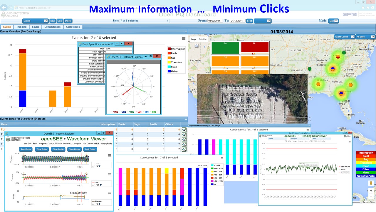
Open PQ Dashboard provides visual displays to quickly convey the status and location of power quality (PQ) anomalies throughout the electrical power system. Summary displays start with the choice of a geospatial map-view or annunciator panel, both with unique visualizations for across-the-room viewing fit for a PQ operations center. Drill-downs are in place for various statistics and guide users all the way down to the waveform level. This version consists of a few proof-of-concept applications of applying event severity and trend values to heatmap displays—giving the PQ engineers a wide-area status of PQ for quick interpretation. Data quality has been added so users can quickly see when meters are providing incomplete or invalid data. This dashboard currently accepts power quality data from COMTRADE and PQDIF standard file formats, E-Max Instruments native file format, and some SEL native .eve files from a limited number of relay models. Additional input file formats can be added as new projects require them. See the installation manual for more details.
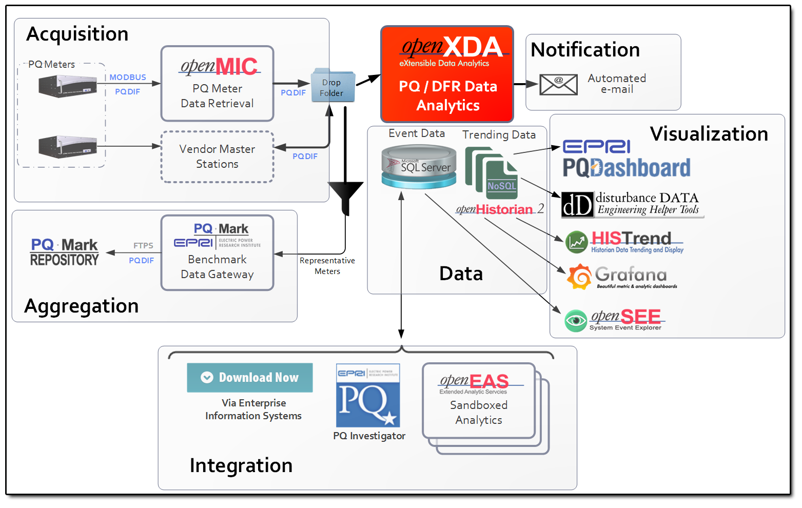
Where Open PQ Dashboard Fits in:
- Instructions for using PQ Dashboard can be found in the wiki.
- Check out the GPA wiki for more information about all products.
- Get in contact with our development team on our discussion board.
Instructions for deploying PQ Dashboard can be found in the wiki
If you would like to contribute please:
- Read our styleguide.
- Fork the repository.
- Work your magic.
- Create a pull request.


