Created Crayons Button Preact component #6987
Conversation
 pr-triage
bot
added
the
PR: draft
pr-triage
bot
added
the
PR: draft
 rhymes
changed the title
rhymes
changed the title
|
whoops i didn't mean to approve, since it's a still draft ;p but whatever.. |
 nickytonline
force-pushed
the
nickytonline/added-crayons-button-preact-component
branch
from
nickytonline
force-pushed
the
nickytonline/added-crayons-button-preact-component
branch
from
6807825 to
26fe594
Compare
| @@ -46,16 +46,6 @@ Outlined.story = { | |||
| name: 'outlined', | |||
| }; | |||
|
|
|||
| export const Text = () => ( | |||
There was a problem hiding this comment.
This story for the HTML components really isn't necessary. Most buttons just have text in them.
| @@ -5,7 +5,7 @@ import { Dropdown } from '@crayons'; | |||
| import './dropdown-css-helper.scss'; | |||
|
|
|||
| export default { | |||
| title: 'Components/Dropdowns/JSX', | |||
| title: 'Components/Dropdowns', | |||
There was a problem hiding this comment.
For Preact components, no point on adding another folder in the hierarchy for the Storybook sidebar. It makes sense for HTML components, but not JSX.
| @@ -1 +1,2 @@ | |||
| export * from '@crayons/Button'; | |||
There was a problem hiding this comment.
Export all buttons so that they are accessible via.
import { Button } from '@crayons';
| } | ||
|
|
||
| if (disabled) { | ||
| additionalClassNames += ' crayons-btn--disabled'; |
There was a problem hiding this comment.
Only buttons that generated <a /> tags get this CSS class.
| as === 'button' ? { type: buttonType, disabled } : { href: url }; | ||
|
|
||
| return ( | ||
| <ComponentName |
There was a problem hiding this comment.
ComponentName can be either button or a.
| return additionalClassNames; | ||
| } | ||
|
|
||
| export const Button = ({ |
There was a problem hiding this comment.
Default settings will give us a primary button.

| import { defaultChildrenPropTypes } from '../../src/components/common-prop-types'; | ||
| import { Button } from './Button'; | ||
|
|
||
| export const DangerButton = ({ |
| import { defaultChildrenPropTypes } from '../../src/components/common-prop-types'; | ||
| import { Button } from './Button'; | ||
|
|
||
| export const OutlinedButton = ({ |
| import { defaultChildrenPropTypes } from '../../src/components/common-prop-types'; | ||
| import { Button } from './Button'; | ||
|
|
||
| export const SecondaryButton = ({ |
|
@ludwiczakpawel, just a couple of outstanding things to do for buttons. I still have to write some tests and I also noticed that hover and active styles work when a button is disabled. If I get time today, I will look at this, but if not and you have time when you start your day tomorrow, it shouldn't take too long. |
nickytonline
force-pushed
the
nickytonline/added-crayons-button-preact-component
branch
from
dc62782 to
e3b44e5
Compare
|
Lemme know if still needs help with hover/disabled. |
pr-triage
bot
added
PR: unreviewed
Looking at it now. I'll ping you if I get stuck. |
 nickytonline
changed the title
nickytonline
changed the title
…button is rendered.
nickytonline
changed the title
|
The code climate issues are complaining about prop types being repetitive code. This is a false negative as it's very common for prop types to become repetitive. |
…crayons-button-preact-component
|
@ludwiczakpawel, I did not add a variant for a design crayons button that is just text. It doesn't really make sense to me or is this just supposed to be a regular hyperlink?
|
 pr-triage
bot
added
PR: partially-approved
pr-triage
bot
added
PR: partially-approved
|
btw. while on it... maybe you could kill that hover effect we have: https://github.com/thepracticaldev/dev.to/blob/master/app/assets/stylesheets/scaffolds.scss#L68-L74 ? it's driving me crazy :D |
pr-triage
bot
added
PR: unreviewed
…crayons-button-preact-component
done. |
| &:enabled:not(&--disabled):hover, | ||
| &:enabled:not(&--disabled):active, | ||
| &--active:enabled:not(&--disabled) { |
| children, | ||
| variant = 'primary', | ||
| as = 'button', | ||
| className, | ||
| icon, | ||
| url, | ||
| buttonType, | ||
| disabled, | ||
| onClick, | ||
| onMouseOver, | ||
| onMouseOut, | ||
| onFocus, | ||
| onBlur, |
There was a problem hiding this comment.
These are all properties of the props parameter, so technically it's one param. 😄 They are all potentially required. It's not that super uncommon. Think of an HTML element and all the potential attributes they can have. 😉
| export const Button = ({ | ||
| children, | ||
| variant = 'primary', | ||
| as = 'button', |
There was a problem hiding this comment.
mmm, I saw you note about using as but as I see it's immediately assigned to ComponentName as a const, what if we call it htmlElement instead of as or componentName ?
There was a problem hiding this comment.
The funny thing about JSX is a component name has to be Pascal cased. So it does look odd setting const ComponentName = as;.
| variant, | ||
| className, | ||
| icon, | ||
| disabled: as === 'a' && disabled, |
There was a problem hiding this comment.
htmlElement === a looks cool
There was a problem hiding this comment.
Instead of htmlElement, it actually makes sense to call it tagName as that's what it really is, https://developer.mozilla.org/en-US/docs/Web/API/Element/tagName.
There was a problem hiding this comment.
Great! tagName which follows HTML conventions!
| @@ -0,0 +1,32 @@ | |||
| import { h } from 'preact'; | |||
There was a problem hiding this comment.
Ok, I'm sure you thought about it, but do we need these specialized files? They seem identical except for the name of the component. They all use <Button variant="VARIANT_NAME">, what if we just use Button ? And if and when we need one with lots of custom behavior, that can be added.
What do you think?
There was a problem hiding this comment.
I decided to go with the separate buttons mainly because I thought from a DX perspective, <DangerButton /> would be more grokkable than <Button variant="danger" />, but this is not a deal breaker for me.
There was a problem hiding this comment.
+1 on having less code in general :-) Also ripgrep is quite fast so rg Button | rg danger is not a big issue :D
There was a problem hiding this comment.
Yeah. I asked some others on our Slack, and I think I will just go with <Button variant="..." /> without the additional layer.
There was a problem hiding this comment.
Now there is only the <Button /> component and you simply use the variant prop to decide what type of button you want. e.g. <Button variant="danger">DANGER!</Button>
 pr-triage
bot
added
PR: partially-approved
nickytonline
deleted the
nickytonline/added-crayons-button-preact-component
branch
pr-triage
bot
added
PR: merged
pr-triage
bot
added
PR: partially-approved
nickytonline
deleted the
nickytonline/added-crayons-button-preact-component
branch
pr-triage
bot
added
PR: merged
What type of PR is this? (check all applicable)
Description
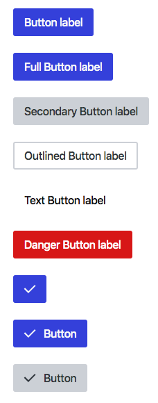
Design system buttons are now available as Preact button components. See the latest Storybook to see button components in action.
By default the
<Button />component renders as an HTML button element,<button ... />, but you can also render it as an HTML anchor element,<a ... />, via theasprop of the<Button />component. I usedasas this is what styled-components used. I basically couldn't think of a better prop name. 😄Related Tickets & Documents
Mobile & Desktop Screenshots/Recordings (if there are UI changes)
Primary
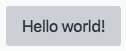
<Button {...props} />Secondary
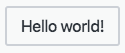
<Button variant="secondary" {...props} />Outlined
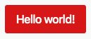
<Button variant="outlined" {...props} />Danger
<Button variant="danger" {...props} />Added tests?
Added to documentation?
[optional] Are there any post deployment tasks we need to perform?
[optional] What gif best describes this PR or how it makes you feel?