XRUI is a responsive UI framework for making cross-platform XR applications with the Unity 3D editor. Its purpose is to assist users in creating efficient and adaptive UIs that can automatically adjust depending on the deployed platform and the environment's reality, supporting regular PC environment as well as AR and VR environments. This way, users only need to design and develop their UI once for all platforms, resulting in a great saving of time.
XRUI is based on Unity's new UI system, UI Toolkit. Internally, it uses UXML and USS, so a basic knowledge and understanding of these technologies are required to use this framework.
- In the package manager, click on
Add package from git URLand insert the repository's URL: https://github.com/chwar/XRUI.git
- Alternatively, you can unzip and import the package manually.
- Add the XRUI controller to your scene by navigating to
XRUI > Add XRUI Controller. You can also create an empty game object and attach the main XRUI script (XRUI.cs). This script is a singleton flagged asDontDestroyOnLoad. It contains the main API that can be easily accessed through the instance:
using com.chwar.xrui;

void Start(){
    // XRUI.Instance...
}- The package uses a default configuration that references the default UXML templates for UI elements. You can create your own by navigating to
Assets > Create > XRUI > Create XRUI Configuration asset. You can then override the default templates for UI elements with your own (see Custom UI Elements). Don't forget to reference your own XRUI configuration asset to the XRUI controller.

XRUI provides a few UI Elements. The style is minimalistic and inspired from Bootstrap. You can add them in your project by navigating from the Unity menu to XRUI > Add XRUI Element. This creates a game object containing a UIDocument (which contains the UXML template and USS styles) and an XRUI script that matches the element. Add your own scripts to this object with a reference to the XRUI script to define the behaviour of the UI.
XRUI elements are thought as basic containers for user content. Given the hierarchic nature of UXML, it is easy to append content within the UI elements at runtime. To easily access your UXML contents and append them into various XRUI elements, reference them in the intended UI Elements list within the XRUI controller:

The list of UI elements is accessible within the XRUI controller's instance. Use the GetUIElement method for easy access:
// Use the name of the VisualTreeAsset you put in the inspector list
VisualTreeAsset myElement = XRUI.Instance.GetUIElement("MyElement");Click to expand!
When adding UI Elements through the XRUI menu in Unity, the system uses the template referenced in the XRUI Configuration asset (see Installation). Each XRUI element script inherits from the XRUIElement class, which comes with some useful generic methods.
To add or remove visual elements from the UI element, call these methods:
VisualElement myElement = someVisualTreeAsset.Instantiate();
XRUICard card = GetComponent<XRUICard>();

card.AddUIElement(myElement, "MyCardContainer");
card.RemoveUIElement(myElement);
You can also show or hide XRUI elements at any time:
card.Show(true);    // Display.Flex
card.Show(false);   // Display.None

card.Show(myElement, false); // Hides some of the content
Note: Keep in mind that hidden elements will not be found with a regular QML query, as they are hidden. You can still find them by either keeping a reference to the visual element in your code, or by querying it like this:
card.Query<TemplateContainer>().Where(ve =>
  ve.style.display.value.Equals(DisplayStyle.None)).First();
Click to expand!
 |
 |
 |
| PC | AR | VR |
The provided XRUI Menu template is designed as a side menu that collapses out of the view frustum. It can be configured in the inspector (see screenshot above).
The list element template is the UXML template that is used to create entries. You can provide a template with a simple button, or more complex compositions with images, text, buttons, etc. to suit your needs.
Add entries to your menu:
var menu = GetComponent<XRUIMenu>();
// The menu returns the created entry to be configured
var element = menu.AddElement();
element.Q<Label>("MyElementLabel").text = "myLabelTitle";Click to expand!
 |
 |
 |
| PC | AR | VR |
The XRUI List works in the same way as the menu:
var list = GetComponent<XRUIList>();
// The list returns the created entry to be configured
var element = list.AddElement();
element.Q<Label>("MyElementLabel").text = "myLabelTitle";Click to expand!
 |
 |
 |
| PC | AR | VR |
The provided navbar is a very simple dark top bar. Since XRUI does not provide any third-party assets, it is provided empty. However, the default template contains a row of buttons (three justified on the left side, one justified on the right side) to get you started. Since navbar designs can be very different, the adopted solution was to propose a very generic template to fit the most users. You could use the template as a base to add your own elements (buttons, dropdowns, labels) to tailor the navbar to your needs.
Click to expand!
 |
 |
 |
| PC | AR | VR |
The XRUI Card is floating on the right corner by default, and sticks to the bottom of the screen in AR mode. You can specify custom dimensions from the inspector. Use the AddUIElement method (see XRUI Element) to fill the card with content. The template's default container is named "MainContainer".
Click to expand!
 |
 |
 |
| PC | AR | VR |
XRUI creates modals at runtime rather than requiring you to create all of them in the editor in order to save resources.
Given the hierarchic nature of UXML, modals are easy to reproduce. XRUI provides one XR Modal template, which consists of a title, empty container, two buttons (main and secondary) sticking at the bottom, and a closing button in the top right corner. You can use this template and fill its container dynamically at runtime.
In Unity, you can reference your modals in the intended list:

The name given to each modal entry can be used to find the matching template and create a modal from it, with the CreateModal method:
// Adapt the namespace to your own
Type t = Type.GetType("myModalScript");
XRUI.Instance.CreateModal("DemoModal", t);
Note: The user script type has to be passed outside of the XRUI package, because Unity packages can't access the Assembly-CSharp assembly, i.e. can't find user namespaces, and hence, can't find user scripts located in the Assets automatically. It's also not possible to reference it through the inspector, as it only accepts instances of a script and not the script itself.
This creates a modal game object on which the XRUIModal script is attached, as well as a UIDocument script that contains the main template. You can access the modal system's API through the XRUIModal script.
The user script type is used to create an instance of said script when the modal is created. This lets you define the behaviour of your elements. One approach is to create one method per page, and to setup event handlers on your buttons to navigate them. To create modal pages, use the UpdateModalFlow method. Its last parameter is a callback function that is fired once upon the page's creation.
private XRUIModal _xruiModal;
private UIDocument _uiDocument;

void Start() {
    _xruiModal = GetComponent<XRUIModal>();
    _uiDocument = GetComponent<UIDocument>();
    StartPage();
}

void StartPage() {
    _xruiModal.UpdateModalFlow("MyModalPage", "MainContainer", () =>
    {
        // This callback is only fired once, when the page is created for the first time
        // Put here initialization code, event subscriptions, etc.

        Button myButton = UIDocument.rootVisualElement.Q<Button>("myButton");
        _myButton.clicked += MyPage;
    });

    // Content to execute every time this page is opened.
}

void MyPage() {
    // ...
}You can use the default modal template that comes with the package and fill it with your own content. It consists of a title, empty container, two buttons (main and secondary) sticking at the bottom, and a closing button in the top right corner. You can add your content to the container by referencing it by name (MainContainer) to the UpdateModalFlow method, as per the example above. You can manipulate the buttons and change the title through the XRUIModal API.
Access the modal's public fields to change the title of the modal, the text of the buttons, or to set the icon of the top right close button:
_xruiModal.ModalTitle.text = "Create a new project";
_xruiModal.CancelButton.text = "Cancel";
_xruiModal.ValidateButton.text = "Finish";
_xruiModal.ValidateButton.visible = true;
Change the justification of the bottom buttons with the SetButtonsPlacement method:
// Supported options: FlexStart, FlexEnd, Center, Space Between, Space Around
_xruiModal.SetButtonsPlacement(Justify.Center);
Set the action of the cancel and validation buttons:
// These methods take an action as parameter, but you can provide a function call

_xruiModal.SetCancelButtonAction(XRUIModal.Destroy);
_xruiModal.SetValidateButtonAction(CreateProject);
Note: prefer these methods to the direct access to
ValidationButton.clickedorCancelButton.clicked, as the methods replace any other event subscription with the provided action. This means that a click on either button can have only one action on a given page.
Destroy the modal:
_xruiModal.Destroy();XRUI supports basic form validation by letting you define required fields. For now, only text fields are supported, i.e. XRUI determines if required text fields are empty or not.
_xruiModal.SetRequiredFields(_fieldOne, _fieldTwo, _fieldThree);You can pass as many fields as you want in one call. Internally, XRUI checks the page where each indicated field is contained in. When a user is on a page containing required fields, the modal's validation button is disabled until all required fields contain an input. Additionally, you can subscribe your own validation methods to the validation button and flag text fields with errors to indicate users the fields to correct.
_xruiModal.SetFieldError(_fieldWithError);Click to expand!
 |
 |
 |
| PC - Primary | AR - Success | VR - Warning |


The provided alert template sets them as floating cards in the right corner of the screen when in PC and VR mode, and as notifications at the top of the screen in AR mode. They also come with animations to attract the attention of users. You can show alerts for different purposes; the types of alerts are inspired from Bootstrap.
Show alerts using the ShowAlert method:
XRUI.Instance.ShowAlert(XRUI.AlertType.Primary, "Primary message.");
XRUI.Instance.ShowAlert(XRUI.AlertType.Success, "Success message.");
XRUI.Instance.ShowAlert(XRUI.AlertType.Warning, "Warning message.");
XRUI.Instance.ShowAlert(XRUI.AlertType.Danger, 	"Error message.");
XRUI.Instance.ShowAlert(XRUI.AlertType.Info, 	"Info message.");
You can also provide a title:
XRUI.Instance.ShowAlert(XRUI.AlertType.Primary, "Title", "Primary message.");You can also give a callback, which will be triggered upon clicking the alert:
XRUI.Instance.ShowAlert(XRUI.AlertType.Primary, "Click me!", "Click to trigger callback", () => MyCallback());Click to expand!
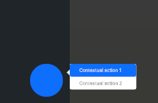 |
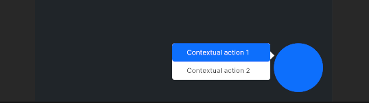 |
| PC | AR (identical) |
XRUI can create contextual menus dynamically. Here, PC and AR styles are identical: the contextual menu is shown as a floating list. VR is currently not supported for this template. Similarly to the menu and list templates, a menu element template is also given to create entries in the contextual menu. Because the entries are context-dependent, they need to be generated dynamically at runtime.
The ShowContextualMenu method needs at least the x and y coordinates of the parent element (i.e. the element that was interacted which caused the contextual menu to appear), and a boolean to indicate whether or not the styling should include an arrow pointing at the parent element. A first overload gives the possibility to provide a custom template. A second overload lets developers provide left and right offsets for finer tuning of the menu’s position. The method returns a XRUIContextualMenu instance, which is required to add entries to the menu.
var myElement = GetComponent<UIDocument>();
var myBtn = myElement.rootVisualElement.Q<Button>("myBtn");

// Define parent coordinates for menu positioning
Vector2 parentCoordinates = new Vector2(myBtn.worldBound.x, myBtn.worldBound.y);

// For using a custom template
VisualTreeAsset myTemplate = Resources.Load<VisualTreeAsset>("myTemplate");

myBtn.clicked +=
{
	var menu;
	// Use one of these overloads
	// Call with 2 parameters: parent coord. and whether to show a pointing arrow
	menu = XRUI.Instance.ShowContextualMenu(parentCoordinates, false);

	// 3 parameters: provide a custom template as 1st param.
	menu = XRUI.Instance.ShowContextualMenu(myTemplate, parentCoordinates, true);

	// 5 parameters: provide left and right offsets in pixels
	menu = XRUI.Instance.ShowContextualMenu(myTemplate, parentCoordinates, true, 50,
	100);
}

// To override the default menu entry template
menu.menuElementTemplate = Resources.Load<VisualTreeAsset>("myEntryTemplate");

// Add entries to the contextual menu
var entry = contextualMenu.AddMenuElement();
In addition, the contextual menu considers the available space on screen. By default, contextual menus will attempt to display on the right of the parent element. However, if there is no available space, they are displayed on the left instead.
XRUI's main functionality is to provide responsiveness for different build targets and XR variants. This is done by adapting all XRUI elements automatically when the build target is changed, by triggering XRUI related USS classes at runtime and in the Unity Editor.
To change the XR variant, change the reality value in the XRUI controller:
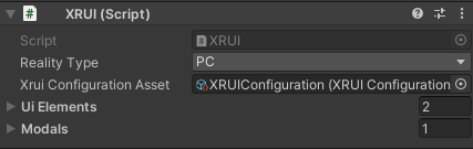
The XRUI API provides a method to assess the current XR variant. You can use it to do target-specific manipulations like so:
if(XRUI.IsCurrentReality(XRUI.RealityType.AR)) {
    // AR specific code here
}In order to organize easily and efficiently UI elements on screen, XRUI makes use of a grid system. You can use it by navigating to XRUI > Add XRUI Grid. In the Unity editor, you can group UI components inside rows through the scene hierarchy. The XRUIGridController component is attached to the root of the grid, and contains the list of all rows. A weighting system allows you to define which rows should take which amount of space (this uses the flex-grow attribute of CSS/USS Flexbox).
For example, a top navbar can be setup in one row, with a weight of 0, i.e., it should not "grow"--as in, take space--more than its initial size. A second row containing the rest of the on-screen UI can have a weight of 1, i.e. it should take more of the available space than what its initial size requires. Since there are two rows and the first row has a weight of 0, this results in the second row using all remaining screen space. Horizontally, elements are contained in absolute containers, which mean they all take the entire horizontal space and can therefore overlap.


Note: In case all UI elements within a row are absolute, the row's height becomes zero, because its USS property is set to
height: auto. You should then indicate a minimum height in the indicated field to obtain the expected behaviour.
You can create your own UXML templates and refer them in the XRUI Configuration asset. You should however be careful in naming your elements, should you want to inherit the functionalities provided by the default UI elements. You can check them with Unity's UI Builder, or you can simply duplicate the UXML files and start working from here.
XRUI comes with its own set of styles that are imported just after Unity's in UI Toolkit's pipeline. They are imported through a theme file which is used in the provided Panel Settings asset (also linked in the XRUI Configuration asset). You can add your own root styles to this theme file, override the root XRUI styles, or remove some of the imported assets if you don't need them. Should you want to inherit some of the XRUI styles for your own UI elements, you can add the USS class .xrui to the desired root visual elements. Additionally, each XRUI component has its own class that uses the BEM methodology, as per Unity's recommendation. They are the following:
| XRUI Element | USS Class |
|---|---|
| Menu | .xrui__menu |
| Menu item | .xrui__menu__item |
| List | .xrui__list |
| List item | .xrui__list__item |
| Navbar | .xrui__navbar |
| Card | .xrui__card |
| Alert | .xrui__alert |
| Modal | .xrui__modal |
| Contextual Menu | .xrui__contextual-menu |