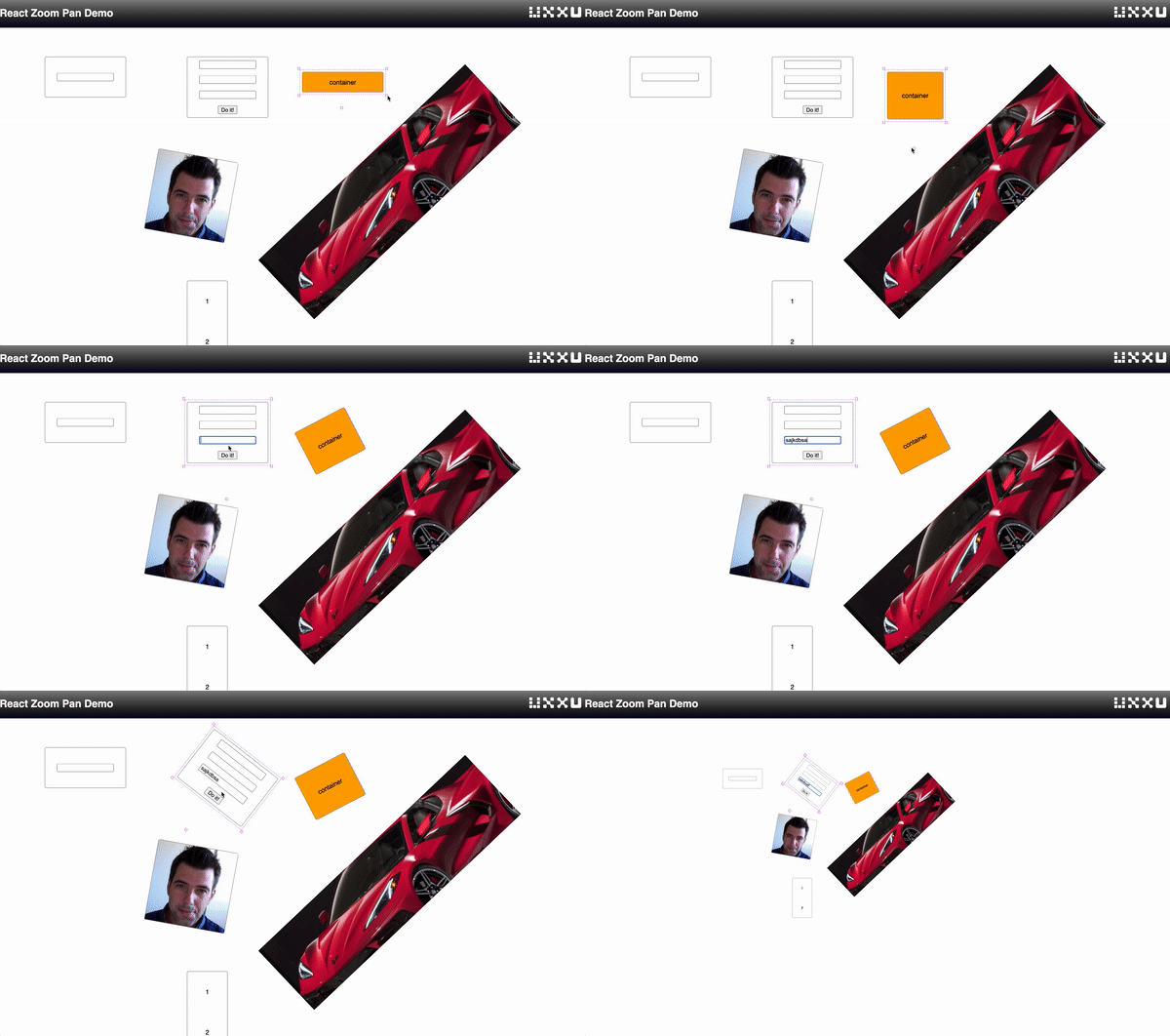
A react component that enables you to add pan,zoom,resize and rotation functionality to your application
React-zoom-pan is a container component that has zoom and pan functionality as well as adding resize,move,and rotation capabilities to any child element .
The component is capable of:
- Can handle thousands of elements .
- Pan Viewport
- Move elements
- Resize elements.
- Rotate elements.
- Zoom.
- Wheel zoom.
- Fully customisable elements.
To play with a live demo .
Support us with a monthly donation and help us continue our activities. [Become a backer]
npm install react-zoom-panUsing this component is really easy, Import the ZoomPan component,add the ZoomPan to your render method and add whatever other component inside the ZoomPan container. And that's all. Now all the components inside the container can be move,resize and rotate, you also can use your mouse wheel to zoom and pan.
import React, { Component } from 'react';
import ZoomPan from 'react-zoom-pan';

import './App.css';

export default class App extends Component {
  constructor(props) {
    super(props);
  }

  render() {
    return (
      <div className="app-container">
        <div className="flow-container">
          <ZoomPan>
            <div x={800} y={50} w={200} h={50}>
              container 1
            </div>
            <div x={100} y={250} w={200} h={50}>
              container 2
            </div>
          </ZoomPan>
        </div>
      </div>
    );
  }
}To set the dimensions like (x,y) positions or (width,height) on the children documents you can set the following properties:
| name | Descriptions |
|---|---|
| y | The y coordinate of the top point of the element |
| w | The width of the element |
| h | The height of the element |
| Property | params | Descriptions |
|---|---|---|
| onSelectItem | string | triggered when an element is selected |
| onChange | string | triggered when an element change |
| onAddItem | string | triggered when an element is added |


