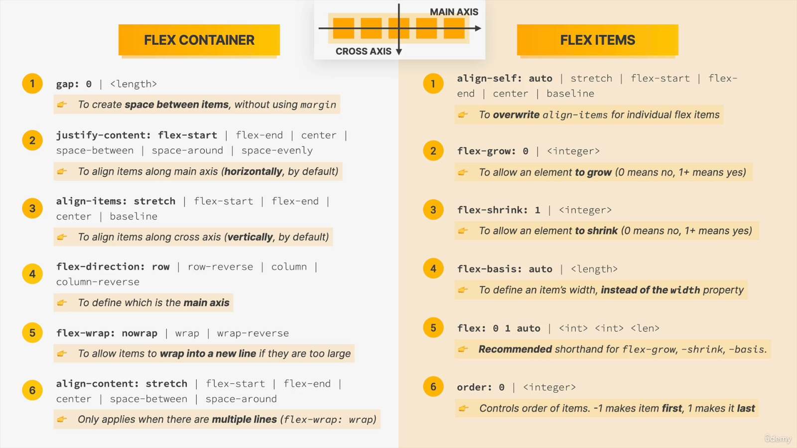
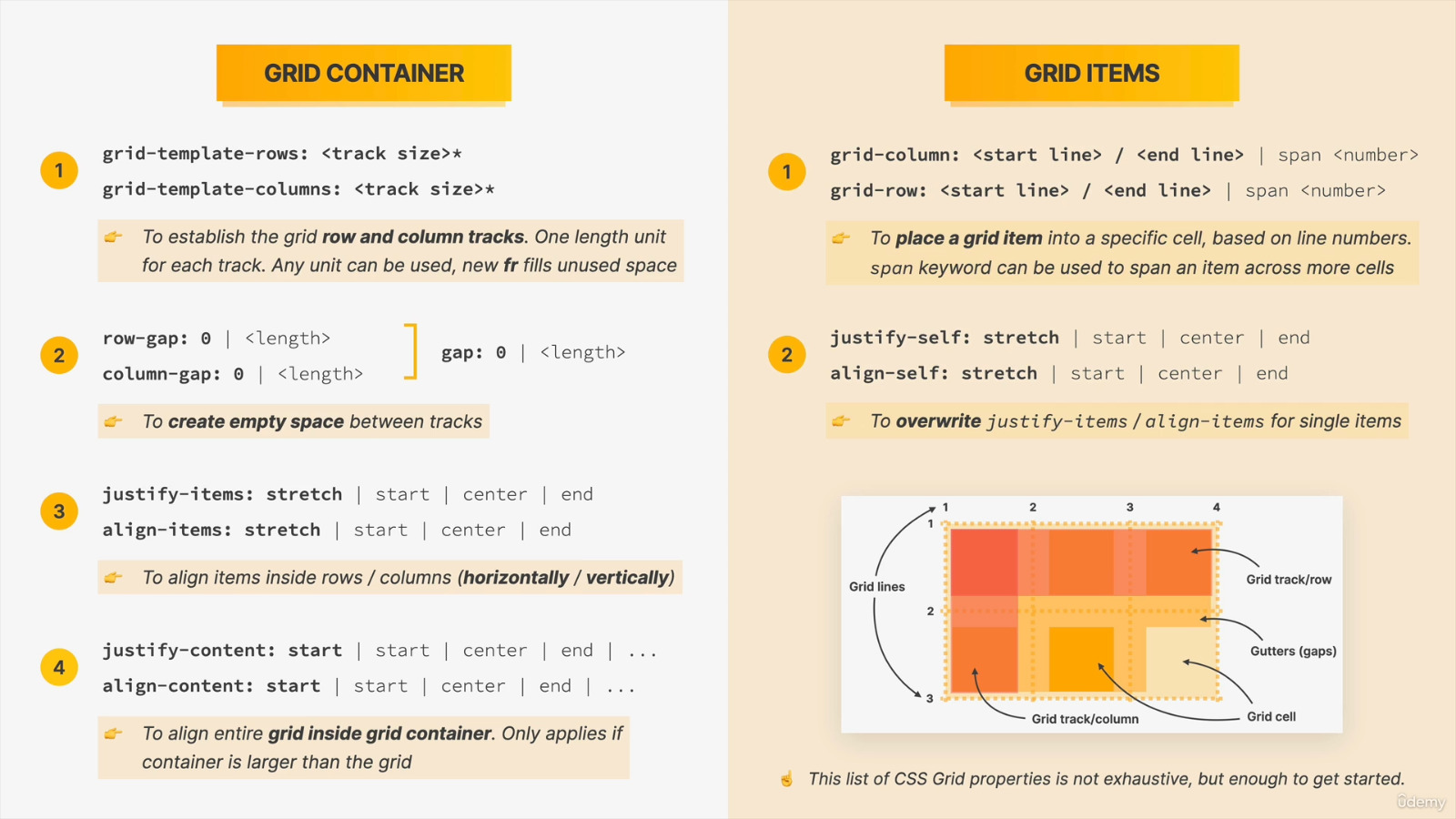
-
Inline and Block Elements
- Inline elements cant have some style properties that blocks have such as height and weight. However they can be identified like block such as :
<b style=" display: inline-block; height: 50px; ">example</b> -
Some display types: initial, inherit, none, inline, inline-block, block, list-item, table, table-row, table-cell, flex, inline-flex
-
When inspecting on browser Styles is the part what I identified for elements and Computed is what is identified automatically by browser.
-
Basic Selectors
- universal selector: (*)
- type selector: (input,h1)
- class selector: (.classname)
- id name selector: (#id)
- attribute selector: ( [class] {color: red}; , [id] {color: blue}; )
-
CSS can be added to HTML documents in 3 ways:
- Inline - by using the
styleattribute inside HTML elements - Internal - by using a
<style>element in the<head>section - External - by using a
<link>element to link to an external CSS file
<!DOCTYPE html> <html> <head> <link rel="stylesheet" href="styles.css"> </head> <body> <h1>This is a heading</h1> <p>This is a paragraph.</p> </body> </html> - Inline - by using the
-
Size unit "em" is better for scaling. It takes font-size as a reference.
If browser uses default.1 em = 16px -
CSS helper classes, also known as utility classes, are used as,
.gray {
color: gray;
}

.ff-sans {
font-family: sans-serif;
}

<h3 class="gray ff-sans">
    something grey n sans serif
</h3>
- When label is clicked it focuses on associated element.
-
Label for references the id of anything associated. If label tag contains the associated element, then no need id and for.
Below examples mean same thing.<form action=""> <label for="name">Name</label> <input id="name" type="text" /> </form><form action=""> <label> Name <input type="text" /> </label> </form> -
Input type declares what is expected. In mobiles, suitable keyboard opens due type, such as numbers or words.
-
If radio type inputs have same name, only one can be chosen at a time. Using "checked" makes one of them default.
-
Input value and name is important while posting the form. Name works as key.
-
Some selector identifications in CSS for components and actions;
input[type="email"]::placeholder, textarea::placeholder { color: rgb(175, 175, 175); } input[type="email"]:focus, textarea:focus { border-color: rgb(68, 176, 255); } :focus { outline: 0; } -
Icon that is used on background can be pixel fixed as background-size;
select { -webkit-appearance: none; background-image: url("angle-down.png"); background-repeat: no-repeat; background-size: 17px; background-position: right 10px center; } -
"+" sign can be used to mean "if some elements comes one after another" in CSS;
.radio-container label + label { margin-left: 10px; } -
.form-row > label -->affects one-down position children so it doesn't include the lower label tags.
-
Box sizing is used to keep child container inside of parent container.
It handles problems about border but wont affect margin. -
Therefore, at start of a project applying box sizing as below to make some adjustment is useful for smooth working.
* { box-sizing: border-box; } -
In this example (*) refers to universal selector.
-
Parent containers padding works as margin of the child container.
-
This adjustments must be in the first line of CSS
-
Reset.css disables all the auto-stylings in browsers and makes view exact in all browsers
-
Normalize.css only provides similarity in browsers and keeps auto styling for practicality.
-
Normalize.css can be imported in CSS by url
@import "https://necolas.github.io/normalize.css/8.0.1/normalize.css"
-
padding: 20px 10px 50px 40px;
- padding-top: 20px;
- padding-right: 10px;
- padding-bottom: 50px;
- padding-left: 40px;
- padding-top: 20px;
-
Padding works as clockwise
-
padding: 20px 0 50px 40px;
- no padding on right
-
padding: 20px 50px 40px;
- right and left 50px works symmetrically
-
padding: 20px 40px;
- top and bottom 20px
- right and left 40px
-
border: 10px dashed yellow;
- border-width: 10px;
- border-style: dashed;
- border-color: yellow;
- border-width: 10px;
-
Also apply them to all surface
-
background: red url("https://") center top no-repeat;
- background-color: red;
- background-image: url("https://");
- background-position-x: center;
- background-position-y: top;
- background-repeat: no-repeat;
-
font: italic bold 20px/1.4 sans-serif;
- font-style: italic;
- font-weight: bold;
- line-height: 1.4;
- font-family: sans-serif;
-
Color Names
This way contains 147 colors.
http://www.colors.commutercreative.com/grid/- color: red
-
HEX
Hexadecimal codes can be used in 3 or 6 digit- color: #ff4455
- color: #f45
-
RGB
- color: rgb(165, 76, 219)
-
RGBA
Alfa arranges opacity.- color: rgb(165, 76, 219, 0.6)
-
Current Color
This method first checks the container if any color defined and uses that color. If it is not defined, then checks the Parent Container.p { padding: 30px; color: white; background-color: currentColor; }
-
1px
-
1em = font-size
first check itself then parent -
rem = root em
directly goes for root, so it takes font size of htmlhtml { font-size: 20px; } -
%
uses percentage of the Parent container's property if exists
width: 30%; -
vh = viewport height
vw = viewport width.box { background-color: red; width: 100vw; height: 100vh; }gives a red box full screen of browser
-
vmin
vmaxuses the max or min side length of browser.
- visibility: hidden;
display: none;
opacity: .2;
All of them loaded in the page but wont show
-
woff & woff2 formats