This repository was archived by the owner on Sep 30, 2025. It is now read-only.
[Typography foundations] Text component beta release
#7068
Merged
Conversation
This file contains hidden or bidirectional Unicode text that may be interpreted or compiled differently than what appears below. To review, open the file in an editor that reveals hidden Unicode characters.
Learn more about bidirectional Unicode characters
 laurkim
force-pushed
the
typography-beta-release
branch
2 times, most recently
from
laurkim
force-pushed
the
typography-beta-release
branch
2 times, most recently
from
cd45e9e to
f75fdd8
Compare
laurkim
changed the title
Text component beta release
size-limit report 📦
|
laurkim
force-pushed
the
typography-beta-release
branch
from
29923e4 to
19e7c3d
Compare
5 tasks
laurkim
added a commit
that referenced
this pull request
Oct 27, 2022
### WHY are these changes introduced?

[Storybook
url](https://5d559397bae39100201eedc1-yvdsjjnrsr.chromatic.com/?path=/story/all-components-text--variants).

This was originally reviewed and approved in the
`typography-beta-release`
[PR](#7068) but needs to ship
first to unblock migrations.

### WHAT is this pull request doing?

Adds responsive styling to `heading2xl` to `heading4xl` variants to
support the functionality that `DisplayText` originally supported.

<!-- ℹ️ Delete the following for small / trivial changes -->

### How to 🎩

🖥 [Local development
instructions](https://github.com/Shopify/polaris/blob/main/README.md#local-development)
🗒 [General tophatting
guidelines](https://github.com/Shopify/polaris/blob/main/documentation/Tophatting.md)
📄 [Changelog
guidelines](https://github.com/Shopify/polaris/blob/main/.github/CONTRIBUTING.md#changelog)

Storybook url.

### 🎩 checklist

- [x] Tested on
[mobile](https://github.com/Shopify/polaris/blob/main/documentation/Tophatting.md#cross-browser-testing)
- [x] Tested on [multiple
browsers](https://help.shopify.com/en/manual/shopify-admin/supported-browsers)
- [ ] Tested for
[accessibility](https://github.com/Shopify/polaris/blob/main/documentation/Accessibility%20testing.md)
- [ ] Updated the component's `README.md` with documentation changes
- [ ] [Tophatted
documentation](https://github.com/Shopify/polaris/blob/main/documentation/Tophatting%20documentation.md)
changes in the style guide
laurkim
force-pushed
the
typography-beta-release
branch
3 times, most recently
from
cfa8688 to
15b7276
Compare
laurkim
force-pushed
the
typography-beta-release
branch
from
15b7276 to
a3710e2
Compare
…polaris.shopify.com (#6915)
…cated components
…omponents (#6605) ~~#### WARNING⚠️ ~~ ~~https://polaris.shopify.com/components/text is not currently active~~ ~~Do Not Merge!~~ Fixes #6537 <!-- link to issue if one exists --> <!-- Context about the problem that’s being addressed. --> Add deprecation warnings to all of the following existing Text components: - TextStyle - DisplayText - Heading - Subheading - Caption - VisuallyHidden | Text component | `console.log` | | --- | --- | | <img width="870" alt="Screen Shot 2022-07-12 at 10 12 53 AM" src="https://user-images.githubusercontent.com/59836805/178513139-742442e5-ccdc-4591-b0ad-b5ad0a19cbf0.png"> | <img width="633" alt="Screen Shot 2022-07-12 at 10 12 23 AM" src="https://user-images.githubusercontent.com/59836805/178513188-95c3db0e-0536-4de8-8396-fc36cf876818.png"> | Co-authored-by: Lo Kim <lo.kim@shopify.com>
laurkim
force-pushed
the
typography-beta-release
branch
from
8b62db5 to
b79cf0f
Compare
laurkim
force-pushed
the
typography-beta-release
branch
from
2ccdfab to
a9559db
Compare
kyledurand
approved these changes
Nov 4, 2022
| const propsTable = | ||
| type && status?.value !== 'Deprecated' ? ( | ||
| <PropsTable componentName={title} types={type} /> | ||
| ) : null; |
Merged
laurkim
pushed a commit
that referenced
this pull request
Nov 4, 2022
This PR was opened by the [Changesets
release](https://github.com/changesets/action) GitHub action. When
you're ready to do a release, you can merge this and the packages will
be published to npm automatically. If you're not ready to do a release
yet, that's fine, whenever you add more changesets to main, this PR will
be updated.


# Releases
## @shopify/polaris-icons@6.5.0

### Minor Changes

- [#7548](#7548)
[`432bdd5fe`](432bdd5)
Thanks [@anthonymenecola](https://github.com/anthonymenecola)! - add
cancel major icon


- [#7620](#7620)
[`35be8a003`](35be8a0)
Thanks [@rdott](https://github.com/rdott)! - Added inactive location
minor and major icons

## @shopify/polaris-migrator@0.8.0

### Minor Changes

- [#7403](#7403)
[`8859f5db5`](8859f5d)
Thanks [@jesstelford](https://github.com/jesstelford)! - Introduce
`migrate-motion` migration for migrating `transition`,
`transition-duration`, and `transition-delay` usages of duration values.


- [#7606](#7606)
[`cf7badbd1`](cf7badb)
Thanks [@samrose3](https://github.com/samrose3)! - Renamed and split
migrations based on scope and type (react, scss, and styles)


- [#7543](#7543)
[`8c1989618`](8c19896)
Thanks [@jesstelford](https://github.com/jesstelford)! - Expose
utilities for SASS Migrations to leverage the Suggestion-on-partial-fix
pattern


- [#7529](#7529)
[`3652eb901`](3652eb9)
Thanks [@samrose3](https://github.com/samrose3)! - Add relative option
for replace-text-component migration


- [#7532](#7532)
[`ba576498d`](ba57649)
Thanks [@jesstelford](https://github.com/jesstelford)! - Expose the
.report() method to SASS migrations for easier aggregation of discovered
issues during a migration run.

### Patch Changes

- [#7606](#7606)
[`cf7badbd1`](cf7badb)
Thanks [@samrose3](https://github.com/samrose3)! - Update
`createInlineComment` to format text with RegExp


- [#7606](#7606)
[`cf7badbd1`](cf7badb)
Thanks [@samrose3](https://github.com/samrose3)! - Add support to
replace Identifiers along with JSXIdentifiers for Text migration


- [#7632](#7632)
[`1f2ec8bfe`](1f2ec8b)
Thanks [@samrose3](https://github.com/samrose3)! - Check for targeted
component import before modifying in Text component migration

- Updated dependencies
\[[`6e9edd3b5`](6e9edd3)]:
    -   @shopify/polaris-tokens@6.3.0

## @shopify/polaris@10.11.0

### Minor Changes

- [#7572](#7572)
[`20c8cad81`](20c8cad)
Thanks [@laurkim](https://github.com/laurkim)! - Replaced usage of text
components in component stories with `Text` component


- [#7621](#7621)
[`6e9edd3b5`](6e9edd3)
Thanks [@aveline](https://github.com/aveline)! - - Added border width
prop to `Box`
- Exported color token subset alias types from tokens package and remove
from `Box`


- [#7068](#7068)
[`ccdcea22e`](ccdcea2)
Thanks [@laurkim](https://github.com/laurkim)! - Deprecated
`DisplayText`, `Heading`, `Subheading`, `Caption`, `TextStyle`, and
`VisuallyHidden` components

### Patch Changes

- [#7644](#7644)
[`b3e73ee04`](b3e73ee)
Thanks [@kyledurand](https://github.com/kyledurand)! - Added horizontal
spacing defaults to `Bleed`


- [#7530](#7530)
[`79d92a820`](79d92a8)
Thanks [@samrose3](https://github.com/samrose3)! - Replaced all
typography components with the new `Text` component.
    Added support for `text-inverse` color type on `Text`.
Removed references to the following mixins to use the new `Text` or
tokens directly in classes: `text-style-body`, `text-style-heading`,
`text-style-subheading`, `text-style-caption`, `text-style-button`,
`text-style-button-large`, `text-emphasis-subdued`,
`text-emphasis-strong`, `nav-item-text-attributes`.


- [#7577](#7577)
[`db951f855`](db951f8)
Thanks [@RickyMarou](https://github.com/RickyMarou)! - Page component:
display subtitle even when it's the only header prop set


- [#7633](#7633)
[`1364be7f1`](1364be7)
Thanks [@kyledurand](https://github.com/kyledurand)! - Renamed `alignY`
prop to `alignBlock` on `Inline`
    Added more flex properties to `align` on `Inline`


- [#7443](#7443)
[`7a6fb7c1c`](7a6fb7c)
Thanks [@iAmNathanJ](https://github.com/iAmNathanJ)! - Improve
performance of the Scrollable component with React 18


- [#7625](#7625)
[`9f8b651dd`](9f8b651)
Thanks [@kyledurand](https://github.com/kyledurand)! - Removed wrap
children with div from Inline component


- [#7593](#7593)
[`addd6bcdd`](addd6bc)
Thanks [@kyledurand](https://github.com/kyledurand)! - Improved comments
across layout components, changed default spacing of Inline component to
match AlphaStack


- [#7600](#7600)
[`f006509be`](f006509)
Thanks [@billycai](https://github.com/billycai)! - Add spacing between
title and metadata for Page component


- [#7563](#7563)
[`a9051d678`](a9051d6)
Thanks [@chazdean](https://github.com/chazdean)! - Updated `Inline`
component docs and default prop values


- [#7635](#7635)
[`3cb5377a6`](3cb5377)
Thanks [@iAmNathanJ](https://github.com/iAmNathanJ)! - Fixed Scrollable
component to match existing onScrolledToBottom logic

- Updated dependencies
\[[`432bdd5fe`](432bdd5),
[`6e9edd3b5`](6e9edd3),
[`35be8a003`](35be8a0)]:
    -   @shopify/polaris-icons@6.5.0
    -   @shopify/polaris-tokens@6.3.0

## @shopify/polaris-tokens@6.3.0

### Minor Changes

- [#7621](#7621)
[`6e9edd3b5`](6e9edd3)
Thanks [@aveline](https://github.com/aveline)! - - Added border width
prop to `Box`
- Exported color token subset alias types from tokens package and remove
from `Box`

## @shopify/stylelint-polaris@4.4.0

### Minor Changes

- [#7551](#7551)
[`d7dc4436f`](d7dc443)
Thanks [@aaronccasanova](https://github.com/aaronccasanova)! - Add
`stylelint-polaris/coverage` rule

### Patch Changes

- [#7589](#7589)
[`b7b0ef5a9`](b7b0ef5)
Thanks [@aaronccasanova](https://github.com/aaronccasanova)! - Add
constraints to `stylelint-polaris/coverage` disable comments

- Updated dependencies
\[[`6e9edd3b5`](6e9edd3)]:
    -   @shopify/polaris-tokens@6.3.0

## @shopify/plugin-polaris@0.0.16

### Patch Changes

- Updated dependencies
\[[`8859f5db5`](8859f5d),
[`cf7badbd1`](cf7badb),
[`cf7badbd1`](cf7badb),
[`cf7badbd1`](cf7badb),
[`8c1989618`](8c19896),
[`3652eb901`](3652eb9),
[`1f2ec8bfe`](1f2ec8b),
[`ba576498d`](ba57649)]:
    -   @shopify/polaris-migrator@0.8.0

## polaris.shopify.com@0.24.0

### Minor Changes

- [#7068](#7068)
[`ccdcea22e`](ccdcea2)
Thanks [@laurkim](https://github.com/laurkim)! - Deprecated
`DisplayText`, `Heading`, `Subheading`, `Caption`, `TextStyle`, and
`VisuallyHidden` pages and removed examples


- [#7609](#7609)
[`343865159`](3438651)
Thanks [@sarahill](https://github.com/sarahill)! - Added new type style
guidance and info to typography docs

### Patch Changes

- [#7634](#7634)
[`4db441756`](4db4417)
Thanks [@laurkim](https://github.com/laurkim)! - Replaced usage of
typography components (`DisplayText`, `Heading`, `Subheading`,
`Caption`, `VisuallyHidden`, `TextStyle`) with the new `Text` component


- [#7604](#7604)
[`aa82c82ff`](aa82c82)
Thanks [@chazdean](https://github.com/chazdean)! - Updated `Inline`
component doc vertical alignment example


- [#7568](#7568)
[`ab0cf251f`](ab0cf25)
Thanks [@chazdean](https://github.com/chazdean)! - Updated `AlphaCard`
component guidance and examples


- [#7633](#7633)
[`1364be7f1`](1364be7)
Thanks [@kyledurand](https://github.com/kyledurand)! - Renamed `alignY`
prop to `alignBlock` on `Inline`
    Added more flex properties to `align` on `Inline`


- [#7527](#7527)
[`924e9e5cd`](924e9e5)
Thanks [@chazdean](https://github.com/chazdean)! - Update `Columns`
component docs


- [#7596](#7596)
[`749ee31ee`](749ee31)
Thanks [@kyledurand](https://github.com/kyledurand)! - Fixed home promo
image layout


- [#7563](#7563)
[`a9051d678`](a9051d6)
Thanks [@chazdean](https://github.com/chazdean)! - Updated `Inline`
component docs and default prop values


- [#7566](#7566)
[`567822218`](5678222)
Thanks [@kyledurand](https://github.com/kyledurand)! - Bumped nextjs


- [#7602](#7602)
[`9931ce0b4`](9931ce0)
Thanks [@kyledurand](https://github.com/kyledurand)! - Bumped nextjs to
13.0.1


- [#7571](#7571)
[`4c5ccc8fa`](4c5ccc8)
Thanks [@chazdean](https://github.com/chazdean)! - Updated `Bleed`
component guidance and examples

- Updated dependencies
\[[`b3e73ee04`](b3e73ee),
[`20c8cad81`](20c8cad),
[`79d92a820`](79d92a8),
[`db951f855`](db951f8),
[`432bdd5fe`](432bdd5),
[`6e9edd3b5`](6e9edd3),
[`ccdcea22e`](ccdcea2),
[`1364be7f1`](1364be7),
[`7a6fb7c1c`](7a6fb7c),
[`9f8b651dd`](9f8b651),
[`addd6bcdd`](addd6bc),
[`f006509be`](f006509),
[`a9051d678`](a9051d6),
[`3cb5377a6`](3cb5377),
[`35be8a003`](35be8a0)]:
    -   @shopify/polaris@10.11.0
    -   @shopify/polaris-icons@6.5.0
    -   @shopify/polaris-tokens@6.3.0

Co-authored-by: github-actions[bot] <github-actions[bot]@users.noreply.github.com>
Sign up for free
to subscribe to this conversation on GitHub.
Already have an account?
Sign in.
Add this suggestion to a batch that can be applied as a single commit.
This suggestion is invalid because no changes were made to the code.
Suggestions cannot be applied while the pull request is closed.
Suggestions cannot be applied while viewing a subset of changes.
Only one suggestion per line can be applied in a batch.
Add this suggestion to a batch that can be applied as a single commit.
Applying suggestions on deleted lines is not supported.
You must change the existing code in this line in order to create a valid suggestion.
Outdated suggestions cannot be applied.
This suggestion has been applied or marked resolved.
Suggestions cannot be applied from pending reviews.
Suggestions cannot be applied on multi-line comments.
Suggestions cannot be applied while the pull request is queued to merge.
Suggestion cannot be applied right now. Please check back later.
WHY are these changes introduced?
Resolves #6537, resolves #7647.
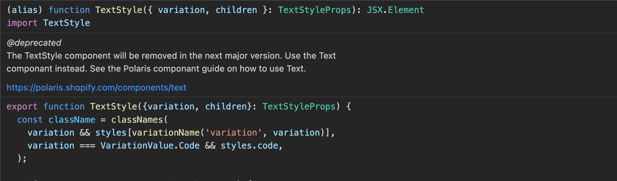
Deprecates our existing typography components with mapping to the new
Textcomponent.Updates the
Textcomponent page in the style guide to use thebetaflag instead ofalpha.WHAT is this pull request doing?
Deprecates
Caption,DisplayText,Heading,Subheading,TextStyle, andVisuallyHiddenon the style guide and inpolaris-react.Adds logic in the style guide to hide the prop table if the component is deprecated and hide the component examples if none exist.
Deprecated Caption component page
How to 🎩
🖥 Local development instructions
🗒 General tophatting guidelines
📄 Changelog guidelines
🎩 checklist
README.mdwith documentation changes