Add defaults to bleed #7644
Add defaults to bleed #7644
Conversation
size-limit report 📦
|
 kyledurand
force-pushed
the
bleed_add-sensible-defaults
branch
from
kyledurand
force-pushed
the
bleed_add-sensible-defaults
branch
from
0dc45db to
3444291
Compare
 kyledurand
force-pushed
the
bleed_add-sensible-defaults
branch
from
kyledurand
force-pushed
the
bleed_add-sensible-defaults
branch
from
3444291 to
3b4dcba
Compare
This PR was opened by the [Changesets
release](https://github.com/changesets/action) GitHub action. When
you're ready to do a release, you can merge this and the packages will
be published to npm automatically. If you're not ready to do a release
yet, that's fine, whenever you add more changesets to main, this PR will
be updated.


# Releases
## @shopify/polaris-icons@6.5.0

### Minor Changes

- [#7548](#7548)
[`432bdd5fe`](432bdd5)
Thanks [@anthonymenecola](https://github.com/anthonymenecola)! - add
cancel major icon


- [#7620](#7620)
[`35be8a003`](35be8a0)
Thanks [@rdott](https://github.com/rdott)! - Added inactive location
minor and major icons

## @shopify/polaris-migrator@0.8.0

### Minor Changes

- [#7403](#7403)
[`8859f5db5`](8859f5d)
Thanks [@jesstelford](https://github.com/jesstelford)! - Introduce
`migrate-motion` migration for migrating `transition`,
`transition-duration`, and `transition-delay` usages of duration values.


- [#7606](#7606)
[`cf7badbd1`](cf7badb)
Thanks [@samrose3](https://github.com/samrose3)! - Renamed and split
migrations based on scope and type (react, scss, and styles)


- [#7543](#7543)
[`8c1989618`](8c19896)
Thanks [@jesstelford](https://github.com/jesstelford)! - Expose
utilities for SASS Migrations to leverage the Suggestion-on-partial-fix
pattern


- [#7529](#7529)
[`3652eb901`](3652eb9)
Thanks [@samrose3](https://github.com/samrose3)! - Add relative option
for replace-text-component migration


- [#7532](#7532)
[`ba576498d`](ba57649)
Thanks [@jesstelford](https://github.com/jesstelford)! - Expose the
.report() method to SASS migrations for easier aggregation of discovered
issues during a migration run.

### Patch Changes

- [#7606](#7606)
[`cf7badbd1`](cf7badb)
Thanks [@samrose3](https://github.com/samrose3)! - Update
`createInlineComment` to format text with RegExp


- [#7606](#7606)
[`cf7badbd1`](cf7badb)
Thanks [@samrose3](https://github.com/samrose3)! - Add support to
replace Identifiers along with JSXIdentifiers for Text migration


- [#7632](#7632)
[`1f2ec8bfe`](1f2ec8b)
Thanks [@samrose3](https://github.com/samrose3)! - Check for targeted
component import before modifying in Text component migration

- Updated dependencies
\[[`6e9edd3b5`](6e9edd3)]:
    -   @shopify/polaris-tokens@6.3.0

## @shopify/polaris@10.11.0

### Minor Changes

- [#7572](#7572)
[`20c8cad81`](20c8cad)
Thanks [@laurkim](https://github.com/laurkim)! - Replaced usage of text
components in component stories with `Text` component


- [#7621](#7621)
[`6e9edd3b5`](6e9edd3)
Thanks [@aveline](https://github.com/aveline)! - - Added border width
prop to `Box`
- Exported color token subset alias types from tokens package and remove
from `Box`


- [#7068](#7068)
[`ccdcea22e`](ccdcea2)
Thanks [@laurkim](https://github.com/laurkim)! - Deprecated
`DisplayText`, `Heading`, `Subheading`, `Caption`, `TextStyle`, and
`VisuallyHidden` components

### Patch Changes

- [#7644](#7644)
[`b3e73ee04`](b3e73ee)
Thanks [@kyledurand](https://github.com/kyledurand)! - Added horizontal
spacing defaults to `Bleed`


- [#7530](#7530)
[`79d92a820`](79d92a8)
Thanks [@samrose3](https://github.com/samrose3)! - Replaced all
typography components with the new `Text` component.
    Added support for `text-inverse` color type on `Text`.
Removed references to the following mixins to use the new `Text` or
tokens directly in classes: `text-style-body`, `text-style-heading`,
`text-style-subheading`, `text-style-caption`, `text-style-button`,
`text-style-button-large`, `text-emphasis-subdued`,
`text-emphasis-strong`, `nav-item-text-attributes`.


- [#7577](#7577)
[`db951f855`](db951f8)
Thanks [@RickyMarou](https://github.com/RickyMarou)! - Page component:
display subtitle even when it's the only header prop set


- [#7633](#7633)
[`1364be7f1`](1364be7)
Thanks [@kyledurand](https://github.com/kyledurand)! - Renamed `alignY`
prop to `alignBlock` on `Inline`
    Added more flex properties to `align` on `Inline`


- [#7443](#7443)
[`7a6fb7c1c`](7a6fb7c)
Thanks [@iAmNathanJ](https://github.com/iAmNathanJ)! - Improve
performance of the Scrollable component with React 18


- [#7625](#7625)
[`9f8b651dd`](9f8b651)
Thanks [@kyledurand](https://github.com/kyledurand)! - Removed wrap
children with div from Inline component


- [#7593](#7593)
[`addd6bcdd`](addd6bc)
Thanks [@kyledurand](https://github.com/kyledurand)! - Improved comments
across layout components, changed default spacing of Inline component to
match AlphaStack


- [#7600](#7600)
[`f006509be`](f006509)
Thanks [@billycai](https://github.com/billycai)! - Add spacing between
title and metadata for Page component


- [#7563](#7563)
[`a9051d678`](a9051d6)
Thanks [@chazdean](https://github.com/chazdean)! - Updated `Inline`
component docs and default prop values


- [#7635](#7635)
[`3cb5377a6`](3cb5377)
Thanks [@iAmNathanJ](https://github.com/iAmNathanJ)! - Fixed Scrollable
component to match existing onScrolledToBottom logic

- Updated dependencies
\[[`432bdd5fe`](432bdd5),
[`6e9edd3b5`](6e9edd3),
[`35be8a003`](35be8a0)]:
    -   @shopify/polaris-icons@6.5.0
    -   @shopify/polaris-tokens@6.3.0

## @shopify/polaris-tokens@6.3.0

### Minor Changes

- [#7621](#7621)
[`6e9edd3b5`](6e9edd3)
Thanks [@aveline](https://github.com/aveline)! - - Added border width
prop to `Box`
- Exported color token subset alias types from tokens package and remove
from `Box`

## @shopify/stylelint-polaris@4.4.0

### Minor Changes

- [#7551](#7551)
[`d7dc4436f`](d7dc443)
Thanks [@aaronccasanova](https://github.com/aaronccasanova)! - Add
`stylelint-polaris/coverage` rule

### Patch Changes

- [#7589](#7589)
[`b7b0ef5a9`](b7b0ef5)
Thanks [@aaronccasanova](https://github.com/aaronccasanova)! - Add
constraints to `stylelint-polaris/coverage` disable comments

- Updated dependencies
\[[`6e9edd3b5`](6e9edd3)]:
    -   @shopify/polaris-tokens@6.3.0

## @shopify/plugin-polaris@0.0.16

### Patch Changes

- Updated dependencies
\[[`8859f5db5`](8859f5d),
[`cf7badbd1`](cf7badb),
[`cf7badbd1`](cf7badb),
[`cf7badbd1`](cf7badb),
[`8c1989618`](8c19896),
[`3652eb901`](3652eb9),
[`1f2ec8bfe`](1f2ec8b),
[`ba576498d`](ba57649)]:
    -   @shopify/polaris-migrator@0.8.0

## polaris.shopify.com@0.24.0

### Minor Changes

- [#7068](#7068)
[`ccdcea22e`](ccdcea2)
Thanks [@laurkim](https://github.com/laurkim)! - Deprecated
`DisplayText`, `Heading`, `Subheading`, `Caption`, `TextStyle`, and
`VisuallyHidden` pages and removed examples


- [#7609](#7609)
[`343865159`](3438651)
Thanks [@sarahill](https://github.com/sarahill)! - Added new type style
guidance and info to typography docs

### Patch Changes

- [#7634](#7634)
[`4db441756`](4db4417)
Thanks [@laurkim](https://github.com/laurkim)! - Replaced usage of
typography components (`DisplayText`, `Heading`, `Subheading`,
`Caption`, `VisuallyHidden`, `TextStyle`) with the new `Text` component


- [#7604](#7604)
[`aa82c82ff`](aa82c82)
Thanks [@chazdean](https://github.com/chazdean)! - Updated `Inline`
component doc vertical alignment example


- [#7568](#7568)
[`ab0cf251f`](ab0cf25)
Thanks [@chazdean](https://github.com/chazdean)! - Updated `AlphaCard`
component guidance and examples


- [#7633](#7633)
[`1364be7f1`](1364be7)
Thanks [@kyledurand](https://github.com/kyledurand)! - Renamed `alignY`
prop to `alignBlock` on `Inline`
    Added more flex properties to `align` on `Inline`


- [#7527](#7527)
[`924e9e5cd`](924e9e5)
Thanks [@chazdean](https://github.com/chazdean)! - Update `Columns`
component docs


- [#7596](#7596)
[`749ee31ee`](749ee31)
Thanks [@kyledurand](https://github.com/kyledurand)! - Fixed home promo
image layout


- [#7563](#7563)
[`a9051d678`](a9051d6)
Thanks [@chazdean](https://github.com/chazdean)! - Updated `Inline`
component docs and default prop values


- [#7566](#7566)
[`567822218`](5678222)
Thanks [@kyledurand](https://github.com/kyledurand)! - Bumped nextjs


- [#7602](#7602)
[`9931ce0b4`](9931ce0)
Thanks [@kyledurand](https://github.com/kyledurand)! - Bumped nextjs to
13.0.1


- [#7571](#7571)
[`4c5ccc8fa`](4c5ccc8)
Thanks [@chazdean](https://github.com/chazdean)! - Updated `Bleed`
component guidance and examples

- Updated dependencies
\[[`b3e73ee04`](b3e73ee),
[`20c8cad81`](20c8cad),
[`79d92a820`](79d92a8),
[`db951f855`](db951f8),
[`432bdd5fe`](432bdd5),
[`6e9edd3b5`](6e9edd3),
[`ccdcea22e`](ccdcea2),
[`1364be7f1`](1364be7),
[`7a6fb7c1c`](7a6fb7c),
[`9f8b651dd`](9f8b651),
[`addd6bcdd`](addd6bc),
[`f006509be`](f006509),
[`a9051d678`](a9051d6),
[`3cb5377a6`](3cb5377),
[`35be8a003`](35be8a0)]:
    -   @shopify/polaris@10.11.0
    -   @shopify/polaris-icons@6.5.0
    -   @shopify/polaris-tokens@6.3.0

Co-authored-by: github-actions[bot] <github-actions[bot]@users.noreply.github.com>
|
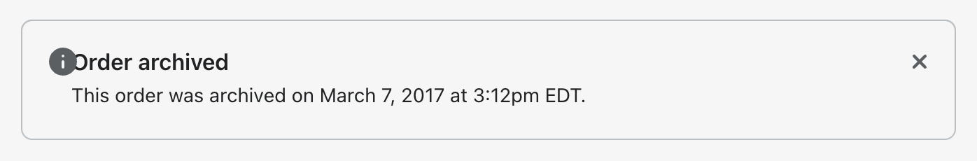
Actually I'm not sure this component should have defaults. I realized this PR caused a regression in the
Previous to this change After this change it would need to be updated to And I don't think that's a great experience for any time I think we should revert this change. |
I think that's the lesser used use case though. Feels weird to me to have components that do nothing without adding a configuration. I'm not super tied to these defaults so I'm fine if we decide to revert but it was expected by a user that bleed would have some sort of default |
|
For sure it's ideal when we can have defaults and components can show how they're intended to be used without adding a configuration. But it's a balance and I think it's a worse experience to have to remove default configuration and also having to remove them clutters up the markup. |
|
Is there a better default or do you feel like we should remove them completely? If we remove defaults here then what other components shouldn't have a default and why? Something I've been thinking about is removing all spacing defaults, I don't want to do it but it might be necessary if we remove all zero values from tokens For now, I'm happy leaving these in but we should definitely come back to this before moving this component out of beta |
|
In the case of Right now my hunch is more low level components, like
That would probably be a good topic to start a discussion on. |
I'm still of the opinion that our layout components should have some
defaults and the ones we have on bleed may not be right but we need to
use it in more places to figure out what those defaults should be.

For now, this fixes regressions to Banner that were introduced in
#7644
I'm still of the opinion that our layout components should have some
defaults and the ones we have on bleed may not be right but we need to
use it in more places to figure out what those defaults should be.

For now, this fixes regressions to Banner that were introduced in
#7644
I'm still of the opinion that our layout components should have some
defaults and the ones we have on bleed may not be right but we need to
use it in more places to figure out what those defaults should be.

For now, this fixes regressions to Banner that were introduced in
#7644
I'm still of the opinion that our layout components should have some
defaults and the ones we have on bleed may not be right but we need to
use it in more places to figure out what those defaults should be.

For now, this fixes regressions to Banner that were introduced in
#7644
I'm still of the opinion that our layout components should have some
defaults and the ones we have on bleed may not be right but we need to
use it in more places to figure out what those defaults should be.

For now, this fixes regressions to Banner that were introduced in
#7644
I'm still of the opinion that our layout components should have some
defaults and the ones we have on bleed may not be right but we need to
use it in more places to figure out what those defaults should be.

For now, this fixes regressions to Banner that were introduced in
#7644
Bleed should do something by default. This offsets the default horizontal padding from AlphaCard which I think will be the most common use case
Part of #7592