Repository navigation
Home
This page is made from README.md on every change to
main; edit it there.
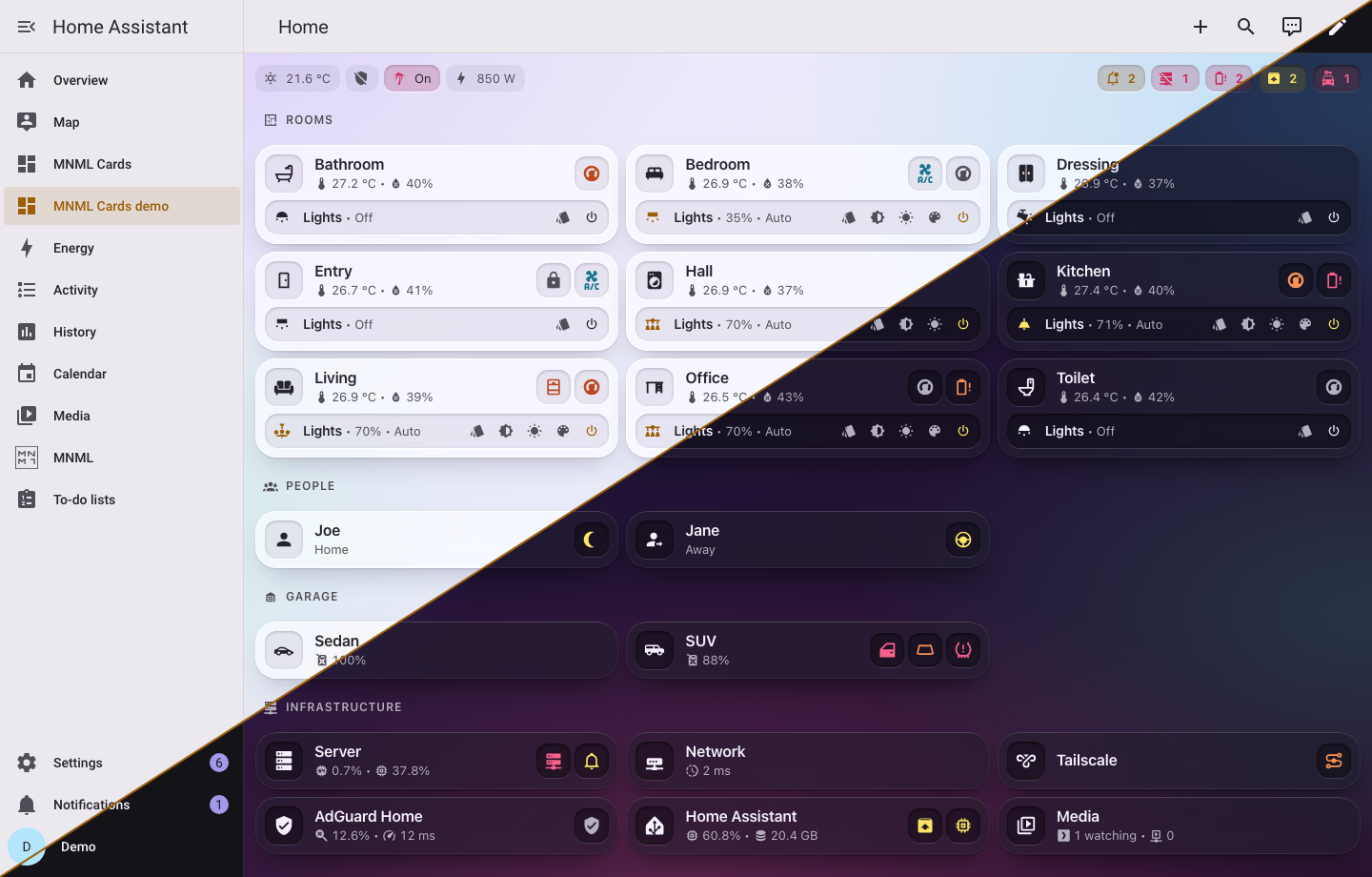
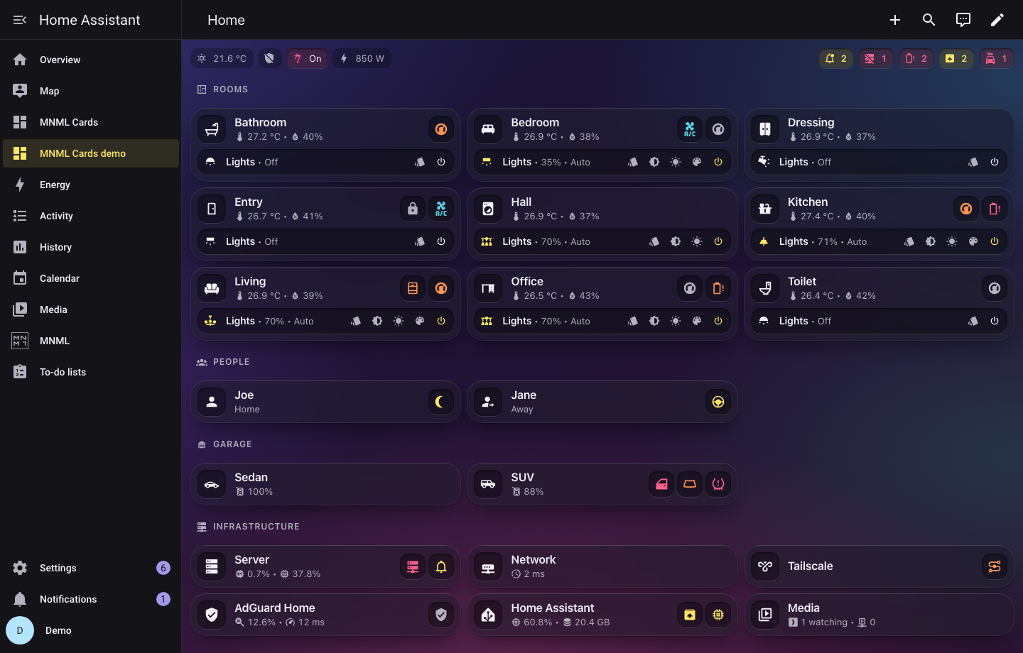
A minimal card set for Home Assistant, with its editors, its templates and its theme, in one integration. One design in two materials to pick from: frosted glass, with translucent cards over a soft background, or a flat one, the same shapes in opaque colours. Colour only where something needs you, and pop-ups that open by the URL hash, so the back button and a shared link both work.
-
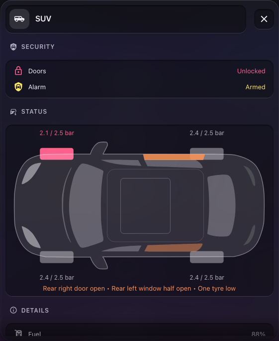
Cards for the things a home is made of: a room tile with its chips, items with their controls, lists and tables, a heading per section, a media card, a car seen from above, an agenda, a messages feed and a client list. Every card is plain YAML,
type: custom:mnml-<name>-card. -
Pop-ups for everything a tile opens, drawn by one
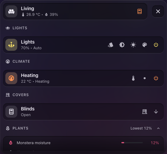
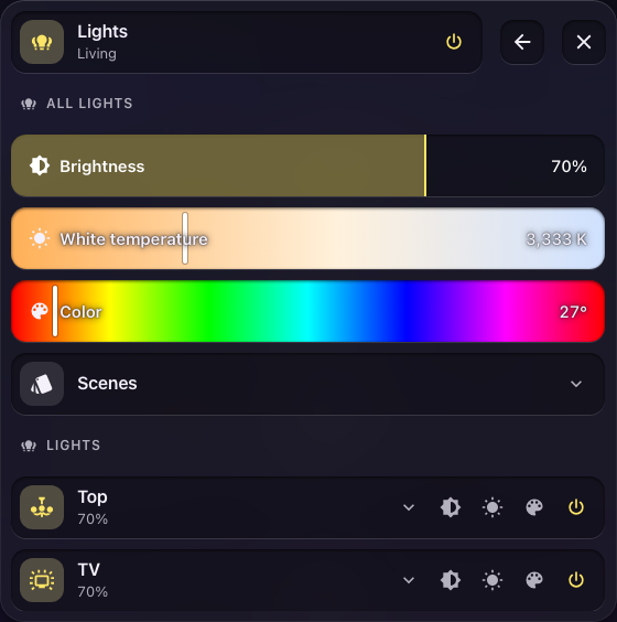
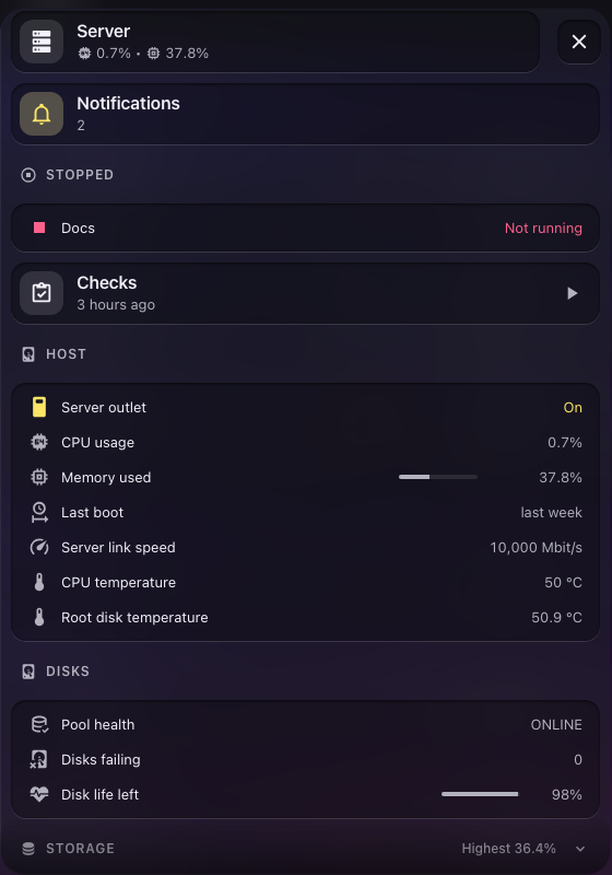
custom:mnml-popups-cardon the dashboard and opened by hash (#living,#living-lights). They are dialogs on a desktop and sheets on a phone, and moving from one to another keeps the backdrop still. - Templates for whole tiles and their pop-ups: a room (with its cameras, covers, air, appliances, pets and plants), a person, a car, a server, the network, AdGuard Home, Home Assistant, a media server, the home's energy, and a strip of glances at its overall statuses. Place one by area and it finds its own entities, or spell its slots by hand, or write your own.
- A dashboard builder in the MNML panel, which makes a whole dashboard from your home in one click, or step by step, and rebuilds it when the home changes.
- Two materials, chosen when you add the integration and changed any time in its options: glass and flat, two MNML themes of one design. The cards work under any other theme, in the flat material.
- A home generator for those who keep their dashboard in code: describe the home once, typed, and get the whole dashboard.
| Desktop, dark | Phone |
|---|---|
 |
 |
| A room | Its lights | A car |
|---|---|---|
 |
 |
 |
| The server | A 3D printer | The media server |
|---|---|---|
 |
 |
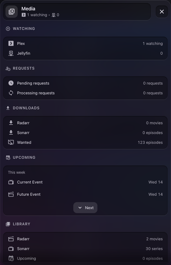 |
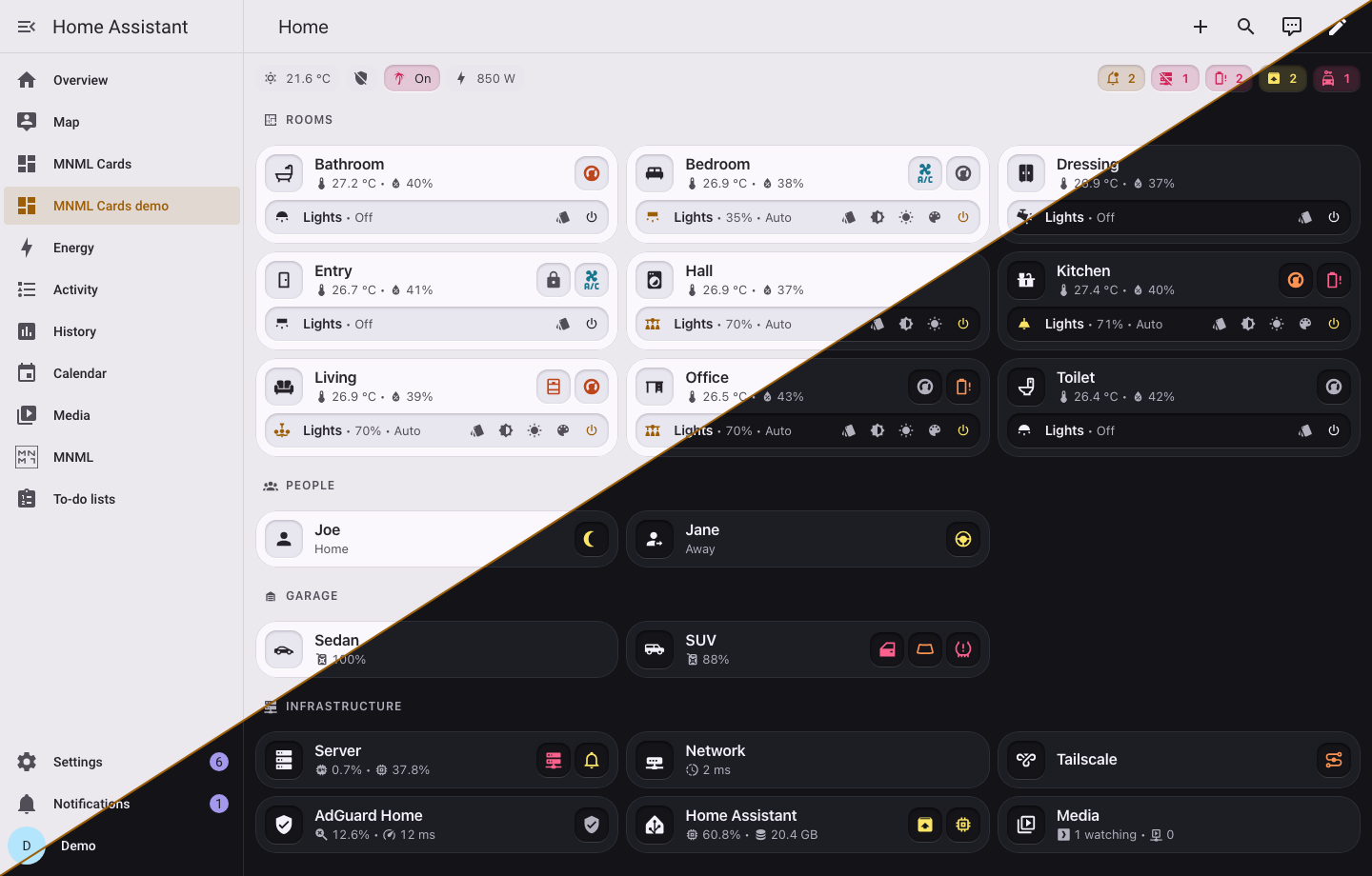
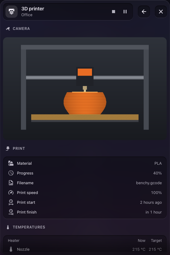
Every screenshot is of the demo home, Joe's and Jane's, on a throwaway Home Assistant; pnpm screenshots takes them again, in the glass design and then in the flat one, and joins each desktop's light and dark into one, light above the diagonal and dark below it.
MNML is a Home Assistant integration. It brings the cards, their editors, the shipped templates and the MNML theme; there is no dashboard resource and no theme file to add.
With HACS: add https://github.com/bfmatei/ha-mnml as a custom repository of type Integration, install MNML, and restart Home Assistant.
By hand: unpack mnml.zip from a release into config/custom_components/mnml/, and restart Home Assistant.
Then add MNML in Settings, Devices & services. The setup asks for two things, which the integration's options change later:
- Use the glass design. On, MNML installs its glass theme: translucent, blurred cards over a soft gradient. Off, it installs the flat one: the same design, with opaque cards on a hairline edge and no blur. Either way, the theme is named MNML.
-
Use MNML as the default theme, for everyone who has not picked a theme in their profile, in light and dark mode. MNML applies it when the answer changes, once Home Assistant loads the MNML theme, so a default set later with the
frontend.set_themeaction stays until the answer changes again.
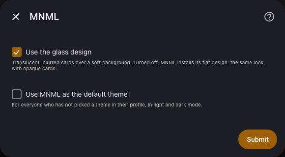
Otherwise pick MNML as the theme in your profile. Under another theme the cards keep the same shapes in that theme's colours, opaque, since the glass is made of the MNML theme's variables.
The theme lives in config/themes/mnml-integration/, which the integration owns and rewrites on each update. Home Assistant must load themes from config/themes/ (frontend: themes: !include_dir_merge_named themes, as its default configuration does); when it does not, the integration takes its theme away again and a repair says what to change. A repair also says so when a dashboard resource still loads MNML Cards by hand, or another theme is named MNML.
The fastest start is the builder: open MNML in the sidebar and pick Quick start. MNML makes a dashboard with a tile for each room it finds something in, one for each person, and the system cards it finds the entities of, and puts it in the sidebar. Step by step lets you choose the rooms and their order, the people, the system cards and how pop-ups open first; either way, the dashboard's row opens the builder again to change it and Rebuild, and Undo goes back one rebuild. A dashboard is shared with Share, as a dashboard template without your home's areas, people or entities, and made from one with From a template, filled with the home that imports it. Building a dashboard and Sharing a dashboard have the details.
To place cards by hand, add the one pop-up card anywhere on a dashboard; it takes no space:
type: custom:mnml-popups-card
width: 560px
Then a room, found from one of your areas:
type: custom:mnml-template-card
template: room
area: living
That draws the living room's tile, with its temperature and humidity, its window, door and lock, its lights and their controls, and a chip for a low battery or a leak while there is one. Tapping it opens the room's pop-up, and from there the lights, the heating, the AC, the vacuum and the speakers, whichever the area has.
A slot set by hand wins over what the area finds, so a template can be corrected one slot at a time:
type: custom:mnml-template-card
template: room
area: living
slots:
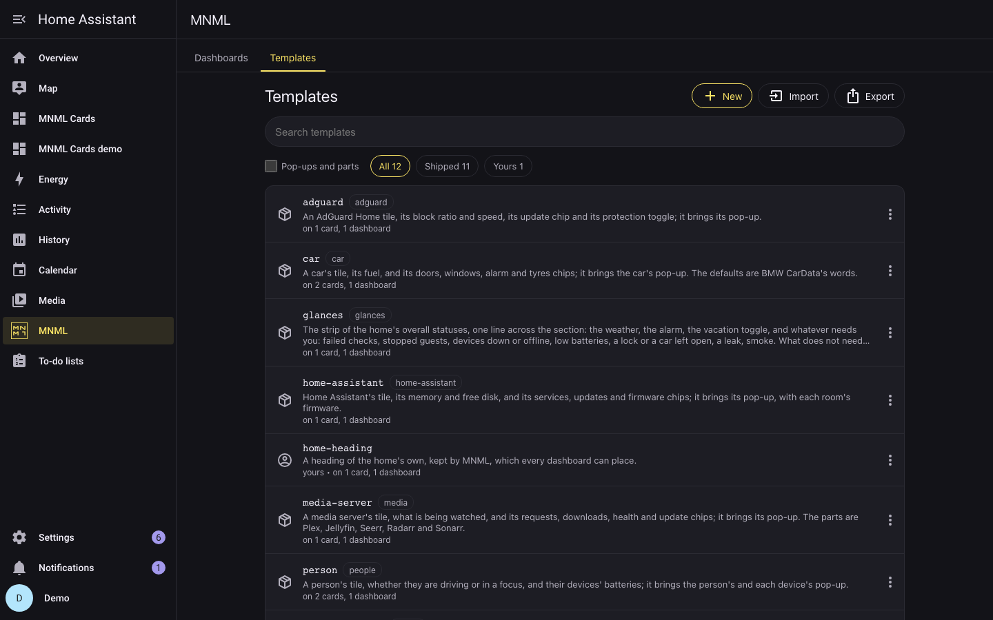
icon: mdi:sofaThe MNML panel in Home Assistant's sidebar, for admins, keeps the home's templates. Its library lists the tiles, the templates you place on a dashboard, and with Pop-ups and parts every other one too, shipped, customised and the home's own, with where each is used. A template opens in a builder:
-
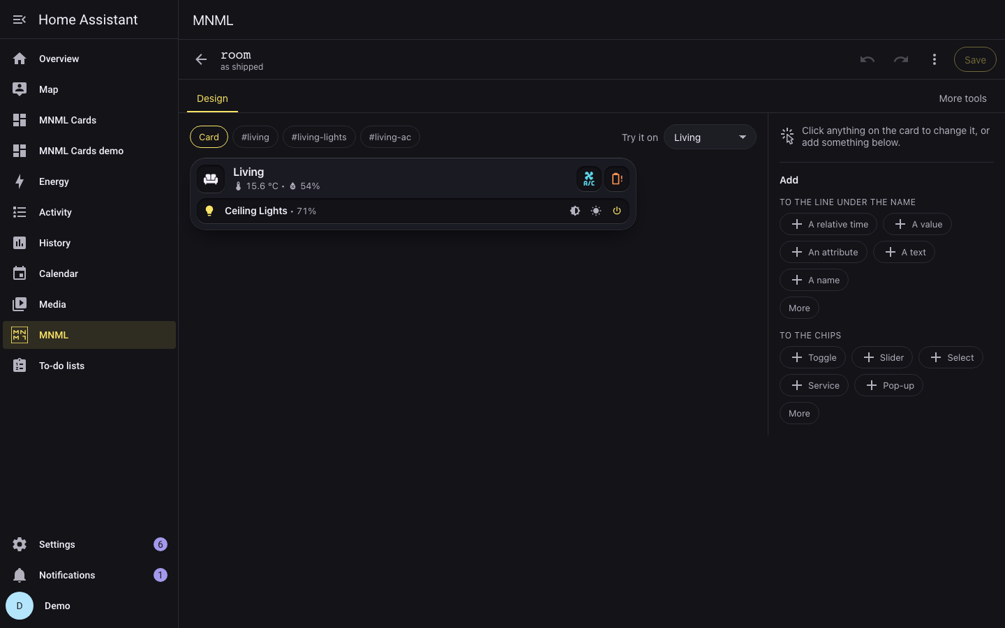
Design, where it opens: the template drawn large. Click, drag or arrow to any part of it to change what it shows, its colour, icon and name, move it, copy it, delete it, or add another beside it. A new template starts from a tile, a list, a strip or a pop-up. The other tools are behind More tools;
-
the outline of its card and pop-ups;
-
a live preview, on the example or on any area;
-
the selected part's fields, each a value or a slot.
Slots and their discovery rules are set as sentences ("Find the first sensor with device class temperature in the area"). YAML is one tab among them.
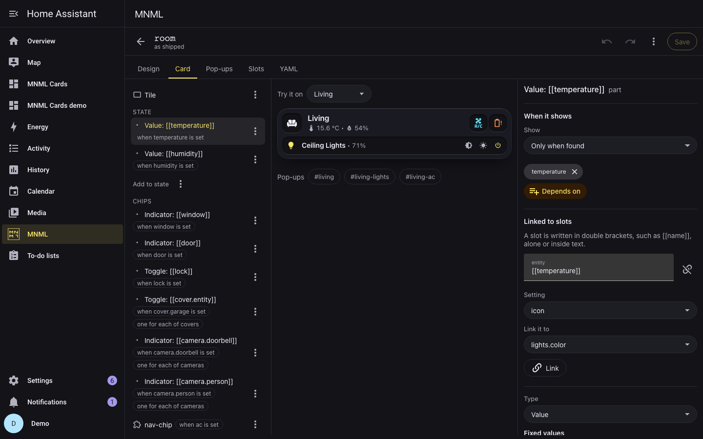
A change to a shipped template is kept as changes laid over it, so a release that improves the template still reaches the parts you left alone; the builder marks a change a release has since touched. The integration keeps everything in .storage/mnml.templates, with the last ten versions of each template, and every open dashboard follows a save at once. When two places have the same name, the first wins:
- The home's own templates.
- A shipped template with the home's changes.
- The shipped templates.
A template with a shipped name replaces the shipped one everywhere, inside other templates too. The library imports and exports templates as YAML; it offers to import the mnml_templates: a dashboard holds, which the cards do not read. Templates and Editing in the UI have the rest.
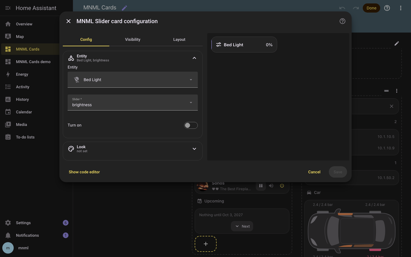
Every card is in Home Assistant's card picker (Add card, By card, then search for MNML), and every card with keys but the pop-ups card opens in a form: Home Assistant's own pickers for entities and icons, sections that open on a click, and a list editor for controls, rows and the other parts, with copy and paste between cards. The template card's editor has a gallery of the tiles with a live preview, the pop-ups and parts folded under them, and a form for the chosen template: it finds the template's devices in an area, or in the whole home, or lets you fill them in yourself, in panels the template describes; for an admin, Edit this template opens it in the MNML panel. The YAML it writes is the YAML you would write. Editing in the UI has the details.
| Page | What it covers |
|---|---|
| The cards' keys | Every card and every key it takes; a key a card does not know is an error card |
| Templates | The template language, where the home's templates live, and every template |
| Editing in the UI | The card picker, each card's editor, the template card's gallery, and the MNML panel |
| The home dashboard | What each tile and pop-up of a whole home shows, and why |
| Data the cards read | The sensors the messages, clients and car plan cards expect, and how to make them |
| Design | How the cards look and why: colour, sizes, motion |
| How the cards work | The pop-up shell, routing, and what the cards take from Home Assistant |
| Architecture | The source tree, the build, releases, tests and the throwaway Home Assistant |
examples/cards.yaml is a dashboard with one of every card, and examples/templates.yaml one of rooms placed by area.
- Two materials, chosen when you add the integration and changed any time in its options: glass and flat, two MNML themes of one design. The cards work under any other theme, in the flat material.
-
Two palettes, under
modes, so one theme follows the light and dark setting of each profile; set dark mode to Auto to follow the operating system. - Shape. Cards have a 22 px radius and no border of the theme's own; pop-ups the same.
- The font is the system stack.
- Contrast it can prove. Every accent reads at 4.5:1 or better as text on a card, every icon at 3:1 on its surface, and the build refuses to write a theme where one claim stops holding.
- The cards' variables: the pill colour and its raised variant, the card's fill, blur, edge, highlight and shadow, the recess of a button, the overlay of a slider and a tooltip, and the pop-up's background, section colour, blur, scrim, shadow, scroll shade, radius and gap. The cards work without them, under any theme, as the flat design; both MNML themes set them all.
The theme has the mapping onto Home Assistant's variables, and every contrast claim.
If you keep your dashboard in code, describe the home as one typed Home (src/home/types.ts): its rooms, people, cars and systems, with every entity id spelled. Then:
-
build(home)is the dashboard, ready to save or write as YAML; -
drawn(home)is the same dashboard as the templates expand it, for a tool that checks entity ids; -
problems(home)lists what would break it: a hash opened that no pop-up defines, a key used twice, a subnet that is no IPv4 range.
demo/home.ts is a complete home to start from.
The demo is a whole home: nine rooms, Joe and Jane, two cars, a server, the network, a Tailscale tailnet, AdGuard Home, Home Assistant and a media server, so every tile and pop-up MNML has. It runs on a throwaway Home Assistant in Docker, with the demo integration, the entities demo/entities.ts makes for it, and MNML itself from this folder. With Docker running, pnpm demo starts it at http://localhost:8124, with the demo and the examples as dashboards; its first run makes the owner demo, password demo. Architecture has what it does.
You need Node 22.18 or newer, pnpm (the version packageManager in package.json names), uv (for Python 3.14), and Docker, for pnpm check's hassfest and for the throwaway Home Assistant.
pnpm install && uv sync
pnpm check    # format, lint and type check, Markdown lint, dead code, ruff, mypy, hassfest, the tests: the gate
pnpm fix      # the part ids, format, and fix what the linters can
pnpm test     # vitest, then pytest
pnpm build    # custom_components/mnml/www/: the cards, the loader, the editors, the panel, the template families and the theme
pnpm zip      # mnml.zip, the release, from custom_components/mnml/
pnpm demo     # the throwaway Home Assistant, running the integration, with the demo and the examples
pnpm look     # every card, template, editor, pop-up and the panel on the throwaway, in both themes, phone and desktop
pnpm walk     # the panel walked through on the throwaway: edit, save, reset, new, duplicate, delete
pnpm videos   # out/videos/: five silent tutorial videos of the demo and the panel, with captions and a visible cursor
pnpm icons    # custom_components/mnml/brand/: the PNG icons from icon-light.svg and icon-dark.svg
AGENTS.md holds the working rules, for people and coding agents alike.
MIT