[Stepper] adds stepIconBuilder property #122816
Conversation
 flutter-dashboard
bot
added
f: material design
flutter-dashboard
bot
added
f: material design
|
@HansMuller gentle reminder for review |
There was a problem hiding this comment.
This looks like a good change. Two issues to resolve:
- Why not allow the developer to override the "icon" for the error state?
- To make it possible to override the default icons for a subset of the states:
typedef StepIconBuilder = Widget? Function(int stepIndex, StepState stepState);and then only use the widget returned by stepIconBuilder if it's non-null; other use the default widget.
The error state have a triangle which can't fit icon inside the paint area unless the icon is way too smaller, said that if Icon is bigger it will overflow the boundary of triangle which might cause opening of new issues by users.
For second point, I don't think it will work unless we add |
|
This is what I was suggesting: Widget _buildCircleChild(int index, bool oldState) {
final StepState state = oldState ? _oldStates[index]! : widget.steps[index].state;
final bool isDarkActive = _isDark() && widget.steps[index].isActive;
if (widget.stepIconBuilder != null) {
final Widget? icon = widget.stepIconBuilder!(index, state);
if (icon != null) {
return icon;
}
}
switch (state) {
case StepState.indexed:
case StepState.disabled:
return Text(
'${index + 1}',
style: isDarkActive ? _kStepStyle.copyWith(color: Colors.black87) : _kStepStyle,
);
case StepState.editing:
return Icon(
Icons.edit,
color: isDarkActive ? _kCircleActiveDark : _kCircleActiveLight,
size: 18.0,
);
case StepState.complete:
return Icon(
Icons.check,
color: isDarkActive ? _kCircleActiveDark : _kCircleActiveLight,
size: 18.0,
);
case StepState.error:
return const Text('!', style: _kStepStyle);
}
}In this version it would be necessary to warn developers that if they override the error state icon they'll need to return a widget whose size is less than [whatever the size limits are]. |
|
Ah, got it. Make sense. To warn the developers, we can document the behavior in the docs of |
Made a few cosmetic changes; this should be ready to land once the presubmits pass.
|
Thanks for resolving the comments @HansMuller |
 AyushBherwani1998
added
the
autosubmit
AyushBherwani1998
added
the
autosubmit
Description
Adds a new
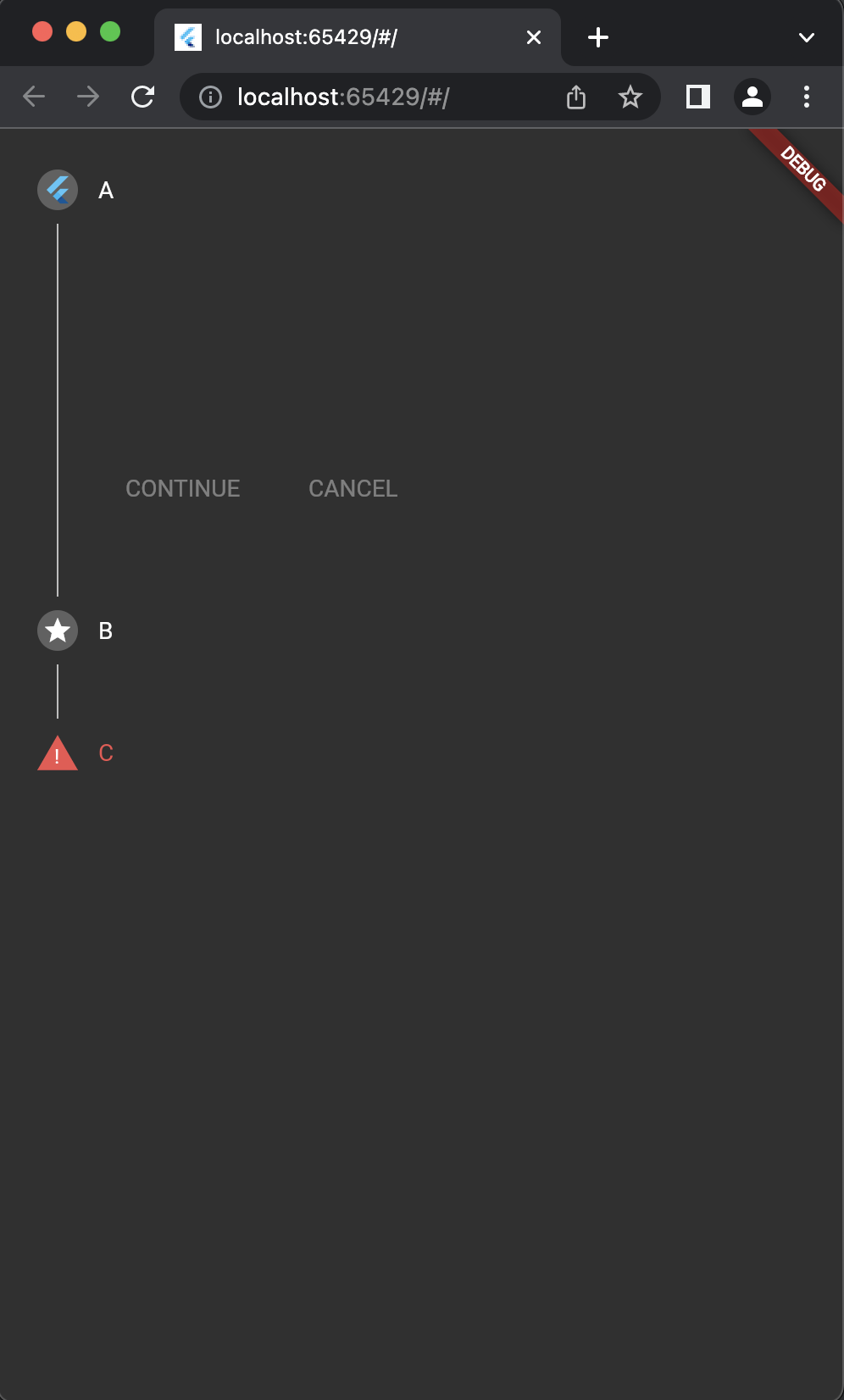
stepIconBuilderproperty inStepper. The property can be used to add custom icon to step based on index or state. The property can be used for all theStepStateexcept forStepState.error.Fixes: #121108
Before:

After:
Pre-launch Checklist
///).If you need help, consider asking for advice on the #hackers-new channel on Discord.