Fix images and text on "Stress testing" guide #1056
Conversation
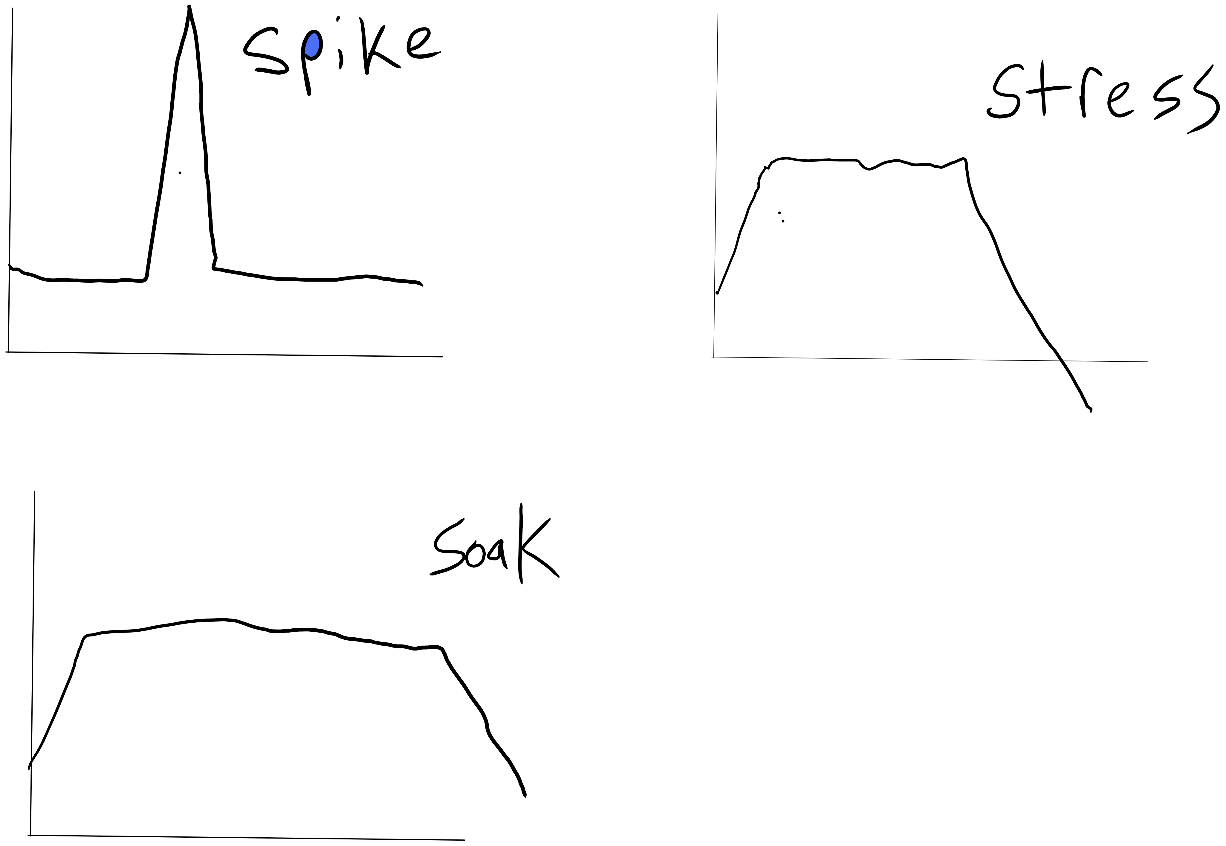
Some of the images on the "Stress testing" guide[1] were removed and
some text was mangled in #978.

[1]: https://k6.io/docs/test-types/stress-testing/
|
There's a version of the docs published here: https://mdr-ci.staging.k6.io/docs/refs/pull/1056/merge It will be deleted automatically in 30 days. |
|
Thanks for this. Merging it to be consistent with the other test types. Note that @srperf will soon update this article. |
|
FYI, I removed that image after a suggestion from mystoykov: #978 (review). Sorry, I should have linked that in my commit. However, I think specific graph could run the risk of confusing users if it doesn't match the script. Maybe instead we could abstract these images to simple line graphs, not connected to any number or application-specific presentation. Obviously this example is rather crude:
https://community.k6.io/t/about-the-number-of-users-in-the-stress-test-documentation/6131 |
|
Well, we still need to label the line in some way, otherwise it's completely meaningless. Maybe RPS would be a better indicator, but I really don't see why expressing the load in terms of VUs would be confusing, since there's usually a direct correlation between RPS and amount of VUs. This reporting issue was recently fixed, so it would report the actual number of VUs in use. Yet if we graphed it now, it would appear very "jumpy", and it wouldn't illustrate the behavior properly. The confusion in that forum post is mostly because of the precise phrasing of "this configuration increases the load by 100 users every 2 minutes". I think it would be enough to soften the language that describes the graphs, without putting so much emphasis on VUs, and explain that the graphs are illustrative of the load, and don't describe the script options exactly. But I definitely wouldn't remove the graphs altogether, as they're very helpful to understand the behavior. |
Some of the images on the "Stress testing" guide were removed and some text was mangled in #978.
It seems @MattDodsonEnglish intentionally removed them in 74b33b3 because they were "misleading", but I'm not sure why he thought that. The images help visualize the test behavior, and not having them is worse, IMO. Maybe the exact VU number will change on different test runs, but the point is to show how the script options affect the load.
In any case, if we decide to remove them, we should also remove the text that introduces them, also change the Spanish translation, and remove the images themselves from the repo.