This NPM package is developed as part of a tutorial from The Odin Project, aimed at creating dynamic, single-level dropdown menus with minimal setup. For an in-depth guide, refer to the lesson on 'Dropdown Menus'.
The @k-bell/k-bell-dropdown-menu-practice simplifies the implementation of single-level dropdown menus on webpages. By initializing once, the package enables all dropdowns to toggle visibility seamlessly. This tool is designed for handling multiple dropdowns without the need for individual configurations.
Note: This package is intended for private and educational use, tailored to specific project requirements.
-
- Attaches click event listeners to dropdown triggers globally on page load. This function activates the dropdown effect for all menus simultaneously.
-
- Dynamically inserts a structured dropdown list (
<ul><li><a>Link</a></li></ul>) under each<a>Menu Title</a>. It is capable of targeting multiple anchor elements at once.
- Dynamically inserts a structured dropdown list (
-
k-bell-dropdown.css:- Provides essential styles for the functioning of the dropdown effects and includes basic styling that can be easily adapted or extended.
For quick installation and basic usage instructions, please visit my Usage Guide
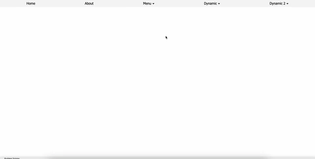
Here’s what the default setup looks like:

See how the package can be transformed with a bit of customization:
/* my-customized-style.css */

* {
    margin: 0;
    padding: 0;
    box-sizing: border-box;
    font-family: 'Segoe UI', Tahoma, Geneva, Verdana, sans-serif
}

ul {
    padding-inline-start: 0;
}

a {
    color: black;
}

ul.nav-container {
    display: flex;
    justify-content: space-around;
    background: whitesmoke;
    padding: 8px;
}

.k-bell-dropdown::after  {
    content: '▾';
    font-size: 16px;
    padding-left: 5px;
}

.k-bell-dropdown + ul {
    translate: 0 8px;
    background: gainsboro;
    min-width: 150px;
    z-index: 1;
}

.k-bell-dropdown + ul li {
    width: 100%;
    padding: 8px;
}

.k-bell-dropdown + ul li:hover {
    background: lemonchiffon;
}

/* This setup makes the entire area of each list item clickable, improving usability for navigation. Makes <a> tags fill the entire space of their parent <li>. */
.k-bell-dropdown + ul li a {
    display: block;
    width: 100%;
    height: 100%;
}Throughout the development of this npm package, I encountered several challenges that not only tested my technical skills but also deepened my understanding of effective web development practices. Here’s a recap of the major learning points and the solutions I crafted:
Problem: Choosing the optimal method to control the visibility of dropdown contents.
- Reflection: I opted for a CSS-centric approach with minimal DOM manipulation to manage dropdown visibility. This decision was influenced by the principle of separation of concerns, aiming for efficiency and cleaner code.
Problem: Deciding on the interaction model for triggering the dropdown—whether through hover, click, or both.
- Reflection: After evaluating user interaction patterns and considering the complexity involved, I settled on using the click event. This method not only simplifies the interaction but also improves accessibility, particularly for mobile environments where hover states can be problematic and for users who rely on assistive technologies.
Problem: Ensuring intuitive usability by closing the dropdown when clicking outside of it.
- Reflection: I implemented a document-level listener to detect clicks outside the dropdown, a common UX practice that enhances the interface's responsiveness and user engagement.
Problem: Determining the right amount of functionality to include without compromising simplicity and usability.
- Reflection: Still exploring the best practices in npm package development, I chose a minimalist approach. The functions were designed to perform effectively with a single invocation, supplemented by CSS for basic styling and adjustments, allowing users flexibility without complexity.
These experiences have not only contributed to my professional growth but also shaped my approach to software development, emphasizing the importance of user-centric design and clean coding practices. While I strive to fully incorporate these principles, I recognize that mastering them is an ongoing process. Each challenge I encountered has been a stepping stone in understanding and implementing these crucial aspects more effectively.