Repository navigation
1.6.0

Time filters for lists, zoom for light boxes, and pressable accent boxes
Highlights
- Lists filter date ranges by time, not only by whole days.
- Lists and tables skip re-renders of items and rows that did not change. A list-only refetch in mStudio dropped from about 700 ms to under 2 ms.
LightBoxzooms by click, double tap, wheel, pinch and keyboard.- A whole
AccentBoxbecomes pressable through a link or button in itsactionslot.
Deprecations
dependenciesonList.Itemis deprecated. It still works and warns. UserenderDependenciesinstead, but list every outside value the item renders: withrenderDependencies, the render function's identity no longer counts, so a value missing from the list goes stale. No codemod, since only you know what the item reads.
Time filters for lists
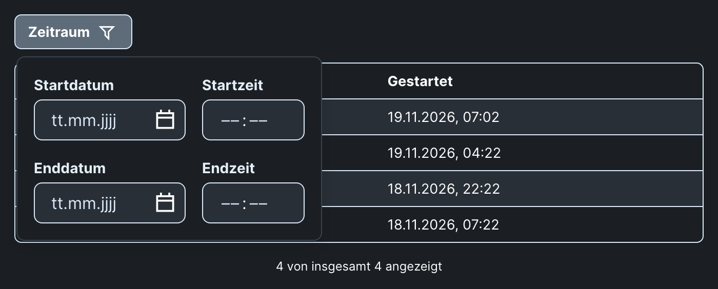
Set dateRangeOptions={{ granularity: "minute" }} on a dateRange filter and the calendar becomes start date, start time, end date and end time fields, in the filter popover and in the "All filters" modal. Logs, backups or cronjob runs can then be narrowed to a time window. The default stays "day", so existing lists do not change. (#3388)
<CronjobRunList.Filter
  property="startedAt"
  mode="dateRange"
  name="Started"
  dateRangeOptions={{ granularity: "minute" }}
/>
A date without a time covers its whole day, and an empty date leaves that side open. A range that ends before it starts shows one error below the fields. The active filter chip now formats dates with the Flow locale instead of the browser's, for both granularities. A loader that filters on the server resolves a filter value to the same bounds with the new resolveDateRangeFilterValue. The Vue List gets the same fields.
The time fields in the filter popover
Faster lists and tables
A re-render of a list's parent, or a refetch that returns the same items, no longer re-renders the list's items or table rows. Inline onAction, textValue and href on items no longer break the memo either. (#3526, #3575, #3581)
To let an item or row with an inline render function skip re-renders, declare what it reads in renderDependencies. It then re-renders only when its data or one of those values changes. Table rows without it re-render with the list, as before.
<ProjectList.Item renderDependencies={[selectedId]}>
  {(project) => (
    <ListItemView>
      <Heading>{project.name}</Heading>
      {project.id === selectedId && <Text>Selected</Text>}
    </ListItemView>
  )}
</ProjectList.Item>
Measured in mStudio: refetching a 160-row invoice table went from about 700 ms of rendering to 1.5 ms, and a 185-item domain list from 353 ms to 25 ms. The List page in the Styleguide has new performance guidance for items, modals and batches (#3527).
LightBox zoom
<LightBox withZoom> lets the content zoom in and out. Click, double tap or Enter toggle 2×. The mouse wheel, a pinch and +/- zoom up to 3×, or to an image's natural size if that is larger. Dragging and the arrow keys move the zoomed content. In a LightBoxGallery each item zooms on its own, and paging works only while it is not zoomed. Works in extensions as well. (#3513)
Every light box gets a new layout: close and the ActionGroup now sit in one row in the top right corner, close last. The gallery's arrows and indicators sit at the screen's edges.
Pressable AccentBox
A Link or Button with slot="action" makes the whole AccentBox pressable. A click anywhere presses it, screen readers announce its text, and the focus ring sits on the box. Other links and buttons in the box stay clickable on their own. This replaces stretched-link CSS copied into tiles. (#3666)
The action itself is not shown. A box that should show a call to action needs an extra visible button or link. On hover, the box fades in a translucent layer over its background.
<AccentBox backgroundColor="blue">
  <Section>
    <Heading>New in mStudio</Heading>
    <Text>All updates of the last weeks at a glance.</Text>
    <Link slot="action" href="/release-notes">
      Go to the release notes
    </Link>
  </Section>
</AccentBox>
Finer grain texture
The texture.grain token is finer and neutral grey in both themes. Blended with overlay, it adds contrast without shifting brightness or greying light surfaces. (#3576)