Home
-
What is going to be developed
- 1.1 Object structure
- 1.2 Props types
- 1.2.1 Global properties
- 1.2.2 Columns props
- 1.2.3 Additional icons props
-
Features
- 2.1 Handling millions of rows
- 2.2 Row selection
- 2.3 Pagination
- 2.4 Column drag and drop
- 2.5 Columns display
- 2.6 Save user configuration
- 2.7 Columns sorting
- 2.8 Filter by search
- 2.9 Row editing
- 2.10 Revert changes
- 2.11 Save changes
- 2.12 Refresh rows
- 2.13 Download data
- 2.14 Print datatable
- 2.15 Adding icons
- 2.16 Cells content overlap
- Using external library
- Bundling project
- Code Quality
-
Testing
- 6.1 Unit testing
- 6.2 Integration testing
- 6.3 E2E testing
A datatable component is going to be developed including the features listed below. The code must follow the "override" pattern also called "render props". What needs to be overridable :
- Header (button functionalities)
- Column's header (datatable)
- Cell's header
- Row
- Row cells (and input cell)
- Footer
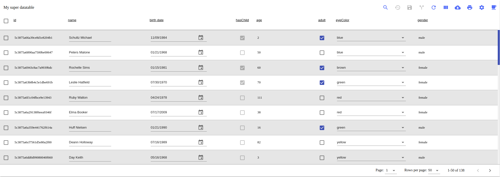
How the datatable should look like at the end :
The developer must give to the datatable an object of this format (The format / name of key can change through the development, the wiki will be updated).
let options  = {
    title: "My super datatable",
    dimensions: {
        datatable: {
            width: "90vw",
        },
        header: {
            height: "60px"
        },
        body: {
            height: "40vh"
        },
        row:{
            height: "60px"
        }
    },
    keyColumn: 'id',
    font: "Arial",
    data: {
        columns: [
            {
                id: "id",
                label: "id",
                colSize: 10,
                editable: true,
                required: true,
                dataType: "text",
                valueVerification: (val) => {
                    let error = val === "whatever" ? true : false;
                    let message = val === "whatever" ? "Value is not valid" : "";
                    return {
                        error: error,
                        message: message,
                    }
                }
            },
            {
                id: "name",
                label: "name",
                colSize: 20,
                editable: false,
                dataType: "text"
            },
            {
                id: "age",
                label: "age",
                colSize: 3,
                editable: true,
                required: false,
                dataType: "number",
                valueVerification: (val) => {
                    let error = val > 100 ? true : false;
                    let message = val > 100 ? "Value is too big" : "";
                    return {
                        error: error,
                        message: message,
                    }
                }
            },
            {
                id: "adult",
                label: "adult",
                colSize: 0,
                editable: false,
                dataType: "boolean",
                inputType:"checkbox",
            },
            {
                id: "birthDate",
                label: "birth date",
                colSize: 10,
                editable: false,
                dataType: "date"
                inputType: "date",
                dateFormat: "YYYY-MM-DDTHH:MM:ss"
            },
        ],
        rows: [
            {
                id: "50cf",
                age: 28,
                name: "Kerr Mayo",
                adult: true,
                birthDate: "1972-09-04T11:09:59",
            },
            {
                id: "209",
                age: 34,
                name: "Freda Bowman",
                adult: true,
                birthDate: "1988-03-14T09:03:19"
            },
            {
                id: "2dd81ef",
                age: 14,
                name: "Becky Lawrence",
                adult: false,
                birthDate: "1969-02-10T04:02:44"
            }
        ],
    },
    features: {
        canEdit: true,
        canPrint: true,
        canDownload: true,
        canSearch: true,
        canRefreshRows: true,
        canFilterColumns: true,
        canSaveUserConfiguration: true,
        userConfiguration: {
            columnsOrder: ["id", "name", "age"],
            copyToClipboard: true,
        },
        rowsPerPage: {
            available: [10, 25, 50, 100],
            selected: 50
        },
        selection: {
            rowsSelectable: true,
            selectPageRows: true,
            selectAllRows: false,
        },
        additionalIcons: [
            {
                tooltip: 'Coffee',
                icon: <CoffeeIcon/>,
                onClick: () => alert('Coffee Time!')
            }
        ],
        selectionIcons: [
            {
                tooltip: 'Selected Rows',
                icon: <CallSplitIcon />,
                onClick: (rows) => console.log(rows)
            }
        ]
    }
}| Property | Type | Required? | Default | Description |
|---|---|---|---|---|
| title | string | no | " " | Title of the datatable. |
| dimensions .datatable .width | string | no | "100vw" | Width of the the Datatable. (in vw or px) |
| dimensions .header .height | string | no | "60px" | Height of the header of the Datatable. (in vh or px) |
| dimensions .body .height | string | no | "300px" | Height of the body of the Datatable. (in vh or px) |
| dimensions .row .height | string | no | "60px" | Height of each row of the Datatable. (in vh or px) |
| keyColumn | string | yes | / | Name of the column that has unique value and allows to identify a row. |
| font | string | no | "Arial" | Name of the font you are using. It allows the datatable to calculate the overlapping of cells. |
| data .columns | array of object | yes | / | An array of objects where each object is defined by this keys. Click here to have more information. |
| data .rows | array of object | yes | / | An array of objects where each object is defined by the columns identifier as key and the value. |
| features .canEdit | boolean | no | false | If the user can edit the rows. |
| features .canPrint | boolean | no | false | If you want stripped rows. |
| features .canDownload | boolean | no | false | If the user can download the data. |
| features .canSearch | boolean | no | false | If the user can filter the data by text through a search input. |
| features .canRefreshRows | boolean | no | false | If the user can click to refresh the rows. |
| features .canFilterColumns | boolean | false | no | If the user can select the columns to display. |
| features .canSaveUserConfiguration | boolean | no | false | If the user can save his columns configuration. (order and which one is displayed) |
| features .userConfiguration .columnsOrder | array of strings | no | [ ] | An array of strings where the strings are the column identifier. Datatable will be rendered only with the columns present in the array. |
| features .userConfiguration .copyToClipboard | boolean | no | true | If true, when the user click on cell it will copy the value in the clipboard. |
| features .rowsPerPage .available | array of number | no | [10, 25, 50, 100] | An array with the numbers of rows per page you want available. |
| features .rowsPerPage .selected | number | no | 50 | The number of rows per page selected by default. |
| features .selection .rowsSelectable | boolean | no | false | If the user can select row. |
| features .selection .selectPageRows | boolean | no | false | If the user can do a global select and it selects all the rows of the current page. |
| features .selection .selectAllRows | boolean | no | false | If the user can do a global select and it selects all the rows. |
| features .selection .additionalIcons | array of object | no | [ ] | If you want to add icon which trigger a function. Click here to have more information. |
| features .selection .selectionIcons | array of object | no | [ ] | If you want to add icon which execute a function with the rows selected. Click here to have more information. |
Columns is an array of object construct with these keys :
| Property | Type | Required? | Description |
|---|---|---|---|
| id | string | yes | Id of the column (need to be unique). |
| label | string | yes | Label of the column. |
| colSize | number | yes | Size of the column (between 1 and 15). |
| editable | boolean | no | If the each value of row corresponding to the column is editable or not. |
| dataType | string | no | Possible values: test, number, data. |
| inputType | string | no | Possible values: checkbox, datePicker, select. |
| dateFormat | string | yes (only if datatype = date) | Format of the date. |
| values | array | yes (only if inputType = select) | Possible values displayed in the select. |
| required | boolean | no | If the field can't be empty. |
| valueVerification | function | no | If you want to verify value on save. You need to provide a function which take a parameter (the new value) and return and object in this format {error: boolan, message: string} |
Additional icons is an array of object construct with these keys :
| Property | Type | Required? | Description |
|---|---|---|---|
| tooltip | string | no | Description of the button. The text will be displayed on hovering the icon |
| icon | Component | yes | Use @material-ui/icons to provide an icon to display. |
| onClick | function | yes | A function that doesn't take parameter. |
Additional selection icons is an array of object construct with these keys :
| Property | Type | Required? | Description |
|---|---|---|---|
| tooltip | string | no | Description of the button. The text will be displayed on hovering the icon |
| icon | Component | yes | Use @material-ui/icons to provide an icon to display. |
| onClick | function | yes | A function that takes a parameter (the selected rows). |
This is the list of the "user" features. If you want to see the development process, you can see it here and also here.
In order to develop something generic and reusable the datatable needs to handle infinite amount of rows without lag on the interface. To respond to that problem, implement a virtualization library: react-infinite. Virtualization is process where only what is visible to the user is insert in the html dom. On scrolling, the library is going to inject new elements.
Users can select a row by clicking on a checkbox positioned at the left. Users can click on a checkbox on the column level and it will select either all the rows of the datatable. The selecting parameter is an option provided by the developer using the component :
features: {
    canSelectRow: true
    ...
}Users can navigate across pages by clicking on "next" and "previous" button. They can select a page by a select input. They can select the number of rows per page. The developer can provide as option the number of rows per page and which one is selected by default :
features: {
    rowsPerPage: {
        available: [10, 25, 50, 100],
        selected: 50
    },
    ...
}Users can drag and drop column to reorder as they please. Use a library as react-sortable-hoc.
Users can choose which columns to display. There is a button on top right (in the header), on click opens a modal with the list of column with a checkbox to display/hide.
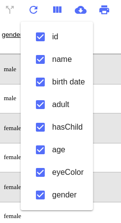
This feature is in option :
features {
    canFilterColumns: true,
    ...
}Users can save their columns configuration and copy to clipboard option. There is a button on top right (in the header), on click opens a modal as the following picture.
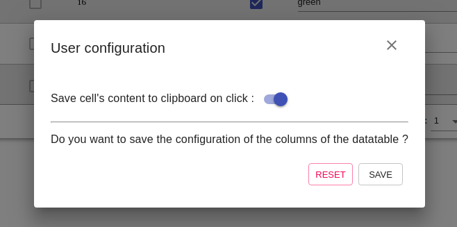
On save, it will send to the developer the user configuration in this format :
userConfiguration: {
    columnsOrder: ["column1", "column4", "column5"], // Array where each element is the id of the column
    copyToClipboard: true,
}
The developer can give the user configuration in this format :
features: {
    userConfiguration: {
        columnsOrder: ["column1", "column4", "column5"], // Array where each element is the id of the column
        copyToClipboard: true,
    },
    ...
}Users can click on a column's name to sort by asc or desc. Users can sort by multiple column, use this library: fast-sort.
Users can filter rows by search input present in the header. This feature is in option :
features {
    canSearch: true,
    ...
}Users can edit some values of a row according to what the developer has defined. Either all rows are editable or there is an icon on the left of each row which toggle the edit mode on. Values that need to be handled: text (input), number (input), date (material-ui-pickers, select, boolean (checkbox). Developper can provide new datatype by giving a component. The developer can defined if rows are editable or not :
features: {
    canEdit: true,
    ...
}
If some columns shouldn't be editable the developer has to defined it in the columnInfo :
data: {
    columns: [
        {
            editable: false,
            ...
        }
    ],
    ...
}Users can revert their changes by clicking on a button on the top right (in the header).
Users can save the changes his just made by clicking on a button on the top right. Clicking on the button gives to the developer an array of object where each object is composed of the id of the edited row and the id of the column as key and the new value :
[
    {id: "4556e", name: "Louis", age: 45},
    {id: "7891e", hasChild: true},
    ...
]Users can click on a button on the top right (in the header), it will send a "notification" to the developer that the user wants to refresh the rows. This feature is in option :
features {
    canRefreshRows: true,
    ...
}Users can click on a button on the top right (in the header), it will open a modal where they can choose the output format, the name and which rows download.
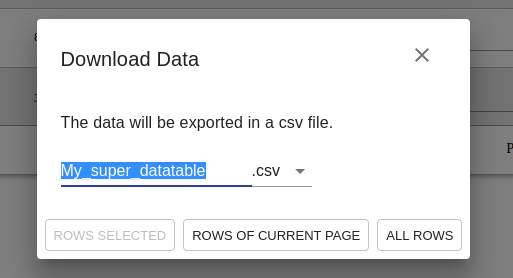
This feature is in option :
features {
    canDownload true,
    ...
}Users can click on a button on the top right (in the header), it will open the print mode. This feature is in option :
features {
    canPrint: true,
    ...
}The developer can add new button to the top right (in the header) which will trigger a function. He can also add button that trigger a function on selected rows. He can select the position of the button.
features: {
    additionalIcons: [
            {
                tooltip: 'Coffee',
                icon: <CoffeeIcon/>,
                position: 1,
                onClick: () => alert('Coffee Time!')
            }
    ],
    selectionIcons: [
            {
                tooltip: 'Selected Rows',
                icon: <CallSplitIcon />,
                position: 5,
                onClick: (rows) => console.log(rows)
            }
    ],
    ...
}If the content of a cell is too long for the cells, the overflow is hidden and display "...". On hover it will display a tooltip with the complete value. Use this library to calculate if content is too big : text-width.
You are free to use external library to help you in the development but at two conditions :
- The library must be free to use and distribute commercial (eg: MIT)
- You can't use a component library except if this one is a wrapper
// You can't use this one
<YourExternalLibrary data={data} />

// You can use this one
<YourExternalLibrary>
    {data}
    // Other stuff here
</YourExternalLibrary>We are using Babel and Webpack to transform our project into a library.
Babel is a toolchain that is mainly used to convert ECMAScript 2015+ code into a backwards compatible version of JavaScript in current and older browsers or environments.
At its core, webpack is a static module bundler for modern JavaScript applications. When webpack processes your application, it internally builds a dependency graph which maps every module your project needs and generates one or more bundles.
In order to have a good quality of homogeneous code we are using some tools which are Eslint, Prettier and Husky
Code linting is a type of static analysis that is frequently used to find problematic patterns or code that doesn’t adhere to certain style guidelines. JavaScript, being a dynamic and loosely-typed language, is especially prone to developer error. Without the benefit of a compilation process, JavaScript code is typically executed in order to find syntax or other errors. Linting tools like ESLint allow developers to discover problems with their JavaScript code without executing it. We are using the Airbnb preset.
Prettier enforces a consistent code style (i.e. code formatting that won't affect the AST) across your entire codebase because it disregards the original styling* by parsing it away and re-printing the parsed AST with its own rules that take the maximum line length into account, wrapping code when necessary.
Husky is here to prevent bad commit and push. Before committing any changes, husky will launch eslint and prettier. If there is any error, your commit wont be effective, you need to correct your code and commit again.
Testing is necessary to keep the code safe. There is multiple type of testing but we will concentrate on these three :
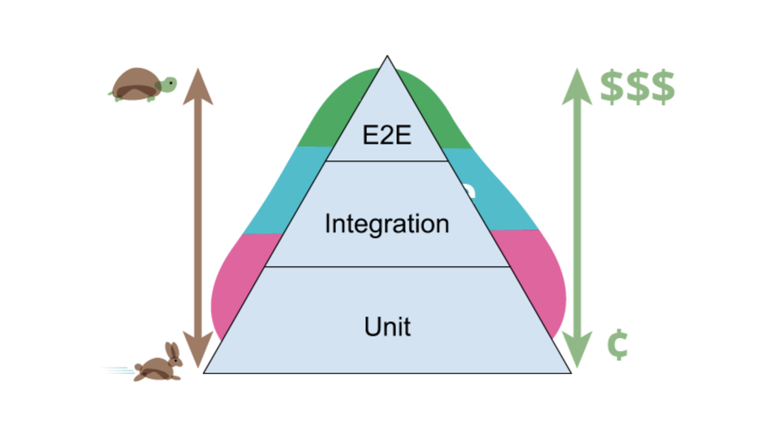
We will split our testing like this (according to google advise) :
- 70% of unit testing
- 20% of integration testing
- 10% of e2e testing
To develop these tests, we will use Jest and Enzyme.
To develop these tests, we will use Enzyme.
To develop these tests, we will use Cypress.