-
-
Notifications
You must be signed in to change notification settings - Fork 10.3k
New issue
Have a question about this project? Sign up for a free GitHub account to open an issue and contact its maintainers and the community.
By clicking “Sign up for GitHub”, you agree to our terms of service and privacy statement. We’ll occasionally send you account related emails.
Already on GitHub? Sign in to your account
Properly working with High-DPI screen on Windows (SDL2, DPI-aware) #2956
Comments
That looks pretty good to me :) Very crisp text. Add shadows would be my only comment. Just because I have just managed to do that myself :) here Having said that, this is very useful I am going to try this out on Mac Retina and report back how it works. At the moment I am loading font with double the size of |
|
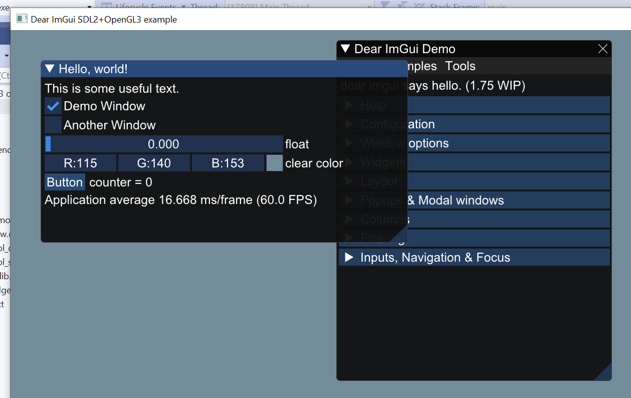
@abbaswasim Oh I'm quite happy with the way the text looks. But shouldn't the positioning adapt automatically? ... Oh damn. I just found out that the positioning is wrong because the example code (that I've copy-pasted) renders the demo window first. When I change the rendering order to match the visual order, "Dear ImGui Demo" appears at the expected place. I guess I'll have to read up a bit on window positioning rules. But does this really mean that blowing up the size of the fonts is the only thing that's required to correctly handle high DPI? Regarding your use of |
|
I am not very familiar with I did try the Is the size of glyphs the same in the texture atlas compared to your screenshots? As in no scaling applied anywhere? |
|
@abbaswasim Sorry for the late, late answer. I found the font texture under "Demo/Images" and no, it looks a bit different at first glance: However, looking at the two variants of the letter "m" in Paint, magnified, reveals that the letter is in fact exactly the same height! Evidently, what's happening here is that the font was rasterized at 3 times width so that, when scaled down on the x axis by the same factor, OpenGL or the rendering shader would be able to do anti-aliasing at the sub-pixel level - which however, again according to my magnified view, does not seem to be happening: This also means, however, that my impression that fonts were rendered at a higher scale is not generally true. |
|
@JPGygax68 not sure what you mean by:
You atlas is bigger than the text but you are saying only in horizontal direction? This might be due to the following: int OversampleH; // 3 // Rasterize at higher quality for sub-pixel positioning. Read https://github.com/nothings/stb/blob/master/tests/oversample/README.md for details. |
|
@abbaswasim I must have misinterpreted something I've seen in one of the issues here. Yes, you're probably right about |
|
yes that bit I am less clear about. I do see with the default |


There are quite a few DPI-related questions already, but I haven't found a good answer yet.
I'd like my GUI to properly adapt to high-DPI screens, and am unsure of how to do this right.
So far, I've adapted the SDL2/OpenGL3 sample in the following way:
14 * dpi/72(Code excerpt):
This gives me a perfectly crisp font at an easily readable size, but the default layout (when no imgui.ini is present) has the windows overlap even though there is ample space available to the right (not shown on this screenshot, but the monitor is 4k, and the window uses 7/8ths of that):

What can I do to improve this?
The text was updated successfully, but these errors were encountered: