Repository navigation
Styling
You can set your own custom themes! Only a light one, a dark one or both. The following functions expect JSON strings.
This is the specification of a theme. All fields are optional. Customize as you want.
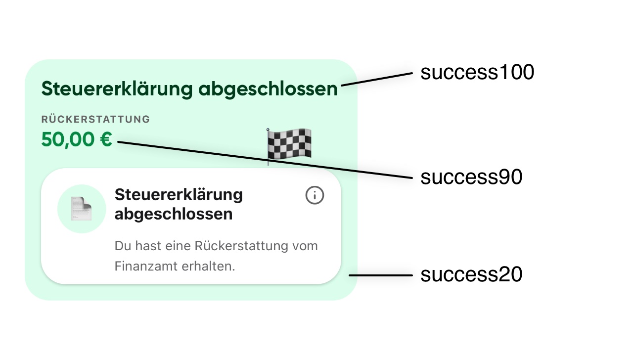
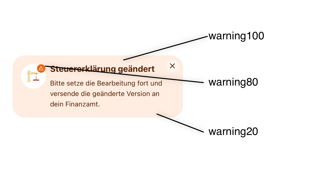
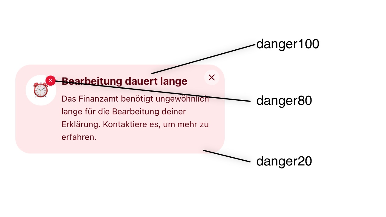
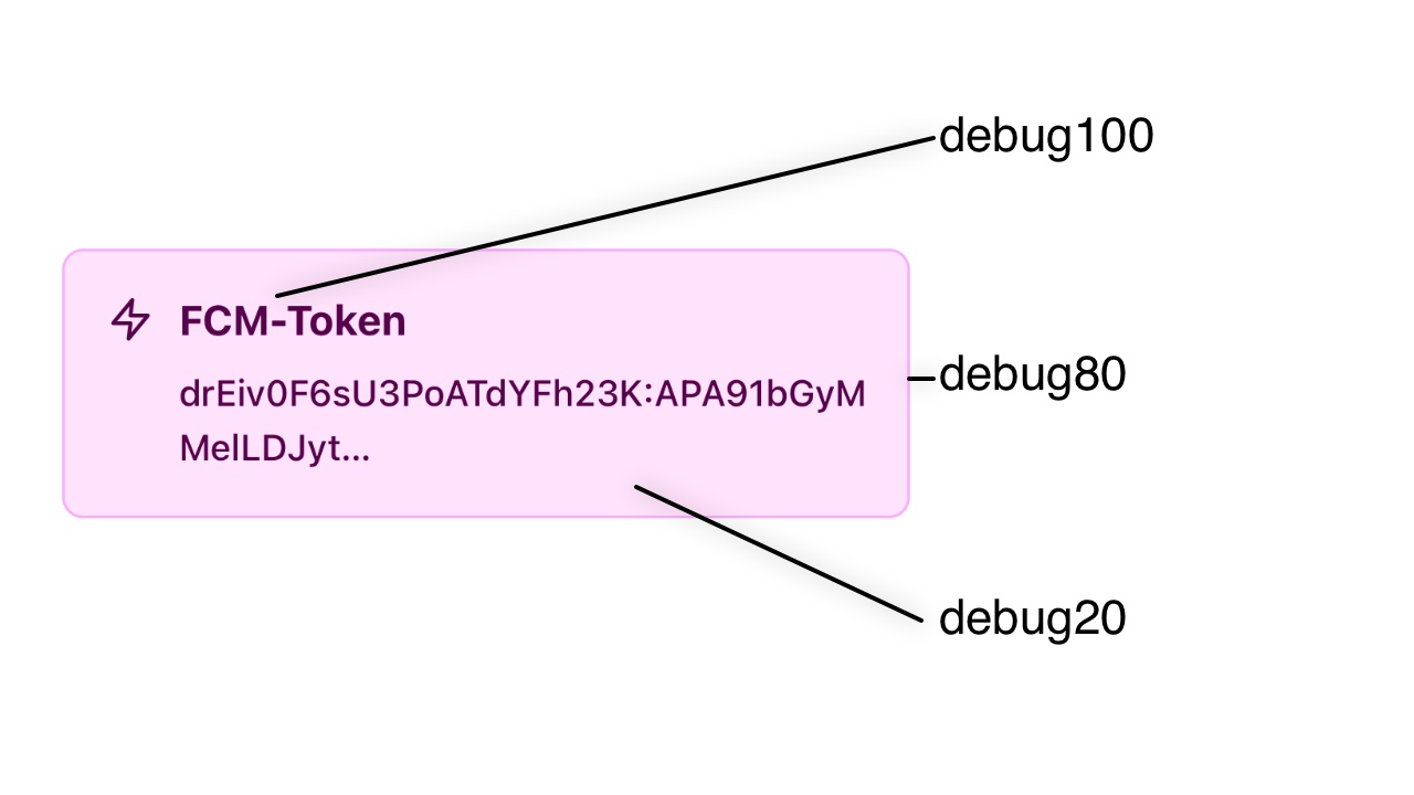
Colors are defined by their base color, which always is suffixed with 80 (e.g. primary80). Additionally there are several shades of the base color, which have to be defined (e.g. primary40). The lower the suffixed number, the lower the contrast (brighter in light-mode, darker in dark-mode).
Static gray colors are a exception. These gray colors should be the same in light and dark themes (staticGray100 the darkest, staticGray0 the lightest).
All colors are optional and will fallback to the Steuerbot-theme.
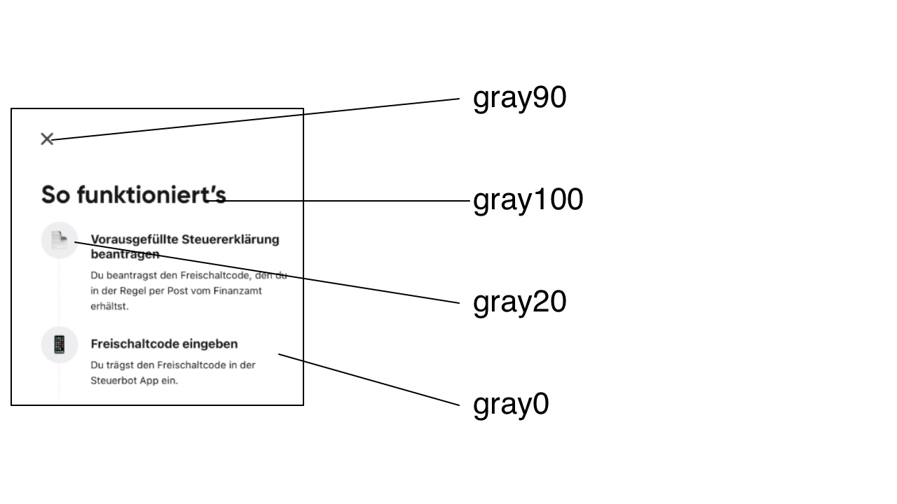
gray: used throughout components and for backgrounds
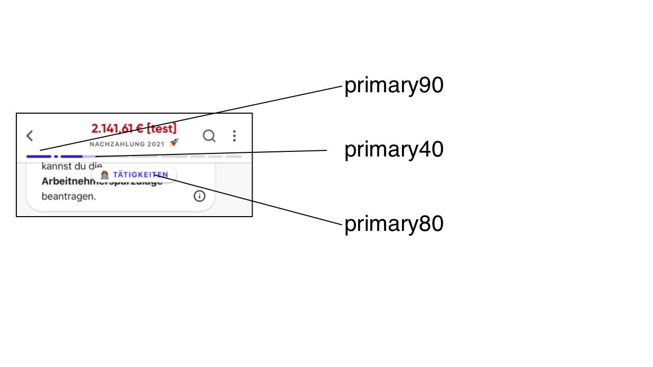
primary: this is your brand color, the main color used in the integration. primary80 should represent your main brand color. (default: purple)
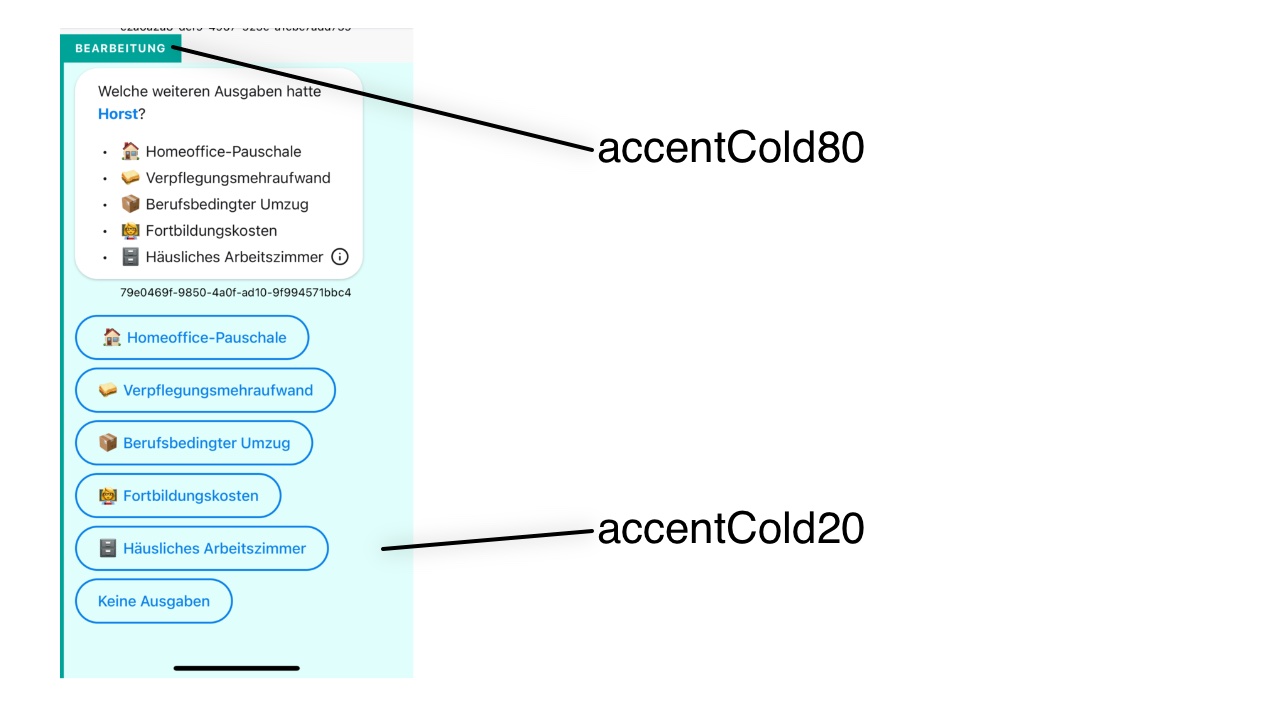
accentCold: accent colors, e.g. used for edit mode (default: cyan)
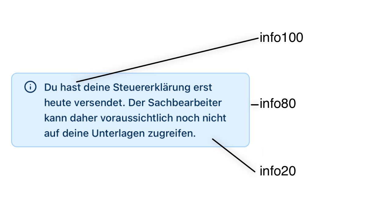
info: Marks special information (default: blue)
success: Indicates if a action or a state was/is successfull (default: green)
warning: Informs the user that there es something unexpected happening (default: orange)
danger: Will show the user if some error occured. Mustly indicates, that user interaction is needed. (default: red)
debug: Marks debug-information for the developer (default: pink)
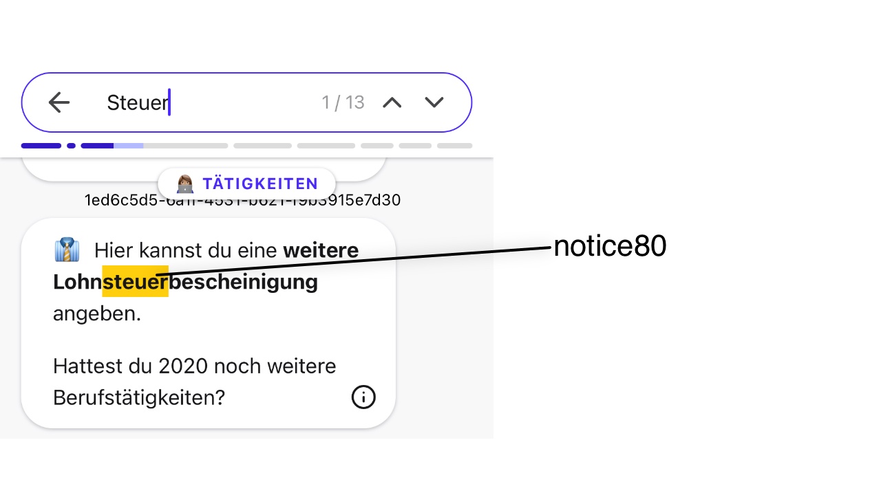
notice: highlight colors
It can be defined, which font should be used for the headlines by the fonts name. (Fonts must be bundled with the hosting app). The fallback is the system-font.
lineHeight, marginTop, marginBottom and fontWeight can be defined for every level of Headlines.
Exact font-sizes (numbers) can be defined for different text (xsmall, small, medium, large, xlarge)
{
  name: string; // the name of your custom theme
  colors: { // for light mode: the higher the color number the darker the color (e.g. gray100 is very dark), for dark mode it should be the opposite (e.g. gray100 is very light)
    // gray colors, used throughout components and for background
    gray100: string;
    gray90: string;
    gray80: string;
    gray70: string;
    gray60: string;
    gray50: string;
    gray40: string;
    gray30: string;
    gray20: string;
    gray10: string;
    gray0: string;
    // static gray colors, these gray colors should be the same in light and dark themes (staticGray100 the darkest, staticGray0 the lightest)
    staticGray100: string;
    staticGray90: string;
    staticGray80: string;
    staticGray70: string;
    staticGray60: string;
    staticGray50: string;
    staticGray40: string;
    staticGray30: string;
    staticGray20: string;
    staticGray10: string;
    staticGray0: string;
    // primary colors
    primary100: string;
    primary90: string;
    primary80: string; // this is your brand color, the main color used in the integration
    primary60: string;
    primary40: string;
    primary20: string;
    // accent colors, e.g. used for edit mode
    accentCold100: string;
    accentCold90: string;
    accentCold80: string;
    accentCold60: string;
    accentCold40: string;
    accentCold30: string;
    accentCold20: string;
    // info colors
    info100: string;
    info90: string;
    info80: string;
    info60: string;
    info40: string;
    info20: string;
    // success colors
    success100: string;
    success90: string;
    success80: string;
    success60: string;
    success40: string;
    success20: string;
    // warning colors
    warning100: string;
    warning90: string;
    warning80: string;
    warning60: string;
    warning40: string;
    warning20: string;
    // danger colors
    danger100: string;
    danger90: string;
    danger80: string;
    danger60: string;
    danger40: string;
    danger20: string;
    // debug colors
    debug100: string;
    debug90: string;
    debug80: string;
    debug40: string;
    debug20: string;
    // highlight colors
    notice80: string;
    notice20: string;
    // transparent color, only change for debugging reasons
    transparent: string;
  };
  fonts: {
    headline: string;
  };
  text: {
    fontSizes: {
      xsmall: number;
      small: number;
      medium: number;
      large: number;
      xlarge: number;
    };
  };
  headline: { // headline sizes
    level1: {
      fontSize: number;
      lineHeight: number;
      marginTop: number;
      marginBottom: number;
      fontWeight: 'light' | 'regular' | 'medium' | 'bold' | 'black';
    };
    level2: {
      fontSize: number;
      lineHeight: number;
      marginTop: number;
      marginBottom: number;
      fontWeight: 'light' | 'regular' | 'medium' | 'bold' | 'black';
    };
    level3: {
      fontSize: number;
      lineHeight: number;
      marginTop: number;
      marginBottom: number;
      fontWeight: 'light' | 'regular' | 'medium' | 'bold' | 'black';
    };
    level4: {
      fontSize: number;
      lineHeight: number;
      marginTop: number;
      marginBottom: number;
    };
    level5: {
      fontSize: number;
      lineHeight: number;
      marginTop: number;
      marginBottom: number;
    };
  };
}