


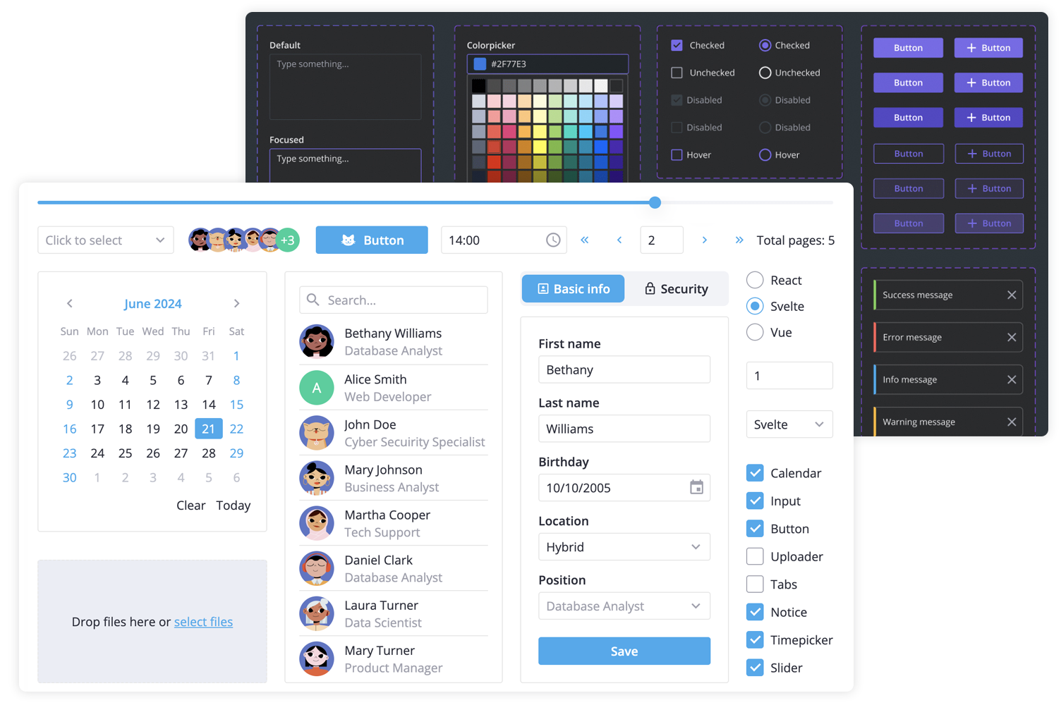
SVAR React Core is a lightweight, fast, and mobile-friendly React component library that offers 20+ reusable, pre-styled UI components. It includes form controls, popups, date & time pickers, toast notifications, and more. The components are easily customizable and come with built-in light and dark themes.
Along with the Core library, you can use the following SVAR React components to build a unified app interface:
- Menu - create basic menu bar, actions or context menu;
- Toolbar - create button and icon panels with configurable, responsive layouts;
- Tasklist - basic to-do list component to add, edit, check or delete tasks;
- Comments - nice-looking comments section with bubbles or flow views;
- File uploader - simple file uploader component.
To start using the components from the Core package, simply import the package and include the desired component in your React file:
import { Button } from "@svar-ui/react-core";
import "@svar-ui/react-core/all.css";

const myComponent => (<Button>Click me</Button>);
See the getting started guide to quickly set up and begin using SVAR Core components in your React projects.
Post an Issue or use our community forum.